I am a color addict.
Not sure how I got this way. I can remember when I was 10 or 11 years old, my friend Gary and I, and sometimes Ira, who was sometimes a friend, sometimes someone we bullied, used to set fires, and then try to put them out. We would set fire to this field behind the Ford dealership on Rt. 22. We would set fire to homes and businesses under construction. We would set fires, let them burn awhile and then try to put them out by stamping them with our feet, putting blankets over them, pouring water on them.
We set fires until we were caught. By the police. Punished severely by our parents who could not figure out why we were setting fires. The word because was insufficient for them. We did it because we could. The fields and buildings were there waiting to be used. We used them the way we knew how. That gave us some fun. A feeling of power. And that was that.
That was that for Gary and Ira. Actually, not for me. I became mesmerized. The colors. The contrasts. The saturation and vibrancy. The interplay. The movement and rapid color changes. The certainty when it was all over.
My gaze locked in, never wavering, staring as the light tans and beiges of the tall field grasses, very still, began undulating with reds and oranges, some blues, some maroons, the fiery colors taking over, first a small area, then more and more, until the colors were more powerful than the heat generated by the fire. Once the fire was put out, I literally felt the strong juxtaposition between charcoal and beige, at once listless and lifeless, yet exuding a powerful finality.
Color is such a powerful influencer. I never set fires again, but, at the same time, I had no one to share my very personal, very emotional, very primal color experiences with until I was in my late 20’s. In school, I was always tracked with the more intelligent kids. This meant rewards for math and science, and some put downs for art and music. My parents did not want to hear about anything else besides lawyer and doctor.
Soon after Gary and Ira and I were caught, I moved away.
But I doubt color was in their forethoughts as we set fires to things.
The Jewelry Designer Colors Differently Than The Artist
You cannot paint with beads and other jewelry components.
I am going to repeat this: You cannot paint with beads and other jewelry components.
When you take color class after color class rooted in art, they are teaching you how to paint. You can’t do this with jewelry and beads.
I give this warning to all my students. I repeat it frequently in the articles I write. I follow it carefully when designing my own pieces. I have been challenged frequently by people who make jewelry and consider themselves artists. But to create successful jewelry takes you beyond art, its ideas, constructs and precepts. Jewelry has some roots in art, which is true. But it also has roots in craft. It is very comparable to architecture. Its product — the outcome — plays a different role and must conform to different social and physical tensions than paintings and sculptures. I repeat: You cannot paint with beads.
As frustrating as this can be, you cannot ignore the fact that Color is the single most important Design Element. Colors, their selection, use and arrangement, are believed to have universal powers to get people to see things as harmonious and appealing. Color attracts attention. A great use of color within an object, not only makes that object more coherent, it can make it more contagious, as well. Using colors that do not work well together, or using too many colors or not enough colors, or using colors which look good on paper but distort in reality can put people off.
Jewelry Designers can learn the artistic basics of Color concepts and theories. They can reference this visual language of color to influence how they go about making choices, including those about picking and using colors. However, jewelry artists who are fluent in design will be very aware of the limitations this artistic, painterly language imposes on them. They will have to learn how to decode, adjust and leverage their thinking to anticipate how the bead and other related and integrated materials assert their needs for color, and how to strategically compose, construct and manipulate them.
Jewelry, unlike painting or sculpture, has certain characteristics and requirements which rely on the management and control of color, its sensation and its variability with a slightly different emphasis than learned in a traditional art class. Jewelry is a 3-dimensional object, composed of a range of materials. Jewelry situates, moves and adjusts in relation to the human body and what that body is doing at the moment.
To get the attention their jewelry deserves, jewelry artists must become fluent with color selection and application from their own disciplinary perspective. We must understand color in jewelry as the jewelry is worn, and worn in a particular context or situation. Ever-changing directions and intensities of light and shadow, reflection, absorption and refraction. The observation that color may be present, even projected (the color shadow), outside the boundaries of the bead or jewelry component itself.
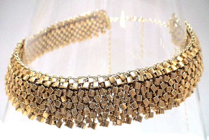
Beads [here I use ‘beads’ as a stand-in for all the component parts and stringing and canvas materials used in a piece of jewelry] are curved or faceted or otherwise shaped, and the shape and texture and material and dimensionality and even the hole through it affect the color, its variation and its placement and movement on the bead’s surface. They affect how light reflects and refracts, so depending on the angle at which you are standing, and how you are looking at the bead, you get some unexpected, unanticipated, sometimes unwanted colors in your piece of jewelry.
Additionally, you need to anticipate how the bead, when worn, can alter its color, depending on the source and positioning of light, the type and pace of movement of the wearer, and how the eye interacts with the bead at any point of time or positioning. There are many more color tensions that come from the interrelationships between positive and negative spaces. There are many gaps of light between each pair of beads, and you can’t paint these in. The colors don’t blend, don’t merge, don’t spill over, don’t integrate. You can’t create the millions of subtle color variations that you can with paint.
I’m not suggesting that beaders and jewelry makers be afraid of colors. Rather, they should embrace them. They should learn insights into understanding colors. They should be inspired by colors. They should express their artistic and creative selves through color. They should use color palettes to their fullest. They should recognize how their various audiences see and claim and interact with color.
It is most important that jewelry designers understand color, its use and application from their own disciplinary standpoint. In some sense, however, the approaches of most bead artists and jewelry designers too often remain somewhat painterly — too rooted in the Art Model.
The Art Model ignores things about functionality and context. The Art Model does not anticipate all the additional management and control issues which arise with jewelry creation and how /where / when it is worn. The Art Model diminishes how the individuality of the designer, and the subjective responses of the wearer and viewer affect each other. In many respects, these are synergetic, mutually dependent and reciprocal. The Art Model understands the success of jewelry only as if the jewelry were sitting on an easel, not as it is worn. When jewelry is treated as an inanimate object, apart from when it is worn, then traditional art color theories would suffice and apply.
As a result, when the use of color is solely dictated by art theory, then color theories get oversimplified for the jewelry artist. “Value” is barely differentiated from “Intensity”. Color selection focuses too much on harmony and variety, and too little on resonance and edginess. Color training too often steers jewelry designers towards a step-by-step, paint-by-number sort of approach to color selection and application. Color theory seeks to explain the universal, and paintings, given that they are immobile, hung on a wall, give time and space for the viewer to experience these universals.
Jewelry, on the other hand, requires an understanding of how color can be adapted to more subjective experiences. It does not stay in the same place. It is not desired in the same way across individuals who view it and wear it. As such, the co-dependent relationship between Color and other Jewelry Design Elements is downplayed and glossed over. This is a major disservice.
Designers need to think of colors as building blocks, and the process of using colors, as one of Creative Construction. Creative Construction requires focusing on how color (and multiple co-existing colors) is (are) sensed, and sensed by various audiences which include the artist him- or herself, and the wearer and the viewer, and the exhibitor, collector, and the seller, if need be. Creative Construction also requires anticipating how color is sensed within those context(s) and situation(s) the jewelry will be worn. Creative Construction includes an ability to anticipate how the various audiences of the designer use color to assume, perceive, understand, express, value and desire jewelry within any context.
All jewelry designers, including myself, are challenged with tasks like controlling the presentation of color(s) along a jewelry object’s silhouette. Or in blending colors among fixed physical objects awkwardly aligning or misaligning within some positive and negative spaces. Or having two or more colors co-exist within the same space or form which may or may not harmonize, given the reality that beads and other jewelry objects do not come in every possible and desirable color, nor consistently express any particular color over their entire surface.
I have found the use of simultaneity effects especially useful here. The one I use the most is that of grays. Gray takes on the colors around it. If I line up an orange bead, then a gray bead, then a blue bead, the middle gray bead will create the perception of a blended orange to blue form. Any bead with an underlying gray or black tone, strategically placed, will accomplish some color blending otherwise problematic.
I often play with other simultaneity effects. Some colors in combination emphasize warmth, and others cold. A sense of temperature (for example a red square embedded within a white square vs. that same red square embedded within a black square) can sometimes be used to divert the mind’s attention from whether the colors correctly harmonize.
In a similar way, some colors in combination (example a yellow square within a black square vs. within a white square) can create the illusion of either projecting or receding, and this too can be used to divert the mind’s attention from whether the colors correctly harmonize.
In my pieces, you will often find colors which, if not used strategically in combination and placement, would not seem to go together. They don’t fit a color scheme. They do not perfectly conform to a mathematical algorithm. They might even clash. More often, however, they just seem off in some way. But by smartly using simultaneity effects, they feel whole, consistent, coherent, right in some way. But also intriguing as the viewer’s mind tries to make sense of them. The colors resonate and are edgy in some way, yet feel harmonious, and the viewers can never figure out why. I intentionally create an object which lacks inherent meaning in order to trap the viewer into trying to find inherent meaning. Fun stuff. And something which often draws the viewer’s attention to my pieces, and keeps their attention there.
I like to play with color proportions. There are ideal proportions of the presence of any two or more colors. Red should appear in equal proportions to green. There should be one orange for any two blues. In art, we would strive to achieve the perfect proportions. In jewelry design, however, I would want to play with imperfections in proportions to give an edginess to my piece. This edginess, if not gone too far, enhances how the jewelry resonates emotionally for the wearer or buyer. We want our jewelry to have a little bit of edginess, or else it may feel harmonious yet boring and banal.
I believe the jewelry designer needs to be able to apply the careful of consideration of color with the goal of evoking resonance in the viewer. Something beyond harmony. Something represented by the difference of the viewer saying I like it, from the viewer saying I want to wear it, or I want to buy it. The designer is here to perhaps emphasize a little bit of the absurdity in life, some playfulness, some inquisitiveness which result from tensions between order and chaos, meaning and meaninglessness.
The designer is there, in part, to challenge the viewer’s subjective interpretations. This is especially true as the jewelry is worn and the wearer moves from different situations, contexts, and lighting. The use of color in jewelry designer often fails when the designer merely tries to duplicate a perfect color scheme, given perfect lighting and no movement. Jewelry is not a painting or sculpture to be displayed in fixed position. It’s much more. Using color from the designer’s viewpoint, rather than of the artist, is a very useful tool.
All these and similar color tricks I use as a jewelry designer contribute to how my jewelry expresses and reflects my authenticity. They add the cachet to my pieces as contemporary. Uninhibited by social norms encapsulated in art theory rules for the use of color. Creating more of a sense of freedom in my pieces, a sense which affects the feelings of freedom the wearer has. Transcendence. A re-imagining. Revelation, connection, awakening.
That’s what my Rogue Elephant needs, wants, demands. In this chaotic and indifferent universe, that rogue-ness could not have it any other way.
_______________________________
I hope you found this article useful. Please consider sharing. Thank you for clicking the CLAP HANDS icon at the bottom of this article.
I’d welcome any suggestions for topics (warren@warrenfeldjewelry.com)
Also, check out my website (www.warrenfeldjewelry.com).
Enroll in my jewelry design and business of craft Video Tutorials online. Begin with my ORIENTATION TO BEADS & JEWELRY FINDINGS COURSE.
Take my tutorial on THE JEWELRY DESIGNER’S APPROACH TO COLOR .
Follow my articles on Medium.com.
Check out my books on Amazon.com
Subscribe to my Learn To Bead blog (https://blog.landofodds.com).
Follow my series HOW TO BEAD A ROGUE ELEPHANT.
Visit Land of Odds online (https://www.landofodds.com)for all your jewelry making supplies.
Check out my Jewelry Making and Beadwork Kits.
Add your name to my email list.
_________________________________________________________________
CONQUERING THE CREATIVE MARKETPLACE: Between the Fickleness of Business and the Pursuit of Design

SO YOU WANT TO BE A JEWELRY DESIGNER
Merging Your Voice With Form

Ebook , Kindle or Print formats
The Jewelry Journey Podcast
“Building Jewelry That Works: Why Jewelry Design Is Like Architecture”
Podcast, Part 1
Podcast, Part 2
PEARL KNOTTING…Warren’s Way
Easy. Simple. No tools. Anyone Can Do!

SO YOU WANT TO DO CRAFT SHOWS: 16 Lessons I Learned Doing Craft Shows

BASICS OF BEAD STRINGING AND ATTACHING CLASPS

___________________________________________