Immerse Yourself in Centuries of Design — Hands-on Workshop, Market Adventures, and Cultural Inspirations Await
I have always been fascinated by how contemporary jewelry artists reinterpret traditional designs to make them more alive for today’s audiences. My fascination led me to Istanbul – where jewelry has been made for over 3,000 years, and its contemporary artists some of the best in the world. Each approaches contemporizing traditional jewelry in unique ways. I can’t wait to meet them and see their work in person.
Use a catchy phrase to summarize your business and get people’s attention…
Create A Tag Line
On written documents, brochures, stationery, envelopes and on online documents with titles, headings and the like, you have an opportunity to present more “words”, that is “meanings”, about your business. This gives you a second opportunity to convey things about your business that perhaps your specific business name falls short on, or needs more emphasis.
After you’ve come up with a business name, return to your lists of key words, and not-so-key words, and think of a tag line. Think of it as a “subtitle”.
Your Tag Line is a marketing opportunity, and should be worded in a catchy way. A great tag line captures the essence of the value you provide to your customer in one or two concise sentences.
Great tag line for taxidermy business: “the only game in town”
For my shop, Be Dazzled, “Don’t Be Frazzled, Be Dazzled!”
For my shop, Land of Odds, “Your Partner In Design”
First write a 9 words or less tag line. You need to be able to tell someone, in 1-sentence, preferably seven to nine words, who you are as a jewelry designer. What’s your style? What’s your approach? What’s your uniqueness? What’s your competitive advantage?
No qualifiers. No further supporting detail and elaboration. 1-Sentence.
It might be helpful to fill in this blank: “You want to buy/sell my jewelry because….(blank)….”
Or, “My jewelry is different and more relevant and better than everyone else’s because… (blank) …. “
A tagline doesn’t need to be overly clever or cute to be effective. A good tagline is primarily functional. It should explain the unique value that your business offers as clearly as possible.
Sure, many classic taglines are pretty smart. “Let your fingers do the walking” is a clever play on words. But it also clearly evokes the value that the Yellow Pages offers: easy access to reliable information.
Don’t Worry About Being Too Cute
Make It Memorable
Inject a Little Personality
Settle on a final draft.
GUIDELINES TO CREATE A GREAT SLOGAN
1. Identification. A good slogan must stay consistent with the brand name either obviously stated or strongly implied. It’s better to include the name of your business to it.
2. Memorable. Some of the best taglines or slogans are still being used today, even though they were launched several years ago.
3. Beneficial. Reveal your purpose and benefits of the product by conveying the message in consumer language. Turn bad into good. Suggest the risk of not using the product. Create a positive feeling for the consumers.
4. Differentiation. In an overcrowded market, companies in the same industry need to set themselves apart through their creative and original tagline or slogan.
5. Keep it simple. Use proven words and short keywords. One word is usually not enough.
Some examples of tag lines / slogans:
A diamond is forever. Beyond precision. Crystal gets closer to the body than ever before. Diamonds by the Yard. Every kiss begins with Kay. Live the moment. Perpetual spirit. Quality is Remembered Long After the Price is Forgotten. The crown jewellers for 150 years. The Jeweller of Kings. The right time for life. The added value of the first impression. Where Maryland gets engaged. For those who want more. Honesty, my addiction. Getting rid of headaches since 1888. Ring on your finger, necklace on your neck, and men on their knees. Diamonds. Divas. Desire. Love’s embrace. Want honesty? She only has two things on her list. Unleashing the beauty of the stone. Unstoppable. Our reputation shines as brightly as our diamonds. Beautiful, masterful design never goes out of fashion. Walk down our aisles first. Hearts on fire. The ultimate in luxury and style.
For more articles about Conquering The Creative Marketplace, click over to our Jewelry Designers’ Hub
Many people learn beadwork and jewelry-making in order to sell the pieces they make. Based both on the creation and development of my own jewelry design business, as well as teaching countless students over the past 35+ years about business and craft, I want to address what should be some of your key concerns and uncertainties. I want to share with you the kinds of things (specifically, a business mindset and confidence) it takes to start your own jewelry business, run it, anticipate risks and rewards, and lead it to a level of success you feel is right for you. I want to help you plan your road map.
I will explore answers to such questions as: How does someone get started marketing and selling their pieces? What business fundamentals need to be brought to the fore? How do you measure risk and return on investment? How does the creative person develop and maintain a passion for business? To what extent should business decisions affect artistic choices? What similar traits to successful jewelry designers do those in business share? How do you protect your intellectual property?
The major topics covered include,
1. Integrating Business With Design
2. Getting Started
3. Financial Management
4. Product Development, Creating Your Line, and Pricing
5. Marketing, Promotion, Branding
6. Selling
7. Professional Responsibilities and Strategic Planning
8. Professional Responsibilities and Gallery / Boutique Representation
9. Professional Responsibilities and Creating Your Necessary Written Documents
Materials establish the character and personality of jewelry. They contribute to understandings whether the piece is finished and successful. However, there are no perfect materials for every project. Selecting materials is about making smart, strategic choices. This means relating your materials choices to your design and marketing goals. It also frequently means having to make tradeoffs and judgment calls between aesthetics and functionality. There are three types of materials — Stringing, Aesthetic, and Functional. Each material has three types of properties — Mechanical, Physical and Chemical. Materials differ in quality and value. They differ in the associational and emotional connections which they evoke. They differ in their functional efficiency and effectiveness to lend pieces an ability to retain a shape, while at the same time, an ability to move, drape and flow. They differ in cost and durability. Last, materials may have different relationships with the designer, wearer or viewer depending on how they are intended to be used, and the situational or cultural contexts.
MATERIALS: Knowing What To Know The materials I use are alive
The world of jewelry design and the materials used can be complex, especially for jewelry designers just starting out in their careers. The novice, but also the more experienced designer, as well, often run up against some terms and properties of materials they have not dealt with before. Materials affect the appeal of the piece. They affect its structural integrity. They affect the cost. They affect how people view, sense, desire and understand the piece, its coherence, its relationship to the designer, and its value.
If you wanted to gain an understanding of materials, You Would Be Very Aware Of…
You would be very aware of where they came from, how they were described, sold and marketed. You would be very aware of the beads and jewelry findings and stringing materials and tools, their qualities, when they were useful and when they were not, and what happened to them when they age. You would be very aware of what country the material was made or found in, how the material was manufactured, synthesized or gotten at, if it was modified or changed in any way, and how it came to market. You would be very aware if the product was sold at different levels of quality, even if this was not differentiated on the product’s label. It would also be important to be very aware how any of these aspects of the material have changed over time, or might change over time in the future.
You would be very aware that there was no such thing as the perfect material. There are only better materials, given your situation and goals. There is no perfect bead for every situation. No perfect clasp. No perfect stringing material. Every choice you make as a jewelry designer will require some tradeoffs and judgment calls. The more you understand the quality of the materials in the pieces you are working with are made of, and the clearer you are about your design goals, and if you are selling things, your marketing goals, as well, the more prepared you will be to make these kinds of choices.
You would be very aware that materials have different values and life spans, and this must relate to your project goals. The choices you make for fashion jewelry will rely on very different criteria than the choices you make for investment quality pieces. You would not want to use metalized plastic beads, for example, in a piece you call an heirloom bracelet. Metalized plastic beads are a metal shell around a milky white plastic bead. The shell will chip easily. On the other hand, when doing fashion jewelry, these very inexpensive beads, and which have a short life-span, would be perfect. Not only are they cheap, but because they are cheap, there are lots and lots more styles and shapes and textures.
If your goal is to create more investment quality pieces, then you would not want to buy lampwork beads which have not been appropriately annealed (that is, if not cooled down correctly, they will fracture and break easily). You would buy appropriately annealed ones, but which are considerably more expensive. This may affect the look of your pieces. For an inexpensive, fashion oriented piece, your necklace made up entirely of lampwork beads which have not been appropriately annealed might be very affordable. It would have that great handmade, artisan look. It might sell for only $60.00. If the necklace was made up of all quality lampwork beads, — it would have the exact same look and style as its inexpensive cousin, but it might have to retail for $600–800.00. Usually, with more investment quality lampwork beads, you might just use one, or perhaps three of these considerably more expensive lampwork beads, and have a lot of cord showing, or a lot of filler beads, to keep the piece affordable. This would be a very different design look and style.
Again, for an investment quality piece, you would want to use crystal beads manufactured in Austria or the Czech Republic, and not ones manufactured elsewhere. And you would not let yourself be fooled when the front of the package says “Austrian Crystal” when the back says “Made In China”. Crystal beads made in China are not as bright, there are more production issues and flaws in the beads, and the holes are often drilled off-center when compared to their “Made In Austria” counterparts. But crystal beads more appropriate for that investment quality piece might be overkill for a fashion piece where you want to add a pop of brightness without a lot of additional cost. Often the cheaper cousins have some interesting colors or shapes not available in the more expensive lines.
You would want to be very aware of the different treatments of beads and metals. Some things are radiated, heated, reconstituted, partly synthesized, lacquered, coated or dyed. Sometimes this is a good thing and these treatments enhance the quality of materials in appearance and durability. Othertimes this is a bad thing, negatively affecting the quality or look and sensibility of the materials.
You would be very aware that many of the materials you use are described in ways that do not provide you with sufficient information to make a choice. Take the material gold-filled. The definition of gold-filled is that the material is a measurable layer of real gold fused to brass, sometimes copper. But the legal definition does not tell you how thick the gold has to be over the brass for the material to be called gold-filled. So in the market, some gold-filled has very little gold and will lose its gold very quickly, and other gold-filled has a thicker layer and will keep its gold, its shine, its shape for decades.
Or sterling silver. Sterling silver is supposed to be 92.5% silver (marked .925). The alloy, that is the remaining 7.5%, is supposed to contain, by law, a lot of copper. However, many manufacturers substitute some nickel for the copper to keep the cost down. The addition of nickel in the alloy makes the sterling silver less expensive, yes, but it also makes it more brittle. It is the difference between being able to open and close the loop on an ear wire, off of which to hang the dangle, many, many times or only two or three times before the wire loop breaks.
Lots of sterling silver items get marked .925. And in jewelry making, many of the pieces we use are so small, there is no .925 stamp on them. Besides a change of what is in the alloy affecting the usefulness and value, many other things happen in the marketplace, as well. Many sterling silver items have been cast. What frequently happens is that some of the silver is lost in the casting process, so it is no longer at 92.5%. Manufacturers are supposed to make note of this, but many just stamp .925 on these items. Some shops label items as sterling silver, but in reality, are selling you pieces that are nickel. And some places will sell you something silver plated, but attach a sterling silver .925 tag to it and which is marked .925 on it off the clasp. The tag is sterling; the jewelry is not. I’ve seen some major craft stores, many chain stores in the malls, and some major jewelry stores sell metalized plastic jewelry and jewelry components and label it .925.
Flexible, nylon coated cable wires are one of the primary types of stringing materials. The measure of cable wire strength is called tensile strength. This has to do with what the wires are made of, what the nylon sheathing is made of, and how thick and nonporous that nylon sheathing is. What makes the wire strong is the nylon sheathing’s ability to maintain the twist in the wire. As soon as the integrity of the nylon sheathing is violated, the wire untwists and immediately breaks. You will not see tensile strength referenced on the labels of these products. The information which is referenced (number of strands, wire thickness) gives you some information needed to make a choice, but insufficient information to make an actual choice. Even when they list the number of strands, this doesn’t give you enough factual information to depend on. One brand’s high-end, 7-strand is stronger and more supple than that same brand’s 49-strand middle range product. This same brand’s middle range 49-strand product is stronger and more supple than another brand’s high end 49-strand product.
You would also be very aware that you cannot assume that there is consistency and uniformity for any given product. There are many production issues that arise in the manufacture of glass beads, for example. Some beads are perfect. Some have flaws. These flaws might include some flat surfaces when everything should be rounded. The color not going all the way through. Holes drilled off-centered. Bead sizes and hole sizes inconsistent from bead to bead. Some bead holes that are especially sharp. Some beads which have coated coloration which is poorly applied and chips off quickly. In clothing, these beads with flaws would be labeled irregulars, but they are not so labeled in beads. Some companies specialize in selling you perfect manufactured glass beads; other companies specialize in selling you the irregulars. They don’t advertise that fact. Either quality looks the same when you buy it; they just don’t hold up the same in close examination or from wear.
You would be aware that fabricated and stamped metal pieces are more durable than cast metal pieces, but a lot more expensive, and with a smaller palette of designs for the artist. You would be aware that the measure of pound strength on any label is the weakest piece of information to grab onto. The law only defines how pound strength should be measured. Since most products are manufactured abroad, little care is taken to guarantee the validity of this information.
You would be aware that materials which are dyed may be a different color from batch to batch. The color of the material is affected by the barometric pressure outside the manufacturing facility the day they are dyed. The factory cannot control for this.
You would be aware that there are a lot of things to know about the materials used in jewelry design.
SO YOU WANT TO BE A JEWELRY DESIGNER Merging Your Voice With Form
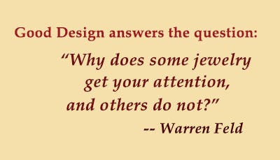
So You Want To Be A Jewelry Designer reinterprets how to apply techniques and modify art theories from the Jewelry Designer’s perspective. To go beyond craft, the jewelry designer needs to become literate in this discipline called Jewelry Design. Literacy means understanding how to answer the question: Why do some pieces of jewelry draw your attention, and others do not? How to develop the authentic, creative self, someone who is fluent, flexible and original. How to gain the necessary design skills and be able to apply them, whether the situation is familiar or not.
Besides your personal pages on various social media sites, you will want to have separate business pages. You would each business page to be keyed off you unique, registered and/or trademarked business name.
It’s a good idea to claim your social media name early in the naming process — even if you are not sure which sites you intend to use. A name for your Facebook page can be set up and changed, but you can only claim a vanity URL or custom URL once you’ve got 25 fans or “likes.” This custom URL name must be unique, or un-claimed.
Along with the URL for the business name, you’ll want to check and make sure there are places on Facebook, LinkedIn, Twitter, and Instagram (at the minimum) to claim early on.
You will want your business listed as a business in various search engines, like Google and Bing, Google Maps, Google Business, and various directories, like Yelp.
Being active on public social media platforms such as Facebook, Instagram, LinkedIn, BlueSky, and Twitter in addition to your own business blog, is almost an essential part of any business marketing toolkit. These tools can have enormous benefits, but they also have their dangers.
For example, some businesses jump on social networking sites only to discover that someone has already registered their company or product names on Facebook and Twitter and is misrepresenting their brand as a consequence. Likewise someone might be out there reproducing your copyrighted web copy, blogs, photographs and videos (all that good multi-media stuff that social networks love to propagate) — without your knowledge.
For more articles about Conquering The Creative Marketplace, click over to our Jewelry Designers’ Hub
Many people learn beadwork and jewelry-making in order to sell the pieces they make. Based both on the creation and development of my own jewelry design business, as well as teaching countless students over the past 35+ years about business and craft, I want to address what should be some of your key concerns and uncertainties. I want to share with you the kinds of things (specifically, a business mindset and confidence) it takes to start your own jewelry business, run it, anticipate risks and rewards, and lead it to a level of success you feel is right for you. I want to help you plan your road map.
I will explore answers to such questions as: How does someone get started marketing and selling their pieces? What business fundamentals need to be brought to the fore? How do you measure risk and return on investment? How does the creative person develop and maintain a passion for business? To what extent should business decisions affect artistic choices? What similar traits to successful jewelry designers do those in business share? How do you protect your intellectual property?
The major topics covered include,
1. Integrating Business With Design
2. Getting Started
3. Financial Management
4. Product Development, Creating Your Line, and Pricing
5. Marketing, Promotion, Branding
6. Selling
7. Professional Responsibilities and Strategic Planning
8. Professional Responsibilities and Gallery / Boutique Representation
9. Professional Responsibilities and Creating Your Necessary Written Documents
Jewelry comforts us as we age in place. The bracelet we got for graduation still worn on an occasion when we are 65. The ring he bought her when she was in her 20’s still worn on the day she passed away.
With jewelry, we will never feel alone as we grow older. As our body changes in pallor and texture. As we gain weight or lose weight. As we change our styles of clothing or hair or activity.
This constellation of material objects, distributed across the human body, reflects transformation, movement, growth, and behavior. These reflect the life we live, and how we lived it. These are stories of how we performed our lives over time. They reveal an otherwise unseen perspective on life as the body ages, and we live through time. They show that not all lived lives have been ad lib’ed.
The jewelry will also show its age over time. Changes in color, perhaps fading, perhaps becoming duller or spotty. A clasp may have been replaced. The piece may have been restrung. It may have been shortened or lengthened. It may have been worn a lot. Or lost for a while. Or given away. Its associative or symbolic value may have changed.
Jewelry is life performed. Both are observable. Both indicative of our place – our aura – in the world around us as time goes on. Both an experience – often changing – of a point of view from the hand that crafted the piece in the first place, and the desires of the person who wore the piece over time. We possess it and wear it so it reminds us that we are not alone.
SO YOU WANT TO BE A JEWELRY DESIGNER Merging Your Voice With Form
So You Want To Be A Jewelry Designer reinterprets how to apply techniques and modify art theories from the Jewelry Designer’s perspective. To go beyond craft, the jewelry designer needs to become literate in this discipline called Jewelry Design. Literacy means understanding how to answer the question: Why do some pieces of jewelry draw your attention, and others do not? How to develop the authentic, creative self, someone who is fluent, flexible and original. How to gain the necessary design skills and be able to apply them, whether the situation is familiar or not.
Check to see if anyone has registered your business name online as a registered domain name. Go to http://www.networksolutions.com/ or www.GoDaddy.com and type in the name you want. If the name you want is taken, you can always vary the domain type, such as “.net” or “.biz” instead of “.com”. You can vary a name by adding punctuation like a hyphen or period or deleting a space between words. You can vary a name by making it plural. You can vary the name by playing with the spelling of certain words — even making up your own creative spelling for some words.
Next, register a business domain name, so that you protect your business name from other people who might use it on-line. In translating your business name to an internet domain name, keep in mind that your email address will include that domain name. You want people to be able to easily and quickly type in your email address into an email. You do not want people to confuse the spelling or any added punctuation.
Pointers: The business name does not have to match your domain name The .com extension would be best, even though there are many other choices If possible, the domain name should be rich in key words.
To find out if your business name has been claimed online, do a simple web search to see if anyone is already using that name.
Many people learn beadwork and jewelry-making in order to sell the pieces they make. Based both on the creation and development of my own jewelry design business, as well as teaching countless students over the past 35+ years about business and craft, I want to address what should be some of your key concerns and uncertainties. I want to share with you the kinds of things (specifically, a business mindset and confidence) it takes to start your own jewelry business, run it, anticipate risks and rewards, and lead it to a level of success you feel is right for you. I want to help you plan your road map.
I will explore answers to such questions as: How does someone get started marketing and selling their pieces? What business fundamentals need to be brought to the fore? How do you measure risk and return on investment? How does the creative person develop and maintain a passion for business? To what extent should business decisions affect artistic choices? What similar traits to successful jewelry designers do those in business share? How do you protect your intellectual property?
The major topics covered include,
1. Integrating Business With Design
2. Getting Started
3. Financial Management
4. Product Development, Creating Your Line, and Pricing
5. Marketing, Promotion, Branding
6. Selling
7. Professional Responsibilities and Strategic Planning
8. Professional Responsibilities and Gallery / Boutique Representation
9. Professional Responsibilities and Creating Your Necessary Written Documents
DIALECTIC: Jewelry As Interaction and Shared Understandings. Jewelry is a two-way street. It is a way to create, confirm and retain connections. At its very core, it is interactive and communicative. It is more an action than an object. Jewelry can start a conversation. Jewelry encapsulates a very public, ongoing matrix of choices and interactions among artist, wearer and viewer, with the purpose of getting responses. It is a dialectic.
The optimum position to view jewelry is on a person’s body, where and when its dialectical power is greatest. Again, it is very public, yet concurrently, very intimate. We exhibit jewelry. It forces reaction, response and reciprocity. Jewelry helps us negotiate, in relatively non-threatening ways, those critical tensions and contradictions in life, not merely define them.
It very publicly forces us to reveal our values, delineate tensions and contradictions which might result, and resolve all those betwixt and between qualities which occur as the artist, wearer, viewer, marketer, seller, exhibitor and collector try to make sense of it all. Conversely, jewelry, as worn, may signal that any negotiation would be futile, but this is a dialectic, communicative act, as well.
Jewelry expresses or implies things, the relevance of which emerges through interactions. There is an exchange of meaning. There is some reciprocity between the artist expressing an inspiration with the desire for a reaction, and the wearer evaluating the success of the piece and impacting the artist, in return. We have those coherence-contagion-decoherence behavioral patterns discussed above.
Jewelry is persuasive. It allows for the negotiation of influence and power in subtle, often soft-pedalled ways. It helps smooth the way for support or control. Compliance or challenge. Wealth and success or poverty and failure. High or low status. Social recognition. An expression of who you know, and who might know you. Jewelry is a tool for managing the dynamics between any two people.
Jewelry is emotional and feeling, with attempts by the artist to direct these, and with opportunities for others to experience these. It is not that we react emotionally to the beauty of an object. It is not mechanical or fleeting. It is more of a dialectic. The jewelry is an expression of an artist’s inspiration and intent. We react emotionally to what we sense as that expression as it resonates from the object itself. This resonance ebbs and flows, waxes and wanes, over time as the object is worn in many different situations.
Jewelry draws attention. It becomes a virtual contract between artist and wearer. The artist agrees to design something that will call attention to the wearer and that wearer’s preferred sense of self. The wearer agrees to wear something that reaffirms the artist’s insights for all to witness and experience and draw support.
Jewelry may cue the rules for sexual and sensual interactions. Nurturing and desire. Necklaces draw attention to the breasts. Earrings to the ear and neck. Rings to the hands. Jewelry, such as a wedding band, may confirm a relationship, and signal permission for various forms of touching that otherwise would not be appropriate. The silhouettes and placements of jewelry on the body indicate where it may be appropriate for the viewer to place his gaze or touch, and where it would not.
We don’t feel alone because we have opportunities to have a dialectic experience — a dialogue between self and artist, self and others, self and self — all catalyzed by the piece of jewelry, and our sensation of all the choices that had to be made in order for it to exist, in order for it to feel coherent, in order for it for fulfill desire, and in order for all of this to somehow feel contagious and resonant. We don’t feel alone because the jewelry taps into something inside us that makes us want to wear it, buy it and share it.
SO YOU WANT TO BE A JEWELRY DESIGNER Merging Your Voice With Form
So You Want To Be A Jewelry Designer reinterprets how to apply techniques and modify art theories from the Jewelry Designer’s perspective. To go beyond craft, the jewelry designer needs to become literate in this discipline called Jewelry Design. Literacy means understanding how to answer the question: Why do some pieces of jewelry draw your attention, and others do not? How to develop the authentic, creative self, someone who is fluent, flexible and original. How to gain the necessary design skills and be able to apply them, whether the situation is familiar or not.
Or you can send a copy to yourself in a Registered letter, write on the outside of the envelop what is inside, and don’t open the envelop when you receive it back in the mail. This is a proof of date, should you need to challenge anyone.
Crittenden Jewelry
One jewelry dealer I know, and who exemplifies many other jewelry artists I’ve met, owns a business called Crittenden Jewelry. Ulrich is his name. Ulrich is very pleasant, interesting to talk with, knows the jewelry business in and out, but is somewhat of an odd duck. He sells some of the most beautiful and intricate jewelry you will ever see anywhere, except in a museum.
But he hides it.
He keeps all these phenomenal pieces in boxes under the floorboards of the store. He fears if they were on display, other jewelry makers would copy them. And he would be out of business. So he only takes these pieces out for a select few.
Not surprisingly, Ulrich works alone. As he often explains, “I don’t want to hire anyone to assist me, because all they’re going to do is steal my designs.”
Business is about taking risks. If you are unwilling to take risks, as Ulrich has done, you probably don’t really have a viable business.
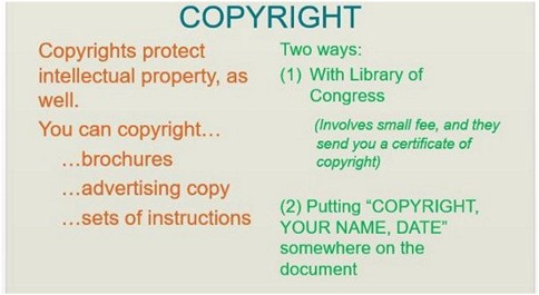
At this point, your document is considered copyrighted. The issue for you is if someone violated that copyright and you went to court to contest this, this would not be sufficient evidence for the courts.
Library of Congress: You can get an official certificate of copyright by submitting an application to the US Library of Congress. Your copyright starts the date the application is submitted. There is a minimal fee. It usually takes about one year before you actually receive the certificate. Courts usually require this certificate as evidence.
US Post Office: You can put your material in a self-addressed, stamped envelope and mail this Registered/Certified to yourself. On the outside of the envelope, write what is inside. When you receive it, however, DO NOT OPEN IT. The post mark date will be evidence of copyright. This will usually hold up in court.
NOTE: It is difficult to copyright a specific jewelry design. While there is no legal rule about what constitutes a copyright violation of the design, it is generally accepted that merely a 10% difference would not be a violation. That 10% difference might be a different clasp, a slightly different pattern, or a different color scheme (though the courts allow you some flexibility with color issues).
NOTE: It is expensive to contest a copyright violation in court. This might run $3,000 per incident.
The US Copyright Office will often reject jewelry designs for lacking authorship because they consist of common or usual shapes and forms. When submitting your application, you should present a well-reasoned argument, based on basic principles of jewelry design composition, form and function, as to why your jewelry and patterns should be copyrighted.
You can also copyright a “collection of jewelry”, but you can’t add new designs to the collection, without getting new copyrights. In the collection, the pieces would need to share design elements and sensibilities, and these would need to be obvious.
Copyrights last for the life of the designer plus 70 years. Use form VA (Visual Arts). It usually takes about a year for the paperwork to go through, but your piece is considered copyrighted from the date you submitted your application.
For more articles about Conquering The Creative Marketplace, click over to our Jewelry Designers’ Hub
Many people learn beadwork and jewelry-making in order to sell the pieces they make. Based both on the creation and development of my own jewelry design business, as well as teaching countless students over the past 35+ years about business and craft, I want to address what should be some of your key concerns and uncertainties. I want to share with you the kinds of things (specifically, a business mindset and confidence) it takes to start your own jewelry business, run it, anticipate risks and rewards, and lead it to a level of success you feel is right for you. I want to help you plan your road map.
I will explore answers to such questions as: How does someone get started marketing and selling their pieces? What business fundamentals need to be brought to the fore? How do you measure risk and return on investment? How does the creative person develop and maintain a passion for business? To what extent should business decisions affect artistic choices? What similar traits to successful jewelry designers do those in business share? How do you protect your intellectual property?
The major topics covered include,
1. Integrating Business With Design
2. Getting Started
3. Financial Management
4. Product Development, Creating Your Line, and Pricing
5. Marketing, Promotion, Branding
6. Selling
7. Professional Responsibilities and Strategic Planning
8. Professional Responsibilities and Gallery / Boutique Representation
9. Professional Responsibilities and Creating Your Necessary Written Documents
Someone has to infuse the object (jewelry) with all this content, and this proactive act leads us to the idea of intent. Why these choices, what was the motivation? Often this imposition of meaning begins with the jewelry artist. Jewelry becomes a means of self-expression. The artist, in effect, tells the world who the artist is, and what the artist wants to happen next.
The artist might be subdued or bold, colorful or monochromatic, simple or complex, extravagant or economical, logical or romantic, deliberate or spontaneous. The artist might be direct or indirect in how meanings get communicated. It is important, in order to understand the meaning of an object, to begin by delineating the artist’s inspiration, aspiration and intent.
The jewelry artist begins with nothing and creates something. The unknown, the unknowable, the nothingness is made more accessible.
The artist fills in a negative space with points, lines, planes, shapes, forms and themes. Color, pattern and texture are added. Things get organized and arranged.
Though often unstated, it becomes obvious that of all the possible choices the artist could have made in design, that some choices were ignored and excluded, while others were not. Some negative space is left so. Some positive space has direction, motion, weightiness. Somethings are abstract; other things realistic. These and related choices have implications and consequences.
The question becomes, what influences that artist’s selections? Successful jewelry reveals the artist’s hand.
Our senses and perceptions of the coherence in the artist’s inspiration and intent, as reflected in our interpretations of that artist’s jewelry, helps us not to feel alone. We may see coherence as a subjective thing or a universally understood thing. It doesn’t matter which. If we believe we can make sense of things because they have a purpose, if the jewelry feels and seems coherent in some way again because we sense it is purposeful and intentional, we feel safe, and that we have reduced the risks in life. We do not feel so left alone.
INTENT: Jewelry As Creating Order Out Of Chaos. Partly, what the artist does is attempt to order the world. The artist looks for clues within him- or herself (inspiration and intent). The artist formulates concepts and a plan for translating inspiration and intent into a design. The artist determines whether to take into account the expectations of others (shared understandings) about what would be judged as finished and successful.
Jewelry is an object created out of chaos and which has an order to it. The order has content, meaning and value. It has purpose and coherency based on color and texture and arrangement. Mass placed within space.
Jewelry as an organized, ordered, coherent object — something out of nothingness — reflects the hypotheses the artist comes up with about how to translate inspiration into aspiration, and do this in such a way that the derived jewelry is judged positively. The artist anticipates how others might experience and sense the object on an emotional level.
It reflects the shared understandings among artist, wearer and viewer about emotions, desires, inherent tensions and yearnings and how these play out in everyday life.
The artist makes the ordered chaos more coherent, and this coherence becomes contagious through the artist’s choices about creative production and design. The artist lets this contagion spread. To the extent that others share the artist’s ideas about coherence, the more likely the work will be judged finished and successful. And no one — not the artist, not the wearer, not the viewer, not the buyer, not the collector — will feel alone.
The process of bringing order to chaos continues with the wearer. The wearer introduces the piece of jewelry into a larger context. We have more contagion — what we might call viral. The jewelry as worn causes more, ever-expanding tension and efforts at balance and resolution. There is an effort to figure out the original artist intent and ideas about coherence as reflected in design.
Unsuccessful efforts at design, where the artist’s intent becomes obscured, reverse the process, and the object — our piece of jewelry — then brings about decoherence. Decoherence may come in the forms of bad feedback, inappropriate feedback, less than satisfying feedback, or no feedback at all.
Decoherence means the wearer may not get that sense of self s/he seeks. S/he may feel less motivated to wear the piece. S/he may store the piece or give the piece away. As this decoherence filters down to the level of the artist, any necessary support in design may be lost. There will be fewer clients, fewer opportunities to display the works publicly, and fewer sales. The artist’s motivation may diminish.
INTENT: Jewelry As An Agent of Personality. People wear jewelry because they like it. It becomes an extension of themselves. It is sensed as self-confirming, self-identifying and self-reconfirming. Liking a piece of jewelry gets equated with liking oneself, or as a strategy for getting others to express their like for you. Jewelry makes us feel more like ourselves. We might use jewelry to help us feel emotionally independent, or we might come to rely on jewelry for emotional support and feedback — that positive comment about the jewelry we are wearing — , leading us down the path to emotional dependency.
Jewelry may have personal significance, linking one to their past, or one to their family, or one to their group. It may be a way to integrate history with the present. It is a tool to help us satisfy our need to affiliate.
Jewelry may help us differentiate ourselves from others. It may assist us in standing out from the crowds. Conversely, we may use it to blend into those multitudes, as well.
Jewelry fulfills our needs. If we look at Maslow’s Hierarchy of Needs, after meeting our basic physiological needs such as for food and water, and our safety needs, such as for shelter, we can turn to jewelry to meet our additional social needs for love and belonging and self-esteem. Designing and creating jewelry can form an additional basis for our needs for self-actualization.
We may derive our personality and sense of soul and spirit from the qualities we assign the jewelry we wear. We do not merely wear jewelry as some object; more specifically, we inhabit jewelry. If ruby jewelry symbolizes passion, we may feel passion when wearing it. We may use jewelry as an expressive display of who we feel we are and want to be seen as in order to attract mates and sexual partners. We use jewelry in a narcissistic way to influence the alignment of the interests and desires among artist, weaver, viewer, buyer, collector, exhibiter, and seller.
In similar ways, we may derive our sense of belief, devotion and faith to a higher power or spiritual being or God from wearing jewelry. It may help us feel more connected to that religious, spiritual something within ourselves. It may remind us to stay on our religious path.
As an agent of our psychological selves, jewelry is used to resolve those core conflicts — Who are we? Why do we exist? How should we relate to other people around us? Jewelry orients us in coming to grips with our self-perceived place within critical contradictions around us. Trust and mistrust. Living and dying. Good and evil. Pleasure and pain. Permission and denial. Love and hate. Experience and expectation. Traditional and contemporary. Rational and reasonable.
SO YOU WANT TO BE A JEWELRY DESIGNER Merging Your Voice With Form
So You Want To Be A Jewelry Designer reinterprets how to apply techniques and modify art theories from the Jewelry Designer’s perspective. To go beyond craft, the jewelry designer needs to become literate in this discipline called Jewelry Design. Literacy means understanding how to answer the question: Why do some pieces of jewelry draw your attention, and others do not? How to develop the authentic, creative self, someone who is fluent, flexible and original. How to gain the necessary design skills and be able to apply them, whether the situation is familiar or not.
However, as we get closer to defining the object (jewelry) as one that is sensed and experienced and which evokes an emotional response, it becomes more difficult to maintain that the object does not reflect meaning, does not result from some kind of thought process and intent, and does not communicate quite a lot about the designer, the wearer, the viewer and the situation. Jewelry when worn and which succeeds becomes a sort of identifier or locator, which can inform the wearer and the viewer about particular qualities or content, such as where you belong, or what you are about, or what your needs are. So we sense jewelry not so much as an object universally understood, but something with more nuance, interest, meaning, and value, with an element of subjective references.
Jewelry without content, after all, can skew to the superficial, boring, monotonous, and unsatisfying. Without meaning and value, jewelry has little to offer.
These shared recognitions and valuing of meanings helps us not to feel alone.
CONTENT: Jewelry As Meaning. Jewelry when worn signals, signifies or symbolizes something else. It is a type of recognizable short-hand. It is a powerful language of definition and expression. By representing meaning, it takes responsibility for instigating shared understandings, such as membership in a group or delineating the good from the bad. It might summarize difficult to express concepts or emotions, such as God, love, loyalty, fidelity. It might be a stand-in marker for status, power, wealth, connection and commitment. It might visually represent the completion or fulfillment of a rite of passage — puberty, adulthood, marriage, birthing, and death.
Sometimes, the sensation of jewelry as meaning derives from energy and powers we believe can transfer from the meaning of the materials the jewelry is made of to ourselves. These might be good luck, or good fortune, or good health, or good love, or good faith or protection from harm. Various gemstones, metals and other materials are seen to have mystical, magical and supernatural qualities that, when touching the body, allow us to incorporate these powers with our own.
CONTENT: Jewelry As Value. When we refer to meaning as having power, sacredness, respect, significance, we are beginning to assign a value to it. A sensation of value may emerge from how rare the item is — its material rarity or the rarity of how it was constructed or where it came from or who made it or who was allowed to wear it. It may emerge from how bright it is or the noteworthy arrangement of its elements. Its value may emerge from how pliable or workable the material is. Its value might be set from how tradable it is for other materials, objects, access or activities.
By assigning value, we determine things like importance, uniqueness, appeal, status, need, want, and demand. We establish control over how and how often a piece of jewelry will change hands. We establish some regulation over how individuals in a group, culture or society interact and transact with one another.
SO YOU WANT TO BE A JEWELRY DESIGNER Merging Your Voice With Form
So You Want To Be A Jewelry Designer reinterprets how to apply techniques and modify art theories from the Jewelry Designer’s perspective. To go beyond craft, the jewelry designer needs to become literate in this discipline called Jewelry Design. Literacy means understanding how to answer the question: Why do some pieces of jewelry draw your attention, and others do not? How to develop the authentic, creative self, someone who is fluent, flexible and original. How to gain the necessary design skills and be able to apply them, whether the situation is familiar or not.
When it comes to starting a business, there’s often some confusion about the process of business name registration. How are trade names and trademarks different? Does a trade name afford any legal branding protection? Can your trade name be the same as your trademark?
Simply put, a trade name is the official name under which a company does business. It is also known as a doing business as (DBA) name, assumed name, or fictitious name. A trade name does not afford any brand name protection or provide you with unlimited rights for the use of that name. However, registering a trade name is an important step for some — but not all — businesses (more on this below).
A trademark is used to protect your brand name and can also be associated with your trade name. A trademark can also protect symbols, logos and slogans. Your name is one of your most valuable business assets, so it’s worth protecting.
An important reason to distinguish between trade names and trademarks is that if a business starts to use its trade name to identify products and services, it could be perceived that the trade name is now functioning as a trademark, which could potentially infringe on existing trademarks.
NOTE: You cannot trademark adjectives. For example, you can’t trademark the business name “Best Jeweler In Town”.
Registering a Trade Name
Naming your business is an important branding exercise. If you choose to name your business as anything other than your own personal name (i.e. a “trade name”), then you’ll need to register it with the appropriate authority as a “doing business as” (DBA) name.
Consider this scenario: John Smith sets up a painting business and chooses to name it “John Smith Painting.” Because “John Smith Paining” is considered a DBA name (or trade name), John will need to register it as a fictitious business name with a government agency.
You need a DBA in the following scenarios:
• Sole Proprietors or Partnerships — If you wish to start a business under any name other than your real one, you’ll need to register a DBA name so you can do business under the DBA name.
• Existing Corporations or LLCs — If your business is already incorporated and you want to do business under a different name, you will need to register a DBA.
Note that many sole proprietors maintain a DBA or trade name to give their business a professional image, yet still use their own name on tax forms and invoices.
Depending on where your business is located, you’ll need to register your DBA name through either your county clerk’s office, city clerks office, and/or your state government. Note: Not all states require fictitious business names or DBA registration. SBA’s Business Name Registration (http://www.sba.gov/content/register-your-fictitious-or-doing-business-dba-name) page has more information about the process, plus links to the registration authorities in each state.
Registering Your Trademark
Choosing to register a trademark is up to you, but your business name and identity is one of its most valuable assets, so it’s worth protecting.
Registering a trademark guarantees exclusive use, establishes legally that your mark is not already being used, and provides government protection from any liability or infringement issues that may arise. Being cautious in the beginning can certainly save you trouble in the long run. You may choose to personally apply for trademark registration or hire an intellectual property lawyer to register for you.
Because it can be tricky to identify potential infringement or clashes, and the penalties for doing so are high, it’s worth talking to a good intellectual property lawyer to ensure you cover all bases.
As you begin to narrow down a name, check with the US Trademark office to be sure no one else has used these names. Go to www.uspto.gov , and search the business names. Your state trademarks office may also have a searchable list.
Protect your business name by registering the name (and logo, if you have one) as a trademark or service mark. Also copyright your brochures and advertising copy, and any sets of instructions, if you create these.
As soon as you pick your business name, register it as a trade or service mark with your state trademark office. Each State you do business in, as well as the US as a whole, offer opportunities to protect your trade or service mark. You can prevent someone else from using your business name, or product name, by registering this name with the state(s), or US. You would put a TM next to the name you’ve trademarked, such as Be Dazzled Beads TM .
In Tennessee, this process is especially inexpensive — around $40.00 per trade or service mark. Your intellectual property would be protected in Tennessee. If you create a strong brand identity, this can prevent businesses outside the state of Tennessee from representing your intellectual property as their own.
Getting a US trademark is expensive and a little more complicated, and I’d strongly suggest using the services of a trademark lawyer in this case. A US trademark would protect your intellectual property anywhere in the United States.
In Tennessee, trademarks and service marks are handled by the Tennessee Secretary of State. For the United States, these are handled by the US Patent and Trademark Office.
Have I conducted a proper trademark search?
A great name is worthless if someone else already has laid claim to it. Start with some free resources like Trademarkia.com or USPTO.gov to do a cursory search to see if the name is already in use. Then, hire a trademark attorney to do a more thorough screening, and if the name isn’t taken, to register it with the U.S. Patent and Trademark Office. “Get it right the first time,” Watkins says. “A third of our business comes from companies who are being threatened with trademark infringement.”
For more articles about Conquering The Creative Marketplace, click over to our Jewelry Designers’ Hub
Many people learn beadwork and jewelry-making in order to sell the pieces they make. Based both on the creation and development of my own jewelry design business, as well as teaching countless students over the past 35+ years about business and craft, I want to address what should be some of your key concerns and uncertainties. I want to share with you the kinds of things (specifically, a business mindset and confidence) it takes to start your own jewelry business, run it, anticipate risks and rewards, and lead it to a level of success you feel is right for you. I want to help you plan your road map.
I will explore answers to such questions as: How does someone get started marketing and selling their pieces? What business fundamentals need to be brought to the fore? How do you measure risk and return on investment? How does the creative person develop and maintain a passion for business? To what extent should business decisions affect artistic choices? What similar traits to successful jewelry designers do those in business share? How do you protect your intellectual property?
The major topics covered include,
1. Integrating Business With Design
2. Getting Started
3. Financial Management
4. Product Development, Creating Your Line, and Pricing
5. Marketing, Promotion, Branding
6. Selling
7. Professional Responsibilities and Strategic Planning
8. Professional Responsibilities and Gallery / Boutique Representation
9. Professional Responsibilities and Creating Your Necessary Written Documents
Too often, ideas about communication and meaning and intent get too messy and complicated. We seek a simpler framework within which to understand what jewelry is all about. We try to fit the idea of jewelry into the confines of a box we call “object”.
As an object, it is decoration. Sculptural adornment. Jewelry succeeds as “object” to the extent that everyone everywhere universally agrees to what it is, how it is made, what it is made from, why it was made, and in what ways it is used. This universality in defining and evaluating jewelry helps us not to feel alone.
OBJECT: Jewelry As Something That We Do. Wearing jewelry might simply be something that we do. We put on earrings. We slip a ring onto a finger. We clasp a necklace around our neck or a bracelet around our wrist. It is habit. Routine. Not something to stop and ask why. A necklace is a necklace. An earring is an earring. We mechanically interact with decorative objects we call jewelry.
OBJECT: Jewelry As A Material. Sometimes we want to get a little more specific and describe what this object or ‘box’ is made of. It is some kind of material. …
From Warren Feld and Land of Odds TAKING JEWELRY BEYOND CRAFT Join my community of jewelry designers on myPatreon hub September 1, 2025 Sign up for a Free or Paid Subscription[Note: Paid Subscribers on Patreon Hub get 25% Off @Land of Odds]www.landofodds.comHi everyone, Some Updates and Things Happening. (Please share this newsletter)
In this Issue: 1. You’re Invited: Solo Exhibition, Warren Feld Jewelry, 9/15 – 10/15/25, Pryor Gallery, Columbia, TN, “Pursuing Why Some Jewelry Draws Attention, and Others Do Not” 2. From a recent blog post by Christopher Remmers: Impossible Expectations 3. LESSONS LEARNED DOING CRAFT SHOWS: Finding Them
Some articles you may have missed Featured
~~~~~~~~~~
1. You’re Invited: Solo Exhibition, Warren Feld Jewelry, 9/15 – 10/17/25, Pryor Gallery, Columbia, TN, “Pursuing Why Some Jewelry Draws Attention, and Others Do Not”
“What are the essential elements which make some jewelry pieces stand out while others fade into the background. It’s not just about glitz; it’s about how I combine design elements to achieve beauty, appeal, functionality, and durability. Each piece starts with a blank space where I creatively introduce lines, dots, and shapes, aiming for a finished product that resonates emotionally and feels exciting to wear. I encourage you to think about how we can incorporate a little edginess into our designs to evoke a stronger response from our audience. Let’s strive to create jewelry that not only looks good but also makes people feel something special when they wear it.” — Warren Feld
“One of the primary challenges all jewelry designers face is knowing when to stop adding elements to their pieces. It’s important to find that optimum point of parsimony, where any additional or removed element would detract from the success of the design. Many designers tend to overdo it, leading to over-embellishment. I encourage my fellow designers to be mindful of this balance in their creative process. Let’s strive for that perfect parsimony in our jewelry creations — where we are confident that our pieces will be judged as both finished and successful.” — Warren Feld
“Jewelry design is an emergent process, a dialogue between the designer and the anticipated wearer. This ongoing dialogue reflects, modifies, adapts, evolves those desires, values and expectations of both designer and wearer. Jewelry transcends being merely an object; it conveys meaning through colors, shapes, and themes, reflecting the identity of the wearer and the context in which it is worn. I encourage designers to consider the intent behind their pieces, as this understanding will enhance their design process and ultimately make them better designers. I urge viewers to reflect on the purpose of these jewelry creations and how they can foster conversations through their jewelry.” — Warren Feld
“Jewelry, as an art form, is unique. It is only truly art when worn. Unlike paintings or sculptures, jewelry moves with the person, enhancing their presence as they engage in various activities. I highlight that to evaluate the success of jewelry, we must consider its inherent quality of being art in motion. I encoutage viewers to reflect on this perspective and how it influences our understanding of jewelry’s artistic value.” — Warren Feld
“The common approach to teaching and learning jewelry making techniques relies on a step-by-step method. I believe this is fundamentally flawed; instead, we should view these techniques as philosophies. As philosophies, techniques are seen involving a set of critical choices. Each choice has a fundamental basis for being and leading to success. Importantly, though, not all choices are the same or exist for the same reason. For example, some choices, their placement and sequencing are there to help your piece maintain a shape. Other choices, their placement and sequencing are there to enhance movement, drape and flow. Still other choices influence durability over time. Crucial when learning the philosophy underlying any technique is to recognize that any choice includes what mathematicians and linguists call THE SET and the UNSET. That is, every choice also reflects the things which weren’t chosen and the implications for why not.” — Warren Feld
Solo Exhibit, Warren Feld Art Jewelry 9/15/2025 – 10/17/2025
Opening Reception: 9/18/25, 5-7pm
At Pryor Gallery, Columbia State Community College Humanities Building (Waymon L. Hickman Bldg), 1665 Hampshire Pike, Columbia, TN 38401
Exhibits are free and open to the public Gallery Hours: Monday – Thursday 8 a.m. to 7 p.m. Friday 8 a.m. to 4 p.m.
~~~~~~~~~~
2. From a recent blog post by Christopher Remmers: Impossible ExpectationsChristopher Remmers <christopher@christopherremmers.com>
There are days when pursuing your art feels impossible.
One minute you’re inspired… the next, you’re questioning everything. And underneath the inconsistency, the doubt, and the procrastination, there’s often a deeper pattern at play:
You’re holding yourself to impossible expectations.
You tell yourself: “I should be further along by now.” “If I were really talented, this would be easier.” “I need to fix everything at once.”
What I see time and again in the Academy is that most artists aren’t failing at their goals; they’re failing at goal-setting.
They set the bar so high that they can’t possibly meet it. Then they crash, feel shame, and retreat until they try again with the same unrealistic plan.
This is how you end up in the “fits and starts” cycle: burnout, self-doubt, inconsistency, repeat. It’s hard emotionally, and it really stifles you creatively. And it definitely keeps you from building momentum.
So what’s the alternative?: Set goals that support your nervous system. Build rhythms that you can actually stick to Practice consistency over intensity.
It’s not glamorous, but it works.
If your dream is to become a full-time artist, or simply to make work that feels alive and true, this kind of sustainable structure is non-negotiable.
It’s what we teach inside the Conscious Creativity Academy: Vision first. Structure second. Mastery over time.
About Christopher Remmers:Christopher Remmers is a classically trained oil painter, educator, and entrepreneur. As an artist, Christopher has built a body of work that explores myth and story through nature, ceremony, and psychedelia. His large-scale narrative figure paintings aim to initiate an experience of awe and transcendence by connecting the viewer to deeper meaning and purpose via archetypal motifs and chiaroscuro compositions. His work is collected internationally and has been exhibited, awarded, and sold through Sotheby’s and the Art Renewal Center’s Salon, among many others.As an educator, Christopher has taught foundational skills in classical painting and drawing through the Georgetown Atelier in Seattle and privately from his studio in Bellingham, WA. This has evolved into a unique offering for creatives of all backgrounds called the Conscious Creativity Academy and has become a quickly growing community online and in person.As an entrepreneur, he is co-founder and Creative Director of Evolving the Myth, an immersive art experience bridging the gap between deep meaning, our relationship to the wild, and large-scale narrative art. He guides individuals and groups into the wild utilizing a variety of nature-based modalities, exploring the fundamental axiom that our most authentic creative self is found via our relationship to nature. This work is informed by his lifelong practice of Vipassana Meditation, training rooted in Wild Mind and Soul Craft practices, and his deep connection to nature.
~~~~~~~~~~
3. LESSONS LEARNED DOING CRAFT SHOWS: Finding Them FromSO YOU WANT TO DO CRAFT SHOWS Kindle or Ebook or Print
There are plenty of tools and resources for finding out which craft shows are right for you. You just have to make yourself aware of these… And use them.Not every show will be a good fit for you. Research them. Converse with vendors and management there. Ask yourself: Is there a good fit with (1) your art work/merchandise, (2) your goals, (3) your expectations, and (4) your customers.
RESOURCESFestival Network (festivalnet.comCrafts Fair Online (craftsfaironline.comArt Festival (artfestival.com)Sunshine Artist (sunshineartist.com)Art Fair Calendar (artfaircalendar.com)Craftmaster News (craftmasternews.com)Fairs and Festivals (fairsandfestivals.net)Art & Craft Show Yellow Pages (artscraftsshowbusiness.com)Art Fair Source Book (artfairsourcebook.com)Facebook posts, groups, eventsEtsy Teams (etsy.com/teams)Juried Art Services (juriedartservices.com)Zapplication (zapplication.org)Check local and statewide arts commissionsCheck local and statewide arts/crafts associations
QUESTIONS TO ASK VENDORS, MANAGEMENT and YOURSELFHistory?Attendance?Marketing plan?All fees?Availability of electricity?Availability of parking?Layout? Where might you end up?Food vendors? Entertainment?Your vendor location relative to food and entertainment?Admission charge?Merchandise mix and fit with you?Local, state sales taxes; insurance? Then, check for show reviews, ratings and experiences on line. Do some social networking. And, THINK!
~~~~~~~~~~
Upcoming Workshops by Warren Feld
Sat, 9/20, 9am-Noon, LEARN BEAD WEAVING: RIGHT ANGLE WEAVE and CURVY RAW BRACELET Middle Tenn Gem & Mineral Society, Donelson Fifty Forward Registration begins June 21 http://www.mtgms.org/schools.htm
Sat, 9/20, 1-4pm, INTRO TO EVEN COUNT, FLAT PEYOTE and JUNGLE FLOWER BRACELET Middle Tenn Gem & Mineral Society, Donelson Fifty Forward Registration begins June 21 http://www.mtgms.org/schools.htm
Sat, 10/25/2025, 9am-Noon, PEARL KNOTTING…WARREN’S WAY Middle Tenn Gem & Mineral Society, Donelson Fifty Forward Registration begins September 20 http://www.mtgms.org/schools.htm
Sun, 10/26/25, 1-4pm, DISCOVER PEARL KNOTTING Register through Hoamsy.com Class held at Cyanide Cider, 410 Woodbine St, Nashville, TN 37211
Sun, 11/16/25, 1-4pm, WIRE WRAPPED CABOCHON PENDANT Register through Hoamsy.com Class held at Cyanide Cider, 410 Woodbine St, Nashville, TN 37211
Sat, 11/22/25, 9am-Noon, WIRE WEAVING INTRO AND MAYAN PENDANT Middle Tenn Gem & Mineral Society, Donelson Fifty Forward Registration begins September 20 http://www.mtgms.org/schools.htm
Sat, 11/22/2025, 1-4pm, INTRO TO WIRE WORK and MIX N MATCH BRACELET Middle Tenn Gem & Mineral Society, Donelson Fifty Forward Registration begins September 20 http://www.mtgms.org/schools.htm
Sat, 12/6/25, 9am-Noon, WIRE WRAPPED CABOCHON PENDANT Middle Tenn Gem & Mineral Society, Donelson Fifty Forward Registration begins September 20 http://www.mtgms.org/schools.htm
Sat, 12/6/25, 1-4pm, WIRE WEAVE 2 and SUN PENDANT Middle Tenn Gem & Mineral Society, Donelson Fifty Forward Registration begins September 20 http://www.mtgms.org/schools.htm
Sun, 12/7/25, 1-4pm, WIRE WEAVING AND MAYAN PENDANT Register through Hoamsy.com Class held at Cyanide Cider, 410 Woodbine St, Nashville, TN 37211
Solo Exhibit Warren Feld Art Jewelry At Pryor Gallery, Columbia State Community College Humanities Building (Waymon L. Hickman Bldg), 1665 Hampshire Pike, Columbia, TN 38401
Exhibits are free and open to the public Gallery Hours: Monday – Thursday 8 a.m. to 7 p.m. Friday 8 a.m. to 4 p.m. My pieces will be showcased an this exhibit. In the works is a possible Seminar and a beading workshop.
WARREN FELD JEWELRY (www.warrenfeldjewelry.com) Custom Design, Workshops, Video Tutorials, Webinars, Coaching, Kits, Group Activities, Repairs ~~~~~~~~~~~~~~~~~~~~~~~ Join our community of jewelry designers on myPatreon hub Be part of a community of jewelry designers who recognize that we have a different way of thinking and doing than other types of crafters or artists. One free downloadable Mini-Lesson of your choice for all new members! ~~~~~~~~~~~~~~~~~~~~~~~
Add your email address to my Warren Feld Jewelry emailing listhere.
Thanks for being here. I look forward to sharing more resources, tips, sources of inspiration and insights with you.Join A Community Of Jewelry Designers On MyPatreon Hub
Abstract: We create and wear jewelry because we do not want to feel alone. But “not wanting to feel alone” can mean different things to different people.People want to feel a connection, and jewelry is an important tool or signifier for them.The jewelry designer must have insight here. The designer needs to understand what jewelry really is in order to make the kinds of successful choices about forms, materials, design elements, inspirations, techniques, arrangements, public presentations and exhibitions and the like. Why do people touch it, wear it, buy it, display it, share it, collect it? There are different frameworks, that is different types of evidence or lenses, from which the designer might draw such understanding, including the sensation of jewelry as OBJECT, CONTENT, INTENT or DIALECTIC. All these lenses share one thing in common — communication. Although jewelry can be described in the absence of communicative interaction, the designer can never begin to truly understand what jewelry really is without some knowledge about its creation and without somehow referencing the designer, the wearer, the viewer and the context.
WHAT IS JEWELRY, Really?
Simply put, we create and wear jewelry because we do not want to feel alone.
But “not wanting to feel alone” can mean different things to different people. People want to feel a connection, and jewelry is an important tool or signifier for them. The jewelry designer, in order to make the best choices and the most strategic choices throughout the process of designing a piece of jewelry, requires some detail and clarity here. What does it mean to say that we create and wear jewelry so we do not want to feel alone?
We might want to reaffirm that we are similar (or different) than someone else or some other group or culture, so that we do not feel alone. We might want to signal some connection (or disconnection or mal-connection) with a higher power or mystical source or sense of well-being or with some idea, concept or meaning, so that we do not feel alone. We might want to express an intent or feeling or emotion, so that we do not feel alone.
We might want to differentiate what it means to be yourself relative to something else, whether animate or inanimate, functional or artistic, part of a dialectic conversation with self or other. We might want to signal or differentiate status, intelligence, awareness, and resolution. We might want to separate ourselves from that which is sacred and that which is profane.
Whatever the situation, jewelry becomes something more than simple decoration or adornment. …


 There are plenty of tools and resources for finding out which craft shows are right for you. You just have to make yourself aware of these… And use them.
 Not every show will be a good fit for you. Research them. Converse with vendors and management there. Ask yourself: Is there a good fit with (1) your art work/merchandise, (2) your goals, (3) your expectations, and (4) your customers.