|
RETHINKING THE TEACHING OF “COLOR” IN JEWELRY DESIGN
or,
HOW JEWELRY DESIGNERS SHOULD APPROACH COLOR
by Warren Feld, Jewelry Designer

Abstract
Color is the single most important Design Element, whether used alone, or in combination with other Design Elements. Yet, the bead, and its use in jewelry, – its very being – creates a series of dilemmas for the colorist. And each dilemma is only overcome through strategically making choices about color and design. This article reviews the basic concepts in color theory and suggests how to adapt each of these to the special requirements of beads and jewelry. This paper seeks to answer how the bead (and its use in jewelry) asserts its need for color. Special attention is paid to differentiating those aspects of color use we can consider as objective and universal from those which are not. The fluent designer is one who can maneuver between universality and individuality when selecting and implementing colors, color combinations and color blends.
RETHINKING THE TEACHING OF “COLOR” IN JEWELRY DESIGN
Color is the single most important Design Element. Color concepts and theories form a language about how to best make choices about picking and using colors for universally attracting and involving both the wearer and the viewer. The artist who is fluent in design will be very aware of how the bead and other materials assert their needs for color, and how to strategically compose, construct and manipulate them.
I’m always thrilled when someone tells me “I never thought of using those colors before, …But they work!” I like to push the envelop with color, and incorporate some subtle tricks such as the use of “grays”, the selection of tertiary or “just-off” colors, the strategic use of color proportions, and the combinations of finishes and effects which often don’t get combined, but, from a color-theorist’s perspective, can be made to work, and made to work quite well. As my friend Vera always tells me, “You have a way of using a lot of “pukey” colors, and making something spectacularly beautiful with them.”
But I also have this tendency, that I keep having to fight, to want to “paint” with the beads. Painting with beads doesn’t work. The colors don’t blend, don’t merge, don’t spill over, don’t integrate. You can’t create the millions of subtle color variations that you can with paint. Plus the beads are curved or faceted or otherwise shaped, and the shape and texture and dimensionality affects the color, its variation and its placement and movement on the beads surface. They affect how light reflects and refracts, so depending on the angle at which you are standing, and how you are looking at the bead, you get some unexpected, unanticipated, sometimes unwanted colors in your piece of jewelry. There are many gaps of light between each pair of beads, and you can’t paint these in.
So, when I plan a piece or visualize it in my mind, I have to fight this tendency to see things as a painter, or approach design from a painterly way. It doesn’t work well. You need to bring an understanding of both color and beads, not just color, to the project. You need to understand how the bead asserts its need for color. Contemplate. You need to approach the subject of color as a jewelry designer who uses beads, not a painter who uses paints. Additionally, you need to anticipate how the bead, when worn, can alter its color, depending on the source of light, the type and pace of movement of the wearer, and how the eye interacts with the bead at any point of time or positioning.
Beaders should not be afraid of colors, but should embrace them. They should learn insights into understanding colors. They should be inspired by colors. They should express their artistic and creative selves through color. They should use color palettes to their fullest.
In some sense, however, the approaches of most bead artists and jewelry designers are still somewhat painterly – too routed in the Art Model. The Art Model ignores things about functionality and context. It diminishes the individuality of the designer, and the subjective responses of the wearer and viewer. As a result, color theories get oversimplified for the jewelry artist. “Value” is barely differentiated from “Intensity”. Color selection focuses too much on harmony, and too little on edginess. It too often steers jewelry designers towards a step-by-step, paint-by-number sort of approach to color selection and application. The co-dependent relationship between Color and other Design Elements is downplayed and glossed over. This is a major disservice.
So, I’ve tried to re-think how we could and should teach “color” to jewelry artists. Not easy. Art and Design Theory suggests that, in order to teach designers to make good choices, we need to break down color concepts and theories into teachable and digestible groups of skills. And then show how the next set of skills builds upon the first. We need to show jewelry artists what kinds of choices they will be making as they create pieces of jewelry, and then put them in situations where they are forced to make these kinds of choices. We need to think of colors as “building blocks”, and the process of using colors, as one of creative construction.
We need to add a sense of realism and practicality to what we teach. I doubt most beaders and jewelry makers start with the Color Wheel or Color Schemes when they pick their colors. They start with colors they like, and then keep tweaking them until they feel the mix of colors are right. So we should add some behavioral reality to how we teach about color and how we teach how/when/why to use the Color Wheel and Color Schemes.
So, that’s where we’ll begin with color: Delineating the types of choices that the jewelry artist needs to make, starting with choices about picking colors.
Picking Colors
There are many different kinds of choices involved, when using Color:
Choices about colors based on our understanding of…
– Personal strategies for picking colors or finding inspirations for colors
– Color theories and concepts
– How the bead asserts its needs for color
– How color affects the viewers of color
– Designing jewelry with color
– The situation or context within which the jewelry is to be worn
How do you actually go about picking your colors, and then deciding on your final colors for your piece? What kinds of things influence you in choosing colors? What inspires you? Where do you look for inspiration? Do you have favorite colors and color combinations? Or colors and color combinations that you detest?
Most people pick colors a little like they pick lottery tickets – they rely on a random numbers generator, OR, choose the same numbers like birth dates over and over again, OR use some kind of mystical “system”, the logical basis of which is never quite fully known and seems too good to be true.
Picking colors is about making strategic choices. And picking Bead Colors is about understanding how the bead (and other materials) asserts its needs for color.
[If you are in your bead or jewelry making room, you might pause a few minutes, and go pick out three colors of beads that you feel go together well. Try to be very conscious of why you picked them.
Then pick a fourth color that you think goes with the first three.
Take away one of the four colors, and see if you like a combination of 3 better than that of 4, or better than any other combination of 3. Re-arrange the order of the cords. Make a difference in how you like them?
Try to think about why you prefer one combination or arrangement over another.]
|
Recently, I asked three of my students to pick 3 colors, and then a fourth. One student picked pink and light purple colors. She explained that these colors were bright and matched everything she wore. Her mom had made her wear dark navy clothes, and only dark navy clothes, when she was a girl, so as an adult, she picked colors as different from navy as she could get.
Another student had been up all the previous night making Easter-themed gifts for the customers of a store she worked at. At class, she picked pastel pink, pastel purple and pastel green, as her first 3 colors. At first, she said these were colors she liked, and they were very spring-like. But after thinking how she had lived with these colors for the past 24 hours, she remarked that these were the colors on her brain, and that’s probably why she picked them.
The third student picked colors with high contrast, and, searched for a fourth color that would tone them down or balance them off. One color was Capri silver lined, and a 2nd was a metallic hot coral pink. Her additional colors were gold and brown. She did a lot of ballroom dancing and made her own costumes. Her choice of colors anticipated what she felt she needed for these costumes. She discussed at length how the costumes moved as she danced, and what her goals for color and bead embellishment were, given the movement.
I know I like to pick one or two colors to begin with, and then tweak them. Based on my knowledge of the Color Wheel and Color Schemes, I might pull another 5 or 6 colors. Then I narrow my choices. I play with different shades and tones of these colors. I rearrange the order of them. I reposition their orientation – horizontal, vertical, diagonal. I test whether an AB-effect (or other effects or finishes) works with or against my developing ideas. As I settle in with a more limited number of colors, I try to play with proportions. At this point, I start to lay out the beads into some kind of design and arrangement.
About Yellow
The great colorist debates about yellow in the latter part of the 19th century were whether urine could be a component, and if so, who’s. People do have a lot of time on their hands.
Tales from Pakistan and India told of secret animal urine added to the spice turmeric to create the basis of yellow pigment. This was difficult to duplicate. Camel or Cow or, Please-Don’t-Say-Human? One scientist happened upon a farm in India that made this “puree of India”. Here the cows were fed mangos, and their urine was very yellow. But there were not enough cows to account for all the yellow pigment available in India at the time. Whatever the recipe, production ceased around 1908, in favor of other methods.
Yellow is an attention getter. It is often used to signal “caution”, as in a yield sign, or as in the “yellow” in yellow fever. People lose their tempers more often in yellow rooms, and babies cry more.
I know I’m yellow-phobic, and, am not alone. I can only use it in small doses.
|
Color Choices
Choosing Colors is an involved exercise. Most people avoid this kind of exercise, and settle for a set of colors that match. But, in design terms, Colors are used by the designer to clarify and intensify the effects she or he wants to achieve.
What does it mean to “clarify and intensify” the effects you might want to achieve? For example, the artist may use color to clarify and/or intensify any of these kinds of things…
– delineation of segments, forms, themes, areas
– expressions of naturalism or abstraction
– enhancing the sense of structure or physicality (forward/recede; emphasize mass or lines or surfaces or points)
– playing with light (surprise, distort, challenge, contradict, provoke)
– altering the natural relationship between the jewelry and the situation it is worn in (context, clothing, setting)
Color is the primary Design Element designers choose to express their intent, establish unity, create rhythm, set movement and dimensionality in place, enhance shape, make points, lines and planes come alive, and the like. Alas, too few people apply this kind of thinking and make this kind of effort when choosing colors.
One designer I know – Jenna – spends an agonizingly amount of time trying to match colors within her pieces, but never tries to clarify and intensify her jewelry. Her necklaces and bracelets are strings of matched colors. Anyone could have strung them. Anyone can wear them. No one wearing them should expect to attract the kinds of compliments, interest and attention a well-designed piece should command. These are pieces of jewelry best viewed through cataract’d eyes. Acceptable, yet not appealing. Wearable, but not exciting. Matching, yet not wowing.
We refer to her jewelry, with some sarcastic bite, as “Old Lady” jewelry – jewelry for older ladies who were used to having someone else make the decisions about color and design for them. Older ladies who settled for blander necklaces which were not threatening, and jewelry which did not enhance or detract from their identities and places in the social scheme of things. Adornment without emotion. Art without intent.
Jenna could have done lots of things with color, though she didn’t. She could have delineated segments within the piece and establish a rhythm. She could have selected colors which emphasize a naturalism, or conversely an abstraction. Colors recede, project forward, have warmth, are cold, have tensions between mass, line and point, surprise, distort, challenge, contradict, provoke. Colors intentionally designed can even alter the natural relationship between jewelry and the situation it’s worn in.
Jenna did none of this.
Annisette was a slave to fashion colors. On her web-blog, she bookmarked every reference she could find to the current fashion colors for Spring, then for Summer, then for Autumn, then for Winter, and once again for Spring. She was determined to make and sell jewelry that was up-to-date and current. Never mind that different fashion magazines and other fashion sources often disagreed on what were the “IT” colors of the moment. Annisette would usually pick one, just because.
In reality, while some people follow color trends, most do not. Most people wear similar colors from year to year. They don’t change much. And while fashion excitement might originate in New York and Los Angeles, it doesn’t necessarily trickle down to anywhere else.
For myself, I know that as I start to play with my design arrangements, I also begin to identify potential color issues. Designs are imperfect. Beads are imperfect. Colors are imperfect. With each issue, I try to figure out solutions – other things I can do with colors to make everything work. My choices begin with scientifically proven color theories – shared universals that virtually everyone has about picking colors. In literacy terminology, this is called decoding. Then I begin to personalize my choices so that my results show more of my individuality as an artist. Some of these latter choices do not necessarily reflect shared universal understandings about color and its use. In literacy terminology, my ability to move back and forth between the objective and subjective is called fluency.
About Red
Red is emotionally intense, full of itself, causing the heart to beat faster and the lungs to breathe faster, as well. Red can be an extreme color.
The ancient Egyptians wrote their curse-words in red ink. I guess now we know that ancient Egyptians had curse-words.
Red can evoke love, and anger. Red can indicate a person (or people) is in control, and challenge others to question that control.
Red can be destructive, as well as signify re-birth. Red stimulates appetite. Red does a lot – a lot of extreme things.
I like working with red to a point. But I’m uncomfortable sitting in an entirely red room.
|
Bead Choices
The bead – its very being – creates as series of dilemmas for the colorist. And each dilemma is only overcome through strategically making choices about color and design.
Such dilemmas include things like…
- Beads are not the same as using paints
- Can’t blend beads
- Boundary issues
- Issues associated with shapes, faceting, edges, crevices
- Limits in the range of colors (and color tones) you can pick from
- Issues associated with the fact that jewelry as worn, takes many shapes/positions, as the person moves, and the color appearance may change or vary
- Beads are parts in whole compositions, and juxtaposition of 2 or more beads may change or vary the colors’ appearance
- Jumping from bead to bead within the composition, means the viewer’s mind has to fill in where there are gaps of color to give the illusion there is a continuance of color throughout the composition
Yet most people do not recognize or anticipate these kinds of dilemmas. They ignore the bead, instead of contemplating it. The bead is a spiritual void, without much impact or consequence. They look at color wheels, read color guides, and rely on a Pantone’d world – “from Pantone [1], the world-renowned authority on colour and provider of colour systems and leading technology for the selection and accurate communication…”. Each season’s fashion colors are reduced to Pantone codes, and beads are forced to conform to Pantone. But this never works out well.
The bead is reduced to a flat circle in a diagram or in a photo. It’s colored in with Crayola pencils or jet-dry inks. It is static on the page. Lifeless. It makes no shifts. The spaces between beads are white and show no shadows. The threads are shown as lines at the beginning and end of the piece, and maybe a dotted line, if any, through the beads as they line up and progress along. The bead is a monolith. It’s trapped in a spatial odyssey, computer-designed, and reduced to a 1 and 0, Yes and No, black and white.
So, when someone like Esther, always chooses blue, she does the bead a disservice, almost a put-down. Blue, for Esther, is a safe choice, but it’s not necessarily a designed choice. And it’s not a choice about beads.
Beads are not paints. They are not inks, or colored pencils or magic markers. You can blend paints, and inks and stains. You can’t blend beads. Beads do not come in every color. Bead colors do not necessarily coordinate with similar palettes and in tones, shades or tints.
Beads have boundaries. They have curvatures, other shaping, faceting, edges, crevices.
Beads reflect and refract light, and this reflection and refraction changes as the wearer moves from space to space, lighting to lighting, shade to shadow, angle and perspective to another angle and perspective.
Beads are parts in whole compositions. The sum of the parts may not add up to the value of the whole.
Jumping from bead to bead within the composition – almost like your mind/eye jumping off a cliff — means the viewer’s mind has to fill in where there are gaps of color and light. This requires some work. It is effort. What color choices – selections, combinations, arrangements — would motivate the person to be actually willing to jump off a cliff? How many people will have the necessary energy it will take to intellectually work their way through a composition of beads, so that they can make sense of it and appreciate it? That means filling in the gaps of light with color. That means responding to all the myriad color choices – good, bad, incomplete, redundant or indifferent — in the composition. Jewelry has to be really special to have this kind of motivating power.
And jewelry must be appreciated as it is worn. That means the colors must be appreciated as well – as the person moves up and down, and side to side, and back and forth, and cattycorner to cattycorner. The jewelry and its associated colors have to maintain their “power and appeal”, no matter what. No matter if the person is working at a desk. No matter if the person is dancing on the dance floor. No matter if the person is negotiating a contract. No matter if the person slips on a banana peel.
About Blue
It’s always disturbed me that there are virtually no blue fruits and vegetables. Blue is so calming. Did Nature not want us to be calm when we ate fruits and vegetables? Blue is so In Nature, but seems so out of it as well. The contradiction is disturbing. The skies are blue, the ocean is blue, some flowers are blue. Yet when we hear of a blue lobster or blue spider monkey, we are somehow surprised and taken aback by their “blue-ness”. Don’t they have a right to be blue? Shouldn’t we be calm about it?
Blue is the most popular color for fashion. It shows loyalty, honesty, calmness, reliability. It should come as no surprise – although it did to me – that people are most productive in rooms that are painted blue. Even weight lifters can lift heavier weights in blue settings, than in non-blue settings. Have you checked the color of the walls at your local gym lately?
|
Emotions, Moods and Choices
The emotional and psychological effects of color are undeniable. These effects are usually felt through processes of color comparisons and contrasts. The better designer anticipates the goals of the wearer, and what emotions and moods the wearer wants to evoke in all that see the jewelry as worn. This might be appeal, beauty, trust, power, wealth, intelligence, and the list goes on.
About Green
Green was once the preferred color choice for wedding gowns and veils. I wonder at what point brides-to-be decided that looking like a tree was no longer a positive thing. They jumped ship and went to white.
Green has so many good feelings going for it. It brings you closer to nature. It refreshes you. It has a sense of renewal. So it always seems so out of place to go from saying someone has a Green Thumb, to saying someone is Green With Envy or Green With Jealousy.
Did you know that people in green rooms experience fewer stomach aches than people not in green rooms? Or that if you lay a green transparent piece of plastic over a page in a book, you can read more attentively, and retain more of what you read?
|
Designing With Color – Many Choices
The jewelry designer must be strategic with color, which comes down to..
- Selection
- Placement
- Distribution
- Transition
- Proportion
Designers must be intentional, not only with the selection of colors, but in the placement of color within the piece, as well. The designer achieves balance and harmony, partly through the placement of colors. The designer determines how colors are distributed within the piece, and how colors transition from one color to the next. And the designer determines what proportions of each color are used, where in the piece, and how. These kinds of choices affect movement and rhythm, dimensionality, and resonance.
About Orange
Orange is another color, like Yellow, that is difficult for me to work with. I like burnt oranges and hyacinths, but a simple bright orange is not usually my thing. I hear that I am not alone. Orange, it appears, is the least favorite color on earth.
The Sumptuary Laws in Elizabethan England dictated who could wear orange in their clothing, how much, and in what areas of the clothing. This inclusion and placement of orange signaled to others the social status of the wearer in terms of wealth, social status, and religious conviction. The Laws applied to the lower classes, as well as the upper classes.
It seems fascinating that the dye used to make orange at the time was very cheap and bled out and faded over time. I guess this allowed for a little bit of democracy in action, ups and downs in class status, and some avoidance of class warfare, as well. But I’m glad we get to pick our own colors to wear, and no longer have any limits proscribed by law.
|
Subjective or Objective Choices?
Can choices about color(s) ever be objective? Or are they primarily subjective?
If there are no objective, scientific, universally accepted understandings about color, can you ever teach jewelry artists to be better users of colors, that is, to clarify and intensify the effects the artist is trying to achieve?
Much of choosing colors is very subjective. Different people prefer different colors and combinations of colors. There are socio-cultural, preset expectations about colors, as well, where some colors are used to reaffirm membership in a larger group, or exclude others. Some people like certain colors when part of a vertical positioning and arrangement, but may dislike those same colors when organized horizontally. Some people gravitate to pristine colors, with little shading, and sharp boundaries, where others prefer shading and tinting, and blurred boundaries. Some people prefer very rhythmic arrangements of colors where others are more satisfied with pieces which are more subdued and measured.
However, if we are to teach the use of color, and give students tools toward that end, we want some things which can be seen as objective and universally understood. There has to be a set of objective, grammatical rules, for using and combining colors that have been proven over time, are workable, and good rules of thumb to use when selecting colors for any design.
Here we can turn to some research history on color and universals about how people recognize color and satisfying color combinations. We can begin to know that there is an “Objective, Grammar of Color” by exploring some of the research on our reactions to color. Understanding how viewers react to color helps us make choices. Research shows us Universals – how everyone seems to be pre-wired to experience color and relationships between and among colors. We find that there are certain universally agreed upon ways that people decode color, its selection and its expressive use in art and jewelry. As teachers, we can think aloud and demonstrate for our students how to decode and become more fluent with design and color.
SOME TOOLS FROM ART THEORY
Many people are often skeptical that you can choose colors with any basis of rationality. Choosing colors is intuitive, subjective, personal. You can’t teach people to be better users of colors, because you’re either born with a sense of color, or you are not.
People seem to have cultural or social expectations about the meanings of some colors. When Vanderbilt students see gold, they associate it with school colors. When others see gold, they associate it with something else. The same goes for University of Tennessee Orange, and so forth school to school.
I remember when I was a kid, I worked in my father’s pharmacy. His pharmacy was in an old-world Italian community in central New Jersey. One of the things I did was manage the Hallmark cards section. I noticed that in the general cards, as well as the seasonal ones, we seemed to always be stuck with brown cards. These old-world Italians did not like brown. No brown. No way.
To save us from ending up with all brown cards in every general card slot, and in every seasonal card slot, I frantically called Hallmark. How can I bypass your system, so I can weed out brown cards? I asked. They told me how I could alter the computer codes. I did. And success. In about a year’s time, I had weeded out all the unsalable brown cards.
And I got rid of brown wherever it predominated, (and wherever I could) – no brown earring cards, no brown cosmetic packaging, no brown displays, no brown bags, no brown stationery or stationery ink. Again, big success.
But this doesn’t mean that all people, or even all Italians, have a distaste for brown.
If we are to be able to teach jewelry makers and beaders to be more scientific in their choices of colors, and be able to anticipate how their various audiences respond to colors, then we would need to have some objective rules, rules that refer universally to just about everyone. Rules that inform people what colors are best. What colors go together, which ones do not. Rules that show how to manipulate color and its expression in perfect and predictable ways. But everything seems so subjective.
About Purple
Purple has always been the color of royalty. This was probably because purple dyes were very expensive. One source was mollusk shells, and it took something like 10,000 crushed shells to produce enough purple dye to make a simple scarf.
The color purple is associated with spirituality, psychic powers, and healing.
I love the poem by Jenny Joseph called Warning, in which she writes, “When I am an old woman, I shall wear purple, with a red hat that doesn’t go, and doesn’t suit me.” Later this line in the poem was used to expand on a collection of writings about growing older.
There are many famous purple stories in literature. There is the story of the two Japanese girls who went to Australia to see the purple kangaroos, only to be told that they were just two people, and that “two” people was not enough to warrant the opening of the zoo’s gates.
There is the little girl whose parents told her to go to the forest to wait for the purple wood. The girl is still waiting.
And there is the story of purple friends who look green. Too gory to go into the details.
|
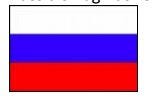
When people see colors on the vertical, they may respond very differently than when they see these same colors on the horizontal.
Look at flags of countries around the world. Many flag colors are red, white and blue. If you look at France’s flag, you have red/white/blue on the vertical.

French Flag
Russia’s flag has red/white/blue on the horizontal.

Russian Flag
Do French people turn their head to the side when viewing the Russian flag? Do French think Russians are gloomy and do not know how to have fun, because the rhythm on their flag, as suggested by the horizontal layout, is so much less energetic than the vertically organized colors on the French flag.
Or do Russians, because of the color layout on the flags, have a great deal of suspicion about the French, when they see their flag? Are the French too indecisive and too ready to change their minds?
You frequently find that people might like a color arrangement in a vertical organization, but feel very uncomfortable, or have much disdain for those same colors, when found in the horizontal.
The same might be said of objects. People often tend towards themes when buying jewelry, and collect jewelry which are all Native American, or all Wicca, or all Horses, or all Wolves, or all something. The Fish people are especially interesting. Some Fish people prefer to wear Dead Fish (hanging vertically), and others Live Fish (swimming horizontally).
Debby was a student of mine. She related to colors as if they were notes in a marching band’s score. Sharp cacophony! Sharp boundaries. No color shall begin before the next color ends. Each color’s note should be pure and clear. COLOR A, COLOR B, COLOR A, COLOR B, COLOR A, COLOR B, Left, Right, Left Right. Debby, in fact, goes ballistic over blurring, and shading, and tinting. Any color pattern that isn’t the One-Two variety, is very disconcerting. She doesn’t like it.
Again, the world and all its people seemed so preset to be biased in viewing colors, opinionated in understanding colors, and subjective in choosing colors. Is there no place for Art Theory, Science, and the Objective Way?
Color Research suggests that there is.
About Black
Some fashion experts say a woman wearing black implies submission to men. I’d don’t know about that. A lot of women wear black. Dracula wears black. Villains and bad cowboys and mobsters wear black. Priests and nuns wear black.
Wearing black with another color can enhance that color’s energy, just like wearing black can enhance your body’s energy. Black can convey an inner strength and control.
I like to use black a lot. I use it to create shadows, to frame things, to back up things, to create borders, to create a sense of negative spaces. Black is a great non-color color.
|
Some Research History on Color
Color research over the past 100 years or so suggests that there are many universals in how people perceive, understand and respond to colors. My favorite book on this research is by Johannes Itten [2] called
The Elements of Color. The most important color universals for jewelry designers, I feel, include,
- After Images
- Simultaneity Effects
- Color Proportions
- Color Schemes
- Use of the Color Wheel
(1) After Images
The first research had to do with After Images. If you stare at a particular color long enough, and close your eyes, you’ll begin to see the color on the opposite side of the color wheel. So, if you stare at red, close your eyes, and you’ll see green.
I know you want to do this, so stare away:

Everyone seems to see after images and see the same after images. It seems that the eye/brain wants somehow to neutralize the energy in color to achieve some balance or 0.0 point. The brain always seeks a balanced energy in light and color. The human eye is only “satisfied” when the complementary color is established. [This is the basis underlying the various color schemes below.]
If red had an energy of 10 (I’m making up this scale), and the eye/brain then convinced your psyche to see green, then I would suppose that green would have an energy of -10. Hence, we reach a 0.0 point. Again, the brain wants balance, harmony, beauty, non-threatening situations. The brain does not want anxiety, feel, ugliness.
And we can continue to speculate that your eye/brain does Not want you the designer to overly clarify and intensify, should this result in a more resonant, perhaps edgy, composition. This takes you too far away from 0.0 energy, and starts to become threatening. It might excite you. It might revolt you. In either case you would react, feel, sense the power of color.
Your eye/brain does Not want you to push yourself and your jewelry to the edge with color. The eye/brain wants balance, harmony, monotony. Red and green can seem so much fun at Christmas time. But if you put your red and green necklace on a copy machine, and took a photocopy of it, it would all look like one color of black. Red and green will always copy as the same color black.
And that is how we perceive them. And cognate them. We see red and green as the same. As the same color black. And if we assign red a 10 score, and green a -10 score, the eye/brain is happy to end up with a 0.0 score. This combination can be boring and monotonous. If, in reality, something doesn’t balance off the color red, in this case, the brain will create its own after image to force that balance. The brain wants to feel safe. Everyone’s brain seems to operate similarly so that this aspect of perceiving color is universally employed.
How far the jewelry designer should fight this universal tendency is up for debate. However, when initially picking colors to combine in a piece, we might try to achieve this 0.0 balance score, and then, by clarifying and intensifying, deviate from it a little bit, but always with an eye on that 0.0 – what anyone’s eye/brain is driving it to do. We want the eye/brain to feel satisfied and “safe”, but as a designer, we also want to give the jewelry a punch, a wow, and edge. There are many color tricks and techniques that the designer can apply here.
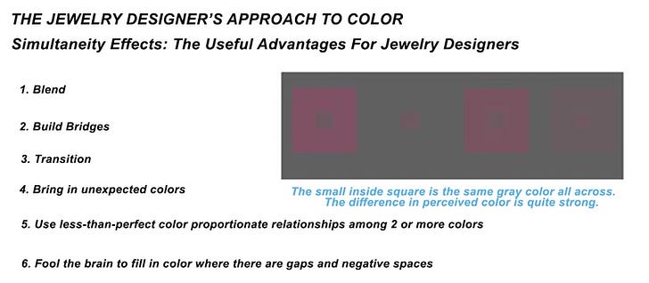
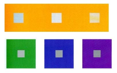
(2) Simultaneity Effects
A second line of research dealt with Simultaneity Effects. Colors can be affected by other colors around them. Colors in the presence of other colors get perceived differently, depending on the color combination.
Simultaneity effects are a boon to the jewelry designer. They are great tools for such things as…
- Filling in the gaps of light between beads
- Assisting in the blending of colors or the sense of movement of colors along a line or plane
- Assisting in establishing dimensionality in a piece that otherwise would appear flat
- Harmonizing 2 or more colors which, on as a set, don’t quite match up on the color wheel
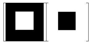
For example, a White Square on a Black background looks bigger than a Black Square on a white background. White reaches out and overflows the boundary; black contracts.
Gray always picks up some of the color characteristics of other colors around it.

Existence of these simultaneity effects is a great piece of information for the designer. There will be gaps of color and light between beads. Many bead colors are imperfect, particularly in combination. Playing with what I call “grays” [thus, simultaneity effects] gives the designer tools to overcome some of the color limitations associated with the bead.
Simultaneity effects trick the brain into filling in those gaps of light between beads. Simultaneity effects trick the brain into believing colors are more connected and mutually-supportive than they would, if separately evaluated. Simultaneity effects trick the brain into seeing satisfying arrangements, rhythms, and dimensionality, where, without them, things would be unsatisfying instead.
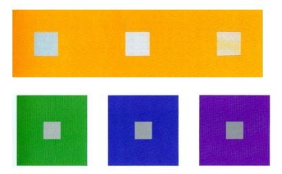
A final example of simultaneity effects has to do with how people sense whether colors are warm or cool. In one composition, depending on the color mix, a particular color might be felt as “warm”. In a second composition, with a different color mix, that same color might be felt as “cool”.
Here the yellow square surrounded by white feels lighter, brighter and a different temperature than its counterpart. The red square surrounded by the black feels darker, duller, and a different temperature than its counterpart.

Again, simultaneity effects give tools to the jewelry designer for intensifying and clarifying the design, without disturbing the eye/brain pre-wired fear and anxiety responses. These allow you to “blend” and build “bridges” and create “transitions.” You have a lot of tricks to use here which enable you to push the envelop with your designs. And still have your piece be judged as beautiful and appealing.
About White
Don’t wear white after Labor Day. This is a rule among rules among rules. It’s an instructive piece of advice to help the fashionista and colorist to maneuver their what-with-alls and get through the remainder of the year.
White is neutral. It goes with everything. And I extend the idea of White to that of Clear, Crystal, and Transparent.
White can also be used to frame and boundary. It can be used to fill negative space.
I once read an article about Europeans’ impressions about Americans. One of the comments always stuck in my mind. “WHITE TEETH”. Americans have White Teeth, implying that Europeans don’t, and don’t care. The article was illustrated, and next to this comment was a picture of ruby red lips and very white teeth.
|
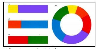
(3) Color Proportions
A last series of research on color focused on balance and harmony by proportion of color use. These scientifically derived proportions show the joint effect of 2 or more colors, if the brain is to score their sum as a value of 0.0. (Again, I’ve made up this scoring, but you get the point about reaching equilibrium).
And again, I’ll make the point that not all compositions have to be harmonious.
You can play with these concepts about proportions most easily with the colors Purple and Yellow.
Using your Yellow and your Violet pencils, color each row in with the following pattern:
First row: alternating Yellow/Violet/Yellow/Violet etc.
Second row: set this pattern: Violet/Yellow/Violet/Violet/Violet/Yellow/Yellow/Violet/Violet/Violet/Yellow/Violet
Third row: Violet/Violet/Yellow/Violet/Violet Violet/Yellow/Violet/Violet/Violet/Yellow/Violet
Which arrangement do you find most attractive or satisfying?
Yellow is very bright and draws your attention immediately. You don’t need much yellow to make your point. In fact, the scientific formula which balances yellow with purple is 1:4. This is read as “1 in 4”, and means that given 4 parts, 1 should be yellow and the remaining 3 should be purple. (This is the pattern in Arrangement 3/Third Channel above).
|
Some other harmonious proportional relationships:
Orange to blue, 1:3
Red to green, 1:2
Yellow to orange: 1:1.3
Itten has a picture of the relative proportions of colors.

(4) The Color Wheel
With almost every book about color, there is a Color Wheel. Some are more detailed than others. Some are easier to turn and manipulate. They all have different colors at the North, South, East and West points, but it is the same series of colors, ordered in the same way, color to color.
It is important to understand how to use the Color Wheel. The Color Wheel is a tool and a guide. It’s not an absolute. A rainbow bent into a circle is a color wheel. This curtain of color provides the insights for selecting and arranging colors that might go together well. But beads don’t always conform to the colors on the wheel; nor do they reflect light and color in ways consistent with how these colors appear on the wheel.
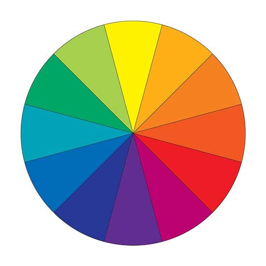
Look at this color wheel:

Get some color pencils, and color in all the colors around the wheel.
Science and Art Theory have provided us with tools to help us pick and combine colors. One tool is the Color Wheel. This curtain of color provides the insights and tools for selecting and arranging colors in jewelry design. The color wheel helps us delineate what color choices we can make, and which combinations of colors might work the best together.
There are 12 colors arranged into
three families of color.
The Primary Color family includes three colors: yellow, blue and red. These colors present the world as Absolutes. They are definitive, certain, and steady. They convey intelligence, security, and clarity.
The Secondary Color family includes those colors you can make by mixing any two primary colors. These three colors are: green, orange and violet. These colors present the world as Contingencies. They are situational, dependent on something, and questioning. They convey questioning, inquiry, risks assessed against benefits.
The Tertiary Color family includes six colors. Each of these colors is a mix of one of the primary colors and one of the secondary colors. These include: red-violet, yellow-orange, blue-green, blue-violet, yellow-green, red-orange. These colors show Transitions. These colors are useful for transitioning from one primary or secondary color to the next. They bridge, integrate, tie things together, stretch things out. They give a sense of before and after, lower then higher, inside and outside, betwixt and between. They convey ambiguity or a teetering on fulcrum of a scale.
In fact, you can create your own chart of colors, if you wish. Perhaps your Color Wheel should show Winter, Spring, Summer and Fall quadrants of colors and transitional colors. After all, we frequently name our fashions and cosmetics and moods after the seasons and their colorations. What should you wear in May, and how would that differ than what you should wear in June? What should someone with a Winter skin tone wear in July?
Or perhaps your Color Wheel should show Earth, Wind, Fire and Water quadrants of colors and transitional colors. Take Water, for example, what colors would be Fish (water) or Mermaids (water-air) or Flying Birds (air-water) or Turtles (water-land)? How would you color-illustrate a Surf N’ Turf necklace? Or, Fire and Ice? Our color and design choices are so often influenced by our experiences of nature and natural phenomenon, why not Earth, Wind, Fire and Water?
Whatever your take on The Color Wheel, the wheel provides you some ways to view and interrelate colors. But remember the power to pick colors is in your hands – you have the power. The Wheel is not the power.
As you begin to pick colors, you will also want to manipulate them – make them lighter or darker, brighter or duller, more forward projecting or more receding, and the like. Expressions of color are referred to as attributes. Expressive attributes are the ways you use color as building blocks in design. So, here are some important building block/color terms and vocabulary.
Expressive Attributes of Color:
Important Color Terms and Vocabulary
Each color on the wheel is called a HUE. Hues are pure colors – any color except black or white. And if you look again, there is no black or white on the Color Wheel.
BLACK is the absence of color. We consider black to be opaque. Usually, when people see black, they tend to see shadows. With black, designs tend to feel older, more antique’y, richer, more traditional and solid, and seem to have a patina around them.
WHITE is all the colors merged together. When all colors in “light” merge, you get White. When all the colors in paints or pigments are merged, you get a neutral gray-black or beige. With White, designs tend to feel sharper, brighter, more contemporary.
INTENSITY and VALUE. Better jewelry designers are those who master how to play with INTENSITIES and play with VALUES. This means they know and are comfortable with manipulating bright and dull, and light and dark. They know the subtle differences among red, pink and maroon, and how viewers react to these. They know how to punctuate – BAM! – with Yellow and EASE… with purple and CALM… with blue.
The contrasts between Bright and Dull or Light and Dark are not quite the same. Bright and Dull (intensity) has to do with how much white, gray or black underlay the Hue or pure color. Low intensity is duller; high intensity is brighter. Think of a Stop Sign. It could have just as easily been Red, Pink or Maroon. Red is the most intense – the brightest of the 3 – and hence the sign is Red. You can see red from the farthest distance away. Red is “Bright (intensity)”, but not necessarily “Lighter (values)” than the other colors.
The contrasts between Light and Dark are called VALUES. A lower value is darker, though not necessarily duller (intensity).
Pink has a higher value than maroon, because it is lighter. Yellow is the lightest color; violet is the darkest. Yellow has a higher value than violet.
Unfortunately, in many texts and guides written by Bead Artists and Jewelry Designers, they combine the concepts of intensity and value into a single concept they refer to as “Values”. Bead Artists and Colorists often write that the “secret” to using colors is to vary “values”. When they refer to “values”, they are actually combining these two color theory concepts – “values” and “intensities”. Both are really different, so this combined meaning is a disservice to the bead artist and jewelry designer trying to learn to control color choices and color expression.
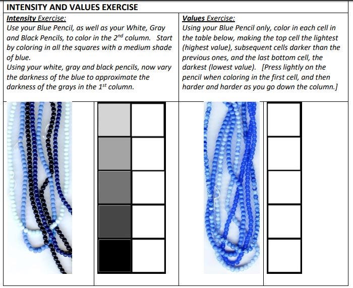
| INTENSITY AND VALUES EXERCISE
|
Intensity Exercise:
Use your Blue Pencil, as well as your White, Gray and Black Pencils, to color in the 2nd column. Start by coloring in all the squares with a medium shade of blue.
Using your white, gray and black pencils, now vary the darkness of the blue to approximate the darkness of the grays in the 1st column.
|
Values Exercise:
Using your Blue Pencil only, color in each cell in the table below, making the top cell the lightest (highest value), subsequent cells darker than the previous ones, and the last bottom cell, the darkest (lowest value). [Press lightly on the pencil when coloring in the first cell, and then harder and harder as you go down the column.]
|

|

|

|

|
So, as you work with people to create jewelry for them, you make choices about, and then manipulate:
– colors
– simultaneity effects
– balance and harmony (distribution, placement, and proportions)
– intensities
– values
Let’s say you wanted to design a necklace with blue tones. If you were designing this necklace for someone to wear at work, it would probably be made up of several blue colors which vary in values, but Not in intensities. To give it some interest, it might be a mix of light blue, blue, dark blue and very dark blue. Thus, the piece is pretty, but does not force any power or sexuality issues on the situation.
If you were making this same necklace for someone to go out on the town one evening, you might use several blue colors which vary in intensity. You might mix periwinkles and Montana blues and cobalt blues and blue quartzes. You want to make a power or sensual statement here, and the typical necklace someone would wear to work just won’t do.
Let’s continue with some more important color building blocks or concepts.

TINT, SHADE and TONE are similar to values and intensities. They are another way of saying similar things about manipulating color Hues. TINTS are colors with white added to them. Pink is a tint of Red. SHADES are colors with black or gray added to them. Maroon is a shade of Red. And TONES define the relative darkness of a color. Violet is a dark tone and yellow is a light tone. Red and green have the same tonal value. “Tones” are what copy machines pick up, and the depth of the black on a photocopy relates to the tonal value of the colors on the original paper you are copying. Red and green photocopy the same black color. They have the same tonal value.
TEMPERATURE. Colors also have Temperature. Some colors are WARM. The addition of black tends to warm colors up. Warm colors are usually based in Red. Red-Orange is considered the warmest color. Warm colors tend to project forward.
COOL colors are usually based in Blue. Green-blue is the coldest color. Addition of white often cools colors. Cool colors tend to recede.
Juxtaposing colors creates MOVEMENT and RHYTHM. By creating patterns, you guide the brain/eye in its circuitous route around the piece, as it tries to make sense of it. Juxtaposing Warm with Cool colors increases the speed or sense of movement.

Some colors tend to PROJECT FORWARD and others tend to RECEDE. Yellow is an advancing color. Black recedes. You can play with this effect to trick the viewer into seeing a more MULTI-DIMENSIONAL piece of jewelry before her. By mixing different colors and different finishes, you can create a marvelous sense of dimensionality.
- Faceted, Glossy beads will tend to look closer and capture the foreground
- Smooth, Glossy beads will tend to capture the middle ground
- Matte, Dull, Frosted, or Muted beads will tend to fall into the background
Colors Have Quirks
Color names have always fascinated me, but they are a bit quirky. When I started in the bead business, many colors went by names I had never heard of before – like Smaragd (Kelly green) or Chroust (a brown tiger eye looking color), or were colors that I did not associate with the color name, like Hyacinth (which was orange) and Amber (which was a bright yellow). There are over 12,000 named colors.
Glass beads, particularly glass seed beads, are created in so many colors, that you can’t make every color using glass alone. Some of the processes used to make some of the colors are unstable. That means, the color can fade, bleed out or rub off. That could end up as a nasty surprise. And somewhat quirky.
And each time the factory makes a batch of a particular color, that same color but next batch, may be different. The color of the beads is affected by the barometric pressure outside the factory when they are made. This is something the factory cannot control.
Traditionally in Europe, transparent color names were given jewel tone names and opaque color names were given what I call crayon color names. So we have Amethyst and Purple, Sapphire and Blue, Rosaline and Pink, Ruby and Red, Emerald and Green, Jet and Black, Black Diamond and Gray, Hyacinth (for the orange version of Zircon) and Orange, and so forth. But this tradition, however elegant, is not kept to very much these days. Things are quirkier.
The violet and blue violet colors of purple were reserved for European royalty, so today, we find very few choices of beads in this part of the color spectrum. Too bad, because people seem to love purples.
The Japanese like to rename their colors every two years. They view color naming in a similar way to “fashion”, and, they reintroduce colors in new names every two years or so. Over the years, I’ve seen “yellow-lined crystal” become “transparent yellow Ceylon” become “daffodil lined transparent crystal” become “daffodil Ceylon lined crystal” become “luminescent yellow lined Ceylon crystal”. The color names don’t make it seem like the bead is the same color. Ceylon means “pearlized”, but none of these color names are used with pearlized beads. The beads are clear with a yellow lining. And so this changing-name-thing is quirky.
The Czechs started doing this. Smaragd is now Kelly. Chroust is now Tiger Eye. Sphinx first became Hematite. More recently, Hematite has become Gunmetal. With some lines, Gunmetal is morphing into Antique Brass. Amber is Citrine. It’s very difficult keeping up when you don’t deal with these quirks of naming on a day-to-day basis.
I came to find out over the years that people claim to own certain colors. This sounds strange, but it’s true. Like in, “Janice, here’s your brown.” Or, “Elaine, come quick, this was the red you wanted.” Or, “Cynthia, that’s not my purple. That’s Ellen’s purple. You know she’ll only work with that one purple color. And I don’t like it. It’s not for me. I don’t even think it’s for Ellen, but God knows, she sure loves that purple. No, it’s not mine. It’s hers. Not mine. No.”
Other quirky things come up with color as well. A lot of people get unpleasantly surprised when they cut seed beads off the hank, or pour them out of the tube. The color of 1 bead alone is often different than when bulked up together.
You cannot easily mix Czech glass and Japanese glass. They use different color palettes. This is most noticeable with the purple color. The Czech purple is reddish; the Japanese purple is dark bluish/black. There is a similar problem with seed beads and delica beads. Again, look at the color purple iris in each. These don’t mix.
Nor can you easily mix Swarovski crystal with glass, or different Swarovski crystal colors with each other, because Swarovski doesn’t coordinate the tones/shades/tints of all the colors. Your eye/brain also wants to blend all the crystal colors, when confronted with more than one color in a composition. It’s very difficult to work with Swarovski Crystallized Elements and control your colors, as a designer should, would, and can.
And it’s difficult to mix crystal beads made in different countries. Swarovski, the Czechs and the Chinese do not use the same color palettes. Swarovski’s color palette is more intense. Swarovski and the Czechs use more lead so their beads are brighter; the Chinese less lead, so their beads are duller. Swarovski modifies the shapes of their beads so that the light refracts through the glass differently than similar beads made in other countries. This altered shaped – a 4mm bicone is 3x4mm, a 10mm round is 9.5x10mm – also changes the way the light refracts through the glass, and results in an intensifying of the bead color.
Familiarity with these different quirks about color make it a little easier to apply and interpret color schemes and theories to beads.
The Kayapo
The Kayapo live in villages in the Amazon River basin in Brazil. One of my anthropology friends studied them for awhile. An interesting thing that she found was a peculiar cultural behavior related to naming colors.
The Kayapo have three names for colors: White, Black and Red. They can see and recognize all the colors of the rainbow, but have not found the cultural or social need to have specific names for them all. So some colors might be light white, or dark white, or very dark white, off-white, and so forth.
When the Kayapo perform ritual feasts and ceremonies, they drop one of the color names – the name for Red. So during rituals, they use White and Black for all colors. During non-ritual times, they use White, Black and Red for all colors.
During the rituals, and I was lucky to watch hours of video on this, when the anthropologist points to red, and asks what color it is, the Kayapo will say Black. If you tell them, that an hour earlier before the ritual, they called this Red, they look at you quixotically and wonder what planet you live on. It’s clearly Black, at least at this moment. During non-ritual times, when you ask them about what just happened, they still think you’re crazy. It’s obviously Red, at least at this new moment.
These naming behaviors triggered several lines of inquiry. One of them was to see if there was a predictable ordering to when color names are created for specific colors. It turns out that you can highly correlate the level of technological development to the number of colors which have specific names. Moreover, every society in the world seems to find the need to name colors in the same order.
So, the least technologically developed cultures have two names – Black and White. Again, they can see and describe all colors, but only have the need for two color names. The next color to be named is Red. Red, then, is the first true Hue or color that people recognize and want the kind of control over it, that giving a name to it would provide. We can only speculate Why. Perhaps it is a color that is easy to make and the materials to make it are readily at hand. Perhaps it relates to the color of blood or the color of something else that is particularly important in society.
Nevertheless, after Red comes Yellow. Then it’s a toss up. Some groups go with Green, then Blue. Other groups go with Blue, then Green. Finally then, comes Orange, and last Purple.
As a jewelry designer, your choice of colors might mimic some of this naming behavior. If you wanted to do a more primitive look, you might emphasize Black, White and Red. An ancient Egyptian piece might emphasis White, Red, Yellow and Blue. A contemporary piece might emphasize Green, Orange and Purple.
|
(5) Color Schemes – Rules of Composition
Color schemes are different, proven ways to use and combine colors, in order to achieve a pleasing or satisfying result. Good color combinations based on color schemes have balanced, harmonious tonal values – their light energy levels balance out at the zero-zero (0.0) point. Better designers like to tweak these combinations a bit, in order to evoke an emotional and resonant response to their work.
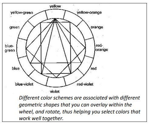
You can place geometric shapes inside the Color Wheel, and rotate them, and where the points hit the wheel, you have a good color combination. For example, if you place an equilateral triangle (all sides are equal length) within the circle, as in the diagram below, the points touch Yellow, Red and Blue. If you rotate it two colors to the right, it touches Orange, Violet and Green.

Different color schemes are associated with different geometric shapes that you can overlay within the wheel, and rotate, thus helping you select colors that work well together.
|
With color schemes, you always need to think about things like:
- Whether one color should predominate, or all colors should be more or less equal
- Whether there should always be a “splash of color”, as interior designers like to say. Do you always need a “drama” color to achieve exciting, focal, look at me first effects?
- If symmetry works with or against your color choices
- If you need to adjust intensity or value in each color, to get a better sense of satisfaction
- If you need to adjust the proportions or distributional patterns or arrangements of each color used; that is, experiment with same colors, different placement
With any Color Scheme, you not only pick particular colors to play with, but you also must decide if one is to be Predominant, and the others Subordinate, or not. Some Color Schemes work best if one color is dominant; others work best where all the colors are co-equal.
With some Color Schemes, symmetrical arrangements are more satisfying and asymmetrical ones are less.
When you select a Color Scheme, sometimes tweaking the intensities and/or values of some of the colors you’ve chosen, will end up with a more satisfying outcome.
In a similar way, when you select a Color Scheme, sometimes tweaking the proportions or placement of colors will end up with a more satisfying outcome.
When you study Interior Design, there is a rule accepted by most Interior Designers about always adding a “Splash of Color.” I don’t know if this is critical to jewelry design, or not. A room will not look right without some drama, some focal point, some surprise. Does jewelry need the equivalent of that Splash of Color? If so, how does this relate to choosing colors on the Color Wheel? Or is it to be some afterthought – some fourth color from the fourth dimension? Is there a science here, or some intuitive emotional irrational choice?
We’re not going to find the answer to this mystery today. So let’s look at the three most popular, often-used Color Schemes – Analogous, Complementary, and Split Complementary.
Analogous
The analogous color scheme is where you pick any 3 hues which are adjacent to one another on the color wheel. For example, you might pick yellow-green, yellow, and yellow-orange. This scheme is a little trickier than it seems. It works best when no color predominates. Where the intensity of each color is similar. And the design is symmetrical. I also think this scheme works best when you have blocks of each color, rather than alternating each color. That is, BETTER: color 1, 1, 1, 1, 1, 2, 2, 2, 2, 3, 3, 3, 3 rather than WORSE: color 1, 2, 3, 2, 1, 2, 3, 2, 1, 2, 3, 2, 1.
Exercise: Test drive the Analogous Color Scheme. Take 10 beads of each of 3 analogous colors, and arrange them on the bead board into a pleasing analogous design. Try changing the proportions of each color, and then evaluate which arrangement seems more satisfying.
|
Complementary (also known as “true complementary” or “dyadic”)
The complementary color scheme is where you pick any 2 colors which are the direct opposite on the color wheel. For example, you might pick yellow and violet. To use this color scheme effectively, you would balance the contrast of the colors by value (lightness/darkness) and/or intensity (brightness/dullness). In this color scheme, one color has to predominate.
Try these exercises:
Exercise: Take 15 beads of each of two complementary colors, and arrange them on the bead board into a pleasing design.
Exercise: Now put back 10 beads of one color, and replace with 10 beads of the other color, so you now have 5 beads of one color and 25 beads of the other. Arrange them on the bead board into a pleasing complementary design.
Which arrangement is more satisfying?
|
Split Complementary
This is the most popular color scheme. Here you choose a hue and the hues on either side of its complement. For example, you might choose yellow and blue-violet and red-violet. In this scheme, one color needs to predominate. This scheme works well with both symmetrical and asymmetrical designs. You can use an isosceles triangle (has two sides with equal length) within the Color Wheel to pick colors.
One thing I like to do with this scheme is arrange all my beads, then replace one color with one of the others, and vice versa. Let’s say you had 20 blue-green (aqua), 10 orange, and 5 red beads, which you had laid out in a satisfactory arrangement. You could change it to 20 orange, 10 blue-green, and 5 red beads, and it would look just as good. A lot of people have difficulty using the color orange in jewelry designs, but find it easy to use blue-green. Here’s a nifty way to trick them into using orange, and liking it. Do the composition with blue-green dominant, then switch out all the blue-green for orange, and any orange you used for blue-green.
Exercise: Choose a hue and its two split complements. Take as many beads of each of these three colors as you like, up to a maximum of 30 beads, and arrange them on the bead board into a pleasing split complementary design.
Play with these beads awhile. Take some away. Add some. Replace one color with another. Change patterns. Change rhythm. Which approaches feel more satisfying than others?
|
There are many other color schemes. Some examples:
Analogous Complementary.(3 analogous colors, and one complement of one of these 3). Example: blue-violet, violet, red-violet with yellow-green.
Triadic: (3 tertiary hues equidistant on the color wheel.) Example: red-violet, yellow-orange, and blue-green. You can use an equilateral triangle within the color wheel to help you pick choices.
Tetradic: (Using 4 colors, a double complementary scheme). Example: Yellow-green, orange, red-violet, and blue. You can use a square or rectangle within the color wheel to help you pick choices.
Hexadic: (Using 5 colors). Can use a pentagon within the color wheel to select your colors.
Monochromatic: (A single hue, though with different intensities, tints and shades)
Achromatic: (black and white and gray (without color))
Neutrals: (mixes of hues to get browns (or grays))
Clash: (combines a color hue with a color on either side of its complement).
Example: blue w/red-orange or orange-yellow
There are many books, as well as free on-line color scheme designer apps to check out and play with.
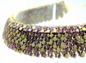
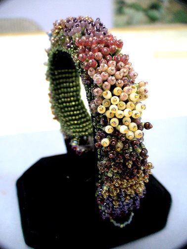
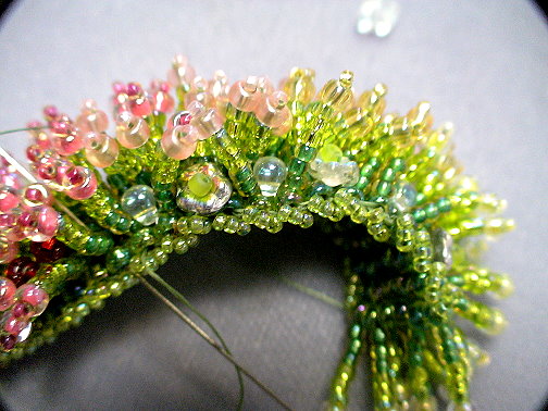
BEADS AND COLOR
The bead presents greater complexity and depth, in terms of color, than any flat surface, like paint. We need to know how the bead asserts its need for color. We need to spend some time contemplating this. [In fact, we need to know how all the materials we use in our jewelry compositions assert their needs for color and spend time in contemplation.]
After you thread the needle and pierce the hole of a bead, you are eyeball to Bead. You cannot fail to notice the sharp and steady interplay of color that rushes to your eye and your brain. That interplay could be subtle, as shadows and subtle differences in shade and tone. Or it could be dramatic, as an Aurora Borealis effect on the bead opens up like a silk and paper fan across the lenses of your eyes. That interplay is often unexpected, as if directed by “someone else’s hand”.
Before you know it, your needle is through this bead and on to the next. You almost gasp, to take in all the color, its powers and effects. As you string or weave more beads together, the developing composition provides more intellectual challenges and stimulations to your mind and eye. Beads demand much more commitment, they are much more assertive, they require much more attention, than paint. And you are there to provide it.
Bead shapes, dimensionality, and movement-when-worn create shadows and highlights. They force you to perceive and have to interpret your perceptions. They offer many plays on light, reflections and refractions, some anticipated, others not.
The Bead has many levels upon which to target your eye. There is the surface. There are the outer edges. There are the inner edges that come with faceting, and texturing, and crevicing. There are the layered inner spaces you see in opalescents and micas and color lined and quartzes and Picassos and hurricanes and tortoises and cubas and conglomerations. There are many other applied effects from aurora borealis to celsian to valentinit to azuro to Labrador to clarit to vega.
And there is the hole, its rim, its recesses, and its channel through the object we call Bead. And as the eye and brain try to target the eye on the bead, it is important to realize that some materials of beads restrict the eye to its surface colors; other materials bring the eye into the bead to different levels or layers below the surface and within the bead itself.
Although many people try to “paint” with beads, you really can’t. Beads don’t come in every color, and they don’t “blend” like paints. Often, you have to make work the limited color palette you have with beads on hand. You rely on techniques based in proven color theories to trick the brain and steer the brain into seeing blends, seeing coherence, seeing continuity, seeing unity of effect.
Each bead already presents some color variation in terms of intensity and value, as the viewer experiences the bead in its entirety, examining the bead over and around each curve and surface. The intensity of value of the bead color may be more or less near the curvature or hole, and more or less at its center.
Sometimes this works to the artist’s advantage, in that the color as experienced on, with, within, through and around the bead might be more “forgiving” than picking a paint color. On some beads, you find color effects fired on to one side, but not the other, and this affects intensity and value, as well.
Color must “jump a cliff” in the spaces between any two beads. The smaller the bead, the less “gap” created between beads, and the more intense and sharper the colors. A composition with 15/0 seed beads would be viewed more favorably, than if the same piece had been done with 11/0 seed beads or 8/0 seed beads. Smaller gaps.
The color and its effects with a bead, as you hold it in the air, may vary considerably than when you place it over cloth. In a similar way, the color of beads on hanks or in tubes or on strands, may be very different than when used within a particular composition.
The time of day, the brightness or dimness of the sun or moon, the casts of shadows along the landscape – these all affect perceptions of color, and the bead, its shape and texturing and coloration effects only makes these perceptions more complex and multi-plex. The color of lighting in a room – fluorescent day, cool or white, or incandescent yellow – and the colors of the walls and floors and ceilings, and the amount of windows, and their positioning – these all affect perceptions of color, as well. The list can go on – the direction of lighting, directed lighting, filtering of lighting, and so forth. The good jewelry designer needs to understand these things.
COLOR MATCHING
With Beads, to understand color combination, you must also understand the materials the beads are made of, and how the materials contribute to or work against such combinations. Whether the material is of the bead itself, or of the stringing material, the light-conveying and light-inhibiting qualities of these materials will also be critical, when choosing color combinations.
One time, we were experimenting with making simple beaded beads. Traditionally, you would use a wooden bead as the “core”, and bead weave all around it. Usually, you would color the wood bead with magic markers or paint, in a color similar to the beads you were weaving with. We tried doing the same beaded bead, first around an acrylic bead, and then around a glass bead. Bead weaving around the acrylic bead seemed more attractive and satisfying than around the wood one. Bead weaving around the glass bead had a considerably bigger and more positive impact on the result.
With the wood core bead, the beaded bead looked a little listless, with little resonance. With the glass core bead, the beaded bead had a lot of resonance. Light flashed all around and through the bead from side to side. The colors seemed more vibrant. With the acrylic bead, the resonance seemed in between that of wood and glass.
It’s very difficult to mix materials within the same piece of jewelry. The eye/brain interacts differently with different materials. When you mix materials, it can get awkward for the eye/brain to perceive and interpret what it’s seeing. When this happens, you begin to trigger our pre-wired fear and anxiety response. This makes the brain edgy because the brain always prefers harmony and balance. So things start to get translated as ugly, boring, monotonous, unsatisfying and the like.
With most glass, the eye/brain sees the outer surface. The light travels to the surface and reflects back from the surface. With most gemstones, the eye/brain sees the surface, as well as sees into the bead and below the surface among many levels and layers. The light travels below the surface, and then is reflected back from below the surface.
When you mix glass and gemstones, you need to try to pick glass that duplicates the eye/brain/gemstone interaction. Opalescent colors of glass work well. Matte transparent beads with color lining, or color effects beneath the surface layer work very well.
It’s also difficult to mix glass and glass crystal (leaded glass) within the same piece. Swarovski crystals use a very different color palette than Czech glass and from which to work. Crystal beads draw the eye/brain deep within the bead and below the surface. Light diffuses, and often, with crystal beads, we see the brightness before we recognize the color itself. This is a very different dynamic than our brain/eye/material interactions associated with most glass and most gemstones.
Each color within the Swarovski crystal line does not seem to be from the same color palette when compared to each other, either – they don’t have the same underlying tones/shades/hues. When mixed, many colors become muted, and less distinct, then when separated. There are many color boundary issues – your eye wants to merge/blend/wash the colors together. Some lighter colors seem to fade or wash out, when next to others, or in a finished piece.
Mixing fibers and other related stringing materials have big impacts on perceptions of color and color combinations. In transparent or translucent beads, the color of the stringing material, or its finish, (glossy, matte, waxed, metallic, dull), can affect the perception of the bead color. Your eye/brain can actually see the stringing material between each pair of beads butted up against each other. This affects color.
How you finish off your necklace or bracelet, and attach a clasp – The Clasp Assembly – can affect perceptions of color. This can be as simple as a gold clasp vs. a silver clasp, or it could be more involved.
The Color Effects of Threads
The color of the stringing material has a big impact on color perceptions of the piece as a whole.
With Black Thread, you see shadows. Black seems to make things look richer, older, more antique-y, with a patina. Black Thread works in most pieces.
With White Thread, you can see the white, where you tie knots. White seems to make things look sharper, brighter, more contemporary.
Most people, when using color threads, match the color of their thread to the predominant color in their piece. In this case, there is little color effect. However, you can get very strategic with color threads. You can take an amethyst colored thread and an olivine colored bead, and get a neat color-lined effect. There is no reason that you have to use the same color of thread throughout your piece. You can change colors, and also get unusual color effects.
Mixed Media Projects
When you mix Beads and Other Media, like fibers, in the same composition, the different materials compete for attention and dominance. The Designer leads the way in how this unfolds. Frequently, though, the person making the jewelry loses control over the materials, their powers, their essence, their color. One of the major things that goes wrong here is a failure to control the colors and the light reflections and refractions.
Say you were creating a felted piece with some additional braiding on it, and embellished the piece with crystal beads. You might have created some fascinating scroll work and layering with your fibers. The brightness of the beads, however, might distract the viewer, or the experiencing of colors within each material might be distracting, making her turn her head. The crux of your piece, then, goes unnoticed.
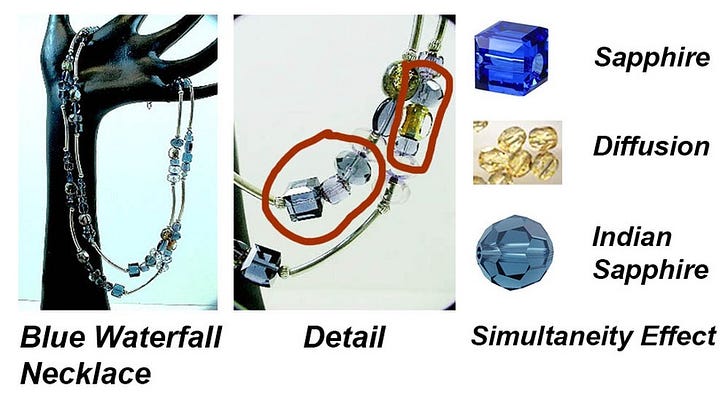
The Use of “GRAYS” (simultaneity effects) to tie things together – Blending and Bridging
With beads, the eye often needs to merge or coordinate colors, as it scans any piece. And then there are the gaps of light between beads. The eye needs help in spanning those gaps. The Artist needs to build color “bridges” and “transitions”, so that the eye doesn’t fall off a cliff or have to make a leap of death from one bead, across the gap, all the way to the next.
One easy technique to use is to play with simultaneity effects. One such effect is where gray takes on the characteristics of the color(s) around it.
In beads, there are many colors that function as “grays” – gray, black diamond, alexandrite, Montana blue, Colorado topaz – colors that have a lot of black tones to them. Most color lined beads result in a gray effect. Metallic finishes can result in a gray effect.
In one piece I made, for example, I used 11/0 peach lined aqua beads as a “gray” to tie in larger teal and antique amethyst beads together. Gray colors pull from one bead, and transition to the next in a very subtle way, that tricks the brain, but does not disturb it.
Framing
I like to put “frames” around things. I like to frame segments of beads in my pieces, to delineate sections, forms and themes. I like to frame pendant drops so that there is a clear top and bottom, beginning and end. I like to frame color blocks to play with line, silhouette and boundaries.
Framing means using colors on either end of something, so that you establish a start and stop, a beginning and end, a top and bottom, or some related boundary. For example, you can put two black seed beads on either side of an 8mm round red bead, to frame the bead, not detract from it, and enhance the viewer’s experience with it.
Need Focal Point In Piece
Not necessarily a “splash of color”, but there is some need to create a sense of drama, life, excitement, a look-at-me-first bead or color. These could be high contrast, or a monochromatic piece. But something because of size or pattern or texture needs to draw focal interest.
Color Blending
Every so often, you might want to create a rainbow, or some sequencing of colors, say from light to dark, where all the colors seem to emerge from the last, and bleed into the next. This is much more difficult with beads than with paints for all the usual reasons discussed above.
A “Random” selection or placement of colors doesn’t usually work. “Alternating” or “graduating” colors doesn’t always work well. You must create a more complex, involved patterning. You must choreograph the layout of colors, so that, from a short distance, they look like they are blending, and gradually changing across the length of your piece.
One way to choreograph things, is to play with color proportions. Go bead by bead or row by row, and begin with the ideal proportionate relationship between two colors. Gradually manipulate this down the piece by anticipating the next ideal proportionate relationship between the next two colors that need to follow.
DESIGNING JEWELRY WITH COLOR
QUESTION: If your jewelry needs something else, how do you make these choices…That color’s not right, what’s not right about it? I want to add a color, which one? My colors are not working 100% within the composition, what can I tweak?
When we study color from a design standpoint, we think of color as part of the jewelry’s structure. That means, color is not merely a decorative effect. It is more like a building component. The specific term is “Design Element”. Color is the most important Design Element. It can both stand alone, as well as easily be combined with other Design Elements.
We use color to express elements of the materials used, like glass or gemstone. We use color to express or emphasize elements of the forms we are creating. We use color to enhance a sense of movement or dimension. We use color to express moods and emotions
Often, the first problem with color in design is the distribution of lights and darks. Using the same colors, you can get very different results, based on how the colors are arranged. When you have questions, it is useful to take a black and white photocopy of the different patterns, and to choose, based on the black and white image.
The second problem is creating a focal point with color.
The third problem is creating a rhythmic feeling, using the distribution of colors and their proportions.
Better pieces are either
(a) those with a dominant color, and some variation in values or intensities, or
(b) those that are dominant in 1 or 2 complementary or analogous colors, with some change in values and/or intensities
Better designers are able to decode the use of color and its expression within any piece. This means being able to determine which colors were selected, define the intensity of values of these colors, determine whether placement, distribution and proportion is applied well, identify where color combined with other Design Elements creates additional expressive qualities, such as movement, dimension, and balance. Fluent designers can decode intuitively and quickly, and apply color in more expressive ways to convey inspiration, show the artist’s strategy and intent, and trigger an especially resonant, energetic response by wearers and viewers alike.
Good Jewelry Design has:
1. Resonance
2. Strategic Use of Line
3. Strategic Placement of Colors and Proportions of Colors
4. The Use of Shapes, Forms and Themes
5. The Power To Affect the Viewer’s Emotions, Moods and Understandings of the Situations Around Her
6. Parsimony (knowing when enough is enough)
1. Resonance
Resonance is the energy the jewelry exudes. Without resonance, jewelry is lifeless and listless. Resonance reflects the jewelry designer’s control of light and shadow, warm and cold, receding and extending out.
Resonance doesn’t mean “sparkle.” It doesn’t mean “bright”. It means the mood, the rhythm, the tonality. It means that the piece of jewelry reflects a sense of design, and a sense of the designer. Not just art. And definitely not just craft. Resonance is the reason why some jewelry gets your attention, and others do not. Pick up a fashion magazine or a bead magazine, and page through it. Which pieces catch your eye, and which ones do not?
The jewelry designer is responsible for creating jewelry which resonates. That is, the jewelry reflects the artist’s intentions, and fully utilizes the powers of color, their combinations, their variations, their arrangements, and distributions with their pieces.
2. Strategic Use of Line
A second aspect of good jewelry design is the strategic use of line. First off, most jewelry is, in essence, a line. Things are lined up. They are organized into a line. They are worn as a line. You don’t necessarily want that line to be creepy or disjointed or disconnected.
The line has many points along it. It outlines things. It sets boundaries. It separates things which are above it from things which are below it.
The line can come to a point. It can curve. It can undulate. It can snake in and around things.
It can be very long. Or it can be short. It can serve alone, or be joined by other lines in sequence or opposition.
The use of line accomplishes two goals.
First, the use of line creates an outline or a shape or boundary. We call this “silhouette”. Usually the silhouette identifies for the viewer, where the wearer feels comfortable accepting the viewer’s gaze, and where she does not. Can/Should the viewer gaze upon the wearer’s face, neck, breasts, belly button, wrist, elbow, upper arm, ankle, knee, thigh, groin? The line demarks the acceptable paths for gazing.
Second, the use of line creates a contour, as the eye moves all around the piece as it is worn; the line and the use of color choreographs the sense and direction and speed of movement that the viewer’s eye follows. This choreography reveals part of the wearer’s personality, moods, and aspirations. It can excite the viewer, or bore her. It can resonate power, or be demure. It can command the viewer to step forward, follow, hesitate, wait, or turn around. It can affect self-image or social class.
Many women are afraid to wear jewelry which does not conform to a straight line. They don’t know how to wear it. They seek the simple straight line, over the multiple straight lines. They seek the simple straight line, over non-straight lines. They seek parallel lines over ones which are skewed.
It’s the jewelry designer’s duty to make the wearer comfortable with whatever line(s) the jewelry embodies. Often this is done with the use of color.
3. Strategic Placement of Colors and Proportions of Colors
A third aspect of good design is the placement and proportions of colors. Colors and their placement work best when they appear to have been coordinated, not necessarily matched perfectly, but neither as afterthoughts. Everything must feel balanced and harmonious, even when the piece is asymmetrical. Placement shows purpose. It reflects choice. It provides a mechanism for the viewer to evaluate the success of the piece, therefore, the success of the wearer. It is very signifying.
4. The Use of Shapes, Forms and Themes
Interpretations and experiences with colors may change, when the color is presented within a shape, or is part of a form or theme within your piece. After all, clusters of Design Elements can have synergistic or antagonistic effects.
Shape is an important Design Element, made up of lines and points, yet different than lines and different than points, when these stand apart from shape. Shapes serve to provide positioning, direction and orientation to the pieces, often better than lines and points. This is an important psychological function.
Shapes provide more dimensionality to pieces. Greater dimensionality is often perceived as more contemporary, smarter, wealthier, higher status, more creative, more beautiful.
Shapes convey symbolic meanings. Triangles suggest action. They are dynamic. They are directional. They seem purposeful and strong. They have a power over the viewer, in that they can control the viewer’s process of perception. Triangles can be made into pyramids, flags, arrows, beacons. They are often used as elements in religious symbols.
Square shapes denote honesty and stability. They are trusted, familiar, safe, comfortable. Most shapes we encounter are squares and rectangles. Squares could also symbolize rigidity and uniformity. [An unexpected placement of squares within a piece, could evoke the opposite feelings and symbols.]
Circle shapes suggest infinity. They are associated with protection (you’re inside the circle or outside). They are associated with movement and freedom. They suggest completeness.
5. The Power To Affect the Viewer’s Emotions, Moods and Understandings of the Situations Around Her
Color affects the viewer. It affects the viewer’s perceptions about reality. If affects the viewer’s understandings of social relationships, power relationships, sexual relationships. It orients the viewer to what is up and down, and left and right, and skews the viewer’s interpretations about right and wrong, beautiful and ugly, satisfying and unsatisfying, that which is to be feared and that which is to be approached.
Some colors get very associated with certain moods. These include,
1. Power/Highly Emotional (red)
2. Rich (burgundy; red with black)
3. Romantic (pink, red with white)
4. Vital (red-orange)
5. Earthy (red-orange with black)
6. Friendly (orange-yellow)
7. Soft (peach)
8. Welcoming (amber)
9. Moving (yellow)
10. Elegant (pale yellow)
11. Fresh (green)
12. Traditional (green with black)
13. Refreshing (blue-green, teal, aqua)
14. Tropical (blue-green or teal or aqua with white)
15. Classic (royal blue)
16. Dependable (navy Blue)
17. Calm (pale blue, blue with white)
18. Regal (deep blue-violet)
19. Magical (deep red-violet
20. Energetic (fuchsia)
21. Subdued (any color with gray, like mauve)
22. Professional/Corporate (gray)
But it is so easy to make a misstep with color. The choice of the wrong color, or wrong intensity or wrong value can lead to misunderstanding, anxiety, stress, avoidance, diminished social status, destroyed relationships, and the like. So, if you have the time, you might want to practice a little with color and evoking moods and emotions.
6. Parsimony
Parsimony means that the designed piece is finished and successful, and should the artist add or subtract one more element, the piece would be less so. Parsimony signals when enough is enough. The artist has not overdone or underdone the selection or application of colors.
Don’t get into a Color Rut
And a last piece of advice.
Don’t get into a color rut. Experiment with different colors. Force yourself to use colors you usually do not use or avoid. If it’s too psychologically painful, make a game of it.
_________________________________________
FOOTNOTES
[1] Pantone website https://www.pantone.com
[2] Itten, Johannes. The Elements of Color: A Treatise on the Color System of Johannes Itten, NY: John Wiley & Sons, 2001
Color References Worth Checking Out
Rockport Publishers, Color Harmony Workbook, Gloucester, MA: Rockport Publishers,
1999.
Deeb, Margie. The Beader’s Guide to Jewelry Design, NY: Lark Jewelry & Beading,
2014.
|