


In this article, I discuss critical choices jewelry designers need to make when doing craft shows. That means, understanding everything involved, and asking the right questions.
[Pardon the all capital letters used below in the article. This is a script of a webinar I do.]
Learn How To…
…Find, Evaluate and Select Craft Shows Right For You
…Set Realistic Goals
…Compute a Simple Break-Even Analysis
…Best Way to Develop Your Applications and Apply
…Understand How Much Inventory To Bring
…Best Promote and Operate Your Craft Show Business
Doing craft shows is a wonderful experience. You can make a lot of money. You meet new people. You have new adventures. And you learn a lot about business and arts and crafts designing. That’s how I got started at Land of Odds. We made up a lot of jewelry. We put together some glass covered display boxes. We set up for the public, hoped for great weather, and prayed that our spread-the-word campaign would pay off. And it did. We repeated our success over and over again, with only a few exceptions — what we call “learning experiences.”
16 LESSONS I LEARNED DOING CRAFTSHOWS
How To Find Them
Lesson 1: Not Every Craft Show Is Alike
Lesson 2: Research All Your Possibilities
Lesson 3: Know Which Craft Shows Are For You, and, Which Are NOT For You
Lesson 4: Set Realistic Goals — Breakeven Analysis
Lesson 5: Get Those Applications In Early
How To Operate At Them
Lesson 6: Promote, Promote, Promote
Lesson 7: Set Up For Success
Lesson 8: Bring Enough Inventory To Sell
Lesson 9: Sell Yourself And Your Craft At The Show
Lesson 10: Make A List Of Things To Bring
Lesson 11: Be Prepared To Accept Credit Cards
Lesson 12: Price Things To Sell, Minimize Discounting and Haggling
Lesson 13: Keep Your Money Safe — Record Keeping
Lesson 14: Focus Your Strategies For Generating Follow-Up Sales
Lesson 15: Take Care Of Yourself
Lesson 16: Be Nice To Your Neighbors
i. Final words of advice
ii. Resource links
Lesson 1: Not Every Craft Show Is Alike
IT IS VERY IMPORTANT FOR ANYONE THINKING ABOUT SELLING AT CRAFT SHOWS, FESTIVALS, BAZAARS, MARKETS, OR SIMILAR SETTINGS TO BE SMART ABOUT IT. THAT MEANS, UNDERSTANDING EVERYTHING INVOLVED, AND, ASKING THE RIGHT QUESTIONS.
THERE ARE MANY ADVANTAGES TO DOING CRAFT SHOWS. YOU CAN MAKE GOOD MONEY. YOU CAN JUMP-START AND ENHANCE YOUR REPUTATION YOU CAN LEARN A LOT OF GOOD BUSINESS TRICKS AND FIND OUT ABOUT A LOT OF GOOD RESOURCES IF,…
AND THAT’S A BIG, “IF”!
YOU KNOW WHAT YOU’RE DOING.
ALL TOO OFTEN, JEWELRY DESIGNERS WHO WANT TO DO CRAFT SHOWS HAVE NOT DONE THEIR HOMEWORK. THEY HAVE NOT RESEARCHED AND EVALUATED WHICH SHOWS TO DO, AND WHICH NOT TO DO. THEY HAVE NOT FIGURED OUT HOW BEST TO SET UP THEIR BOOTHS AND DISPLAYS. THEY ARE CLUELESS ABOUT WHAT INVENTORY TO MAKE, AND TO BRING, AND HOW TO PRICE IT. THEY ARE UNPREPARED TO PROMOTE, TO MARKET AND TO SELL.
MEET ROLAND AND ROLANDA. NEW TO THE JEWELRY DESIGNING TRADE.

WHEN THEY STARTED, THEY DECIDED TO APPLY TO EVERY LOCAL CRAFT SHOW AND FESTIVAL AND FLEA MARKET THEY COULD FIND. THEY SET UP AT THE ST. BERNARD’S FESTIVAL. AND THE METRO ARTS COMMISSION “IN THE PARK” PROGRAM, AND THE SOUTH 2ND STREET FLEA MARKET. AND THE FLEA MARKET AT HOUSER LAKE. AND THE TENNESSEE ARTS COMMISSION FAIR. AND THE CRAFT SHOW OF THE AMERICAS.
ROLAND AND ROLANDA DID NOT UNDERSTAND THAT EVERY CRAFT SHOW WAS NOT ALIKE. THEY WERE NOT PREPARED FOR THE CONFLICTING DEMANDS. AND THEIR BUSINESS SUFFERED FOR IT.

CRAFT SHOWS AND SIMILAR VENUES ARE PLACES WHERE YOU CAN BRING YOUR MERCHANDISE, SET UP SOME KIND OF DISPLAY AND SELL TO PEOPLE WALKING BY. CRAFT SHOWS ARE A GREAT WAY TO MAKE MONEY. PEOPLE COME TO CRAFT SHOWS TO BUY. CRAFT SHOWS ARE A GREAT WAY TO GET BROAD EXPOSURE TO A LARGE CUSTOMER BASE. THEY ARE A GREAT WAY TO JUMP-START, RE-START AND RE-ENERGIZE YOUR JEWELRY DESIGN BUSINESS. AND, SOMETIMES YOU WILL MEET PEOPLE THERE WHO OWN BUSINESSES WHERE THEY WANT TO BUY YOUR ITEMS FOR RE-SALE.
CRAFT SHOWS ALLOW YOU TO HAVE LITTLE INVESTMENT IN OVERHEAD, LIKE RENT, INSURANCE AND THE LIKE THAT COMES WITH A PHYSICAL STORE. CRAFT SHOWS MEANS YOU DO NOT HAVE TO SHARE YOUR PROFITS WITH A STORE OR GALLERY.
NOT EVERY CRAFT SHOW IS ALIKE. THERE ARE:
ARTS AND CRAFTS SHOWS
FLEA MARKETS AND BAZAARS
FESTIVALS AND FAIRS
JURIED VS. OPEN
INDOOR VS. OUTDOOR
HOLIDAY OR THEMED
LARGE VS. SMALL OPERATIONS
WALK-BY-BOOTH SETUPS VS. WALK-IN-BOOTH SETUPS
MIXED MERCHANDISE VS. JEWELRY ONLY SHOWS
ARTS AND CRAFTS SHOWS
ONE TYPE IS AN ARTS AND CRAFTS SHOW. THESE ARE PROFESSIONALLY PRODUCED SHOWS WHICH PROMOTE THE SALES OF HANDCRAFTED ART AND OTHER CRAFT ITEMS. THESE CAN BE INSIDE OR OUTSIDE. YOU FIND THEM IN A WIDE ASSORTMENT OF SETTINGS, FROM PARKS TO COMMUNITY CENTERS TO SHOPPING MALLS. SOME FOCUS ON ART TO THE EXCLUSION OF CRAFT. OTHERS HAVE A BROADER FOCUS.
THIS TYPE OF SHOW WORKS WELL FOR JEWELRY ARTISTS. ARTS AND CRAFTS SHOWS ATTRACT A LOT OF PEOPLE WHO EXPECT TO PAY FOR QUALITY AND WHO COME TO BUY. BUT BE CAREFUL THAT THESE SHOWS ARE NOT “TOP-HEAVY” WITH JEWELRY VENDORS, UNLESS, OF COURSE, IT IS A JEWELRY-ONLY SHOW. THE APPLICATION PROCESS IS OFTEN FORMAL, AND SOMETIMES JURIED. SOME ENTRY FEES ARE VERY LOW. OTHERS ARE VERY HIGH.
FLEA MARKETS AND BAZAARS
FLEA MARKETS AND BAZAARS ARE TYPICALLY ORGANIZED BY CHURCHES, SCHOOLS, CLUBS OR ORGANIZATIONS, OFTEN WITH A FUND-RAISING PURPOSE IN MIND. THERE ARE ALSO BUSINESSES IN MANY COMMUNITIES THAT, FOR A SMALL FEE, OFFER A PLACE FOR ANYONE TO COME TO SELL THEIR WARES. THERE ARE FEW RULES FOR ENTRY, AND FEES TEND TO BE VERY LOW.
THE MIX OF WHAT IS FOR SALE CAN BE VERY HAPHAZARD. PEOPLE OFTEN COME LOOKING FOR BARGAINS, OR TO BROWSE. IN MANY CASES, THE ATTENDANCE WILL HAVE HIGHS AND LOWS DURING EACH DAY
THIS TYPE OF SHOW WORKS WELL FOR THE CRAFTER OR HOBBYIST WHO MAKES THINGS DURING THE YEAR, AND WANTS A ONCE-A-YEAR SALES OUTLET. USUALLY, I FIND THAT THE RETURN-ON-INVESTMENT FOR THESE KINDS OF SHOWS IS NOT VERY GOOD. HOWEVER, IT DEPENDS ON HISTORY, TIMING, WEATHER AND LOCATION.
FOR EXAMPLE, A BAZAAR SETS UP EVERY TWO MONTHS AT A LOCAL UNIVERSITY WHERE I LIVE, THEY CHARGE $25.00 FOR A WEEKEND BOOTH RENTAL.AND PEOPLE DOING THE BAZAAR USUALLY MAKE A KILLING.
FESTIVALS AND FAIRS
FESTIVALS AND FAIRS ARE “SPECIAL EVENTS”, SPONSORED BY TOWNS, CIVIC GROUPS, OR NEIGHBORHOOD ASSOCIATIONS, AND OFTEN PUT ON BY A SPECIAL PROMOTER. THESE ARE WELL-ORGANIZED, WELL-PUBLICIZED AND ATTRACT LOTS OF PEOPLE. SOMETIMES THESE WILL TAKE THE FORM OF AN ARTS AND CRAFTS SHOW, AND THAT WILL BE THEIR CENTRAL PURPOSE. OTHERTIMES, THE MAIN PURPOSE IS SOME KIND OF ENTERTAINMENT, AND THEY HAVE AN AREA SET ASIDE FOR PEOPLE TO SELL THEIR WARES.
IF THE PROMOTERS EMPHASIZE THE ARTS AND CRAFTS PART OF THE FESTIVAL, THEN YOU CAN DO WELL HERE. PEOPLE AT FESTIVALS ARE TYPICALLY WILLING TO SPEND AT MID-RANGE PRICES. IF THERE IS VERY LITTLE PROMOTION OF ARTS AND CRAFTS, OR, IF THAT AREA SET ASIDE FOR ARTS AND CRAFTS SALES IS FAR FROM THE MAIN ACTION, THEN THIS MAY NOT WORK OUT WELL FOR YOU.
JURIED OR OPEN ADMISSION
SOME SHOWS ARE OPEN TO ALL TAKERS WHO PAY THE ENTRY FEE. OTHER SHOWS ARE JURIED. THAT IS, THEY REQUIRE THAT YOU SUBMIT IMAGES OF YOUR WORK, AND PERHAPS, SOME KIND OF ARTIST STATEMENT A PANEL OF JUDGES REVIEWS YOUR WORK, AND DECIDES WHOM TO ADMIT TO THE SHOW. JURIED SHOWS MAY ALSO REQUIRE THAT YOU SUBMIT IMAGES OF YOUR BOOTH AND DISPLAY SET UP.
JURIED SHOWS HAVE GOOD CONTROL OVER THE QUALITY OF VENDORS, AS WELL AS THE MIX OF MERCHANDISE AVAILABLE FOR SALE. THE FEES CAN BE STEEP. IF THESE JURIED SHOWS HAVE A GOOD REPUTATION AND HISTORY, THEY CAN BE VERY LUCRATIVE. THEY ARE BIG REPUTATION BUILDERS.

INDOOR OR OUTDOOR
SOME SHOWS ARE HELD INDOORS. HERE YOU HAVE SOME PROTECTION FROM THE WEATHER. OTHER SHOWS ARE HELD OUTDOORS, WHERE YOU DO NOT. ON GOOD WEATHER DAYS, PEOPLE LIKE TO BE OUTDOORS. ON BAD WEATHER DAYS, PEOPLE LIKE TO BE INDOORS.
WHAT YOU BRING AND HOW YOU SET UP WILL VARY A BIT BETWEEN INDOOR AND OUTDOOR. YOU CAN OFTEN SPREAD OUT A LITTLE MORE, WHEN OUTDOORS. YOU WILL HAVE DIFFERENT SPECIAL LIGHTING NEEDS INDOORS THAN OUTDOORS. IF THE INDOOR SHOW IS VERY WELL ATTENDED, IT CAN GET VERY CLAUSTROPHIC, DUSTY AND HOT. IF THE WEATHER GETS REALLY BAD OR UNPREDICTABLE, YOU MIGHT HAVE A POOR SHOWING AT AN OUTDOOR SHOW. BE SURE TO ASK THE SHOW PROMOTERS WHAT THEIR POLICY IS FOR INCLEMENT WEATHER, IF THE SHOW IS OUTDOORS.
HOLIDAY, THEMED OR TIMING SENSITIVE SHOWS
SOME SHOWS HAVE A STRONG THEME WHICH SETS A VERY IMPORTANT TONE AND DIRECTION FOR THE SHOW. YOU NEED TO PAY CLOSE ATTENTION TO THIS THEME. THERE ARE CHRISTMAS SHOWS AND WESTERN SHOWS AND NATIVE AMERICAN SHOWS. THERE ARE SUMMER CELEBRATIONS AND WINTER CELEBRATIONS. THERE ARE ETHNIC FESTIVALS. TOWN HISTORY FESTIVALS. HISTORICAL RE-ENACTMENTS.
LOTS OF SHOWS AND FESTIVALS AND BAZAARS WITH A HOLIDAY OR OTHER THEME, OR SOMETHING WHICH ARE TIED TO A SPECIFIC TIME OR EVENT. MAKE SURE THE MERCHANDISE YOU BRING, AND HOW YOU SET UP YOUR DISPLAYS AND SIGNAGE, AND EVEN THE WAY YOU PRESENT YOURSELF AS AN ARTIST AND CRAFTSPERSON, COORDINATES WELL WITH THE THEME.
LARGE VS. SMALL OPERATION
SOME OPERATIONS ARE LARGE, OTHERS ARE SMALL. OBVIOUSLY, THE LARGER THEY ARE, THE MORE PEOPLE THEY WILL ATTRACT AND THE MORE LIKELY THEY WILL SUSTAIN THEMSELVES OVER TIME. THAT MEANS LESS RISK FOR YOU. HOWEVER, IF THE OPERATION IS SMALL,SUCH AS
A SMALL NUMBER OF VENDORS,
OR, A LIMITED RANGE OR QUANTITY OF MERCHANDISE,
OR, A SMALLER EXPECTED ATTENDANCE,
OR, MINIMAL ADVERTISING AND PROMOTION,
THEN, IT POSES MORE RISK, FROM A BUSINESS SENSE, SO, WHEN SETTING UP AT A SMALL OPERATION, BE SURE THERE ARE SOME OTHER COMPENSATING FACTORS. SUCH AS A SPECIAL LOCATION OR THAT IT IS LINKED TO A VERY SPECIAL EVENT OR THAT THE ATTENDEES ARE PRIMED TO SPEND, AND SPEND A LOT.
WALK-BY OR WALK-IN BOOTHS
SOME SHOWS LET YOU SET UP SOME KIND OF BOOTH, WHERE CUSTOMERS CAN WALK INTO, WE CALL THIS A WALK-IN SETUP. OTHER SHOWS LINE UP ROWS OF TABLES. YOU RENT ONE OR MORE TABLES. THE TABLES, FROM VENDOR TO VENDOR, USUALLY MERGE WITH ONE ANOTHER. CUSTOMERS WORK THEIR WAY PAST THE FRONT OF THESE ROWS OF TABLES. WE CALL THIS A WALK-BY SETUP.
I PREFER WALK-IN SET-UPS. THESE GIVE YOU MUCH BETTER CONTROL AND MANAGEMENT OF CUSTOMERS AND THE BUYING SITUATION. THEY MORE CLEARLY DELINEATE THE BOUDARIES OF YOUR BOOTH, FROM THOSE OF YOUR NEIGHBORS.
IF DOING A WALK-BY SET-UP, THEN IF YOU CAN SECURE A CORNER SPACE, OR A CENTRAL AISLE INTERSECTION OR A SPOT NEAR THE MAIN ENTRANCE, THESE WORK BETTER. THEY GIVE YOU MORE VISIBILITY.
IF YOU CAN AFFORD TO RENT MORE THAN 1 TABLE AND HAVE THE INVENTORY TO DISPLAY ON MORE THAN 1 TABLE, THIS GIVES YOU EVEN MORE VISIBILITY. THE MORE VISIBILITY YOU HAVE, THE BETTER YOUR SALES.
JEWELRY ONLY VS. MIX OF MERCHANDISE
MOST SHOWS SHOWCASE A MIX OF MERCHANDISE. HOWEVER, SOME SHOWS ARE JEWELRY ONLY. WHEN IT IS JEWELRY-ONLY, THE SHOW ATTRACTS BUYERS SPECIFICALLY INTERESTED IN JEWELRY BUT WILL ATTRACT A SMALLER NUMBER OF BUYERS. IF YOU ARE SELLING AT A JEWELRY ONLY SHOW, BE SURE SOMETHING ABOUT YOUR WORK SETS YOU APART FROM THE CROWD.
WHEN IT IS A MIX OF MERCHANDISE, IT MAY BE A LITTLE MORE DIFFICULT TO LINK UP TO YOUR TARGET CUSTOMER. HOWEVER, THERE WILL BE MORE POTENTIAL CUSTOMERS OVERALL. SHOWS WHICH HAVE A MIX OF MERCHANDISE OFTEN HAVE TO LIMIT THE NUMBER OF JEWELRY VENDORS — JEWELRY IS AN ESPECIALLY POPULAR CATEGORY.
LARGE MARKETING, ADVERTISING AND PROMOTION BUDGETS VS. SMALL BUDGETS
AT THE SHOW, YOU ARE DEPENDENT ON ATTENDANCE. THAT MEANS, YOU ARE DEPENDENT ON HOW WELL THE SHOW PROMOTERS DELIVER THE GOODS. HOW MUCH MONEY DO THEY SPEND ON ADVERTISING AND MARKETING
… TO GET THE WORD OUT?
… HOW MUCH EFFORT ARE THEY MAKING TO EARN A GOOD REPUTATION?
SO, SHOWS WITH LARGE MARKETING BUDGETS DO BETTER THAN THOSE WITH SMALL ONES ESTABLISHED SHOWS DO MUCH, MUCH BETTER THAN 1ST YEAR SHOWS. IN FACT, I WOULD AVOID DOING SHOWS IN THEIR 1ST OR 2ND YEARS, UNTIL I SAW THAT THEY WERE SUCCEEDING ON SOME LEVEL.
I WOULD ALSO CLOSELY EXAMINE THE SHOW’S MARKETING BUDGET. IT MAY BE LARGE, BUT THEY MAY BE PLANNING TO SPEND ALL THEIR MONEY ON A SINGLE BILLBOARD ALONG THE INTERSTATE HIGHWAY. THIS IS NOT ENOUGH. YOU WANT TO SEE THE SHOW PROMOTERS UNDERTAKING A MULTIMETHOD MARKETING PLAN.
WHOLESALE TRADE VS. RETAIL TRADE
FINALLY, WHILE MOST SHOWS WOULD BE CONSIDERED “RETAIL” SHOWS, THAT IS, TARGETED AT THE GENERAL PUBLIC. SOME SHOWS ARE FOR THE WHOLESALE TRADE. THAT IS, BUSINESSES WHO SHOP WHOLESALE SHOWS ARE LOOKING FOR LINES OF MERCHANDISE TO CARRY. THESE BUSINESSES HAVE THEIR OWN RETAIL OUTLETS FOR RE-SELLING YOUR WORK. THE FEES FOR THESE SHOWS ARE USUALLY VERY STEEP. YOU NEED TO BE PREPARED TO ACCEPT AND DELIVER ON LARGE ORDERS. OFTEN, TWO OR MORE BUSINESSES WILL SHARE THE COSTS OF A SINGLE BOOTH.
Lesson 2: Research All Your Possibilities
“I HEARD IT THROUGH THE GRAPEVINE”

THAT SHOULD BE IMOGENE MCALLISTER ROSENSTEIN’S SONG. BECAUSE THAT’S HOW SHE FINDS HER CRAFT SHOWS. BY WORD OF MOUTH BY TWEET BY FACEBOOK POST FROM FRIENDS AND FRIENDS OF FRIENDS AND FAMILY OF FRIENDS OF FRIENDS. LIKE I SAID, SHE HEARD IT THROUGH THE GRAPEVINE.
SHE KEPT SAYING TO ME, “I HEARD SUCH AND SUCH A SHOW WAS GREAT,” “HAVE YOU HEARD ANYTHING ABOUT IT?” RARELY EVER. SHE WOULD SIGN UP FOR THINGS IN PARTS OF TOWN THAT NONE OF HER CUSTOMERS WOULD GO TO. SHE WAS LITERALLY ALL OVER THE PLACE.
THERE ARE PLENTY OF TOOLS AND RESOURCES FOR FINDING OUT WHICH CRAFT SHOWS ARE RIGHT FOR YOU. YOU JUST HAVE TO MAKE YOURSELF AWARE OF THESE…AND USE THEM.
FINDING THEM: CRAFT SHOW DIRECTORIES
At the end of this handout, is a list of on-line craft show listings and databases. You can search these databases to see what shows are available where and when. You can determine what application rules and fees exist. You should follow up on this research by trying to find and talk with vendors who’ve attended these shows before. See if you can uncover an exhibitors/vendors list. If you can visit the show and check it out beforehand, that would be great.
Examine the mix of items offered at the show. Will your inventory complement and fit in? You want to be unique and different, yet you also want your products to have a good fit with whatever else is there. It’s the synergistic effect of all the vendors together which brings the crowds in, and this effect is greater when there are a lot of related things there for sale. Does the show’s style or theme fit well with that of your merchandise and your business? If you’re selling fashion jewelry, you don’t necessarily want to be set up at a country crafts show.
Find out the general attendance at the show, and the number of vendors exhibiting there. Evaluate the numbers with a critical eye. For example, a show without an admission fee might have a large attendance, but many of those attending might not necessarily be there to buy. Another example, all the booths might be full, but many of the vendors might be somehow associated with the event promoters and primarily there to give the appearance of filling up the spaces. Ask questions that get to the core issue: What are the qualities of the customers? What are the qualities of the vendors?
Find out how long the show has been in existence, and how it seems to have fared over time. Shows in their first year or two may not do well, because many people may be unfamiliar with the show. A show’s long-time staying power might reflect on its strength. Conversely, it might reflect on people needlessly holding onto tradition.
Ask about what kinds of marketing the show operators plan to do, and how systematically they’ve evaluated the strengths and weaknesses of past marketing strategies. Hopefully, they plan to do more than putting up a few signs. Successful show marketing requires a multi-method approach, lot of sustained effort and follow-through.
Critically assess the location of the show. Would your customers venture out to this location? Are there parking issues, finding-the-place issues, or related concerns? What are your specific options for a booth location within the show itself? Very often, newcomers start in the least desirable areas. Will customers at the show still find you? Will you be near complementary booths — ones with items that will attract customers you want to attract to your own booth?
Is the show held in conjunction with other activities? Are there entertainment or educational activities? Are there food concessions? Are there adequate bathroom facilities?
If possible, talk with other exhibitors who have done the show. Has it met their expectations? What kinds of people attend the show, and what types of products do they seem to buy? How much does a typical person spend at a booth? How is the traffic flow, and what, if any, peculiarities are there? What is the quality of the merchandise at the show?
If you determine that a particular show is a good fit for you, you should give it more than one chance. You might not do well your first time out because your own marketing efforts or inventory selection might be deficient. Sometimes even a good show has an off year.
THERE ARE MANY ONLINE CRAFT SHOW DIRECTORIES
– CONSUMER CRAFT AND BEADING MAGAZINES
– CRAFT AND ART ORGANIZATIONS, ASSOCIATIONS AND CLUBS IN THEIR NEWSLETTERS, ON THEIR WEBSITES AND FACEBOOK PAGES
– SOMETIMES CRAFT SHOWS WILL TAKE OUT ADS IN LOCAL PAPERS LOOKING FOR VENDORS
YOU CAN ALSO ATTEND LOCAL SHOWS AND TALK WITH MANAGEMENT YOU CAN TALK TO VARIOUS VENDORS AT LOCAL SHOWS. YOU CAN CONTACT LOCAL CRAFT AND FINE ARTISTS.
THERE ARE ALSO SERVICES ONLINE WHICH HELP CRAFT SHOWS FIND YOU. FOR EXAMPLE, JURIED ART SERVICES OR ZAPPLICATION. THESE DIGITAL JURIED AND APPLICATION SYSTEMS ALLOW YOU TO POST A PROFILE WITH IMAGES ONLINE. THEY SEND OUT EMAIL CALLS FOR APPLICATIONS FROM CRAFTS SHOWS THEY REPRESENT. AND THEY ALLOW YOU TO TAILOR FIT YOUR APPLICATION TO THE REQUIREMENTS OF THAT SPECIFIC SHOW.
YOU REGISTER WITH THESE ONLINE, UPLOADING IMAGES OF YOUR WORK, IMAGES OF YOUR BOOTH AND DISPLAY, AND VARIOUS WRITE-UPS.

LESSON 3: NOT EVERY CRAFT SHOW IS FOR YOU

ROWENA STARLIGHT LIKED TO TELL EVERYONE SHE LIVED ON LIGHTHOUSE ROAD.

SHE MIGHT AS WELL HAVE BEEN LIVING IN OUTER MONGOLIA. SHE WAS DETERMINED TO SELL HIGH-END JEWELRY IN LOW-BROW SETTINGS. SHE SPENT SO MUCH TIME MAKING EACH PIECE OF JEWELRY, AND SO LITTLE TIME RESEARCHING WHERE TO SELL IT. SHE RARELY SOLD ANYTHING, SAD FOR HER, SHE COULDN’T FIGURE OUT WHY.

NOT EVERY CRAFT SHOW WILL BE FOR YOU.
WHEN YOU RESEARCH SHOW OPPORTUNITIES, ASK YOURSELF: IS THERE A GOOD FIT WITH
= YOUR MERCHANDISE,
= YOUR GOALS,
= YOUR EXPECTATIONS, “
= YOUR CUSTOMERS?
EVALUATE ALL YOUR SHOW OPTIONS BEFORE SELECTING ONE OR MORE OF THEM. MAKE SITE VISITS. SCOPE IT OUT BEFORE COMMITTING TO IT. IF YOU CAN’T ATTEND A SHOW PRIOR TO APPLYING, ASK THE PROMOTER FOR NAMES AND PHONE NUMBERS OR EMAIL ADDRESSES OF A FEW OF THE EXHIBITORS THAT HAVE DONE THE SHOW BEFORE, AND ARE RETURNING AGAIN.
YOU WANT TO ASK AND HAVE ANSWERED A SERIES OF QUESTIONS. QUESTIONS TO ASK YOURSELF. QUESTIONS TO ASK OTHER VENDORS. QUESTIONS TO ASK THE SHOW PROMOTERS.
WHEN YOU ARE ON YOUR SITE VISIT…
CAREFULLY OBSERVE AND ASK YOURSELF THESE QUESTIONS?
— IS THE VENDOR AREA THE FOCUS OF THE SHOW, OR A PART OF A LARGER ENTERTAINMENT VENUE?
— IS THERE ENTERTAINMENT?
— ARE THERE FOOD VENDORS?
— WHO IS THE CUSTOMER?
— IS THERE GOOD ATTENDANCE?
— IS THERE AN ADMISSION CHARGE?
— IS THERE ADEQUATE CUSTOMER PARKING?
— ARE THE CUSTOMERS BUYING OR BROWSING?
— WHAT IS THE MERCHANDISE MIX, AND HOW MUCH IS JEWELRY?
— WHAT IS THE QUALITY OF THE MERCHANDISE LIKE?
— IS THE MERCHANDISE HAND-CRAFTED ONLY, MOSTLY HAND-CRAFTED, OR NOT?
SPEAK WITH THE VENDORS, AND ASK THEM:
— HOW WELL DOES THIS SHOW WORK FOR THEM?
— HOW DID THEY FIND OUT ABOUT THE SHOW?
— ARE THEY SATISFIED WITH THE MANAGEMENT AND MARKETING OF THE SHOW?
— ARE THERE OTHER VENDORS, PERHAPS TOO MANY OTHER VENDORS, SELLING THE SAME KIND OF THING?
— WHAT ARE THE BEST SHOWS THEY HAVE DONE, AND HOW DOES THIS ONE COMPARE?
— WOULD THEY RETURN TO THIS SHOW AND DO IT AGAIN?
IF YOU CAN, SPEAK WITH THE PROMOTERS.
— HOW LONG HAVE THEY BEEN DOING SHOWS, AND THIS SHOW IN PARTICULAR?
— WHAT ARE THEIR GOALS FOR THE SHOW?
— WHAT KIND OF MARKETING AND PROMOTION DO THEY DO?
— WHAT IS THE AVERAGE ATTENDANCE?
— WHAT AMOUNT DOES THE TYPICAL CUSTOMER SPEND?
— WHAT ARE THE FEES?
— DO YOU TAKE ANY ADDITIONAL COMMISIONS, SUCH AS A PERCENT OF SALES?
— ARE THERE ANY INSURANCE REQUIREMENTS?
— WHAT IS INVOLVED WITH THE APPLICATION PROCESS?
— TELL THEM WHAT YOU SELL, AND ASK THEM IF THEY THINK YOU WOULD FIT IN?
— IF YOU WANT TO DO THE NEXT SHOW, WHEN SHOULD YOU APPLY?
— CAN YOU CHOOSE YOUR BOOTH LOCATION?
— CAN YOU DO DEMONSTRATIONS IN YOUR BOOTH?
ASK THEM TO ADD YOUR NAME TO THEIR MAILING LIST.
THEN, CHECK FOR SHOW REVIEWS, RATINGS AND EXPERIENCES ONLINE. DO SOME SOCIAL NETWORKING. AND THINK!

THINK ABOUT…
HOW COMFORTABLE ARE YOU WITH THE LOCATION,
THE SETTING,
THE LAY-OUT?
THE OPPORTUNITY?
THE POSSIBILITIES TO MAKE A PROFIT?
HOW DOES YOUR MERCHANDISE STACK UP AGAINST THAT WHICH YOU HAVE SEEN?
TRY TO VISUALIZE THE EVENT IN YOUR MIND WITH AS MUCH INFORMATION YOU HAVE GATHERED. IS THIS PARTICULAR EVENT FOR YOU? DOES THIS SHOW ATTRACT THE TYPES OF CUSTOMERS MOST LIKELY TO BUY WHAT YOU MAKE?


LESSON 4: SET REALISTIC GOALS
MAKING MONEY AT FAIRS AND SHOWS ISN’T AS EASY AS IT SEEMS.
AS ROLAND AND ROLANDA QUICKLY FOUND OUT. THEY THOUGHT ALL IT TOOK WAS TO RENT A TABLE AT ANY SHOW OR FAIR LAY OUT THEIR JEWELRY, WAIT FOR CUSTOMERS TO COME BY AND PURCHASE THEIR STUFF.
ALL THROUGH THE SHOWS, THEY SAT ON CHAIRS READING BOOKS, WAITING FOR PEOPLE TO COME BY. THEY SPENT MORE MONEY ON INVENTORY, PACKING, DISPLAYS AND TRAVEL THAN THEY EVER MADE. AND THEY NEVER DEVELOPED ANY KIND OF PLAN OF ACTION.
ROLAND AND ROLANDA NEEDED TO SET REALISTIC GOALS:
– (1) HOW MUCH MONEY DID THEY HAVE TO GET STARTED AND SUSTAIN THEMSELVES?
– (2) WHAT WAS THEIR BREAK-EVEN POINT?
– (3) WHAT DID THEY NEED TO PREPARE THEMSELVES TO “SELL”?
- (4) WHAT AMOUNT OF REPEAT BUSINESS AND FOLLOW-UP SALES WERE THEY LOOKING FOR?
Defining Your Business / Setting Your Goals / Getting Started
Before you get started in your craft business, you need to do some thinking and reflecting. You need to have a clear idea of the types of products you want to sell, and what you think people will be willing to pay for them.
Then you need to research craft show opportunities. We suggest you start small, and start locally. Check out crafts fairs sponsored by local Arts and Park Commissions, churches and synagogues, non-profit organizations and schools. Your local craft and bead stores may know of craft shows, as well. YOU OBVIOUSLY WANT TO KEEP YOUR EXPENSES TO A MINIMUM, AND THERE CAN BE SOME STEEP UP-FRONT COSTS, SUCH AS CREATING A SUFFICIENT INVENTORY.STARTING SMALL GIVES YOU A CHANCE TO TEST OUT YOUR IDEAS ABOUT COSTS. WHEN YOU START, YOU MIGHT BE ABLE TO SHARE BOOTH SPACE WITH ANOTHER FRIEND WHO HAS A BUSINESS. AND SHARE SOME OF THOSE OTHER FIXED COSTS, LIKE TRAVEL AND FEES.
Next, set some business goals. How much are you willing to spend to be included in a Craft Show? How much money do you want to make? To what degree is it important that you make a profit at your first craft show(s)? In what ways can you leverage your efforts to increase your business later on — such as, strategies for getting repeat business, or increasing your mailing list, or finding information from other vendors about other show opportunities or other sources of craft supplies?
Then think about yourself, your personality, energy levels, levels of patience. Is there a good fit, and if not, what kinds of self-improvement things do you need to do to get that good fit? IT REQUIRES AN ABILITY TO KEEP UP A GOOD “RETAIL PERSONALITY” WHILE STANDING ON YOUR FEET FOR LONG HOURS, SOMETIMES WHEN IT’S TOO HOT OR TOO COLD OR TOO WINDY AND DUSTY. “SELLING JEWELRY” REQUIRES A DIFFERENT MIND-SET THAN “CREATING JEWELRY.” IF YOU DON’T HAVE THE PERSONALITY FOR “SELLING”, YOU MIGHT BRING A FRIEND WITH YOU WHO DOES.
Set goals about WHAT AMOUNT OF REPEAT BUSINESS AND FOLLOW-UP SALES SHOULD YOU LOOK FOR? A GOOD GOAL TO SET IS TO GENERATE REPEAT BUSINESS EQUAL TO 25%.SO, IF YOU HAD 10 SALES AT THE SHOW, YOUR GOAL WOULD BE TO GET 3 REPEAT SALES. THESE COULD OCCUR WHEN THE CUSTOMER CONTACTS YOU BETWEEN SHOWS. THESE COULD ALSO OCCUR AT THE NEXT SHOW YOU DO, WHEN THE CUSTOMER BUYS FROM YOU AGAIN. YOU WILL MAKE A MUCH HIGHER PROFIT AND EXPERIENCE BETTER LONG-TERM OUTCOMES, THROUGH REPEAT BUSINESS. WITH REPEAT BUSINESS, YOU CAN CONSIDERABLY LOWER YOUR VARIABLE COSTS, PARTICULARLY THOSE ASSOCIATED WITH MARKETING.BECAUSE OF THIS, THAT 2ND OR FOLLOW-UP SALE IS OFTEN MORE IMPORTANT THAN THAT 1ST SALE AT THE SHOW.
BREAKEVEN ANALYSIS
HOW MUCH MONEY WILL YOU NEED?
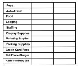
MAKE A LIST OF ALL POSSIBLE COSTS. THERE ARE THE OBVIOUS LIKE TRANSPORTATION, LODGING AND MEALS. AND THE COSTS OF DISPLAYS, PACKING AND MARKETING. AND THE COSTS OF THE PARTS USED TO MAKE THE PIECES WHICH SELL.
ENTRY FEES WILL VARY WIDELY FROM SHOW TO SHOW. THEY COULD COST $25/DAY UP TO $400 AND UP PER DAY. THEY COULD GO AS HIGH AS $5000 PER DAY.
IF YOU HAVE A SPECIFIC CRAFT SHOW IN MIND, REVIEW THEIR RULES, AND WHAT THEIR ENTRY FEES COVER, AND DO NOT COVER. WHAT ARE THE COSTS OF EXTRAS, LIKE ELECTRICITY, TABLES, SPECIAL LIGHTING? DO THEY ALSO COLLECT A PERCENT OF SALES? DO THEY OFFER SPECIAL SERVICES, LIKE BOOTH SITTING, FOR EXTRA FEES? IS PARKING FREE, OR DO THEY CHARGE? DO YOU NEED TO PROVIDE ADDITIONAL INSURANCE? WILL YOU NEED TO PURCHASE SPECIAL LICENSES, REGISTRATIONS AND PERMITS, SUCH AS AN OUT OF STATE WHOLESALE LICENSE?
YOU NEED TO PREPARE A PLAN AND A BUDGET…
…TO BE SURE YOU CAN PAY FOR WHAT YOU ARE COMMITTING YOURSELF TO.
(1) Understand different types of costs and how to account for them
(2) Learn to apply simple Breakeven Analysis Formula
(3) Set revenue goals
(4) Determine how much inventory you need to bring with you
(5) Think about reinvestment
4.1. Types of Costs
FIXED COSTS: FIXED COSTS ARE COSTS THAT REMAIN THE SAME, REGARDLESS OF HOW MANY ITEMS YOU SELL AT YOUR CRAFT FAIR.
FIXED COSTS INCLUDE THINGS LIKE FEES, TRAVEL, FOOD, AND STAFFING. AGAIN, YOU HAVE TO LAY OUT THIS MONEY FOR FIXED COSTS, WHETHER YOU MADE NO MONEY AT ALL, OR MADE A BUCKET FULL OF MONEY AT YOUR CRAFT FAIR.
VARIABLE COSTS: VARIABLE COSTS ARE COSTS THAT GET INCURRED WHEN EACH UNIT IS SOLD.
THUS, VARIABLE COSTS FLUCTUATE BASED ON THE NUMBER OF UNITS SOLD. IF YOU SELL VERY FEW PIECES, YOUR VARIABLE COSTS ARE SMALL, IF YOU SELL A LOT OF PIECES, YOUR VARIABLE COSTS WILL BE MUCH HIGHER.
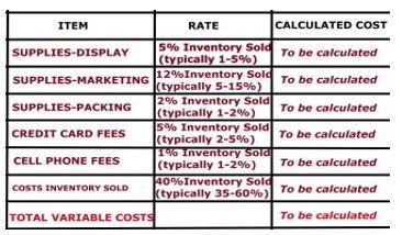
VARIABLE COSTS INCLUDE SPECIAL PACKAGING AND DISPLAYS, BROCHURES AND BUSINESS CARDS HANDED OUT WITH EACH SALE, CREDIT CARD FEES YOU ARE CHARGED BY THE BANKS AFTER EACH SALE, AND THE COST OF THE PARTS USED TO MAKE EACH PIECE THAT HAS SOLD.
WE ESTIMATE VARIABLE COSTS USING SOME INDUSTRY STANDARDS ABOUT THE PERCENT OF TOTAL SALES (USING RETAIL PRICES) THESE COSTS ARE ASSOCIATED WITH.
WHEN WE CALCULATE THE COST OF INVENTORY, WE DIFFERENTIATE BETWEEN THE COST OF THOSE PIECES WHICH WE HAVE SOLD FROM THE COST OF THOSE PIECES WE DID NOT SELL.
FOR PURPOSES OF DEVELOPING A BUDGET AND CALCULATING A BREAK-EVEN ANALYSIS, TO HELP US DECIDE WHETHER A PARTICULAR CRAFT SHOW IS WORTH THE RISK, WE FOCUS ONLY ON THE ESTIMATES BASED ON WHAT WE SELL.
NOTE: There are two other costs we do not deal with in a breakeven analysis, but have big impacts on your business decisions:
1. INVENTORY COSTS. Breakeven Analysis deals with the costs of your inventory which has sold. But you have to bring a lot more pieces with you, and will only sell a proportion of them, typically 25% is a good goal. You will still have to come up with enough cash to cover the full cost of putting together an inventory.
2. REINVESTMENT COSTS. Out of your profits, you will want to reserve some money to buy more jewelry making supplies beyond what you already have and beyond what you need to replace the items sold. You will also want to invest in new displays, packaging, additional marketing and the like. For new businesses, these reinvestments are usually 20–25% or more of your profit. If you think you need to make $100.00 to cover your business and personal costs, perhaps, with an eye on reinvestment, you need to up that goal to $125.00.
4.2 Learn to apply simple Breakeven Analysis Formula
BREAKEVEN ANALYSIS
I WANT TO INTRODUCE YOU TO A QUICK AND DIRTY BREAKEVEN ANALYSIS. I CALL THIS “QUICK AND DIRTY” BECAUSE WE ARE USING IMPERFECT INFORMATION. HOWEVER, THIS IMPERFECT INFORMATION IS GOOD ENOUGH TO HELP US MAKE A DECISION WHETHER A PARTICULAR CRAFT SHOW IS WORTH THE RISK.
YOUR BREAKEVEN POINT IS WHERE YOU HAVE SOLD ENOUGH INVENTORY TO COVER YOUR FIXED AND VARIABLE COSTS. WE EQUATE “INVENTORY” WITH THE TOTAL RETAIL DOLLARS TAKEN IN.
WE USE OUR QUICK AND DIRTY BREAKEVEN ANALSIS TO ANSWER THE QUESTION:
HOW MUCH INVENTORY DO I NEED TO SELL IN ORDER TO BREAK EVEN?
LET’S FAMILIARIZE OURSELVES MORE WITH THE COMPONENTS OF THE FORMULA, AND THEN REVIEW THE MATH.
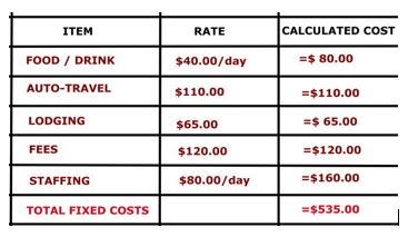
EXAMPLE: 2-Day Craft Show, 200 miles away, and you need 1 extra person
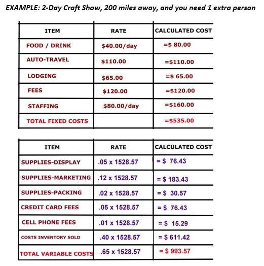
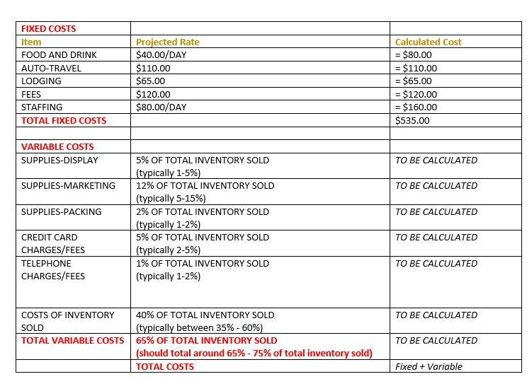
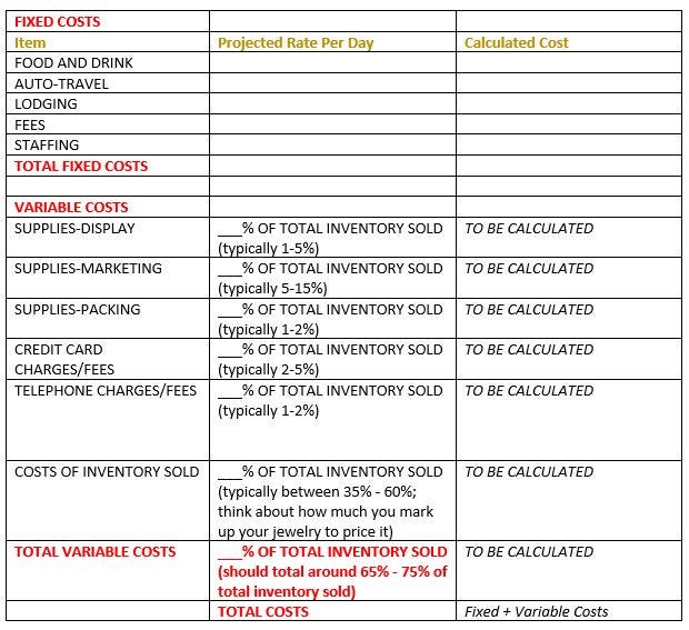
SAY YOU WILL BE DOING A 2-DAY CRAFT SHOW OUT OF TOWN, 200 MILES AWAY FROM HOME. AND YOU WILL NEED TO HIRE 1 PERSON TO HELP YOU. LET’S LOOK AT OUR BUDGET FOR DOING THIS PARTICULAR CRAFT SHOW. YOU HAVE BUDGETED FOR YOUR FIXED AND VARIABLE COSTS AS SHOWN IN THE TABLE. I HAVE PLUGGED IN SOME TYPICAL NUMBERS INTO THIS BUDGET TABLE.
OUR FIXED COSTS ARE RELATIVELY EASY TO FIGURE OUT.
OUR VARIABLE COSTS, HOWEVER, WILL HAVE TO BE ESTIMATED.
THESE VARIABLE COSTS ARE KEYED OFF THE ESTIMATED SALES DATA (KEYED OFF OF RETAIL PRICES YOU SET FOR YOUR JEWELRY). In the chart above, $1528.57 is the estimated sales we think we will get at the craft show, stated in total retail prices. [We can estimate our sales because we expect to sell 25% of the total inventory brought. In this case, we would have brought 4*1528.57 or $6114.28 (at retail pricing). ]
[So, if we marked up our inventory by 3, in this case, our wholesale costs for these sales would have been $1528.57/3 or $509.52, but the cost to us of all the inventory we brought with us would be $6114.28/3 or $2038.09.]
WE WILL USE SOME INDUSTRY PERCENT OF ITEMS SOLD PRICE STANDARDS, These are usually stated as some percent of every dollar sold (at retail pricing). AS WELL AS OUR BREAKEVEN ANALYSIS FORMULA TO HELP US FIGURE OUT THE “TO BE CALCULATED” VARIABLE COSTS IN OUR BUDGET TABLE.

FOR EXAMPLE,
I HAVE USED 12% AS THE PROPORTION OF THE TOTAL RETAIL PRICE THAT WOULD BE SPENT ON MARKETING COSTS. THE COSTS WOULD INCLUDE BROCHURES, BUSINESS CARDS, A POST CARD MAILING, SOME PROMOTIONAL ADS, AND SOME EFFORT TO CONTACT PREVIOUS CUSTOMERS TO LET THEM KNOW YOU WILL BE AT THIS CRAFT SHOW. THE INDUSTRY STANDARD FOR MARKETING RANGES BETWEEN 5 AND 15 PER CENT. IF YOU ARE GETTING STARTED, YOU CAN USE MY NUMBERS PRESENTED IN THIS TABLE. AFTER YOU HAVE DONE A FEW CRAFT SHOWS, YOU CAN BEGIN TO ANALYZE YOUR OWN SALES AND COST DATA, TO DEVELOP WHAT ARE CALLED MULTIPLIERS FOR EACH VARIABLE LINE-ITEM CATEGORY.
BREAKEVEN FORMULA
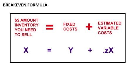
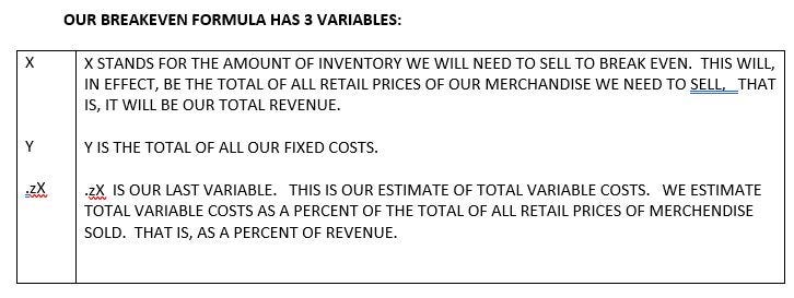
OUR BREAKEVEN FORMULA HAS 3 VARIABLES:
LET’S TRY SOME MATH:
LOOK BACK AT OUR DEVELOPING BUDGET TABLE.
Y, WHICH IS OUR FIXED COSTS TOTAL = $535.00
.z IS THAT PERCENT OF REVENUE REPRESENTING TOTAL VARIABLE COSTS.
.z= .65 (.65 IS SUM OF OUR MULTIPLERS IN OUR BUDGET TABLE
.05+.12+.02+.05+.01+.40)
SOLVE FOR X
NEXT, USING OUR BREAKEVEN FORMULA, WE SOLVE FOR X
TO SOLVE FOR X, WE NEED TO RE-ORGANIZE OUR FORMULA SO THAT THE X VARIABLE, WHICH OCCURS TWICE IN OUR FORMULA, IS ALL PUT ON ONE SIDE OF THE EQUATION.
THIS IS HOW WE SOLVE THIS FORMULA:
a. WE START WITH:
X = 535.00 + .65X
b. WE MOVE THE .65X TO THE LEFT SIDE, BY SUBTRACTING IT FROM BOTH SIDES
X-.65X = 535.00
c. WE COMBINE BOTH X VARIABLES, WHICH IN EFFECT, LET’S US SUBTRACT THE .65X FROM 1X, LEAVING US WITH .35X
.35X = 535.00
d. WE DIVIDE BOTH SIDES OF THE EQUATION BY .35, TO GIVE US 1X
X = 535/.35
e. AND WE GET OUR BREAKEVEN POINT
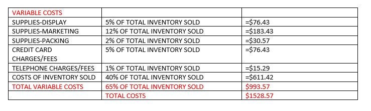
X = $1528.57 (total inventory at retail price we need to sell to break even, given our fixed and variable costs)
SO, TO BREAK EVEN,
WE WOULD NEED TO SELL A RETAIL TOTAL OF $1528.57 OF MERCHANDISE AT OUR 2-DAY SHOW.
TO SELL THAT MUCH INVENTORY, WE WOULD NEED TO BRING ABOUT 4 TIMES THAT MUCH, OR $6,000.00 OF INVENTORY WITH US.
LET’S LOOK AT OUR RESULTING VARIABLE COSTS CALCULATIONS.
NOW, LET’S REVIEW OUR BREAKEVEN ANALYSIS WITH ANOTHER EXAMPLE.
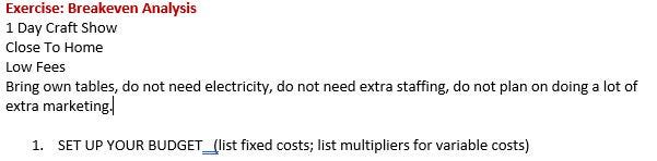
SAY YOU ARE DOING A 1-DAY CRAFT SHOW CLOSE TO HOME, LOW FEES, YOU BRING YOUR OWN TABLES, DON’T NEED ELECTRICITY, AND DON’T NEED EXTRA STAFFING. YOU DON’T PLAN ON DOING A LOT OF MARKETING.
FIRST, YOU BEGIN TO SET UP A BUDGET.
HERE WE HAVE FIXED COSTS EQUAL TO $70.00.
OUR VARIABLE COSTS WE ESTIMATE TO BE 54% OF OUR TOTAL REVENUES.
NEXT, WE CALCULATE OUR BREAKEVEN POINT, USING OUR QUICK AND DIRTY FORMULA.
WE SEE OUR BREAKEVEN POINT IS $152.17.
AND, USING OUR RULE OF THUMB ABOUT HOW MUCH INVENTORY TO BRING,
WE NEED TO BRING 4 X $152.17, OR ABOUT $600.00 OF INVENTORY.

4.3 Set Revenue Goals
First, you do a BREAKEVEN ANALYSIS to determine the minimum amount of revenue you need to generate, in order to cover all your fixed and variable costs.
After you reach your Breakeven Point, you begin to generate a Profit. At this point, you have already covered all your fixed costs. For each additional piece of jewelry you sell, you mostly will only have to cover the variable costs. If your fixed costs in your breakeven analysis were 35% of your sales, then your profit will be roughly 35% of your sales, above this breakeven point.
HOW MUCH OF A PROFIT GOAL YOU WANT TO SET IS YOUR PERSONAL CHOICE. HOWEVER, I LIKE TO TELL STUDENTS THAT BREAKING EVEN AT THE SHOW ITSELF IS OK, IF YOU ALSO HAVE STRATEGIES IN PLACE TO GENERATE FOLLOW-UP SALES, EITHER THROUGH REPEAT SALES BETWEEN SHOWS, OR REPEAT SALES AT THE NEXT SHOW.
4.4 Determine How Much Inventory You Need To Bring
A GOOD RULE OF THUMB FOR FIGURING OUT HOW MUCH INVENTORY TO BRING IS THIS:
YOU WILL NEED TO BRING WITH YOU, AT A MINIMUM, 4 TIMES THE INVENTORY YOU HOPE TO SELL.
FOR EXAMPLE, IF YOU NEED TO SELL $200.00 OF MERCHANDISE TO BREAKEVEN, YOU WILL NEED TO BRING $800.00 OF MERCHANDISE WITH YOU. AGAIN, $800.00 IS THE TOTAL OF ALL THE RETAIL PRICES OF WHAT YOU BRING.
CONTINUE THIS EXAMPLE: IF YOU WANT TO TAKE IN ANOTHER $100.00 OF SALES ON TOP OF YOUR BREAKEVEN, THEN YOU WILL NEED TO SELL $300.00 OF MERCHANDISE, THEN, YOU WILL NEED TO BRING A TOTAL OF $1200.00 OF INVENTORY. THIS IS $400.00 MORE INVENTORY THAT YOU WOULD NEED TO BRING TO MAKE ONE HUNDRED MORE DOLLARS OVER YOUR BREAKEVEN POINT. AGAIN, $1200.00 IS THE TOTAL OF ALL THE RETAIL PRICES.
WE ARE GOING TO TALK ABOUT INVENTORY IN TERMS OF RETAIL PRICES, NOT IN TERMS OF NUMBERS OF ITEMS, AND NOT IN TERMS OF WHOLESALE COSTS.. OUR TOTAL INVENTORY WOULD EQUAL THE TOTAL OF ALL RETAIL PRICES, IF EVERY PIECE SOLD.
4.5 Think about reinvestment
AS WE GO BEYOND OUR BREAKEVEN POINT, AND BECOME PROFITABLE
WE COULD HAVE USED THAT REMAINING 35 CENTS OUT OF EACH DOLLAR OF ADDITIONAL REVENUE TO PAY FOR SOME OF OUR INVESTMENT COSTS, AS WELL AS PAY OURSELVES SOMETHING.
INVESTMENT COSTS ARE THINGS YOU PAY FOR WHICH EITHER HAVE TO LAST A VERY LONG TIME, AND WHICH YOU WILL USE AT MANY, MANY CRAFT SHOWS, OR WHICH INVOLVE EXPANDING YOUR CORE JEWELRY MAKING SUPPLIES INVENTORY BEYOND WHAT YOU NEED TO REPLACE THE PARTS REPRESENTED BY THE ITEMS SOLD.
THESE INCLUDE “LONG TERM ASSETS”, SUCH AS BUYING TABLES AND CHAIRS, A TENT, AND DISPLAY CASES. THESE ALSO INCLUDE “LONG TERM LIABILITIES”, SUCH AS PAYING DOWN LOANS AND CREDIT CARD CHARGES.
WE DO NOT INCLUDE THESE INVESTMENT COSTS IN OUR BREAK-EVEN ANALYSES.

LESSON 5: GET THOSE APPLICATIONS IN EARLY
JOHN JACOB THOUGHT HE COULD SET UP ANYWHERE AND ANYTIME.
SO HE MISSED THE APRIL 30TH DEADLINE FOR THE RED HILLS FAIR. AND HE SENT IN AN INCOMPLETE APPLICATION WITHOUT THE REQUIRED PICTURES TO NAPA SWEETS FESTIVAL.
AND HE DIDN’T TAKE SERIOUSLY THE FACT THAT NAPLES SYMPHONY DAYS WAS A JURIED COMPETITION. AND HE COULDN’T UNDERSTAND HOW ADDING ONE MORE JEWELRY VENDOR TO THE ROCKY MOUNTAIN SHOWROOM WOULD MAKE MUCH OF A DIFFERENCE.

HE HAD CALCULATED THAT HE NEEDED TO DO 4 SHOWS A YEAR TO MAKE A LIVING. BUT FOR SEVERAL YEARS NOW, ALTHOUGH HE HAD APPLIED TO AT LEAST 12 SHOWS EACH YEAR, HE RARELY WAS APPROVED FOR MORE THAN 2.
Application/Acceptance Process
Read ALL THE FINE PRINT. COMPLETE the Application forms COMPLETELY. Be sure to meet all DEADLINES. Include your CHECK/MONEY ORDER for all required PREPAYMENTS and DEPOSITS.
If you need special arrangements, be sure to negotiate these up front. Do you need electricity or special lighting or special access? Do you prefer to have a particular location or table arrangement? Will your displays conform to the show’s expectations, requirements and limitations? If you will be doing demonstrations, will all your equipment and tools meet show requirements or not? Do you need to be on a corner?
Is this a juried show?
Are there additional costs besides the booth rental, such as required advertising expenses, parking fees, electricity fees, tables and chairs, insurance requirements, and the like?
Are there are restrictions as to the type of merchandise allowed, such as a requirement that all merchandise be hand-crafted by the artist.
Are promotional materials such as brochures or postcards provided to exhibitors?
Be sure to find out ahead of time,
– what times you have to be ready and fully set up in your booth
– what time you have to wait until before you can take down your booth
how early you can begin to set up your booth
THE APPLICATION
1. PREPARE A GENERIC APPLICATION
2. UNDERSTAND THE JURIED SELECTION PROCESS
3. SUBMIT APPLICATIONS AND FOLLOW-UP ON THEM
4. SCHEDULE YOURSELF FOR THE YEAR
5.1. PREPARE A GENERIC APPLICATION
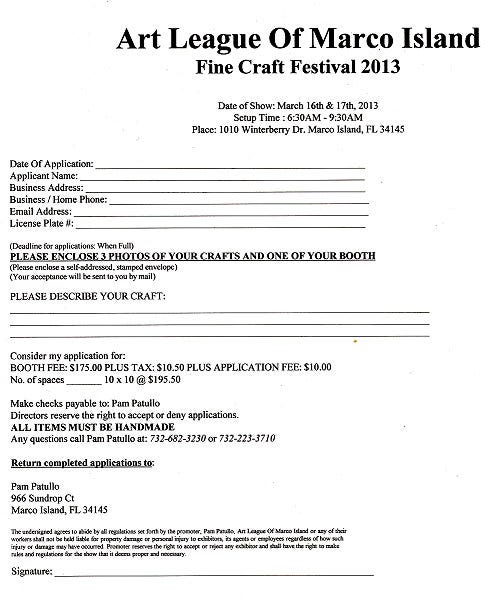
SOME ORGANIZATIONS HAVE A FORMAL, PRINTED APPLICATION FORM TO FILL OUT. MORE AND MORE, HOWEVER, ORGANIZATIONS ARE USING ON-LINE APPLICATION SERVICES. I SUGGEST CREATING A GENERIC APPLICATION FORM, FROM WHICH YOU CAN CUT AND PASTE INTO THESE PRINTED OR ONLINE APPLICATION FORMS.
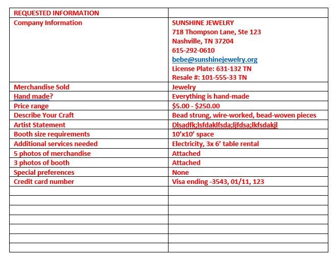
THEY MAY ASK YOU FOR THESE TYPES OF INFORMATION:
1. COMPANY INFORMATION, ADDRESS, PHONE, EMAIL, CONTACT PHONE, ONSITE-CONTACT PHONE, WEBSITE,
LICENSE PLATE #, RE-SALE OR TAX NUMBER AND STATE WHICH ISSUED IT
2. TYPE OF MERCHANDISE TO BE SOLD
3. HAND-MADE?
4. HIGH AND LOW PRICE RANGE OF MERCHANDISE
5. DESCRIBE YOUR CRAFT (TECHNIQUES, MATERIALS, DESIGNS)
6. ARTIST STATEMENT (ABOUT 150–250 WORDS)
7. BOOTH SIZE REQUIREMENTS (WILL YOU NEED MORE THAN ONE 10’X10’ BOOTH SPACE?)
8. REQUIREMENTS FOR ADDITIONAL SERVICES, SUCH AS ELECTRICITY, TABLE AND CHAIR RENTAL, TENT
9. 5 (five) PHOTOS OF YOUR CRAFTS (BE SURE YOUR PHOTOS ARE SHARP AND ATTRACTIVE, AS IF THEY WERE PUBLISHED IN A BOOK. NO DARK PHOTOS.) WITH PHOTOS, YOU MIGHT NEED SLIDES, OR YOU MIGHT NEED .jpg IMAGES THAT ARE 72–96 dpi, OR YOU MIGHT NEED HI-RESOLUTION .jpg IMAGES WHICH ARE 300 OR 600 dpi. They may need to be in 8-bit color or 16-bit color. They may need to use a RGB color scale or another color scale. They might specify a specific width and height in pixels. BE PREPARED WITH EACH OF THESE.
10. 3 (three) PHOTOS OF YOUR BOOTH SET-UP (THEY WANT VISUALLY APPEALING, CUSTOMER ENTICING, USER FRIENDLY BOOTH SET-UPS. AGAIN, NO DARK PHOTOS.)
11. LIST OF SPECIAL PREFERENCES, SUCH AS “CORNER BOOTH, IF AVAILABLE”
12. CREDIT CARD NUMBER, EXPIRATION DATE, SECURITY CODE NUMBER (THEY WILL PROBABLY WANT THIS NUMBER TO KEEP ON FILE)
5.2. UNDERSTAND THE JURIED SELECTION PROCESS
AT THIS POINT, YOU HAVE SELECTED SHOWS WHICH YOU FEEL ARE A GOOD FIT WITH YOUR BUSINESS.NOW, DETERMINE IF YOU ARE ELIGIBLE FOR THEM. DO THEY PUT ANY LIMITATIONS ON WHO CAN AND CANNOT APPLY? DO THEY REQUIRE THAT YOUR CREATIVE WORK BE JURIED?
MOST CRAFT SHOWS MAKE SIMPLE ACCEPTANCE DECISIONS BASED ON
— SUBMITTING AN APPLICATION FORM, AND
— PAYING THE FEE
SOME MAY RESTRICT THE NUMBER OF JEWELRY VENDORS THEY ACCEPT, BECAUSE THEY WANT A BALANCE OF TYPES OF MERCHANDISE, AND OFTEN, TOO MANY JEWELRY VENDORS APPLY.
OTHER SHOWS WANT TO MAINTAIN SOME LEVEL OF MERCHANDISE QUALITY STANDARDS. THEY SUBJECT THE APPLICANT TO A MORE INTENSIVE JURY-REVIEW PROCESS. THE JURY PROCESS IS PROBABLY WHAT YOU WOULD EXPECT. USUALLY A FEW PEOPLE REVIEW ALL THE APPLICATIONS AND SCORE THEM AGAINST A SET OF CRITERIA. THEY CHOOSE THE ONES WHICH SCORE HIGHEST.
SOME TYPICAL CRITERIA THEY USE:
– PRODUCTS CONSIDERED BEST FOR THE SHOW
– AETHETICS AND VISUAL APPEAL
– FUNCTIONALITY
– CREATIVITY
– ORIGINALITY
– TECHNIQUE
– MARKETABILITY
– QUALITY OF WORK
– BOOTH DESIGN
THEY WANT TO END UP WITH VENDORS WHOSE WARES WILL SELL, WHERE THERE WON’T BE MUCH DUPLICATION, AND WHOSE PRESENCE AND SET-UP IS EXCITING FOR THE PEOPLE WHO ATTEND THE SHOW. YOUR SHORT WRITE-UP AND SUBMITTED PHOTOGRAPHS NEED TO MAKE YOUR CASE.
WHAT DOES IT MEAN WHEN A JUROR SAYS “NO!”?
MOST REJECTIONS ARE BASED ON THE LIMITED NUMBER OF OPENINGS
— PARTICULARLY FOR JEWELRY VENDORS. ANOTHER MAJOR REASON FOR REJECTIONS IS THE POOR QUALITY OF PHOTOS SUBMITTED. LOOK AT YOUR PHOTOS. SHARE THEM WITH SOME FRIENDS. JUDGE THEM ACCORDING TO THE PREVIOUSLY DISCUSSED JUDGING CRITERIA. HOW WELL DO THEY MAKE YOUR CASE? ARE THEY CLEAR, FOCUSED, BRIGHT?
5.3. SUBMIT APPLICATIONS AND FOLLOW-UP ON THEM
YOU HAVE CREATED YOUR LIST OF POSSIBLE SHOWS, BASED ON YOUR SENSE OF FIT, THE GOALS YOU HAVE SET FOR YOURSELF, AND YOUR BUDGET, GIVEN THE COSTS INVOLVED. YOU HAVE DETERMINED WHETHER YOU ARE ELIGIBLE FOR THEM. DECIDE ABOUT HOW MANY SHOWS YOU WANT TO DO A YEAR. SELECT 5–10 MORE SHOWS IN ADDITION TO THE NUMBER YOU WANT TO DO. ANOTHER RULE OF THUMB IS TO SELECT 3 EVENTS TO APPLY TO FOR EACH WEEKEND YOU WANT TO WORK.
GET THEIR APPLICATION FORMS, AND REVIEW THE RULES AND APPLICATION DEADLINES. READ ALL THE RULES!
DETERMINE HOW LONG THEIR REVIEW PROCESSES ARE, AND FIGURE OUT WHEN YOU SHOULD KNOW WHETHER YOUR HAVE BEEN ACCEPTED.
CALL OR EMAIL EACH ONE, AND VERIFY THAT ALL THE INFORMATION YOU HAVE — DATES, FEES, APPLICATION REQUIREMENTS, DEADLINES — ARE TRUE.
- **NOTE: THINGS CHANGE. THINGS GET PRINTED WRONG.
5.4. SCHEDULE YOURSELF FOR THE YEAR
ORGANIZATION IS CRITICAL HERE. GET A GOOD 3-YEAR CALENDAR. MAP EVERY DATE OUT. APPLICATION DEADLINE. APPLICATION ACCEPTANCE NOTIFICATION. DEADLINE FOR NOTIFYING THEM, CONFIRMING YOUR ACCEPTANCE, AND SUBMITTING ANY UP-FRONT FEES. SHOW DATES, INCLUDING SET-UP AND BREAK-DOWN DATES AND TIMES. REMEMBER, FOR MANY CRAFT SHOWS, YOU WILL BE APPLYING 6–12 MONTHS AHEAD OF TIME.
IT TAKES A LOT OF COORDINATED EFFORT TO KEEP EVERYTHING ON TRACK.YOU MIGHT SET UP A SPREAD-SHEET OR DATA-BASE. I USE THE ONLINE CALENDAR APPLICATION THAT COMES WITH MY EMAIL PROGRAM. I SET UP AUTOMATIC REMINDERS, SO THEY POP UP WHEN I NEED TO TAKE ACTION.
AFTER YOU SEND IN YOUR FEES, FOLLOW-UP IN 2 WEEKS TO BE SURE THEY RECEIVED YOUR APPLICATION AND PAYMENT.
5.5. BEFORE SAYING YES!…
RE-REVIEW YOUR
- FIT WITH THE SHOW
— BREAK-EVEN ANALYSIS
— CALENDAR SCHEDULE
— THE MONEY NEEDED UP-FRONT
AND,
— WHETHER THERE ARE ANY CANCELLATION PENALTIES OR RULES
— WHAT KINDS OF LOCAL AND STATE LICENSES, CERTIFICATES AND PERMITS YOU WILL NEED,AND IF THE SHOW PROMOTERS ASSIST YOU IN OBTAINING TEMPORARY ONES FOR THE DURATION OF THE SHOW
LESSON 6: PROMOTE, PROMOTE, PROMOTE
YOU NEED TO ACTIVELY PROMOTE YOURSELF BOTH BEFORE AND AFTER THE SHOW. DO NOT RELY ON THE SHOW PROMOTERS TO DO ALL THE MARKETING.
ABOUT 2–4 WEEKS BEFORE THE SHOW:
a. CONTACT YOUR EXISTING CUSTOMERS — EMAIL, MAIL, SOCIAL NETWORK SITES
b. PROMOTE YOUR MESSAGE TO POTENTIAL CUSTOMERS. LEAVE FLYERS AND BROCHURES AT RELEVANT BUSINESSES OR ORGANIZATIONS/ POST MESSAGES ON SOCIAL NETWORK SITES/ POST MESSAGES ON YOUR OWN WEBSITE OR BLOG/ GET LISTED ON COMMUNITY CALENDARS/ TELL PEOPLE YOU INTERACT WITH. IN YOUR PROMOTIONS, BE SURE YOU HAVE ALL THE DETAILS LISTED CORRECTLY. IN A SHORT, CATCHY PHRASE OR SENTENCE, TELL WHY THIS EVENT WOULD BE OF PARTICULAR INTEREST TO THEM. YOU MIGHT OFFER SPECIAL DISCOUNTS, IF THEY PRESENT YOUR CARD OR EMAIL NOTICE.
c. BE SURE YOU ARE GOING TO LOOK PRESENTABLE. IF YOU NEED A HAIR-CUT, GET IT. BE SURE YOU HAVE ALL THE CLOTHES YOU NEED. CHECK YOUR SUPPLY OF BUSINESS CARDS, BROCHURES, OTHER PROMOTIONAL MATERIALS. PRACTICE SAYING YOUR SELLING POINTS. BE STRATEGIC ABOUT WHICH PIECES OF JEWELRY YOU ARE GOING TO WEAR AT THE SHOW.
AT THE SHOW:
HAVE YOUR BUSINESS CARDS, AND ANY BROCHURES, IF YOU HAVE THEM, OUT FOR THE TAKING. IT HELPS IF YOUR BUSINESS CARDS HAVE AN IMAGE OF YOUR JEWELRY ON THEM. TO HELP PEOPLE REMEMBER YOU.
HAVE A BOOK OR SIGN-UP SHEET WHERE PEOPLE CAN LIST THEIR NAMES, MAILING AND EMAILING ADDRESSES.
AFTER THE SHOW:
UPDATE YOUR CUSTOMER DATABASE. STAY IN TOUCH WITH YOUR NEW CUSTOMERS, SUCH AS WITH A FOLLOW-UP MAILING OR EMAILING. DIRECT YOUR NEW CUSTOMERS TO YOUR WEBSITE OR OTHER WAYS OF CONTACTING YOU AND SEEING YOUR PIECES WHICH ARE FOR SALE.

LESSON 7: SET UP FOR SUCCESS
IMOGENE MCALLISTER ROSENSTEIN. REMEMBER SHE HAD NO PLAN OR STRATEGY FOR CHOOSING SHOWS. AND, GUESS WHAT, SHE HAD NO PLAN OR STRATEGY FOR SETTING UP AT SHOWS, EITHER.
IMOGENE, BLESS HER HEART, LOVED PLAIDS. SHE WOULD SET UP A TABLE, AND COVER IT WITH A DARK, PLAID CLOTH, AND LAY HER JEWELRY ONTO THE CLOTH. SHE LIKED TO PUSH HER TABLE UP TO THE FRONT OF THE BOOTH, AND SIT IN A CHAIR BEHIND IT.
HER BOXES OF SUPPLIES AND INVENTORY, WERE STACKED UP AGAINST THE BACK OF HER BOOTH, NO EFFORT TO DISGUISE OR HIDE THEM.
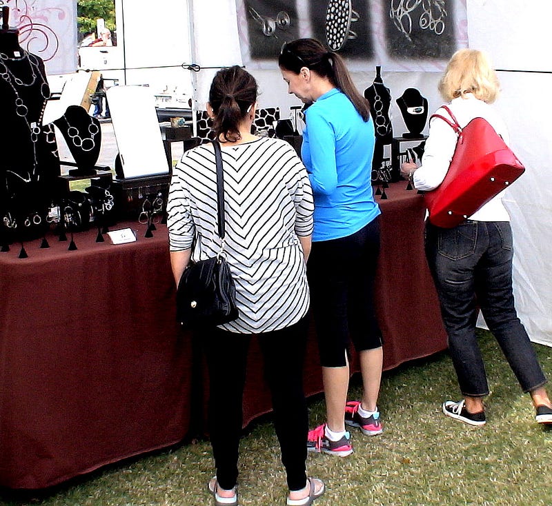
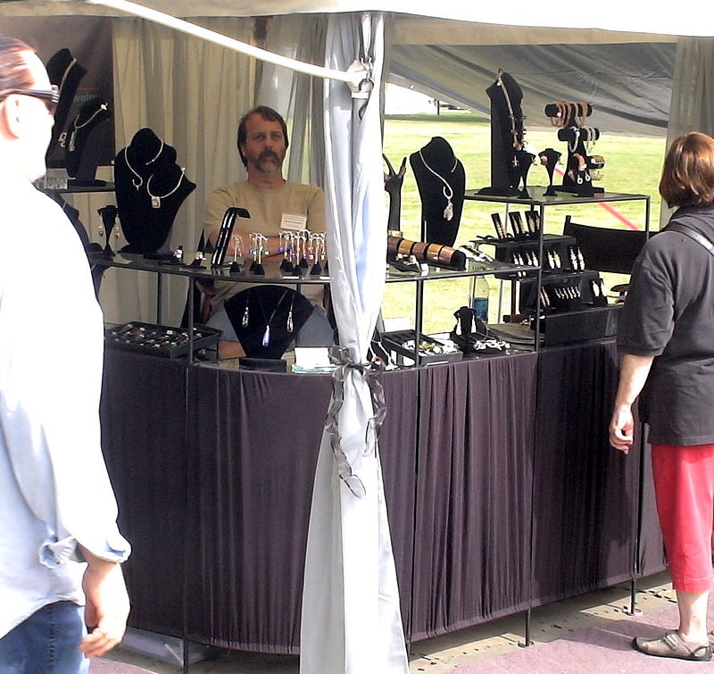
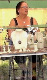
YOUR BOOTH IS YOUR SHOP.IT SHOULD BE COHESIVE, VISUALLY INTERESTING, FUNCTIONAL. YOU DO NOT WANT YOUR BOOTH TO BE DISORGANIZED, DIS-INVITING, INTIMDATING.
SETTING UP FOR SUCCESS MEANS HAVING A GOOD UNDERSTANDING OF
7.1. BOOTH DESIGN
7.2. LAY-OUT AND TABLE SET UP
7.3. MERCHANDISE DISPLAY
7.4. SIGNAGE
7.5. LOADING AND UN-LOADING
WALLS: FIRST, WILL THIS SPACE BE ENCLOSED IN SOME WAY — WALLS, PARTITIONS, INSIDE A TENT?
DO YOU WANT TO HAVE WALLS? DO THE WALLS NEED TO BE FABRIC, WOOD, WIRE GRIDS OR CHICKEN WIRE? WHAT ARE YOU GOING TO DO WITH THE WALLS? CAN THINGS BE HUNG. HOW DO THESE WALLS AFFECT THE VISIBILITY OF YOUR BOOTH SPACE AND YOUR INVENTORY?
AS BEST AS I CAN, I LIKE TO USE MATERIALS AND FURNISHINGS WHICH WILL NOT DIMINISH THE VISIBILITY OF MY BOOTH, AND WHICH CAN DO DOUBLE-TIME. I OFTEN USE WINDOW SHUTTERS OR WIRE GRIDS FOR WALLS AND RACKS, SO THAT I CAN HANG THINGS FROM THEM.
THE CONTAINERS I USE TO TOTE MY INVENTORY AND SUPPLIES GET USED FOR DISPLAYS, OR AS SUPPORT COLUMNS FOR DISPLAYS.

TENT: IF YOU NEED A TENT, SOME SHOWS PROVIDE THEM OR RENT THEM. SOME SHOWS HAVE DETAILED REQUIREMENTS FOR WHAT TENTS SHOULD LOOK LIKE. SOMETIMES THEY WANT ALL TENTS TO BE WHITE. YOU CAN FIND ONLINE SOURCES FOR BUYING TENTS. YOU WANT A TENT WHERE YOU CAN ROLL THE WALLS UP AND DOWN. BE SURE YOU HAVE TENT WEIGHTS, TO DEAL WITH WINDY WEATHER. SOMETIMES, IF THE AIR IS HOT AND HUMID, AND THE TENT WALLS ARE DOWN, THE AIR IN YOUR BOOTH BECOMES STALE AND HEAVY. DON’T LET THIS HAPPEN.
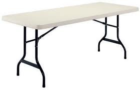

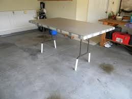
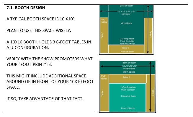
TABLE: SECOND, IF YOU ARE TO BE PROVIDED WITH TABLES, HOW MANY AND OF WHAT SIZE WILL THEY BE? I FIND 6’ BY 2’ TABLES TO BE ESPECIALLY EASY TO MANEUVER AND MANAGE.
FOR EACH TABLE, I HAVE CUT UP PVC PIPE
— TO STICK THE LEGS OF MY TABLES IN, AND TO ALLOW ME TO RAISE THE HEIGHT OF THE TABLES ABOUT 6–9” SO CUSTOMERS DO NOT TO HAVE TO BEND DOWN SO FAR TO VIEW THE INVENTORY.
I DON’T LIKE TABLES FLUSH WITH THE AISLE. IN SOME SETTINGS, THIS IS YOUR ONLY CHOICE. BUT THIS MAKES IT UNCOMFORTABLE FOR PEOPLE TO STAND THERE AND LOOK AT YOUR STUFF. THEY ARE TOO CONCERNED THEY MAY BLOCK SOMEONE IN THE AISLE. IF POSSIBLE, MOVE THE TABLES INWARD, SO YOU GET THEM TO FEEL LIKE THEY HAVE STEPPED INTO YOUR BOOTH.
ADDITIONAL FURNISHINGS: THIRD, WHAT KINDS OF ADDITIONAL FURNISHINGS WILL YOU NEED TO BRING? DO THINGS NEED TO GO ON SHELVES? IS THERE ROOM FOR SOME KIND OF RACK? DO YOU WANT TO PUT A RUG ON THE FLOOR, OR IN FRONT OF YOUR BOOTH? DO YOU WANT TO BRING BOX FANS (OR SPACE HEATERS)? WHAT WILL YOU USE TO STORE THINGS YOU NEED ACCESS TO DURING THE SHOW? BRING A MIRROR FOR YOUR CUSTOMERS.

LIGHTING: FOURTH, WHAT IS YOUR LIGHTING PLAN, AND TOWARDS THIS END, WILL YOU HAVE ACCESS TO ELECTRICITY? HAVING LIGHTING MAKES A BIG DIFFERENCE IN YOUR SALES RESULTS. BRIGHT LED LIGHTS, AT 4100k TO 5500k, ARE BEST. THIS KELVIN MEASURE WILL GIVE YOU A BLUISH WHITE LIGHT. BRING POWER STRIPS AND LONG EXTENSION CORDS. THERE MAY BE ELECTRICITY, BUT THE SOURCE OF THIS POWER MAY BE LOCATED FAR FROM YOUR BOOTH. IF THERE IS NO ELECTRICITY, YOU CAN PURCHASE BATTERY OPERATED LED LIGHTS
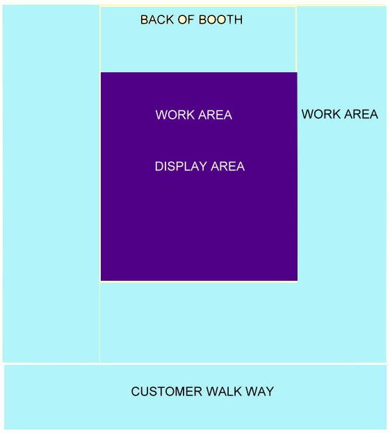
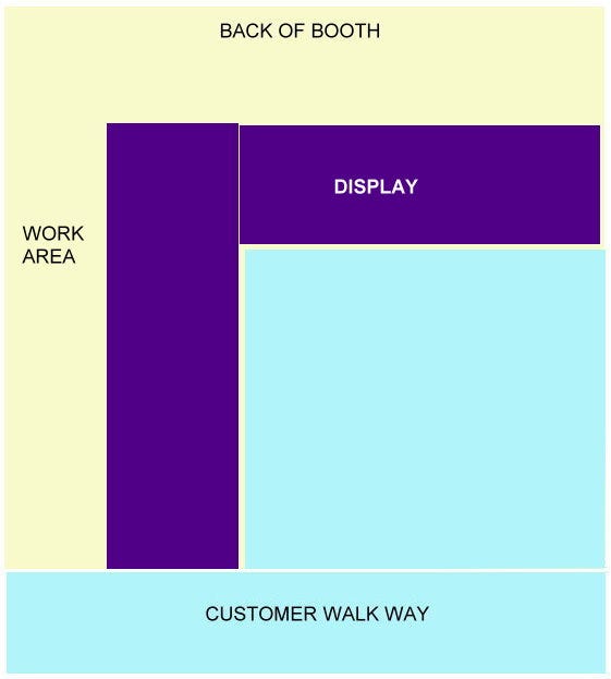
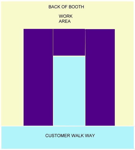
OPTIMUM FLOOR PLAN: FIFTH, GIVEN THE SPACE, WHAT IS THE OPTIMUM FLOOR PLAN FOR YOUR BOOTH? IF POSSIBLE, I PREFER TO ALLOW MY CUSTOMERS TO WALK INTO PART OF MY BOOTH. TOWARDS THIS END, AGAIN IF POSSIBLE, I LIKE TO SET THE TABLES UP EITHER IN AN “L-SHAPE” OR A “U-SHAPE”.

PRACTICE PRACTICE PRACTICE: LAST, PRACTICE SETTING EVERYTHING UP. PRACTICE PACKING YOUR THINGS, TRANSPORTING YOUR THINGS, AND UN-PACKING YOUR THINGS. IF YOU WILL BE USING A TENT, PRACTICE SETTING THIS UP. CAN YOU DO ALL THIS BY YOURSELF? GIVEN THE DISTANCE BETWEEN WHERE YOU WILL HAVE TO PARK, AND WHERE YOUR BOOTH IS, CAN YOU MANAGE TRANSPORTING ALL YOUR STUFF THIS DISTANCE.

ANTICIPATE THE TRAFFIC FLOW BOTH IN FRONT OF YOUR BOOTH, AS WELL AS INSIDE YOUR BOOTH, IF YOU CAN SET UP TO ALLOW PEOPLE TO COME INSIDE. REMEMBER: YOUR SPACE AND CUSTOMER FLOW GO BEYOND THE BOUNDARIES OF YOUR TABLE. REMEMBER: VISUALIZE HOW TRAFFIC WILL FLOW TO AND FROM EACH OF YOUR NEIGHBORS.
AS SHOPPERS WALK BY YOUR BOOTH, HOW MUCH OF IT CAN THEY SEE? ARE THERE THINGS, AND ENOUGH THINGS, TO CATCH THEIR EYE, AND ENTICE THEM TO STOP AND LOOK?
BE SURE THE DÉCOR OF YOUR BOOTH COORDINATES WELL WITH THE JEWELRY YOU ARE SELLING. IT MUST COORDINATE WITH THE SHOW, AS WELL. YOU DON’T WANT BEACH DÉCOR AT A CHRISTMAS HOLIDAY SHOW.
CAN CUSTOMERS…
– ENTER AND EXIT EASILY
– SHOP EASILY
– PAY EASILY
– NOT FEEL TRAPPED, WHEN A LOT OF PEOPLE ARE IN YOUR BOOTH
PREVENT THE “SCRATCHED TUSH” SYNDROME. CUSTOMERS AVOID STANDING WHERE THEY FEAR SOMEONE WILL BRUSH AGAINST THEIR BACK-SIDES.
SET UP A PAYMENT STATION WHERE CUSTOMERS CAN MAKE THEIR PURCHASES OUT OF THE WAY OF OTHER SHOPPERS BUT WHERE YOU CAN STILL KEEP AN EYE ON THINGS. AT YOUR PAYMENT STATION, YOU WILL NEED TO ACCEPT PAYMENT AND MAKE CHANGE, AND YOU WILL NEED TO BE ABLE TO WRITE SOME KIND OF CUSTOMER RECEIPT. YOU MAY NEED TO WRAP UP OR PACKAGE AN ITEM,
SOME ADDITIONAL QUICK POINTERS:
– COVER YOUR TABLES WITH FABRIC
– DON’T USE DARK COLORS.
THESE BRING THE MOOD DOWN, AND OFTEN DON’T ENHANCE YOUR JEWELRY IN THESE VERY OPEN SETTINGS.
– CHOOSE COLORS WHICH ADD TO YOUR PRODUCT, BUT DO NOT COMPETE WITH THEM
– CUSTOMERS LIKE TO USE ALL THEIR SENSES WHEN THEY SHOP: SEE, TOUCH, THINK
– SUBTLY USE PROPS AND MIRRORS TO HELP THE CUSTOMER VISUALIZE HOW THE PRODUCT MIGHT USED OR WORN
– I LIKE TO MAKE MY BOOTH FEEL HOMEY.
– I LIKE TO HAVE RUGS INSIDE AS WELL AS IN FRONT OF MY BOOTH
– I LIKE TO HAVE CHAIRS OR A BENCH NEAR THE FRONT OF MY BOOTH, TO ATTRACT PEOPLE TO SIT AND LINGER, AND SO IT ALWAYS LOOKS LIKE PEOPLE ARE LOOKING AT MY BOOTH
– IN HOT WEATHER, I LIKE TO HAVE A FAN CIRCULATING AIR WHERE THE CUSTOMERS ARE STANDING, NOT JUST ON ME.
– IN COLD WEATHER, I HAVE A HEATER GOING.
– NO GARBAGE SHOULD BE VISIBLE.
– EVERYTHING SHOULD BE STORED AND NEAT
– HAVE ENOUGH SIGNAGE TO GET PEOPLE’S ATTENTION, AND EDUCATE THEM ABOUT YOUR PRODUCTS
- DISPLAY YOUR PRICES CLEARLY

ANTICIPATE THE WEATHER
IS IT…
– HOT AND HUMID
– COLD
– RAINY OR STORMY
– WINDY
– DUSTY
HAVE DROP CLOTHS TO PROTECT YOUR MERCHANDISE AND DISPLAYS. I KEEP LARGE PIECES OF CARDBOARD THAT I CAN LAY ON WET GROUND, WHEN MY BOOTH IS OUTSIDE. SOMETIMES I TAKE A BALE OR TWO OF STRAW THAT I PURCHASED AT THE LOCAL HARDWARE STORE OR GARDEN CENTER, TO COVER WET GROUND. I HAVE PLENTY OF CLEANING AIDS, TO KEEP THE MERCHANDISE LOOKING FRESH AND SALEABLE ALL DURING THE SHOW.
I WEAR LAYERS OF CLOTHING. I BRING SUNGLASSES, GLOVES, HATS, A BATTERY-POWERED HAND-HELD FAN, WHATEVER IT TAKES TO KEEP ME PERKY, HAPPY AND COMFORTABLE.

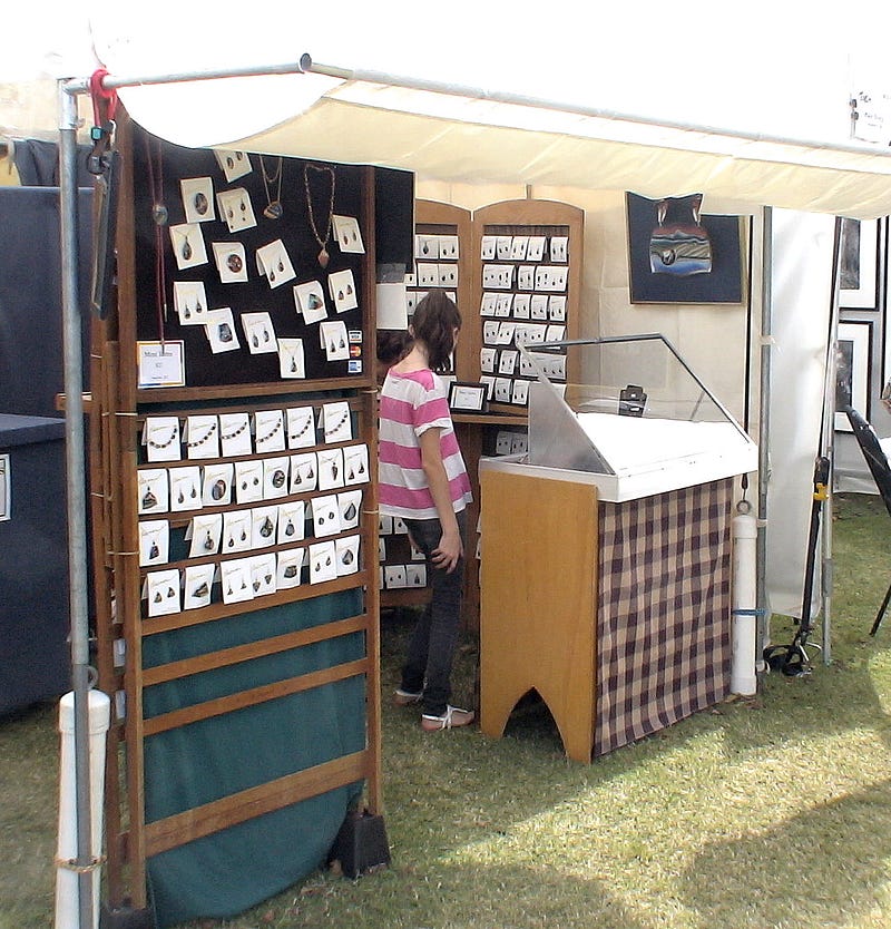
DISPLAYING YOUR MERCHANDISE: SOME POINTERS
COVER YOUR TABLES WITH ATTACTIVE FABRIC, IN A SOLID COLOR WHICH COMPLEMENTS YOUR PIECES. IN CRAFT SHOW SETTINGS, YOU WILL FIND THAT LIGHTER COLORS WORK BETTER THAN DARKER ONES. I THINK IT IS BETTER TO COVER THE FULL FRONT OF THE TABLE WITH A CLOTH, NOT JUST THE TOP OF THE TABLE.
HAVE PRETTY CONTAINERS TO HOLD YOUR WARES.
THINK OF DISPLAY IN TERMS OF LEVELS. YOU DO NOT WANT EVERYTHING LYING FLAT ON A TABLE. IN YOUR BOOTH, YOU MIGHT HAVE A MIX OF LOW TABLES, HIGHER TABLES, TALL HEIGHTS, STANDS, PEDESTALS, HANGING ITEMS
COORDINATE YOUR USE OF COLOR WITH THE COLORS PROMINENT IN YOUR BUSINESS CARDS, BROCHURES AND SIGNAGE.
A WARM, AIRY FEELING IS MUCH BETTER THAN A DARK, CAVE FEELING.
OPEN BOOK CASES WORK BETTER THAN ONES WITH CLOSED BACKS.
BE CAREFUL, IF USING DISPLAYS WHICH ARE GLASS ENCLOSED, THAT THE GLASS REFLECTION DOES NOT DIMINISH THE ABILITY TO VIEW JEWELRY INSIDE THESE DISPLAYS.
KEEP THINGS CREATIVE, BUT NOT COMPLEX OR CLUTTERED. DON’T LET THINGS GET BARREN, EITHER, — WHAT I CALL A “TOOTHLESS LOOK”
YOUR DISPLAYS SHOULD BE ATTRACTIVE, BUT SHOULD NOT COMPETE FOR ATTENTION WITH YOUR JEWELRY.ITH THIS IN MIND, YOU DO NOT NECESSARILY HAVE TO PUT ALL YOUR INVENTORY OUT AT ONCE.
CREATE NATURAL PLACES FOR THE CUSTOMER’S EYE TO SETTLE. BUILD DISPLAYS AROUND THESE NATURAL FOCAL POINTS.

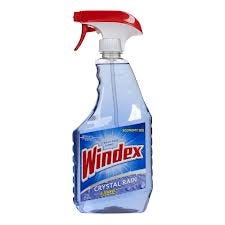
CLEAN. KEEP YOUR GLASS CLEAN. KEEP YOUR JEWELRY SHINY. KEEP YOUR BOOTH TIDY. YOU WANT THAT CUSTOMER AT 4PM SUNDAY TO BE AS EXCITED AS THAT CUSTOMER WAS AT 1PM THE DAY BEFORE.
7.4. SIGNAGE
FIRST AND FOREMOST, FOLLOW THE SHOW PROMOTER’S RULES ABOUT SIGNAGE.
Signs should generate interest and help sell your products. Don’t use “superlatives” like best, most, cheapest, largest and the like. In as few words as possible, tell the customer how your product will solve his or her problem, or meet his or her needs. Be positive and diplomatic in your wording. Writing “unruly kids will be sold as slaves” makes the point much better than “No Kids”.

Explain that which is not obvious. What’s it made of? When using the product, what must be avoided — such as getting it wet? Are there any disclaimers or conditions? What are the advantages of your product over others?

Use colors, typefaces, and images on your sign which have the same feel as your merchandise. Don’t overdo your signage, so that the signs overwhelm your inventory.

Be sure you have a clear, prominent sign that includes the name of your business. If your booths are number, this number should appear on the sign.

YOUR SIGN OR SIGNS SHOULD BE VISIBLE FROM ALL SIDES OF YOUR BOOTH FROM WHICH CUSTOMER WILL BE APPROACHING. IF THE BACK OF YOUR BOOTH WILL BE VISIBLE, PUT A SIGN THERE. PUT A SIGN ON THE INSIDE OF YOUR BOOTH. I LIKE TO HANG A POSTER-SIZED IMAGE OF SOMEONE WEARING A PIECE OF MY JEWELRY. I IMPRINT MY BUSINESS NAME ON THE POSTER.
YOUR SIGNS SHOULD BE SIMPLE, CLEAN AND WITH A CLEAR FONT. THE COLORS RED AND YELLOW ARE SEEN FROM THE FURTHEST DISTANCE AWAY.
YOUR SIGN SHOULD SAY WHAT YOU SELL, NOT NECESSARILY YOUR BUSINESS NAME FOR EXAMPLE: “JEWELRY TO LOVE” IS MUCH BETTER THAN “IMOGENE’S CREATIONS”
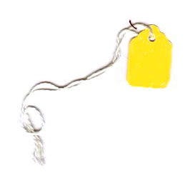
EVERYTHING IN YOUR BOOTH SHOULD BE TAGGED, LABELED, PRICED AND IDENTIFIED FOR THE CUSTOMER. INFORMATION IS IMPORTANT.
YOU MIGHT HAVE FRAMED LITTLE WRITE-UPS SITTING WITH VARIOUS DISPLAYS AND TELLING THE CUSTOMER SOMETHING ABOUT YOURSELF, YOUR TECHNIQUE OR YOUR JEWELRY.
WITHOUT GOOD AND PROMINENTLY VISIBLE INFORMATION, CUSTOMERS OFTEN WALK AWAY WITHOUT ASKING FOR HELP.

PRICE TAGS ARE A MUST. IF YOU HAVE THE TIME AND CAN AFFORD IT,USE PROFESSIONALLY-PRINTED PRICE TAGS.YOU CAN BUY LABEL MAKERS NOW AT STATIONERY STORES AND WITH WHICH YOU CAN GENERATE PRINTED PRICE TAGS. PRICE TAGS GIVE CREDANCE TO THE PRICE, AND REDUCE THE TIMES CUSTOMERS MAY TRY TO HAGGLE.
HAVE BUSINESS CARDS, POSTCARDS, BROCHURES, AND NEWSLETTERS EASILY AVAILABLE.
PUT OUT A SIGN-UP BOOK OR SIGN-UP SHEETS TO EXPAND YOUR MAILING AND EMAILING LISTS.

7.5. LOADING AND UN-LOADING
ALLOW YOURSELF PLENTY OF TIME TO UNLOAD AND SET UP YOUR BOOTH. IF ALLOWED TO DRIVE INTO THE VENUE TO UNLOAD, BE COURTEOUS AND UNLOAD AS QUICKLY AS POSSIBLE. THEN MOVE YOUR VEHICLE BEFORE CONTINUING TO SETUP.
I LIKE TO MODULAR-IZE EVERYTHING. THAT IS, I LIKE TO USE SIMILAR SIZED AND SHAPED CONTAINERS TO CARRY EVERYTHING IN. THEY ARE STURDY, EASY FOR ONE PERSON TO CARRY. THE CONTAINERS ARE STACKABLE. EACH CONTAINER IS CLEARLY LABELED ON THE OUTSIDE TO WHAT IS ON THE INSIDE. SOME OF MY CONTAINERS DO DOUBLE-TIME AS PEDESTALS OR SUPPORTS FOR DISPLAYS. I USE OTHER CONTAINTERS FOR ACTIVE STORAGE DURING THE SHOW.BUT EASILY STORABLE, OUT OF SIGHT OF THE CUSTOMERS.
IF YOU NEED A VAN OR TRUCK, AND DON’T OWN ONE, THESE ARE EASILY AND VERY INEXPENSIVELY RENTABLE AT A LOCAL U-HAUL OR SIMILAR BUSINESS.
LESSON 8: BRING ENOUGH INVENTORY TO SELL
INVENTORY
1. BRING ENOUGH INVENTORY TO SELL, TYPICALLY 4X WHAT YOU HOPE TO SELL.THUS, IF YOU WANT TO SELL $200.00 OF STUFF, YOU WOULD WANT TO BRING $800.00 OF MERCHANDISE.
2. DON’T NECESSARILY PUT EVERYTHING OUT AT ONCE.YOU WANT YOUR BOOTH TO LOOK FULL, ABUNDANT AND COMPLETE, BUT NOT CLUTTERED OR OVERWHELMING. AT THE SAME TIME, YOU DON’T WANT “EMPTY SPACES” WHERE IT LOOKS LIKE YOU HAVE RUN OUT OF THINGS TO SELL. IF YOU STARTED WITH A LARGE BOWL OF LOOSE ITEMS, AND YOU HAVE SOLD OUT HALF OF THEM, REPLACE THAT BOWL WITH A SMALLER BOWL.
3. HAVE MERCHANDISE WITH A VARIETY OF PRICE POINTS. YOU WILL WANT TO HAVE A MIX OF IMPULSE ITEMS, AS WELL AS MORE EXPENSIVE THINGS, AND PERHAPS 2 OR 3 VERY HIGH END ART PIECES.
THINK WHAT KINDS OF JEWELRY SELLS THE MOST, AND WHAT SELLS THE LEAST. USUALLY EARRINGS AND BRACELETS SELL THE MOST, AND NECKLACES AND SPECIALIZED ITEMS SELL THE LEAST. BUT THIS ALL DEPENDS SOMEWHAT ON CURRENT FASHIONS.
PEOPLE CARRY AROUND WITH THEM $1 BILLS, $5 BILLS, $10.00 BILLS, $20’S, $50’S AND $100’S. THE IMPULSE BUYER IS MORE LIKELY TO PURCHASE SOMETHING IN THESE DENOMINATIONS.
4. SELL THINGS YOU LOVE.

LESSON 9: SELL YOURSELF AND YOUR CRAFT AT THE SHOW

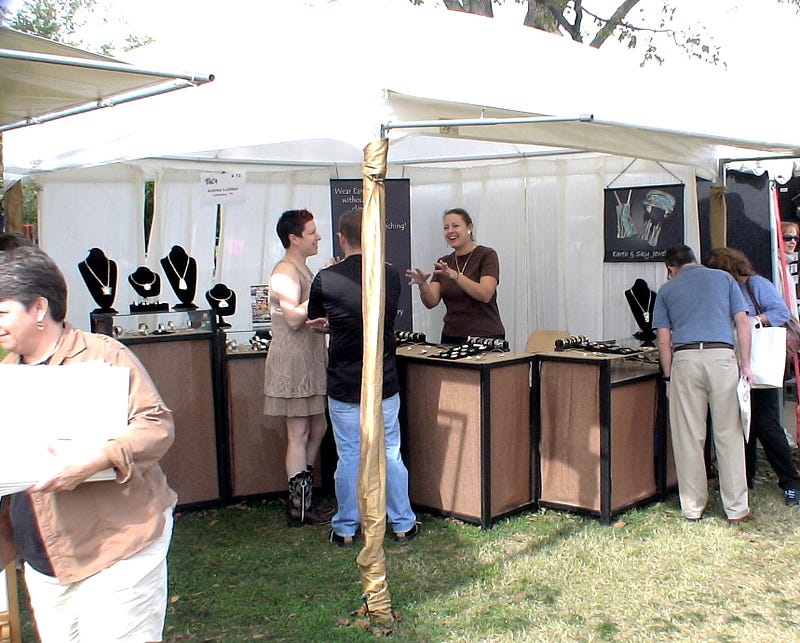
AT THE SHOW, YOU ARE NOT ONLY SELLING YOUR PRODUCTS. YOU ARE SELLING YOURSELF. YOURSELF AS A JEWELRY DESIGNER. YOUR CREATIVITY. YOUR PERSONALITY. THE ESSENCE OF YOUR ARTISTIC SOUL.
YOU SELL YOURSELF TO MOTIVATE YOUR CUSTOMERS. YOU WANT TO MOTIVATE PEOPLE TO STOP BY YOUR BOOTH AND LINGER. YOU WANT TO MOTIVATE PEOPLE TO BUY. YOU WANT TO MOTIVATE THEM TO REMEMBER YOU AND YOUR WORK. YOU WANT THEM TO PURCHASE FROM YOU AGAIN.
ALL THIS MOTIVATING WILL TAKE A LOT OF WORK ON YOUR PART.
(1) BODY LANGUAGE
(2) TELLING YOUR STORY
(3) DEMONSTRATING YOUR SKILLS
(4) MAKING THE SALE WORK FOR THEM
(9.1) BODY LANGUAGE
THE WAY YOU SIT,
THE WAY YOU STAND,
YOUR FACIAL EXPRESSIONS,
HOW YOU GREET CUSTOMERS,
HOW YOU CONVERSE WITH CUSTOMERS,
HOW YOU DESCRIBE YOUR WORK, AND YOUR TECHNIQUE,
THESE ALL SUBTLY AFFECT THE SHOPPING EXPERIENCES AND BEHAVIORS OF YOUR CUSTOMERS.
PART OF THE SELLING PROCESS IS PURE THEATER. YOU NEED TO PUT ON A GOOD SHOW. AFTER ALL,YOU WANT TO ATTRACT CUSTOMERS TO YOUR BOOTH. YOU WANT THEM TO LINGER. YOU WANT THEM TO ASK FOR HELP, AND ASK OTHER QUESTIONS. YOU WANT THEM TO REMEMBER YOU AND WHAT YOU SELL.

FIRST, STAND, DON’T SIT. IF YOU DO NEED TO SIT, SIT AT AN ANGLE TO YOUR BOOTH OR DISPLAY TABLE. RATHER THAN SITTING DIRECTLY CENTERED, FACING FORWARD. IN THIS WAY, PEOPLE CAN APPROACH YOUR DISPLAY WITHOUT FEELING YOU ARE WATCHING THEIR EVERY STEP AS THEY MAKE THEIR WAY TO YOUR BOOTH. IF IT’S GOING TO BE A LONG DAY AND A LONG WEEKEND, YOU MIGHT RESORT TO A HIGHER DIRECTOR’S CHAIR OR STOOL, AS A SORT OF COMPROMISE BETWEEN STANDING AND SITTING TO TAKE SHORT BREAKS.
YOUR FACIAL EXPRESSIONS ARE IMPORTANT. DON’T LOOK BORED. DON’T STARE OFF INTO SPACE. DON’T LOOK LIKE YOU WOULD RATHER BE SOMEWHERE ELSE. DON’T STAND WITH YOUR ARMS FOLDED, OR YOUR HANDS IN YOUR POCKETS. DON’T LOOK LIKE YOUR PRIMARY MISSION IS TO GUARD YOUR BOOTH. LOOK HAPPY. LOOK EAGER TO MEET NEW PEOPLE, GREET FAMILIAR FACES, AND SHARE YOUR STORIES AND YOUR WORK.
BE VISIBLE, DON’T HIDE.
LOOK BUSY. WHEN IT’S SLOW, DO BUSINESS-RELATED ACTIVITIES: CLEAN, DUST, RE-ARRANGE, CHANGE OUT MERCHANDISE, PRICE, MAKE SOME MORE JEWELRY, INVENTORY THINGS, TAKE PICTURES.
ENGAGE PEOPLE AS THEY WALK BY OR APPROACH YOUR BOOTH. CATCH THEIR EYES. SAY “GOOD DAY”, OR “BEAUTIFUL DAY OUT TODAY” COMPLMENT PEOPLE, LIKE SAYING “LOVE THAT NECKLACE,” OR “BEAUTIFUL SHOES.” IF YOU HAVE DIFFICULTY TALKING WITH PEOPLE, HIRE SOMEONE TO WORK WITH YOU WHO CAN.
GIVE YOUR CUSTOMERS SOME SPACE TO SHOP. YES, YOU DO HAVE TO WORRY ABOUT SHOP-LIFTING, BUT YOU DON’T WANT TO MAKE EVERY CUSTOMER FEEL LIKE YOU THINK THEY ARE A CROOK. DON’T HOVER OVER THEM. DON’T FORCE CONVERSATIONS ON THEM. DON’T TAKE AWAY THEIR FUN OF SHOPPING.
BUT ALSO, DO NOT IGNORE THEM. GREET THEM. ASK THEM IF THEY NEED ASSISTANCE. ASK THEM IF THEY WOULD LIKE TO TRY A PIECE ON. ASK THEM HOW THE SHOW HAS BEEN GOING FOR THEM.
DRESS THE PART. BE WELL-GROOMED. BE PRESENTABLE. SMELL GOOD. BUT DON’T BATH YOURSELF IN COLOGNE.DON’T GET CAUGHT WITH BAD BREATH. AND, IN A SIMILAR VEIN, DON’T EAT THINGS WHICH RESULTS IN BAD BREADTH, LIKE ONIONS AND TUNA FISH.
WEAR YOUR JEWELRY.
WEAR A NAME BADGE.
DON’T EAT IN YOUR BOOTH.
DON’T TALK ON THE PHONE.
DON’T TEXT.
DON’T SMOKE.
DON’T DRINK ALCOHOLIC BEVERAGES.
DON’T READ OR SLEEP.
DON’T GET LOST IN CONVERSATION WITH YOUR PARTNER OR STAFF, TO THE EXCLUSION OF YOUR CUSTOMERS.
DON’T BLOCK THE ENTRANCE TO YOUR BOOTH
IT’S A GOOD IDEA TO TAKE BREAKS ABOUT EVERY 4 HOURS. BUT DON’T LEAVE YOUR BOOTH FOR MORE THAN 20 MINUTES AT A TIME. PEOPLE WANT TO MEET THE ARTIST. YOUR PRESENCE IS ONE OF YOUR MAIN SELLING POINTS.
WHEN IT’S CROWDED, AND YOU HAVE CUSTOMERS COMPETING FOR YOUR ATTENTION, ACKNOWLEDGE EACH ONE, LET THEM KNOW ABOUT HOW LONG IT WILL BE BEFORE YOU FINISH WITH YOUR EXISTING CUSTOMER, AND CAN WAIT ON THEM.
PRIORITIZE.THE PERSON YOU MAY BE HELPING MIGHT REQUIRE A LOT OF TIME. THE NEXT PERSON MIGHT REQUIRE JUST A FEW MINUTES. EXCUSE YOURSELF FROM THE FIRST PERSON, AND WAIT ON THE SECOND.
IF YOU HAVE A CHATTY CUSTOMER, LEARN HOW TO POLITELY INTERRUPT, AND RE-DIRECT THE CONVERSATION, SO THAT YOU CAN SMOOTHLY TRANSITION TO THE NEXT CUSTOMER.
THANK YOUR CUSTOMERS FOR COMING OVER TO YOUR BOOTH.
BE SURE THEY SIGN A GUEST REGISTER. BE SURE THEY LEAVE WITH SOME PROMOTIONAL MATERIAL. BE SURE THEY KNOW HOW TO CONTACT YOU AFTER THE SHOW.
IF SOMEONE HAS PURCHASED SOMETHING FROM YOU, THANK THEM, THEN SAY SOMETHING LIKE, “THAT NECKLACE WILL LOOK GREAT ON YOU,” OR, “THAT’S SUCHA THOUGHTFUL GIFT YOU ARE BUYING,” WHICH REINFORCES THE GOOD FEELINGS THEY HAVE ABOUT THE PURCHASE, AS THEY HAND YOU THE MONEY.
(9.2) TELL YOUR STORY
WHEN YOU ESTABLISH A VERY PERSONAL CONNECTION WITH YOUR CUSTOMER,YOU WILL MORE LIKELY MAKE THE SALE.
PEOPLE ARE NOT JUST BUYING YOUR WORK. THEY ARE BUYING AN EXPERIENCE. THE MORE THEY KNOW ABOUT YOU, YOUR TECHNIQUES AND THE PARTICULARS OF THE WORK, THE MORE LIKELY THEY ARE TO BUY SOMETHING. YOU, IN EFFECT, ARE BUILDING A BRAND.THE BRAND IS YOU. YOUR STORY SHOULD BE REAL, RELEVANT TO WHAT YOU ARE SELLING, AND REPEATABLE.

SO, YOUR STORY COULD INCLUDE
– IMPORTANT MILESTONES IN YOUR DEVELOPMENT AS AN ARTIST
– HOW YOU GOT STARTED
– HOW YOU LEARNED YOUR “CRAFT”
– WHO TAUGHT YOU
– THE REASONS YOU ARE PASSIONATE ABOUT YOUR WORK
– DO YOU MAKE THINGS FULL TIME OR PART TIME
– YOUR INSPIRATIONS
– INTERESTING FACTS ABOUT THE MATERIALS YOU USE, and WHERE YOU FIND THEM
– SOME HUMOROUS TALES OF THINGS THAT HAPPENED TO YOU, IN THE CONTEXT OF YOUR WORK
– THE KINDS OF THINGS WHICH DIFFERENTIATE YOURSELF FROM OTHER JEWELRY DESIGNERS
– THE KINDS OF THINGS WHICH ARE CRITICAL TO YOUR SUCCESS
– HOW YOU MANAGE A REGULAR JOB AND YOUR “CRAFT”
– WHERE ELSE DO YOU SELL YOUR PIECES
IF YOU ARE UNCOMFORTABLE TALKING ABOUT YOURSELF AND YOUR JEWELRY, PRACTICE, PRACTICE, PRACTICE. WRITE UP A STORY. MAKE THIS WRITE-UP PART OF YOUR PROMOTIONAL MATERIALS. TELL YOUR STORY TO FRIENDS AND RELATIVES. EVENTUALLY TELLING YOUR STORY WILL BECOME SECOND-NATURE.
(9.3) DEMONSTRATING YOUR SKILLS
IF THE SHOW PROMOTERS ALLOW DEMONSTRATIONS, FIND OUT THEIR RULES.
DEMONSTRATIONS ARE GREAT MARKETING TOOLS. THEY ALWAYS ATTRACT CUSTOMERS. THEY GET PEOPLE TO LINGER. THEY SHOW YOU REALLY DO MAKE YOUR OWN PRODUCTS.
(9.4) MAKE THE SALE WORK FOR THEM
HELP THE CUSTOMER JUSTIFY THE PURCHASE. MAKE IT WORK. HAVE TOOLS HANDY TO TAKE OUT A LINK OR ADD A LINK TO SHORTEN OR LENGTHEN THAT PIECE OF JEWELRY.
YOU MAY NOT HAVE EXACTLY WHAT THEY WANT. PERHAPS YOU HAVE IT IN YOUR INVENTORY AT HOME, AND YOU CAN MAIL ORDER THE SALE.
OR, IF YOU DO COMMISSION WORK, LET PEOPLE KNOW ABOUT THIS. EXPLAIN TO THEM WHAT COMMISSION WORK MEANS, AND WHAT YOUR TERMS ARE.
Children
CHILDREN CAN DISRUPT THE SALES PROCESS. THEY CAN COMPETE FOR THE ATTENTION OF YOUR CUSTOMER THEY CAN SOMETIMES REEK HAVOK WITH YOUR MERCHANDISE AND YOUR DISPLAYS. I ALWAYS HAVE SOME SMALL ITEMS TO DISTRACT THEM, OR SOMETHING THEY CAN FIDDLE OR PLAY WITH.

LESSON 10: MAKE A LIST OF THINGS TO BRING
MAKING LISTS IS ONE OF THE ONLY WAYS I KNOW TO KEEP UP WITH ALL THE DETAILS.
MAKE LISTS OF THINGS TO BRING FOR EACH OF THE FOLLOWING:
1. PACKING AND UNPACKING: storage bins, hand-trucks, bubblewrap
2. BOOTH SET-UP
INCLUDING FURNISHINGS AND EQUIPMENT, LIGHTING AND EXTENSION CORDS
3. INVENTORY
4. MERCHANDISE DISPLAYS
INCLUDING, STANDS, RACKS, SHELVING, EASELS, TRAYS, TABLECLOTHS, MIRROR
5. MERCHANDISE PACKAGING SUPPLIES
SUCH AS BAGS AND TISSUE PAPER
6. MARKETING AND PROMOTION
INCLUDING SIGNAGE, BUSINESS CARDS, BROCHURES
7. PERSONAL COMFORT NEEDS
SUCH AS DRINKS, FOOD, CHANGES OF CLOTHES
8. FIRST AID
INCLUDING BAND-AIDS, ASPIRIN, HAND LOTION
9. CUSTOMER COMFORT NEEDS
10. OFFICE SUPPLIES
LIKE PENS, PAPER, STAPLER, TAPE, PRICE TAGS, CALCULATORS
11. MONEY, CREDIT CARD AND SALES MANAGEMENT
INCLUDING CASH AND CHANGE, FORMS, CELL PHONE, CREDIT CARD EQUIPMENT
CREDIT CARD AUTHORIZATION PHONE NUMBERS, SALES TAX CERTIFICATE, BUSINESS LICENSE
12. WEATHER AND OTHER CONTINGENCIES SUPPLIES
SUCH AS SAFETY PINS, BUNGEE CORDS, ZIP TIES, SCISSORS, TWINE, TAPE, TENT WEIGHTS, PLASTIC DROP CLOTHS OR TARPS,
TOOL KIT FOR REPAIRS, BUG SPRAY, HAT, SUNGLASSES
13. CLEANING SUPPLIES
INCLUDING PAPER TOWELS, GLASS CLEANER, JEWELRY CLEANER, GARBAGE BAGS
14. SHOW RELATED
SUCH AS COPY OF ALL CORRESPONDENCE WITH SHOW PROMOTER, YOUR APPLICATION FORM
15. DEMONSTRATION SUPPLIES
INCLUDING TOOLS, SUPPLIES, SAMPLES
CAMERA: BE SURE TO BRING A CAMERA.TAKE PICTURES OF YOUR FINAL BOOTH SET-UP. TAKE PICTURES OF YOUR MERCHANDISE DISPLAYS.TAKE PICTURES OF ITEMS THAT SEEM TO BE SELLING WELL.
LESSON 11: BE PREPARED TO ACCEPT CREDIT CARDS
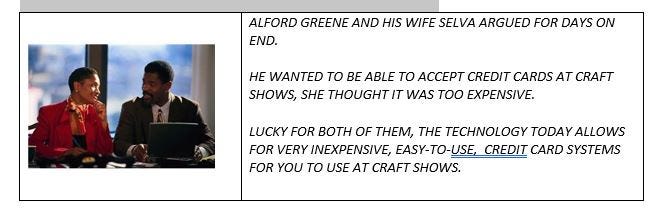
YOU WILL DEFINITELY LOSE SALES, IF YOU DO NOT HAVE A WAY TO ACCEPT CREDIT CARDS.

TODAY, THERE ARE SEVERAL SYSTEMS THAT ALLOW YOU TO PUT A SMALL ATTACHMENT ONTO YOUR CELL PHONE. THEY ALLOW YOU TO RUN CREDIT CARDS WITH VERY SMALL FINANCE CHARGES TO YOU. IT IS VERY QUICK AND EASY TO GET APPROVED. YOUR CELL PHONE COMPANY MAY HAVE A PRODUCT FOR YOU. OR YOU CAN RUN CHARGES DIRECTLY ON YOUR CELL PHONE OR TABLET.
ALSO, THERE ARE COMPANIES WITH SIMILAR PRODUCTS LIKE
SQUARE
GOPAYMENT
PAYANYWHERE

LESSON 12: PRICE THINGS TO SELL
CUSTOMERS WHO ATTEND DIFFERENT KINDS OF SHOWS HAVE DIFFERENT KINDS OF EXPECTATIONS ABOUT PRICE. PEOPLE EXPECT TO PAY HIGHER PRICES AT ARTS AND CRAFTS SHOWS, AND LOWER PRICES AT FLEA MARKETS AND BAZAARS.
YOU ALWAYS BEGIN BY SETTING FAIR AND REASONABLE PRICES
AT HIGHER END SHOWS, YOU WANT TO MINIMIZE ANY DISCOUNTING OR HAGGLING.AT FLEA MARKETS, BE PREPARED TO HAGGLE. WHEN YOU HAGGLE ON PRICE, IN ANY SETTING, YOU WOULD TYPICALLY BE PREPARED TO SELL FOR ABOUT 15% LESS THAN THE MARKED PRICE.
IT’S OK TO SAY “NO”, TO A CUSTOMER IF THE CUSTOMER ONLY SEEMS WILLING TO PAY A VERY LOW AMOUNT. YOU WOULD BE OUT OF BUSINESS IF YOU SOLD ALL YOUR STUFF BELOW WHAT IT COSTS YOU TO MAKE.

LESSON 13: KEEP YOUR MONEY SAFE
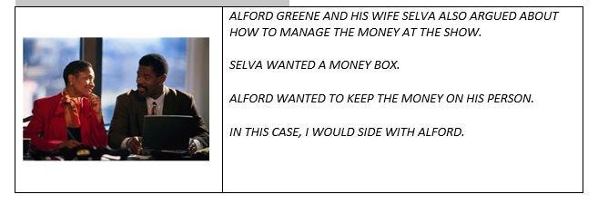
YOU NEED TO MANAGE YOUR TRANSACTIONS.
KEEP YOUR MONEY SAFE
SET UP AN EFFICIENT PAYMENT STATION.
HAVE ENOUGH MONEY ON HAND TO MAKE CHANGE — 1 AND 5 DOLLAR BILLS, AND QUARTERS, DIMES, NICKELS AND PENNIES.
WITH ALL THE PEOPLE AROUND, COMPETING FOR YOUR ATTENTION, IT GETS TOO EASY FOR SHOP-LIFTERS TO STEAL YOUR MONEY BOX, OR TO STEAL YOUR PURSE, BEFORE YOU NOTICE IT.
I LIKE TO WEAR AN APRON WITH POCKETS. I KEEP ENOUGH MONEY IN THE APRON POCKETS TO HANDLE A FEW HOURS WORTH OF SALES. I KEEP THE REST OF THE MONEY IN PANTS POCKETS OR A MONEY BELT OR FANNY PACK ON MY PERSON.
BE ESPECIALLY ALERT AT SET-UP AND BREAK-DOWN, WHEN THERE IS A LOT OF COMMOTION.
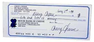
ACCEPTING CHECKS
LOTS OF PEOPLE PASS BAD CHECKS. SOME PEOPLE MAKE A CAREER OF THIS. BECAUSE OF THIS, I AM ALWAYS LEERY OF ACCEPTING CHECKS. LUCKILY TODAY, MANY PEOPLE USE THEIR DEBIT CARDS, IN LIEU OF CHECKS, AND THESE ARE MUCH SAFER. IF SOMEONE ASKS IF THEY CAN WRITE A CHECK, I TRY TO DISCOURAGE IT. I ASK THEM IF THEY CAN USE A DEBIT OR CREDIT CARD, INSTEAD.
OCCASIONALLY I DO ACCEPT CHECKS. IF ACCEPTING CHECKS, SOME YELLOW FLAGS TO WATCH OUT FOR:
– CHECK SEQUENCE NUMBERS BELOW 300
– ANY CHECK FROM ANYONE IN THE MILITARY
– STARTER CHECKS, WHERE THE ADDRESS IS NOT IMPRINTED
– OUT OF STATE CHECKS
– WHERE THE WRITER SHOWS A COLLEGE ID, OR THE ADDRESS IS A COLLEGE DORM
VERIFY THE CUSTOMER’S PHONE NUMBER, AND WRITE THIS ON THE CHECK.
ALSO, CHECK THE CUSTOMER’S DRIVER’S LICENSE, WITH PICTURE AND SIGNATURE. AND WRITE DOWN THE CUSTOMER’S DRIVER’S LICENSE ON THE CHECK.
MOST BANKS NO LONGER ALLOW YOU TO VERIFY WHETHER THE CUSTOMER HAS ENOUGH MONEY IN THEIR ACCOUNT TO COVER THE CHECK. THE FEW BANKS THAT STILL PROVIDE THIS SERVICE, OFTEN CHARGE YOU $5.00 TO $10.00 PER VERIFICATION.
SHOPLIFTING
CRAFT SHOWS ATTRACT SHOPLIFTERS. THERE ARE LOTS OF PEOPLE, LOTS OF COMMOTION, AND LOTS OF DISTRACTIONS. YOU FIND YOURSELF IN A NEW, UNFAMILIAR ENVIRONMENT. THESE KINDS OF THINGS MAKE SHOPLIFTING EASIER TO GET AWAY WITH.

SHOPLIFTERS COME IN ALL SIZES, SHAPES, AGES, GENDERS AND COLORS. THEY MAY TRY TO STUFF SOME JEWELRY INTO A LARGE PURSE OR BAG OR COAT POCKET, AND WALK AWAY WITH OUT PAYING. THEY MAY TRY A PIECE OF JEWELRY ON, AND WALK AWAY WITHOUT PAYING. THEY MAY GRAB AND RUN. OFTEN, THEY WORK IN PAIRS, ONE PERSON TO DISTRACT YOU, AND THE OTHER PERSON TO STEAL YOU BLIND WHILE YOU ARE NOT LOOKING.
TELL-TALE CHARACTERISTICS OF SHOPLIFTERS:
— SEEM NERVOUS, REFUSE OFFERS OF ASSISTANCE
— SPEND AN INORDINATE AMOUNT OF TIME WATCHING SALES STAFF, RATHER THAN LOOKING AT MERCHNDISE
— MAKE AN ESPECIALLY HURRIED EXIT
— WEAR OVERCOATS, BAGGY CLOTHES, CARRY OVERSIZED PURSES
— GROUPS OF TEENAGERS OR TWEEN-AGERS SHOPPING TOGETHER
— LOITER

SHOPLIFTERS REQUIRE SOME LEVEL OF PRIVACY IN ORDER TO CONCEAL MERCHANDISE. So…
— MAXIMIZE VISIBILITY
— MINIMIZE BLIND SPOTS
— FROM WHERE YOU ARE STANDING OR SITTING, YOU SHOULD HAVE GOOD SIGHT LINES THROUGHOUT THE AREAS IN YOUR BOOTH YOUR CUSTOMER HAS ACCESS TO
LOCK UP SHOPLIFTER ATTRACTIVE MERCHANDISE, OR KEEP IT BEHIND THE COUNTER
AS A GENERAL RULE, THE SMALLER AND MORE VALUABLE AN ITEM, THE MORE ATTRACTIVE TARGET IT IS
WHAT PROPORTION OF MERCHANDISE SHOULD YOU KEEP UNDER GLASS? THERE IS NO RULE OF THUMB HERE. YOU HAVE TO USE YOUR JUDGMENT.
KEEP EVERYTHING IN ITS PLACE. THIS MAKES IT EASIER TO MONITOR THINGS, BECAUSE, IF EVERYTHING HAS ITS PLACE, AND YOU KEEP PUTTING THINGS BACK IN THE SAME PLACE, YOU ARE MORE LIKELY TO NOTICE, AND NOTICE MORE QUICKLY, IF THINGS ARE OUT OF ORDER.
IF YOU PUT ITEMS IN A BAG, STAPLE IT CLOSED. STAPLE THE RECEIPT TO THE BAG. YOU CAN EVEN STAPLE ONE OF YOUR BUSINESS CARDS TO THE BAG.
REQUIRE A RECEIPTS FOR ALL RETURNS.
— ONE THING SOME SHOPLIFTERS LIKE TO DO IS STEAL SOMETHING, AND THEN RETURN IT FOR CASH.
THE MOST EFFECTIVE THING YOU CAN DO TO PREVENT SHOPLIFTING IS TO PROVIDE EXCEPTIONAL CUSTOMER SERVICE.
— ACKNOWLEDGE EACH CUSTOMER
— ASK IF THEY NEED ASSISTANCE
IF YOU SUSPECT OR CATCH A SHOPLIFTER, IMMEDIATELY NOTIFY THE SHOW’S SECURITY. YOU WANT TO DESCRIBE THE SUSPECT, WHETHER YOU THINK HE OR SHE IS STILL PRESENT, WHETHER THEY MIGHT BE CAUSING TROUBLE, AND WHAT THE SUSPECTS LOOKS LIKE AND IS WEARING.
JEWELERS SELLING FINE JEWELRY, PARTICULARLY WITH GOLD AND PRECIOUS STONES, NEED TO TAKE SPECIAL PRECAUTIONS. DON’T WORK ALONE. YOU SHOULD HAVE ONE OR MORE PEOPLE WITH YOU IN THE BOOTH AT ALL TIMES. IF YOU FEEL THAT ANYONE IS CASING YOU, ALERT THE SHOW AUTHORITIES.
YOU MIGHT TAKE A PICTURE OF ANYONE SUSPICIOUS WITH YOUR CELL PHONE OR DISPOSABLE CAMERA.
DON’T REGISTER AT THE HOTEL USING YOUR BUSINESS NAME. DON’T TAKE A FIRST FLOOR ROOM. DON’T TAKE A ROOM NEAR AN ELEVATOR OR STAIRS.
WHEN YOU CHECKOUT OF THE HOTEL, YOU WANT TO DRIVE A LONG DISTANCE BEFORE STOPPING FOR FOOD OR GAS.
SO BE SURE YOUR HAVE A FULL GAS-TANK BEFORE THAT LAST DAY AT THE SHOW.
KEEP YOUR MONEY ON YOUR PERSON. IF YOU HAVE VALUABLE MERCHANDISE OR MONEY IN CONTAINERS, KEEP THESE CHAINED TO SOMETHING IMMOVABLE, LIKE A SUPPORT COLUMN IN THE ROOM.
ABOUT HIRING HELP
BE CAREFUL ABOUT HIRING NON-SHOW PEOPLE, WHO HAPPEN TO BE AROUND THE SHOW AT SET-UP, AND OFFER TO HELP FOR MONEY.
IF YOU NEED TO HIRE EXTRA HELP, TRY TO ARRANGE THIS AHEAD OF TIME. DOES THE SHOW PROMOTER KEEP OF LIST OF LOCAL PEOPLE TO CONTACT? CAN YOU CONTACT LOCAL CRAFT, BEAD OR JEWELRY STORES TO ASK FOR RECOMMENDATIONS? HOW ABOUT A LOCAL CRAFT ASSOCIATION OR BEAD SOCIETY? HOW ABOUT OTHER VENDORS — DO THEY KNOW SOMEONE LOCALLY THAT THEY USED BEFORE?
YOU CAN ALSO CONTACT SOME LOCAL TEMPORARY SERVICES
OTHER SECURITY CONCERNS:
DON’T LEAVE TEMPTING ITEMS IN YOUR BOOTH OVERNIGHT.
LOCK YOUR VEHICLE. BE SURE ALL THE DOORS ARE LOCKED — FRONT, BACK, SIDES
RECORD KEEPING
RECORD KEEPING IS VERY IMPORTANT. KEEP GOOD RECORDS OF YOUR SALES. KEEP GOOD RECORDS OF CUSTOMER MAIL, EMAIL ADDRESSES. KEEP GOOD RECORDS AND RECEIPTS OF EXPENSES INCURRED AND OTHER ASSOCIATED COSTS. KEEP GOOD RECORDS OF CAR MILEAGE ASSOCIATED WITH YOUR SHOW RELATED TRAVEL.
IF YOU WILL BE COLLECTING SALES TAXES, BE SURE YOU ARE COLLECTING ALL THE INFORMATION YOU NEED TO FILL OUT ANY GOVERNMENT SALE TAX FORMS.
IF YOU ARE SELLING WHOLESALE, BE SURE YOUR CUSTOMERS ARE PRESENTING YOU WITH THE CORRECT TAX ID NUMBERS AND DOCUMENTATION.
IF YOU ARE IN A STATE THAT COLLECTS SALES TAXES, YOU WILL NEED TO COLLECT SALES TAXES AT THE SHOW. YOU MAY HAVE A PERMANENT RE-SALE NUMBER IN THAT STATE. SOME STATES CALL THESE TAX NUMBERS OR WHOLESALE NUMBERS. IF SO, YOU WOULD PAY THE SALES TAXES YOU HAVE COLLECTED TO THE STATE, AS YOU ALWAYS DO.
IF YOU HAVE A TEMPORARY STATE RE-SALE LICENSE THAT COVERS YOUR TIME AT THE SHOW, YOU WILL BE GIVEN A FORM BY THE STATE WITH WHICH TO TRANSMIT PAYMENT FOR COLLECTED TAXES.
SOMETIMES, STATE OFFICIALS WILL BE AT THE SHOW, GOING BOOTH TO BOOTH, TO COLLECT YOUR SALES TAXES.
IF SO, THEY EXPECT YOU TO HAVE COMPLETED YOUR FORM, MEANING YOU HAVE CALCULATED ALL YOUR TAXABLE AND NON-TAXABLE SALES, AS WELL AS THE TOTAL SALES TAXES OWED AS YOU ARE CLOSING DOWN YOUR BOOTH, AND BEGINNING TO PACK UP.
OTHERTIMES, YOU ARE EXPECTED TO SUBMIT THAT FORM WITH PAYMENT USUALLY WITHIN 2–4 WEEKS OF THE SHOW. NOWADAYS, A LOT OF THIS PROCESS IS DONE ONLINE. BE SURE YOU HAVE THE INSTRUCTIONS ABOUT WHAT YOU NEED TO DO WHEN.

LESSON 14: ALWAYS THINK OF WAYS TO GENERATE FOLLOW-UP SALES
YOU MAKE YOUR REAL MONEY THROUGH REPEAT BUSINESS. MUCH OF THIS REPEAT BUSINESS OCCURS BETWEEN SHOWS. SOME OF IT OCCURS WHEN PEOPLE, WHO BOUGHT FROM YOU AT ONE SHOW, RETURN TO YOUR BOOTH AT THE NEXT ONE.
BEFORE THE SHOW…
– NOTIFY YOUR EXISTING CUSTOMERS WHERE YOU WILL BE WHEN EITHER EMAILING THEM OR MAILING OUT POSTCARDS WORKS FINE. FOR REGULAR OR VERY GOOD CUSTOMERS, YOU MIGHT TRY PHONING THEM.
ALSO, YOU SHOULD HAVE SOME KIND OF WEB PRESENCE WHERE THE CUSTOMER CAN EASILY FIND YOU BETWEEN SHOWS.
DURING THE SHOW…
– HAVE A GUEST REGISTER OR SIGN-UP SHEET, TO GENERATE MAIL AND EMAIL ADDRESSES
– HAVE AT LEAST 2–3 TAKEAWAY PROMOTIONAL ITEMS, SUCH AS BUSINESS CARDS, BROCHURES, POSTCARDS
BE SURE, ON EACH OF YOUR PROMOTIONAL HANDOUTS, YOU CLEARLY LIST HOW THE CUSTOMER CAN GET IN TOUCH WITH YOU BETWEEN SHOWS.
ALSO, I LIKE TO HAVE SOME KIND OF GIVE-AWAY, WHERE PEOPLE FILL OUT A FORM WITH THEIR ADDRESS INFORMATION,SAY TO WIN A FREE PIECE OF JEWELRY.
SOME PEOPLE LIKE TO GIVE AWAY PROMOTIONAL ITEMS WITH THEIR BUSINESS NAMES IMPRINTED ON THEM.
AFTER THE SHOW…
– UPDATE YOUR MAILING AND EMAILING DATABASES
– FOLLOW UP AT LEAST WITH THOSE CUSTOMERS WHO MADE A PURCHASE, USING EMAIL OR MAIL, AND THANKING THEM
– DO SOME EVALUATION. WRITE DOWN WHAT THINGS TO KEEP OR KEEP DOING, AND WHAT THINGS DID NOT SELL THAT WELL. ASK YOURSELF WHY AND WHY NOT?
- RETURN TO YOUR BREAKEVEN ANALYSIS. HOW MUCH MONEY DID YOU ACTUALLY MAKE? WAS IT WORTHWHILE? IF YOU SPENT $1,000, DID YOU MAKE AT LEAST $1,000 BACK?

LESSON 15: TAKE CARE OF YOURSELF

TAKE CARE OF YOURSELF AT THE SHOW. SHOWS ARE EXCITING, BUT ALSO CAN BE PHYSICALLY AND EMOTIONALLY EXHAUSTING.
IF IT’S POSSIBLE TO BRING SOMEONE ALONG TO HELP YOU,
DO SO.

BE SURE YOU WORK OUT THE DETAILS FOR FOOD BREAKS AND BATHROOM BREAKS.
BRING FOOD TO SNACK ON, WATER TO DRINK, ANY MEDICATIONS YOU NEED, AT THE LEAST, SOME ASPIRIN.

ANTICIPATE THE WEATHER, AND WHETHER IT WILL CHANGE DURING THE DAY, OR OVER THE DAYS OF THE SHOW.
AND BRING CLOTHES, HATS, SUNGLASSES, SWEATERS, SUN-BLOCK, BUG-SPRAY — WHATEVER.

ALWAYS THINK IN TERMS OF LAYERS OF CLOTHING.
YOU MAY WANT DIFFERENT CLOTHES TO WEAR WHEN SETTING UP, THAN WHEN STAFFING YOUR BOOTH.

I CAN’T EMPHASIZE ENOUGH: WEAR COMFORTABLE SHOES.
YOU MAY WANT A CHANGE OF CLOTHES, PARTICULARLY IF THE DAYS ARE HOT AND HUMID.
LESSON 16: BE NICE TO YOUR NEIGHBORS

MAKE FRIENDS WITH YOUR NEIGHBORS. YOUR NEIGHBORS MAY BECOME SOME OF YOUR BEST BUSINESS RESOURCES. ASK ABOUT THEIR PRODUCTS. ASK ABOUT THEIR EXPERIENCES WITH CRAFT SHOWS. SEND CUSTOMERS THEIR WAY. EXCHANGE BUSINESS HINTS AND CRAFT SHOW OPPORTUNITIES. OFFER TO WATCH THEIR BOOTHS WHEN THEY NEED TO TAKE A BREAK. LISTEN TO HOW THEY MANAGE SALES AND CUSTOMERS. AS YOU WALK AROUND THE SHOW, PAY ATTENTION TO GOOD BOOTH AND DISPLAY IDEAS.
FOLLOW CRAFT SHOW RULES:
OPEN YOUR BOOTH ON TIME.
DON’T START PACKING UP AND CLOSING YOUR BOOTH UNTIL THE SHOW OFFICIALLY CLOSES.
BE SENSITIVE TO THE NEEDS OF THE HANDICAPPED.
STICK WITHIN THE “LINES” OF YOUR SPACE
BE SURE YOU HAVE CONFORMED TO LOCAL, STATE AND FEDERAL RULES.
RESPECT LIMITS ON SMOKING, DRINKING, EATING AND PLAYING MUSIC.
Booth Etiquette / Following Event Guidelines
If you sign a contract to do a show, you are agreeing to follow all the guidelines and stipulations. Don’t whine or complain. The show owners have a lot to deal with. You don’t want to get yourself banned from future shows.
Stay within your space. If you need a slightly large space, either “buy it” ahead of time from the show promoters, or negotiate an arrangement with your neighbor. You don’t want to make enemies with your neighbors. You don’t want to make it difficult and uncomfortable for your customers to view your merchandise. You don’t want to alienate the show’s promoters.
Don’t pack up early. Wait until the very end of the show.
Be aware of any restrictions about smoking and eating in your booth, or in the general exhibit area.

i. SOME FINAL WORDS OF ADVICE
DOING CRAFT SHOWS IS A WONDERFUL EXPERIENCE. YOU CAN MAKE A LOT OF MONEY AT CRAFT SHOWS, YOU MEET NEW PEOPLE, YOU HAVE NEW ADVENTURES. YOU LEARN A LOT ABOUT BUSINESS AND ARTS AND CRAFTS DESIGNING.
IF… YOU DO YOUR HOMEWORK WHEN SELECTING THEM, AND VERIFY ALL INFORMATION,
AND, IF… YOU ARE VERY ORGANIZED IN PREPARING FOR THEM, SETTING UP, SELLING AND RE-PACKING UP,
AND, IF… YOU PROMOTE, PROMOTE, PROMOTE.
ONE OF THE FIRST THINGS I TELL ANYONE WHO WANTS TO GET INTO THIS BUSINESS IS TO GIVE IT 3 YEARS. IF YOU ARE STILL STRUGGLING AFTER 3 YEARS, PERHAPS CRAFTS SHOWS ARE NOT FOR YOU.
EACH YEAR, YOU WILL DO SOME SHOWS, AND SOME WILL WORK, AND OTHERS MIGHT NOT.
AVOID FIRST TIME EVENTS. I USUALLY AVOID SHOWS IN EXISTENCE LESS THAN 3 YEARS.
TRY TO DO EVENTS OTHERS HAVE TOLD YOU HAVE BEEN SUCCESSFUL FOR THEM.
I GIVE MANY SHOWS A SECOND CHANCE IF I FEEL THE MAJOR ISSUES FOR SLOW SALES, WERE TIMING OR WEATHER.
DON’T FEEL DISAPPOINTED IF YOU DIDN’T MAKE A FORTUNE YOUR FIRST TIME OUT.
REMEMBER, IT’S THAT REPEAT BUSINESS WHERE YOU MAKE THE MOST MONEY.

ii. HELPFUL RESOURCES:


Other Articles of Interest by Warren Feld:
Should I Set Up My Craft Business On A Marketplace Online?
The Importance of Self-Promotion: Don’t Be Shy
Are You Prepared For When The Reporter Comes A-Calling?
A Fool-Proof Formula For Pricing And Selling Your Jewelry
Designer Connect Profile: Tony Perrin, Jewelry Designer
My Aunt Gert: Illustrating Some Lessons In Business Smarts
Copyrighting Your Pieces: Let’s Not Confuse The Moral With The Legal Issues
Naming Your Business / Naming Your Jewelry
Jewelry Making Materials: Knowing What To Do
To What Extent Should Business Concerns Influence Artistic and Jewelry Design Choices
How Creatives Can Successfully Survive In Business
Getting Started In Business: What You Do First To Make It Official
I hope you found this article useful. Be sure to click the CLAP HANDS icon at the bottom of this article.
Also, check out my website (www.warrenfeldjewelry.com).
Subscribe to my Learn To Bead blog (https://blog.landofodds.com).
Visit Land of Odds online (https://www.landofodds.com)for all your jewelry making supplies.
Enroll in my jewelry design and business of craft video tutorials online.
Add your name to my email list.
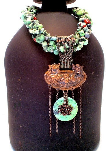
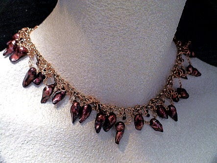
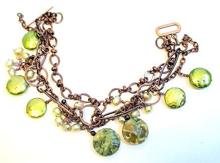


 “
“


 GROUP
GROUP
