


Abstract
Color is the single most important Design Element. Most artists and jewelry designers learn about how to use and control for color in art schools. They learn about how colors are perceived. How to combine colors and maximize the appealing effects of such combinations. How the perceptions of color vary, given the context, and how to anticipate these variations. These art theories work well for those who paint. But not so well for those who design jewelry.
How Artists and Jewelry Designers
Respond Differently To The Use Of Color
The artist is concerned with achieving harmony, balance and evoking an emotional response. Color theories point the way. The artist wants to be guided by these and conform to them. To the artist, color theory is more about objectives and universals. They tap into the brain’s propensity to balance things out. People are prewired with an anxiety response. Our brains have some presets so that we avoid snakes and spiders. When things get too unbalanced and too unharmonious, the brain gets edgy. We begin to interpret things as not as interesting, perhaps somewhat unsatisfying, even ugly.
Color schemes show what colors in combination yield a balance in energy and wave length signatures. For example, and with a lot of oversimplification, color theory points out that in any project, the proportion of red should equal the proportion of green. If red has an energy signature of +1, then the energy signature of green would be -1. Added together, they equal zero. The brain wants things to equal zero. Balanced. Harmonious. And artists who follow the theories about color are secure in this. They recognize that all people want the colors in front of them to balance out to zero. Color theory leads the way. Artists want to be guided and conform to it.
For the jewelry designer, however, color theories are a starting point, but quickly break down. This is because jewelry is only art as it is worn. That means the jewelry will move with the person, shift from one type of light to another as the person moves from room to room or from inside to outside. The materials used in jewelry do not come in every color of the rainbow. You cannot crush them up and blend them. Even with a simple round bead, the color will vary across the bead, becoming lighter or darker, sometimes even changing the color as presented, as you move around the curved surface, perceive the hole piercing through the bead, at the hole’s end with added shadows. Many beads will even cast a color shadow extending well beyond the boundary of the bead, but changing scope and direction as the wearer pivots or the lighting changes. The silhouette of any piece of jewelry will shift in shape as the jewelry shifts in position in responses to the forces of movement, stresses and strains. Unlike a painting, jewelry is never static. The perceived colors keep changing. If from any one position, the jewelry appears less than appealing, this is awkward for the wearer. People viewing jewelry attribute the qualities of the jewelry to the qualities of the person wearing it. This situation is unacceptable to the professional jewelry designer. The wearer should always look good. So color, as a design element with all its attributes of expression, must be managed differently.
The artist manages the perception of color. The jewelry designer manages its sensation. Perceptions may be managed as objective, universal responses to color. Sensations result from designers manipulating, exploiting, challenging and violating theories of color, because sensations are more subjective, less predictable and are context specific. The artist seeks an emotional response. The jewelry design seeks something a little bit more, a slight edginess beyond harmony, what I call resonance. An emotional response to jewelry would be I like it. A resonant response to jewelry would be I want to wear it, or I want to buy it.
PAINTS vs. BEADS
How one becomes fluent in art is by necessity different than how one becomes fluent in jewelry design. Jewelry designers must learn to think differently than artists when working with colors. They must learn to be able to anticipate and control the sensation of colors by wearer AND viewer, as the jewelry is worn.
With artists, color is applied. With jewelry designers, color is arranged. Because color is not applied per se, the bead — its very being — creates a series of dilemmas for the colorist.
(1) Availability of Colors
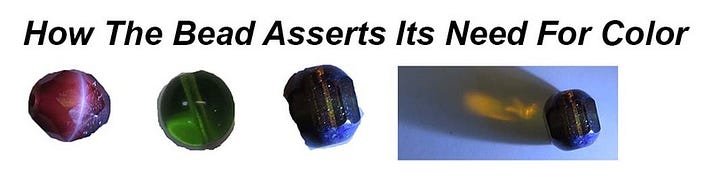
Beads do not come in every color. The perceived color on any bead has a lot of variation due to the shape, curvature and faceting of beads, as well as the effects of the hole and its drilled channel. Some beads will cast a shadow past their boundary. Some beads have striations or other similar effects where different colors are strewn within and throughout the bead. The perception of color may differ as the bead is viewed under different light sources, or indoor or outdoor, or different casts of shadows. Different types of bead finishes reflect, absorb or refract light differently from each other. The perceived color of the bead might vary based on the colors of the clothing, skin tone, hair style and color, and makeup of the person wearing the jewelry.
With paint, you can construct any color and can create many coloration effects. But, once completed, the painting is static as is the lighting. There will be a more consistent perception of colors and colorations.
(2) Position
Painting is observed in fixed position with fixed lighting with a viewer standing in front of it. Jewelry is observed as it moves, with varying light and shadow conditions by someone who wears it and others who view it. Jewelry will also shift positions as it is worn.
(3) Appeal and Functionality
Jewelry has to succeed both visually and functionally. The things contributing to function, from canvas to clasp assembly, offer their own complications to the sensation of color.
Paintings are judged by appeal alone.
(4) 2 or more colors in contrast
When you have 2 or more colors existing within the same composition, they may affect the perception of color of any one of them. They may blend, exude temperature, feel closer or more distant. The proportion of each color present will affect how they are perceived. The juxtaposition of 2 or more colors has a critical effect on the sensation of colors, moreso, complicated because jewelry moves.
(5) Transitioning from one bead to the next
With jewelry, more attention must be given to the transitioning from one bead to the next, one color to the next, because this often is not fluid or natural. There will be gaps of light between beads, or negative spaces not taken up by the volume of each component. With jewelry, as it moves, it is more often the case that perceptions of color will not conform to scientific universals.
(6) Goals
The goal for the artist is to evoke emotions based on harmony and balance with a little variety. Evidence of finish and success lie in establishing harmony and balance.
The goal for the jewelry designer is resonance with a little more of an edge to it that takes the viewer slightly beyond harmony and balance. Evidence of finish and success relates to how the designer and the wearer establish some shared understanding that the values and desires of each have been met when the jewelry is worn.
DESIGNING JEWELRY INVOLVES
MAKING A WHOLE HOST OF CHOICES
As designers, we…
- Select materials and techniques, leveraging their strengths and minimizing their weaknesses
- Anticipate how the parts we use to make a piece of jewelry assert their needs for color
- Anticipate shared universal understandings among self, viewer, wearer, exhibitor, collector and seller about color and its use
- Think through how colors relate to our inspirations and how they might impact our aspirations
- Pick colors
- Place and arrange colors
- Distribute the proportions of colors
- Play with and experiment with color values and color intensities
- Leverage the synergistic effects and what happens when two (or more) colors are placed next to one another
- Create focus, rhythm, balance, dimension and movement with color
- Create satisfying blending and transitioning strategies using color
- Anticipate how color and the play of color within our piece might be affected by contextual or situational variables
- Reflect on how our choices about color affect how the piece of jewelry is judged as finished and successful by our various client audiences
- Use color to promote the coherency of our pieces, and the speed and extent to which attention by others continues to spread
PICKING COLORS FOR JEWELRY DESIGNS
The jewelry designer has to pick colors pleasing to the designer, as well as anticipate what colors will be pleasing to the wearer or buyer. This makes picking colors very personal and subjective. We all know that designs are imperfect. Beads are imperfect. Colors are imperfect. So part of picking colors has to be very strategic and well-managed.
Colors are used by the designer to clarify and intensify the effects she or he wants to achieve. They are used to:
- Delineate segments, forms, themes, areas
- Express naturalism or abstraction
- Enhance the sense of structure or physicality (forward/recede; emphasize mass or lines or surfaces or points)
- Stimulate the senses (warmth or cold; memories; enlarging or decreasing)
- Play with light and shadow (surprise, distort, challenge, contradict, provoke)
- Alter the natural relationship between the jewelry and the situation it is worn in (context, clothing, body and face types/skin tones, setting)
- The resulting relationships between space and mass, negative and positive areas
- Focus attention, particularly providing information about direction, boundaries, permissions
Color Tools At The Designer’s Discretion
Both the artist as well as the jewelry designer have three primary color tools at their discretion. For the artist, these tools are used to control perceptions of color. For the jewelry designer, however, these tools are used to control the sensations and experiencing of color.
TOOL 1: SENSATION OF COLOR BALANCES (Light Values)
Individually, each color is perceived in the same way. Each color is associated with a particular energy and wavelength signature. Both artist and jewelry designer can assume that each color standing fixed and alone is perceived in the same way universally. For the jewelry designer, however, since jewelry is worn and moves, the designer cannot assume that in any one minute, each color will be perceived consistently in the same way.
TOOL 2: SENSATION OF COLOR CONTRASTS (Color Schemes/Color Wheel, Color Proportions)
When 2 or more colors co-exist in the same space, they affect each other. Color schemes and information about color proportions have been scientifically derived. These determine, to oversimplify things, a zero-zero point where the positive and negative energy signatures of each color balance out to zero. With a composition of blue and orange, this contrast color scheme indicates that their energy signatures would balance out to zero. When dealing with proportions, color theory determines that there should be one orange for every 3 blues, again to achieve harmony within this zero balance point. In this way, certain combinations of colors are seen as more appealing than others.

For the artist, she or he can achieve these universal understandings about color contrasts within any composition. For the jewelry designer, not so much. Color schemes and color proportions are a good place for the designer to start any project. But because movement and context will continually distort perceptions of these colors as the jewelry is worn, more color management will be called for, if the piece is to feel finished and successful. The jewelry designer literally has to work hard to trick the brain so that it interprets the inevitably resulting imperfections in color use as PERFECTions.
TOOL 3: SENSATION OF COLOR CONTRASTS IN CONTEXT (simultaneity effects, shared understandings)
When 2 or more colors are present, and you take into effect more contextual information, you often find that colors experienced simultaneously can affect how each color is perceived apart from what you would predict from things like color light values, color schemes or color proportions.
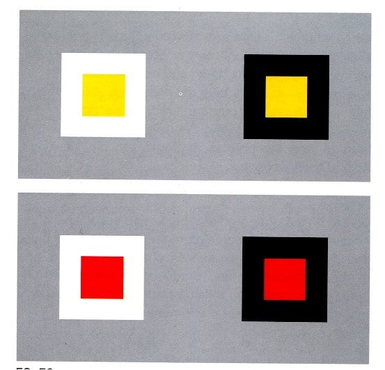
A yellow square inside a white box appears to feel cooler than that same yellow square in a black box. Similarly with the red square. Colors appearing simultaneously can be made to feel to be receding/approaching, warm/gold, blending and bridging, overcoming gaps and negative spaces or paralyzed by them, establishing dimensionality and movement, redirecting attention, blurring or bounding, smaller or larger.
Any color with a gray or black undertone will take on the characteristics of the color beside it. Besides the obvious black diamond color, other colors which have gray or black undertones include prairie green, Montana blue, French rose, purple violet, Colorado topaz.
Other types of beads which allow you to create simultaneity effects: silver, gold, anything with a mirror or foil effect, color-lined beads.
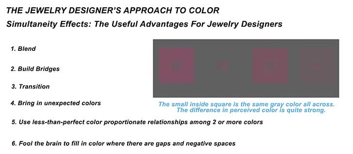
Thus, Simultaneity Effects are a boon to the jewelry designer. They are great tools for TRICKING THE BRAIN and …
- Making the variation in color as expressed within the bead or other object as more homogeneous
- Filling in the gaps of light between beads
- Assisting in the guiding attention along or the sense of movement of colors along a line or plane
- Assisting in establishing dimensionality in a piece that otherwise would appear flat
- Harmonizing, Blending or Bridging two or more colors which, as a set, don’t quite match up on the color wheel
- Establishing frames, boundaries or silhouettes
- Re-directing the eye to another place, or creating sense of movement
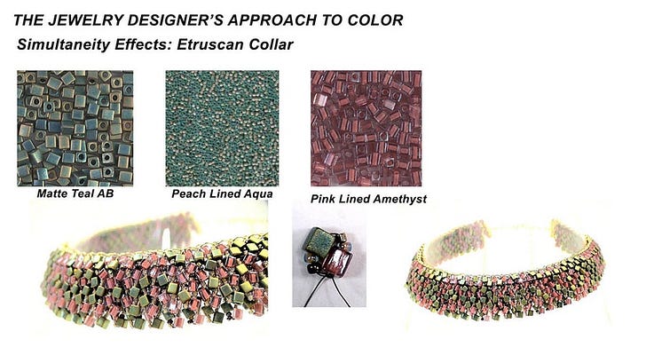
The Blue Waterfall Necklace
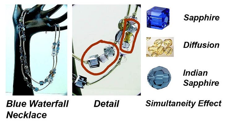
In this Blue Waterfall Necklace, which is one of my designs, I capitalized on the use of simultaneity effects. As you can see in the image above, there are three colors which I lined up together: Sapphire (cube), Crystal Diffusion (cathedral) and Indian Sapphire (which is a rounder shape). Normally, you would not mix sapphire and Indian sapphire in the same piece. They don’t really go together. Using a color in between — crystal diffusion in this case — which acts in a similar way to a gray color bead, I was able to blend the characteristics of the Indian sapphire bead on one side and the sapphire bead on the other. When you look at the finished piece, the colors lined up in each segment appear harmonious.
Some additional examples of strategic color use that I have done:
A. Putting a transparent faceted olivine bead next to a transparent faceted capri blue bead. In bright or direct light, depending on in what direction from the light the person wearing the piece is standing, will cast a color shadow — either an olivine shadow over the capri bead, or a capri blue shadow over the olivine bead. That means, when the person orients their stance in various positions, you will often get a muddy brown look, rather than distinct olivine and capri blue colors.
This arrangement would also be the beginning of an analogous color scheme. In this scheme no color should predominate. If one does, it starts to look less satisfying. If we rely on a different color theory about color proportions, then we want to have 1.5 blue green for every 1 olivine. In this case, we could not meet the criteria for both the color scheme rule and the color proportion rule.
In any event, I would probably first place a sterling silver or gold bead between the olivine and capri. These metal beads will create that simultaneous effect. When a person is wearing the piece, sometimes, depending on the lighting and the person’s stance, the capri and its shadow will take up a greater volume, and vice versa with the olivine. There won’t be that occasional muddy look.
B. In my piece — Little Tapestries: Ghindia — I embedded red crystal beads within a seam. They are not visible if you are standing in front of the person wearing the piece. I wanted the person wearing the piece to subtly catch the eye (bright red flashes of color reflecting the light) of anyone to her side or just behind her.
C. It is difficult to mix materials within the same piece. That is partly because the brain/eye interaction with each type of material is often different, and this is unsettling for the brain. Painful. When the brain is unsettled, the piece gets interpreted as unsatisfactory, unappealing, even ugly. Successfully mixing materials gets very caught up in an understanding of light and shadow. And an understanding of light and shadow is very influenced by and influential in the use of color.
The surface of a material has many characteristics which the jewelry designer leverages within the finished piece. Light might reflect off this surface, such as with opaque glass or shiny metal. Light might be brought into and below the surface before getting reflected back, such as with many gemstones and opalescent glass. Light might refract through the piece at different angles, even creating a prism effect. Light might be absorbed below the surface, as with pearls.
The surface might be a solid color. It might be a mix of colors. It might be matte. It may be flat, have crevices, have matrixing, or have inclusions. It may have fire or flashing coloration effects. There may be tonal differences. There may be pattern or textural differences. It may convey movement. It may convey depth.
One example that comes up a lot: it is difficult to mix gemstone with glass. For most gemstones, the light travels from the eye to the surface of the material, then continues below the surface, before bouncing back. For most glass, the light travels from the eye to the surface of the material, then bounces back; it does not penetrate the surface. When mixing gemstones and glass, if the brain’s interaction with the materials requires a shift in the activity of physical perception, then this is often uneasy and painful for the brain.
If I were to mix glass and gemstone, I would choose glass which mimics the brain/eye/light effect. I would choose a translucent glass bead where this effect is mirrored to that with the gemstone.
Let’s say I created a necklace of opal beads. With opals, the light penetrates below the surface, interacts with movement (fire effect), then bounces back to the eye. I can mirror this effect with silver lined translucent glass beads. The silver lining within the transparent glass mimics the sense of ‘fire’. If I had added a silver lined transparent bead instead, this would not work as well. Here, with the transparent bead, the light hits the surface of the glass and the silver lining intensifies the experience of the particular color of the glass.
Let’s stick with this opal necklace. Say I added an opaque black seed bead in between each opal bead. If small enough, this configuration kicks in the GESTALT cognitive behavior. The brain “sees” a gap between each opal bead, and not a glass bead. The brain fills in the gap with color approximating that of the opal beads. If this seed bead gets too large relative to the opal bead, however, a different cognitive process kicks in. Here the brain has to deal with the perceptual anomaly of light bouncing back and forth in different ways — eye to surface and eye to below surface. Again, painful for the brain.
D. Substituting one material for another will result in a very different experience of the object for the wearer. Take, for example, a Chakra bracelet strung on cable wire with a clasp. Say the beads used are gemstones. Each gemstone has spiritual and healing properties. Each gemstone has a coloration, and each different coloration, too, is associated with certain spiritual and healing properties. Moreover, every individual has their own unique needs for which set of gemstones and which assortment of colorations are best and most appropriate. This can get even more complicated in that each situation and context may have its own requirements.
The designer could have used glass or acrylic beads instead. These would be less spiritual, less healing, less valuable and less durable over time. Only the property of coloration would be the critical variable leading to spiritual and healing properties. The sensations the wearer would have with the gemstone bracelet would differ significantly from those with the glass or acrylic bracelet.
YOU CANNOT SEPARATE THE COLOR
FROM THE HOW AND WHY IT WAS CHOSEN
With any art object, the designer and the artist are at the core of it all. Its success depends on the types of choices made. Though both disciplines overlap some, artists and designers have to resort to a different thinking process when making choices about color.
When someone interacts with any art object, the brain tries everything it can to make sense of and harmonize the situation. Should it like it or not? Should it touch it, wear it, buy it, or not? Should it influence you to share your observations and emotions, or not? The brain tries to zero-sum the light values by taking into effect each color’s energy signature. It has to weigh information about how much of one color there is in relation to one or more other colors. It has to evaluate information about emotional and other meaningful content the juxtaposition and placement of any set of colors within any context or situation represents. It has to fill in the blanks — gaps and negative spaces — where it might expect to see some color but does not. It has to determine whether the person should expend the time and energy to attend to the whole object, or stop at just a small part of it. It has to attend to color, whether static or moving.
The artist seeks to anticipate how people perceive color, and based on color theories, can recognize how certain universals come into play. They emphasize these universals. This results in harmony and balance.
The jewelry designer has a different task, more complex, riskier. The designer, in anticipation of how others perceive, recognize and interpret colors in their lives, has to establish within any design a strategy for how color is used to enhance expression within any piece. The jewelry designer must anticipate the effects of movement on color. The jewelry designer is the manager. The designer is the controller. The designer is the influencer. The designer brings to the situation personal values and desires. The designer establishes and conveys intent and meaning resulting from the choices, including and especially about color, she or he has made. Fluent designers can decode color and its use intuitively and quickly, and apply color in more expressive ways to convey inspiration, show the designer’s strategy and intent, and trigger an especially resonant, energetic response by wearers and viewers alike.
The viewer and wearer then must determine whether the designer’s use of color meets and assists them in expressing their own values, needs and desires. They might wear or buy it. They might show it to their friends. They might merely complement the designer. They might walk away.
_______________________________________________________
Get more from Warren Feld Jewelry on Patreon
Taking Jewelry Beyond Craft
Thanks for being here. I look forward to sharing more resources, tips,
sources of inspiration and insights with you.

WarrenFeldJewelry.com
Shop.warrenfeldjewelry.com
School.warrenfeldjewelry.com
Coaching by Warren Feld
Add your name to my email list.
~~~~~~~~~~~~~~~~~~~~~~~~~
SO YOU WANT TO BE A JEWELRY DESIGNER:
Merging Your Voice With Form

588pp, many images and diagrams Ebook , Kindle or Print formats
Taking Jewelry Design Beyond Craft
Jewelry making has aspects of craft to it, but it is so much more. It is art. It is architecture. It is communicative and interactive. It moves with the person wearing it. It is reflective of the jewelry designer’s hand. And it defines and reaffirms the narrative stories of everyone who wears it, views it, buys it, exhibits it, collects it, talks about it.
To go beyond craft, the jewelry designer needs to become literate in this discipline called Jewelry Design. Literacy means understanding how to answer the question: Why do some pieces of jewelry draw your attention, and others do not? How to develop the authentic, creative self, someone who is fluent, flexible and original. How to gain the necessary design skills and be able to apply them, whether the situation is familiar or not.
Craft and art techniques and theories are of little help. These do not show how to make trade-offs between beauty and functionality. Nor how to introduce pieces publicly. These provide weak rules for determining when a piece of jewelry is finished and successful. Often, the desires and motivations of wearers, viewers and buyers are minimized or ignored.
So You Want To Be A Jewelry Designer reinterprets craft techniques, modifies art theories, and introduces architectural, socio-cultural and perceptual-cognitive considerations so that jewelry makers are better prepared to approach design.
By the end of So You Want To Be A Jewelry Designer, established jewelry artisan Warren Feld teaches you how to
· Select materials, techniques and technologies
· Choose, compose, construct and manipulate jewelry design elements
· Anticipate expectations, perceptions, values and desires of client audiences
· Develop those soft skills of creativity, inspiration, aspiration and passion
Warren Feld examines with you all those things which lead to your success as a jewelry designer, and your associated design practice or business.
588pp, many images and diagrams Ebook , Kindle or Print formats
