Margie Deeb’s New Color Report
Posted by learntobead on February 27, 2011
Margie Deeb’s
Color Report for Bead & Jewelry Designers
Spring/Summer 2011
www.margiedeeb.com
Margie Deeb is a very prolific color artist and jewelry designer. She has written many books, and puts out many articles, including her Color Reports. These are for sale on her website.
In her periodic Color Reports, she discusses the current fashion colors, how to combine and match them in jewelry designs.
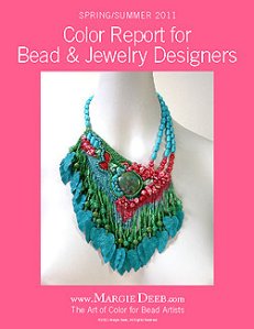
I was particularly struck by the piece on her cover. This piece was done by Jamie Cloud Eakin called “Garden Party.” I think it’s a brilliant example of contemporary jewelry art.
The color choices — a green turquoise, a blue turquiose, and a antique rose work well together.
Her placement of each color, and the proportions of each color are spot on.
The style of the piece — what is called a “jewelry profile” — is very contemporary. We basically have an oversized pendant hung close to the neck like a choker. You see this style widely in New York and California, and on the soap operas and news casters on TV. It’s been an evolving style for about 5 years now, but has not really caught on in the rest of the country.
In our bead studies classes, we refer to the general style as wearing a sign around your neck. And I think that’s one reason the style hasn’t spread widely. Often, the pendant’s relationship to the strap is poorly designed, and so the piece looks like someone is wearing a sign around their neck.
But Jamie’s piece solves this problem wonderfully. I think many factors are operating here: The incline along the top, making the one side of the strap hang higher than the other. Her incorporation of the antique rose color in the one side of the strap at the bottom. The strap on one side is single, and on the other side, it is 3-stranded.
The piece is somewhat asymmetrical, yet very balanced. Jamie has clearly made something noteworthy out of the ordinary.
The piece has movement, and it has dimensionality. These are very important components of contemporary jewelry design.
Last, with turquoise or turquoise and red, you often end up with something very strongly associated with the Southwest US. If you don’t want the viewer to interpret your piece that way, it’s difficult with these colors. I think Jamie has succeeded here, as well.
This is a superbly designed piece. I suggest that everyone study its details closely.
Discover more from Warren Feld Jewelry
Subscribe to get the latest posts sent to your email.


Leave a comment