


A LESSON IN USING COLOR SIMULTANEITY EFFECTS:
Posted by learntobead on April 22, 2013
A LESSON IN USING COLOR SIMULTANEITY EFFECTS:
The Contemporized Etruscan Collar
By Warren Feld
http://www.warrenfeldjewelry.com
reposted from my Jewelry Design Discussion Group on FaceBook
https://www.facebook.com/groups/jewelrydesign/

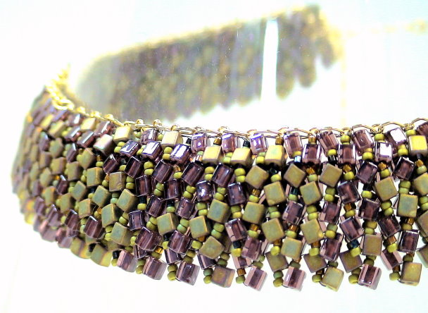
Several years ago, I had been asked to do a week-long jewelry design workshop in Cortona, Italy. The topic I selected was on Contemporizing Traditional Etruscan Jewelry. One of the projects I developed for the workshop was this Contemporized Etruscan Collar. The challenge, here for me, was to create a sophisticated, wearable, and attractive piece that exemplified concepts about contemporizing traditional jewelry.
Contemporizing Traditional Jewelry has to do with how you take particular traditional forms and techniques, and both add your personal style to the pieces, as well as make them more relevant to today’s sense of fashion and style. The challenge for the designer is how to keep traditional ideas essential and alive for today’s audience.
Things clicked. I found a traditional Etruscan Collar that I immediately connected with.
The Contemporized Etruscan Collar
The contemporized piece basically consists of two staggered and overlapping bead-woven strips. The bead-woven technique used is the Ndebele Stitch (sometimes called Herringbone).
There are many design theory elements incorporated into this piece, including dimensionality, curvature, malleability, and movement. One of the more interesting theories I applied here has to do with color simultaneity effects.
Color Simultaneity Effects
Picking colors is about making strategic choices. Picking colors is very revealing about the jewelry artist’s understanding of how the bead asserts its needs for color. One set of color-theories employed to make these kinds of choices has to do with Simultaneity Effects. Colors in the presence of other colors get perceived differently, depending on the color combination.
For example, a White Square on a Black background looks bigger than a Black Square on a white background. White reaches out and overflows the boundary; black contracts.
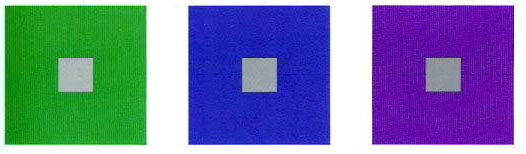
Another example: Gray always picks up some of the color characteristics of other colors around it. Gray next to orange will appear to have an orange tone to it. Gray next to green will appear to have a green tone to it. A “Gray” bead is one, the color of which, has a strong gray or black tone to it. Besides the obvious “gray”, these other colors function as a “gray”: montana blue, alexandrite, colorado topaz, prairie green. Many color-lined and silver-lined beads can function as a “gray”, particularly when the glass color is other than clear. Many metallic or otherwise reflective surface beads can function as a “gray”.
A final example of simultaneity effects has to do with how people sense whether colors are warm or cool. In one composition, depending on the color mix, a particular color might be felt as “warm”. In a second composition, with a different color mix, that same color might be felt as “cool”. You can picture a yellow square surrounded by white feels lighter, brighter and a different temperature than its counterpart surrounded by black. A red square surrounded by black feels darker, duller, and a different temperature than its counterpart surrounded by white.
Existence of these simultaneity effects is a great piece of information for the designer. There will be gaps of color and light between beads. Many bead colors are imperfect, particularly in combination. Playing with simultaneity effects gives the designer tools to overcome some of the color limitations associated with the bead and the gaps of light between beads. These allow you to “blend” and build “bridges” and create “transitions.”
Look back at the images of the Ndebele-stitched piece. When you work with beads, there are always gaps between them. In the Ndebele-stitch, there are many and very pronounced gaps of light between beads. This can be very threatening to a viewer. People are pre-wired to avoid things which might harm them, such as snakes and spiders. This is our fear- or anxiety-response.
We can summarize most color theories as a set of principles the brain uses – both in perception and cognition – to find a state of color or colors which are harmonious. That is, people like to see and feel comfortable and safe with colors which harmonize and go together. When we start to lose that harmonious state of color, this makes the brain edgy. When the brain starts to get edgy, we start to interpret pieces as boring, monotonous, scary, dangerous, will cause death. We innately reject, as part of our pre-wired fear response, that which does not follow good principles of color.
Any viewer’s brain will immediately try to interpret what it sees and make sense of it. This includes jewelry. The viewer’s brain needs to know immediately whether to approach or flee. Each time the eye/brain comes to the end of the bead and is confronted with a gap of light separating it from the next bead, it’s similar to a person approaching a cliff, and getting asked to jump off of that cliff.
No one wants to jump off a cliff. And no one’s eye/brain wants to jump over a gap of light between two beads.
We have to fool ourselves, that is, our brain, in some way. Color theories offer us many possible ideas on how to do this. I find using simultaneity effects works especially well in jewelry compositions using beads. Certain colors, when juxtaposed, create their own meanings, and fool the brain into thinking it sees something in these gaps, or is somehow more motivated to fill in the gaps, and proceed from one bead to the next.
In this Etruscan Collar project, many of my color choices were based on an understanding of simultaneity effects.
Discover more from Warren Feld Jewelry
Subscribe to get the latest posts sent to your email.

Leave a comment