


HOW TO DESIGN AN UGLY NECKLACE: The Ultimate Designer’s Challenge / You Be The Judge
Posted by learntobead on October 25, 2020
Abstract
It’s not easy to do Ugly! Your mind and eye won’t let you go there. We are prewired with an anxiety response to help us avoid things that might harm us. So, it turns out, it is easier to design a beautiful piece of jewelry than an ugly one. Designing an ugly necklace, then, presents the designer with the ultimate challenge. To achieve a truly hideous result means making the hard design choices, putting ourselves in situations and forcing us to make the kinds of choices we’re unfamiliar with, and taking us inside ourselves to places that we are somewhat scared about, and where we do not want to go. The International Ugly Necklace Contest, first announced in 2002, and held 10 times since then, was one of the programs we launched as a way to reaffirm our beliefs in a design-oriented, theory-based, professional craft education curriculum. This article discusses the idea of “Ugly”, and provides some clues to designers about achieving it.
At the end of the article, you are given the chance to review and judge three of the submissions to The Ugly Necklace Contest — How Ugly Are They? You decide.
HOW TO DESIGN AN UGLY NECKLAC:
The Ultimate Designer’s Challenge
Can you put together a well-designed and functional, yet UGLY, necklace? What kinds of things might you do if you were trying to design a necklace that is ugly, hideous, unsatisfying and what have you?
It’s Not Easy To Do Ugly!
Your mind and eye won’t let you go there. As research into color and design has shown, your eye and brain compensate for imbalances in color or in the positioning of pieces and objects — they try to correct and harmonize them.
You are pre-wired with an innate fear and anxiety response to subconsciously avoid anything that is disorienting, disturbing or distracting. You are genetically predisposed to avoid things that might hurt you or kill you, like snakes and spiders.
Moreover, necklaces are arranged in a circle. The circle shape itself errs on the side of beauty, and anything arranged, ordered or organized, such as the component parts of a necklace, will err on the side of beauty.
Because of all this, beauty is the norm. It is easier to design a beautiful necklace than an ugly one! How about that! Any jewelry designer who attempts to achieve “Ugly,” has to have enough control and discipline to override, perhaps overcome, intuitive, internally integrated principles of good design.
To achieve a truly hideous result means making the hard design choices, putting ourselves in situations and forcing us to make the kinds of choices we’re unfamiliar with, and taking us inside ourselves to places that we are somewhat scared about, and where we do not want to go.
– Can I push myself to use more yellow than the purple warrants, and mix in some orange?
— Can I make the piece off-sided or disorienting, or not have a clear beginning, middle or end?
— Can I disrupt my pattern in a way that, rather than “jazz,” results in “discord?”
— Can I work with colors and materials and patterns and textures and placements and proportions I don’t like?
— Can I design something I do not personally like, and perhaps am unwilling, to wear around my neck?
— Can I create a piece of jewelry that represents some awful feeling, emotion or experience I’m uncomfortable with?
— Can I make something I know that others won’t like, and may ridicule me for it?
Because answering questions like these is not something people like to do, jewelry designers who attempt to achieve “Ugly,” have to have a lot of control and discipline to override, perhaps overcome, intuitive, internally integrated principles of artistic beauty.
The best jewelry designers, therefore, will be those artists who can prove that they can design a truly Ugly Necklace. These are designers who can break the boundaries of form, material and technique.
What Is Ugly?

We often like to say that beauty (and by inference, ugly) is in the eye of the beholder. But once we utter that phrase, we deny the possibilities of design — and the perspective from the eye of the designer. We refuse to accept universal understandings of beauty and appeal. We take away much of our power to reflect and evaluate and judge. We leave too much to the situation, and too little to our abilities as jewelry designers to translate inspiration into aspiration into finished designs which emotionally affect those around us.
As designers, we like to think we are capable of designing something beautiful. As teachers, we like to believe we are capable of training someone to be a better designer — one who can more readily choose colors, patterns, textures, forms and arrangements — in universally pleasing ways. As a discipline, we like to think of good design as resulting from sets of learned information, insights and behaviors.
Different people interpret “Ugly” in different ways. Some might focus on the ugliness of each individual component. Some might use materials they feel convey a sense of ugly, such as llama droppings, or felted matted dog hair, or rusty nails, or cigarette butts, or a banana peel. Some might focus on mood and consciousness, and how certain configurations of pieces and colors evoke these moods or states of consciousness. Others might focus on combining colors which don’t combine well. Still others might focus on how the wearer’s own body would contribute to a sense of ugliness, when wearing the piece, such as the addition of a “Breast Pocket” which would lay just below the woman’s breast, or peacock feathers that covered the wearer’s mouth, or the irritating sounds of rusty cow bells, or the icky feeling of a rotting banana peel on the skin. Still others might view Ugly as a sense of psychological consciousness, such as being homeless, or an uncomfortable transition from adolescence to adulthood. For some Ugly might mean politically ugly, like Saddam Hussein of Iraq, or the trans-fats associated with fast foods.
It is not enough just to string a bunch of ugly beads on a wire. Ugly pieces do not necessarily result in an ugly necklace. Actually, if you look at many ugly pieces or components, once they are arranged and organized, they no longer seem as ugly anymore. Organization and arrangement contribute their own qualities and sense of beauty which transcend the ugly parts.
Adding to the fun (?difficulty?), designers want their ugly necklaces to also be functional and wearable. This goes to the heart of what jewelry is all about. Otherwise, they would merely be creating sculptures. The parts and techniques used to design an ugly necklace must also anticipate functional requirements. Otherwise, the piece of jewelry becomes a failure not only as a piece of jewelry, but of art, as well.
About The International Ugly Necklace Contest
The Ugly Necklace Contest, first announced in 2002, and held 10 times since then, was one of the programs Land of Odds-Be Dazzled Beads launched as a way to reaffirm our beliefs in a design-oriented, theory-based, professional craft education curriculum. The Contest was conceived as a fun way to break students out of the traditional craft mold, and get them to think, ponder, and translate their feelings and perceptions of what is UGLY into an organized and functional necklace design.
We made the contest international. We launched it on-line. Our goal was to politely influence the entire beading community to think in different terms and to try to work outside the box. We also wanted very actively to stimulate discussion about whether there are universal and practical design theories which underlie beadwork, and which can be taught.
Can you really design UGLY, or is UGLY merely in the eye of the beholder?
Four conceptual precepts underlying the creation of the Contest itself included:
1. The Necklace should be Ugly, yet still function as a piece of jewelry.
2. Better designers will demonstrate a degree of control over achieving these ends.
3. Better designers will show a sense of how both the larger context within which the jewelry is worn, as well as the overall effects of the wearer wearing the piece, will increase the piece’s Ugliness.
4. Better designers will have an intuitive design sense; best designers will show some strategic control over the design process.
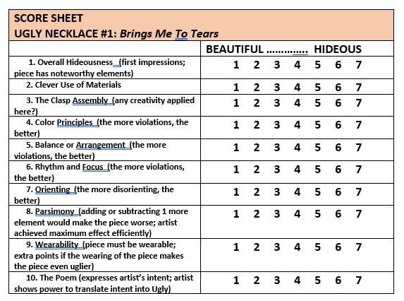
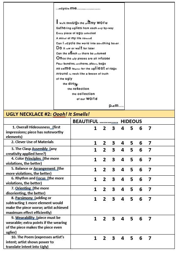
Our judges evaluated each Ugly Necklace submission according to 10 jewelry design criteria (See Below), and scored each criteria. Each criterion was weighted equally. The 10 necklaces with the highest average scores were selected as our 10 semi-finalists.
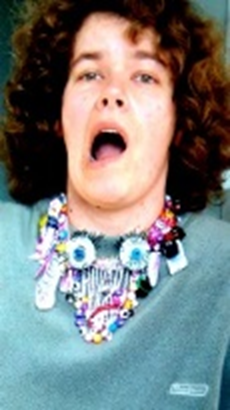
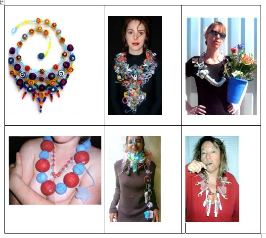
Ten Semi-Finalists were picked. They were asked to submit the actual necklaces to us, to be put on display at Be Dazzled Beads. We took images of each one — a full frontal image showing someone wearing the piece, a close-up, and a close-up of the clasp assembly. We posted these images, along with the poems, on-line (now on display here) so that visitors to the site could vote for the winner and runner up. The winner got a $992.93 shopping spree on the Land of Odds web-site; the runner-up got a $399.07 shopping spree on the web-site.
NOW, You be the JUDGE!
Below, I present three very different Ugly Necklace submissions. Each artist submitting their necklace must include the following in their packet:
1) At least 4 images (front, back, someone wearing it, detail of clasp assembly)
2) A poem where they get to put into rhyme the kinds of things they were thinking when they made their various design decisions
3) A list of materials and techniques.
Some of this material is provided below to assist you when scoring each piece.
And you might want to take some aspirin first. It’s difficult to get your mind to evaluate things opposite to how you normally would do it.
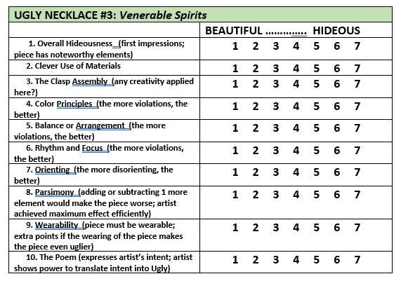
The Judges Criteria
Each necklace is scored on 10 jewelry design criteria.
1. Overall Hideousness (first impressions; piece has noteworthy
elements which slant your impressions toward Ugliness)
2. Clever Use of Materials (something about the materials chosen
contribute to a sense of Ugliness)
3. The Clasp Assembly (any creativity applied here?)
4. Color Principles (the more violations, the better)
5. Balance or Arrangement (the more violations, the better)
6. Rhythm and Focus (the more violations, the better)
7. Orienting (the more disorienting, the better)
8. Parsimony (adding or subtracting 1 more element would make the
piece more appealing, satisfying, even beautiful rather than more
ugly; artist achieved maximum ugly effect efficiently and
economically)
9. Wearability (piece must be wearable; extra points if the wearing of
the piece makes the piece even uglier)
10. The Poem (expresses artist’s intent; artist shows power to
translate intent into Ugly)
The Criteria In More Detail
1. Overall Hideousness (first impressions; piece has noteworthy
elements which slant your impressions toward Ugliness)
The idea of “Noteworthiness” is key here. Noteworthiness means the extent the artist took something ordinary and made it extraordinary.
The best examples were the unexpected use of familiar materials. For example, felted dog hair shaped into beads; llama droppings, colored and drilled to be used as beads; a toothbrush used as part of a clasp assembly; a banana peel used as a pendant drop.
In some cases, the artist tried to make the necklace into a political statement, such as the Saddam Hussein necklace with bullets and pink shoes; or the glutenous fast food necklace with the gummi hot dog and gummi bun as the clasp.
In many cases, found objects, insignificant on their own, were organized to call attention to special meanings, such as the grenade box found among shells at the beach; or the remaining parts of a cat along with the chicken bone that led to her demise; or plastic jewels that seemed electrifying to the designer as a young girl, and so not as an adult.
Other things the judges look at include the clasp assembly, the artist’s anticipation of the effects of wearing the piece, the overall goals of the artist with the piece, and their first reaction to the piece.
2. Clever Use of Materials (something about the materials chosen
contribute to a sense of Ugliness)
In too many cases, the jewelry artist chose ugly pieces and assumed that a necklace made of ugly pieces would itself be ugly as well. But as you can see from the images on this web-site, this strategy does not work well.
The artist has to have a deeper understanding of why the materials are ugly. The artist also needs to stay focused and strategic enough in the design process, so that she or he maintains this sense of ugly as the necklace gets organized.
For example, one necklace used felted matted dog hair, and made beads out of this. This was a start at a clever use of materials. But once strung into a circle, the necklace looked like something someone might actually wear.
A necklace of cigarette butts, again once organized into a circle, doesn’t look quite as ugly. In addition, the necklace over-used cigarette butts — too many — which started to make the necklace a bit boring. While “boring” might take us in the direction of “ugly”, in this case, it diminished the power of the cigarette butts to make a statement about “ugly”.
This criteria looks at the total picture. Not just the ugliness of each individual piece. But also the degree to which the assembly of pieces maintains this sense of ugliness. The concern here is “design-cleverness in the USE of materials”.
3. The Clasp Assembly (any creativity applied here?)
A better clasp assembly is one that seems to be an integral part of the necklace, not just an after-thought or add-on. It should anticipate how it contributes to the ugliness of the piece, how it re-affirms the artist’s concept and goals, and how it adds to the wearability of the piece.
Successful Clasp Assemblies:
A gummy hot dog closes into a candy gummy bun
There is an elaborate strap, zipper, and suspender toggles system as the clasp assembly. With different configurations of parts, the necklace may be worn as a choker, a back pack, a wrap, a fanny pack, a clutch, or a traditional over-the-shoulder and around the neck necklace.
A troll doll is the clasp. One end of necklace string is tied into a loop and wraps around the left hand of the troll doll. The other end of the necklace string is tied into a loop and wraps around the right hand of the troll doll. The two hands of the troll doll push apart to open up, and push closed to secure the necklace.
4. Color Principles (the more violations, the better)
The degree the piece violates good principles of color. This might include using colors in incorrect proportions; or which violate color schemes; or violate rules of dominance/submission; or disturbing arrangements — vertical vs. horizontal, shading and tinting, sharp vs. blurred boundaries, placements and balance, projecting forward vs. receding; or violating socio-cultural rules and expectations.
This is self-explanatory. For example, the appropriate proportions of yellow to purple should be 1:4, meaning in any grouping of 5 beads, 4 should be purple and 1 yellow. When you deviate from this, your piece gets uglier.
COLOR THEORY discusses the use of the color wheel to select colors that work together within a “scheme”. There are many schemes, including Analogous, Complementary, and Split Complementary. An ugly necklace would select colors that violate this scheme. This might mean selecting colors that do not fit together within a scheme. It might mean using the wrong proportions of color within the scheme. It might also mean violating expectations about which colors should and should not predominate within the scheme.
5. Balance or Arrangement (the more violations, the better)
This is self-explanatory. Does the placement seem satisfying, such as a graduated necklace that starts with smaller sizes, works up to larger sizes in the center, then works back down to smaller sizes at the clasp? Or, not?
When looking at the piece, can you see alternative arrangements that might make the piece look even uglier?
Another aspect of bad balance and arrangement has to do with “dimensionality”. This is the degree, whether the piece is flat or 3-dimensional, that this is satisfying, or not. For example, a flat loomed piece with an extra large button clasp on the top of it, would probably be less satisfying than one with a smaller clasp on the end of the piece. Dimensionality can also be created through mixing beads or objects with different finishes, like mixing glossy and matte. An ugly mix somehow would feel dissatisfying.
6. Rhythm and Focus (the more violations, the better)
One of the goals of the jewelry artist is to motivate the viewer to take in, experience and appreciate the whole necklace. One of the major techniques is to create a rhythm with the patterning of the beads, and to create a focal point. This influences the viewer’s brain/eye to want to see each part of the necklace from beginning to end, and then come to rest.
An ugly necklace, would either have no rhythm or a boring rhythm or a nauseating rhythm. An ugly necklace would either have no focal point, or have a focal point that is in a very disorienting or disturbing place on the necklace, or be very disorienting or disturbing in and of itself.
7. Orienting (the more disorienting, the better)
Jewelry plays a critical psychological role for the viewer in a room or in a space. It orients them. It is one of the important things in any person’s visual environment that lets the person know what is up and what is down, and what is right and what is left.
The natural state in life is to be dis-oriented. It takes walls and ceilings, trees and horizons, things with clear right angles, clear perpendicularity, obvious horizontal and vertical planes, to enable us to orient ourselves within any space. Otherwise people would fall down, lose a sense of how to turn or position themselves, or feel paralyzed.
The wearing of jewelry plays a critical function here, in that it visually establishes for the viewer appropriate horizontal and vertical lines and planes. If you see someone with their earring dangle at a 90 degree angle, or their necklace turned around so that the clasp is showing when it shouldn’t — you know how uncomfortable this makes you feel, even wanting to cringe. And you know you want and need them to straighten things out. This jewelry is dis-orienting you, at a time when you subconsciously rely on it to be orienting.
If this wasn’t important, things like the odd-angled dangle wouldn’t bother you….But we know that it does.
8. Parsimony (adding or subtracting 1 more element would make the
piece more appealing, satisfying, even beautiful rather than more
ugly; artist achieved maximum ugly effect efficiently and
economically)
Once the artist has made their point, they don’t need to keep making it. For example, one entry used plastic trolls to create a sense of Ugly. There were over 20 on the necklace, but in their particular design, 6 or 8 were probably sufficient to make the point. The additional trolls served no other purpose in this piece. Just throwing in a lot of ugly pieces doesn’t necessarily result in something that is uglier. The additional trolls could have been used to make additional design points, but they were not. Instead they added a sense of repetition and disinterest.
A necklace of felted dog hair beads was a very clever idea. It was over 36″. No other design points were made, so an 18″ necklace of felted dog hair beads would have been as good as 36″. In a similar way, a very long necklace of cigarette butts would have been equally as good, or better if shorter, since no other design points were made.
9. Wearability (piece must be wearable; extra points if the wearing of
the piece makes the piece even uglier)
From a design perspective, Jewelry is Art As It Is Worn.
In other words, you can only appreciate the artistic qualities and sensibilities of any piece of jewelry only when you see it worn — as it moves with the body, as it conforms to the body, as it enhances the wearer’s sense of self, and the viewer’s sense of the situation and context.
In our contest, we set the rule that the piece has to be Wearable.
This rule tends to make it more difficult to achieve “Ugly”, but we’ve had some clever submissions that succeed here.
Some examples from our entries:
— Peacock feathers that would fill the wearer’s mouth
— An over-the-shoulder necklace that struggles to stay on the shoulders
— A breast pocket strategically placed on the tip of the breast
— Bloody teeth or a rotting banana peel meant to be worn against the skin
To the judges, wearability means that there should be clear evidence that the designer anticipated where the parts came from, and where they are going to, when the piece is worn.
10. The Poem (expresses artist’s intent; artist shows power to
translate intent into Ugly)
The poem must relate to the piece. It should clearly explain the artist’s goals and concept. It should detail the artist’s strategies for making the design choices she or he did.
The judges ask themselves, given what the artist wrote in the poem, to what degree have they successfully created an ugly piece of jewelry?
Your Turn
Use the scoring sheets below to evaluate UGLY NECKLACE #1 and UGLY NECKLACE #2 and UGLY NECKLACE #3.
Or even try your own hand at designing an Ugly Necklace. Can you do it?
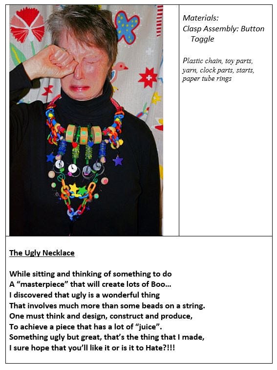
UGLY NECKLACE #1: Brings Me To Tears
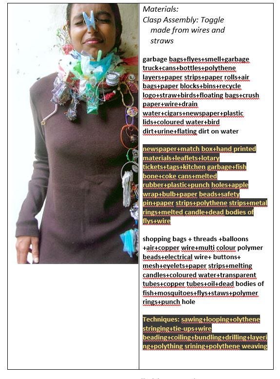
UGLY NECKLACE #2: Oooh! It Smells!
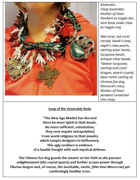
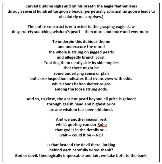
UGLY NECKLACE #3: Venerable Spirits
Other Articles of Interest by Warren Feld:
The Jewelry Design Philosophy: Not Craft, Not Art, But Design
Creativity: How Do You Get It? How Do You Enhance It?
Disciplinary Literacy and Fluency In Design
Becoming The Bead Artist and Jewelry Designer
5 Essential Questions Every Jewelry Designer Should Have An Answer For
Getting Started / Channeling Your Excitement
Getting Started / Developing Your Passion
Getting Started / Cultivating Your Practice
Becoming One With What Inspires You
Architectural Basics of Jewelry Design
Doubt / Self Doubt: Major Pitfalls For The Jewelry Designer
Techniques and Technologies: Knowing What To Do
Jewelry Making Materials: Knowing What To Do
Teaching Discplinary Literacy: Strategic Thinking In Jewelry Design
The Jewelry Designer’s Approach To Color
Point, Line, Plane, Shape, Form, Theme: Creating Something Out Of Nothing
The Jewelry Designer’s Path To Resonance
Jewelry Design Principles: Composing, Constructing, Manipulating
Jewelry Design Composition: Playing With Building Blocks Called Design Elements
Contemporary Jewelry Is Not A “Look” — It’s A Way Of Thinking
___________________________
FOOTNOTES
Deeb, Margie. The Beader’s Guide To Jewelry Design: A Beautiful
Exploration of Unity, Balance, Color & More. NY: Lark Jewelry &
Beading, 2014.
The International Ugly Necklace Contest, sponsored by Warren Feld Jewelry, Land of Odds, Be Dazzled Beads, LearnToBead.net. As referenced:
http://www.warrenfeldjewelry.com/wfjuglynecklace.htm
— — — — — — — — — — — — — — — —
I hope you found this article useful.
Also, check out my website (www.warrenfeldjewelry.com).
Enroll in my jewelry design and business of craft video tutorials online.
Add your name to my email list.
Visit Land of Odds online (https://www.landofodds.com)for all your jewelry making supplies.
Subscribe to my Learn To Bead blog (https://blog.landofodds.com).
Discover more from Warren Feld Jewelry
Subscribe to get the latest posts sent to your email.

Leave a comment