<!–
|


Powered by WebRing.
|
Posted by learntobead on July 20, 2018
<!–
|
Posted in Art or Craft?, art theory, design management, design theory, jewelry design, jewelry making, Learn To Bead, Stitch 'n Bitch | Tagged: design elements, principles of composition | Leave a Comment »
Posted by learntobead on April 24, 2018
JEWELRY DESIGN PRINCIPLES:
|
|||||||||||||||||||||||||||||||||||||||||||||||||||||||||||||||||||||||||||||||||||||||||||||||||||||||||||||||||||||||||||||||||||||||||||||||||||||||||||||||||||||||||||||||||||||||||||||||||||||||||||||||||||||||||||||||
 |
 |
 |
 |
 |
 |
Abstract:
It is not happenstance that some pieces of jewelry draw your attention, and others do not. It is the result of an artist fluent in design. That fluency begins with selecting Design Elements, but it comes to full fruition with the application of Principles of Composition, Construction and Manipulation. This is where the artist flourishes, shows a recognition of shared understandings about good design, and makes that cluster of jewelry design choices resulting in a piece that is seen as both finished and successful. These Principles represent different organizing schemes the artist might resort to. Jewelry artists translate these Principles a little differently than painters or sculptors, in that jewelry presents different demands and expectations on the artist. The better artist/designer achieves a level of disciplinary literacy – selecting Design Elements and applying Principles — where fluency becomes automatic, accurate, and rapidly applied.
COMPOSING, CONSTRUCTING, MANIPULATING
Some pieces of jewelry draw your attention. Others do not.
This is not a matter of happenstance. It is the result of an artist fluent in design. That fluency begins with the selection of Design Elements – the smallest meaningful units of design. But it comes to full fulfillment with the application and manipulation of Principles of Composition, Construction and Manipulation. These “organizing schemes” reflect what the individual artist wants to express, and how the individual artist anticipates how others will understand and respond to this expression.
Design Elements, which I have discussed in an earlier article [1], are like building blocks and function a bit like the vowel and consonant letters of the alphabet. They have form. They have meaning. They can be assembled into different arrangements which extend their meaning and usefulness in expression. Examples: color, shape, texture, point/line/plane, movement, dimensionality, and the like. Each Design Element has a set of expressive attributes. Color can be expressed as a color scheme, or as proportions, or as simultaneity effects. Shape can be geometric or dimensional or recognizable or symbolic. And so forth.
Design Elements function like a vocabulary. They represent universally accepted expressive content. Visualize the analogy between design elements and vocabulary. Picture a “t”, perhaps combined with an “h”, and then with an “e”. Or, picture the difficulty in trying to combine a “th” with a “z”. Or, still yet, picture how the “c” in “cat” is pronounced differently than the “c” in “sense”, yet still recognized as a “c”. In similar ways, the artist might decide to use the design elements of “color” and “line,” and combine them to yield another design element of “movement.” Literacy begins with the ability to decode, and this ability centers on the selection and use of Design Elements.
Principles of Composition, Construction and Manipulation function more like a grammar. Given the Design Elements selected by the artist, Principles represent organizing strategies to which the artist resorts when attempting to achieve a piece that will be seen as both “finished” and “successful”, both by the artist, as well as that artist’s audience. The artist might arrange several design elements and their expressive attributes to yield a higher level organizing principle. For example, the artist might combine color(intensity)+line(direction)+
shape( geometry)+placement(symmetry)+balance+material” to yield a sense of “rhythm.”
To continue our analogy with vocabulary, grammar and literacy, picture our “t”, “h” and “e” put together to form a full word like ”thesaurus”, then expanded into an idea, like “teachers like to use a thesaurus”, and further expressed, in anticipation of a response, to something like “but students hate when the teacher asks them to use a thesaurus.”
Literacy goes beyond decoding; it includes a fluency in how the Design Elements are organized to evoke an emotional response. This involves an intuitive understanding of Principles of Composition, Construction and Manipulation, and how to apply them. While Design Elements are selected primarily based on shared, more universal understandings of what they express, often, Principles are applied in ways more reflective of artist’s hand, and its subjective expression.
The successful jewelry designer has developed a fluency in the Disciplinary Literacy of jewelry design. Fluency is the ability of the designer to select and connect Design Elements smoothly, in visually and functionally and situationally appropriate ways with understanding. The idea of understanding is broadly defined, to include the artist’s personal goals for expression, as well as the expectations of all the audiences – the wearer, the viewer, the buyer, the seller, the student, the master. The better designer achieves a level of disciplinary literacy where fluency becomes automatic, accurate, and rapidly applied.
This Disciplinary Literacy in jewelry design has a structure all its own. There are four main components to it:
1) Vocabulary: Design Elements As The Basis Of Composition
2) Grammar: Principles of Composition, Construction and Manipulation
3) Strategy: Project Management[2]
4) Context/Culture: Shared Understandings[3]
This article focuses on the second component – Principles.
What Are Principles of Composition, Construction and Manipulation?
Jewelry Design is the strategic application of basic principles of organization and expression to achieve a piece which evokes emotion, resonates, and is appealing as it is worn. Traditionally the art and design worlds referred to these as “Principles of Composition.” Often artists and designers get tripped up on the word Principles, and jewelry designers get a bit confused or frustrated with the word Composition.
The use of the word “Principles” in art and design can be somewhat confusing. These Principles do not represent a set of universal, dependable and repeatable standards to strive for, which we might assume, at first.
A different meaning about “Principles” applies here. A Principle is an organizing scheme as a way to combine design elements into a more pleasing whole composition. The design elements include things which are visual effects; but, for jewelry designers, they also include things which functional, as well as things which are more social, psychological, cultural and situational. Principles inform artists in their expressive, authentic performances. Every artist is expected to apply these Principles, but only in ways the artist chooses. There might be better or worse ways to apply them, but no right or wrong ways.
Another aspect of confusion is the use of the word “Composition”. I’ve expanded the phrase, though somewhat awkwardly, to “Principles of Composition, Construction and Manipulation.” The traditional art and design idea of “composition” covers two very different types of jewelry design literacy skills under a single label, namely decoding (Design Elements) and fluency (Principles). The better jewelry designer needs to learn and apply both aspects of disciplinary literacy, but each involves different ways of thinking. As a teacher, both require different sets of strategies for training and educating jewelry designers.
Jewelry designers, by the nature of jewelry, have to deal equally with functional aspects of design, not just artistic composition. Traditional Principles of Composition need to be re-oriented for the jewelry artist to be more sensitive to the more architectural aspects of design. Design choices are also best understood at the boundary between the art of design and the body it adorns.
Limited to the idea of composition, jewelry might be judged successful as “art”, as if it was displayed on a mannequin or easel. But jewelry, in reality, can only be judged as a constructive, manipulated result situated at the boundary between art and body; that is, jewelry can only be judged as “art as it is worn.”
In this article, I focus on Principles of Composition, Construction and Manipulation. The Principles, as organizing schemes, are intertwined, and, the use of one will often depend on another. Movement might be achieved by the placement of lines, which might also establish a rhythm. Such placement of lines might be symmetrically balanced, with line thinness and thickness statistically distributed evenly through the piece.
These organizing and arranging schemes might include:
Some of these design Principles are applied in similar ways to all art forms, such as painting and sculpture, no matter what the medium.
For other Principles, jewelry creates its own challenges, because all jewelry places some different demands and expectations on the artist than painting or sculpture does. Jewelry…
Good jewelry should exude an energy. It should resonate. This energy results from how the artist applies these Principles to compose with, construct and manipulate light and shadow, and their characteristics of warmth and cold, receding and approaching, bright and dull, light and dark. The artist’s piece is judged on whether the resulting piece feels coherent, organized, controlled, and strategically designed, again, as the jewelry is worn. Successful application of these Principles results in a piece which feels finished and successful.
The Principles include,
TABLE OF PRINCIPLES
| Principles of Composition, Construction, and Manipulation
(Organizing Schemes) |
What the Principle is About | How Principle Might Get Expressed as Organizing Schema |
|
This is how the piece leads the viewer through sequences of steps. It is a measure of the degree the piece engages the viewer’s eye.
There is a continuance, a flow or a feeling of movement from one place of the piece to another. |
Repetition
Pattern Random Regular Alternating Flowing Progressive Vertical, Horizontal, Diagonal, Overlapping, Piercing Placement |
|
Pointers are places of emphasis, dominance or focus. Certain elements assume more importance than others within the same composition. | Isolating
Directional Contrast Anomaly Leading Convergence Size, Weight, Color Gradient Framing Focusing and Depth Absence Implied |
|
The degree the piece is not disorienting; obvious what is “up” and what is “down”.
Orienting and Directional |
Straight or Curved
2-D or 3D Violating, Crossing or Intersecting, Interpenetrating Parallel or Aligned Perpendicular Angular or Diagonal Vector Fixed, Directional, Infinite, or Disappearing Continuous, Broken or Perforated Radial At Edges or Within; Framed or Bound Thin or Thick Textured or Smooth Opaque or Transparent Moving, Rotating, Spinning, Darting, Flashing Silhouette |
|
The degree the artist has made the ordinary…”noteworthy” | Add variety
Give person an experience Vibrance, Intensity Unexpected use or positioning Surprise Sense of strength or fragility Symbolic meaning Perspective Inspirational Pattern Clash Juxtaposition Simultaneity effects |
|
How satisfying the numbers and sizes and measures of objects within the piece are | Equality, Equity, Equal Weight, Mass, Volume, Visual Effect (or the opposite of equality)
Randomness Color proportions Scale Measurements Numbers of |
|
How satisfying the placement of objects (and their attributes) is | Equilibrium in Weight, Mass, Volume, Visual Effect
Symmetry or Asymmetry Pattern or No Pattern Regular or Irregular Equalizing visual forces Scale Permanent, Illusory, Contingent Placement, Alignment, Proximity, Repetition Radial Identical or Similar |
|
Jewelry often can be structured in terms of segments, components or forms. How the pieces get interconnected or amassed is of concern. | Unique, Singular, Parallel/Symmetrical, Repeated, Multiple
Evolving Variety Segmentation 2-D or 3-D Realistic or Abstract Geometric or Organic Complete or Incomplete Layering, Overlapping Fringing, Surface Embellishment Continuity Coordinating Clashing, Off-putting |
|
Any piece of jewelry must be acceptable within a certain historical, social, cultural or situational context. | Visual Expectation
Materials Expectation Techniques/Technology Expectation Referents, Inscriptions, Images Symbolism Themes Rule-bound or not Revival style or Contemporized Traditional style Appropriateness/Relevance to situation or context Coordination with situation or context |
|
The degree the piece is designed so that it accommodates physical stresses when the piece is worn | Jointedness and Support (links, rivets, hinges, loops, unglued knots, and the like)
Drape, Flow, Movement (built-in features allowing adjustment to body shape or body movement) Length, Fit Adjustability Choices of stringing material or assembly strategy Clasp Assembly (how piece attached to clasp) Strap, Bail, Pendant, Fringe, Embellishment Stiffness, Looseness, Bending, Conforming Inclusion of technology Structural Integrity Application of architectural principles of construction Physical mechanics Weight-bearing |
|
There should be no nonessential elements; the addition or subtraction of one element or its attribute will make the piece less satisfying | Length, Volume, Mass, Weight, Visual Effects
Goodness of fit Sufficient balance between unity and variety to evoke an emotional response and resonance An economy in the use of resources A result which feels finished and successful, reflecting the artist’s hand, as well as an anticipation of shared understandings among all audiences – viewer, wearer, buyer, seller, student, master |
THE PRINCIPLES IN MORE DETAIL
1. Rhythm
Movement is the path our eyes follow when we look at a work of art, and it is generally very important to keep a viewer’s eyes engaged in the work. Without movement, artwork becomes stagnant. A few good strategies to evoke a sense of movement (among many others) are using diagonal lines, placing shapes so that the extend beyond the boundaries of the picture plane, and using changing values.
Rhythm is one Principle used to shape the viewer’s experience with the piece. Rhythm is how the piece leads the viewer through sequences of steps. It is a measure of the degree the piece engages the viewer’s eye.
There is a continuance, a flow or a feeling of movement from one place of the piece to another.
Repetition and pattern are key here. The artist might achieve a rhythm by varying or repeating colors, textures, sizes, forms. The rhythm might be slow, fast, predictable, random, staccato, measured, safe, edgy, and so forth. The intervals between repetitions and patterns can create a sense of rhythm in the viewer and a sense of movement. Repetitions and patterns can be random, regular, alternating, flowing, progressive – there are many directions the artist can go in establishing a rhythm.
When a piece has multiple and coordinated rhythms, we call this Symphonic Rhythm. For example, in a piece, there might be a clear rhythm set by the use of colors throughout the piece, as well as the positioning of definable forms, such as a series of beaded leaves or other shapes.
The Rhythm should assist the viewer in cognitively making a complete circle around the piece. You don’t want the viewer to lose interest, get bored, or fall flat, before the eye and brain can make that complete circle.
Example:
Black-o-Black-o-Black-o-White-o-Black-o-Black-o-Black-o-White-o
Or,
Black-o-White-o-Black-o-White-o-Black-o-White-o-Black-o-White-o
The better designer can empower the design, if using Rhythm in the right way.
~~~~~~~~~~~~~~~~~~~~~~~~~~~~~~~~~~~~~~~~~~~~~~~~
2. Pointers
Pointers are places of emphasis, dominance or focus. Certain elements assume more importance than others within the same composition.
Pointers guide the viewer to a specific place, or focal point. Cognitively, you want to create the place for the eye/brain to come to rest.
Examples:
The better designer is able to capture the viewer’s attention to more important parts of the piece.
~~~~~~~~~~~~~~~~~~~~~~~~~~~~~~~~~~~~~~~~~~~~~~~~
3. Linear and Planar Relationships

This is the degree the piece is not disorienting to the viewer, or particularly confusing in terms of what is up and what is down.
People always need to orient themselves to their surroundings, so that they know what is up and what is down. They usually do this by recognizing the horizontal planes of the floor and the ceiling of a room (ground and sky outside), and the vertical planes of the walls of a room (buildings, trees and the like outside).
Jewelry must assist, or at least not get in the way, of this natural orienting process. It accomplishes this in how its “lines” are arranged and organized. If a piece is very 3-dimensional, then how its “planes” are arranged and organized becomes important, as well.
Design elements we might use to achieve a satisfactory planar relationship within our piece:
– a strategic use of lines and planes
— shapes
— boundaries
– -silhouettes
— contours
– symmetry
– or, more difficult to achieve, a satisfying asymmetry
– a planar pattern in how each section of the piece relates to the other sections
– how sections of the piece interlock
– how we “draw and interrelate” parallel lines/planes, perpendicular lines/planes and curved lines/planes within the piece
Example:
How can a person truly pull off wearing only one earring? After all, visually, it pulls the person off to one side, thus violating the basic orienting planar relationships. What about the composition of the earring, allows this to work; what about the composition doesn’t?
Example:
Wearing a necklace, where the clasp is worn on the side, instead of the back. Again, what about the composition of the necklace, allows this to work; what about the composition doesn’t?
~~~~~~~~~~~~~~~~~~~~~~~~~~~~~~~~~~~~~~~~~~~~~~~~
4. Interest

“Interest” means the degree to which the artist makes the ordinary…noteworthy.
Here the artist demonstrates how to balance off and control “variety” with “unity” and “harmony”. Without unity and harmony, the piece becomes chaotic. Without variety, the piece becomes boring, monotonous and uninteresting.
Arranging and organizing Design Elements might involve:
– selection of materials and mix of materials
– selection of color combinations
– varying the sizes of things
– pushing the envelop on interrelating planar relationships among the sections of the jewelry
– playing with the rhythm
– clever use of a focal point
~~~~~~~~~~~~~~~~~~~~~~~~~~~~~~~~~~~~~~~~~~~~~~~~
5. Statistical Distribution
The artist is always concerned with the number or size or scale or measurement of things. This principle focuses on these statistics. With this principle, we are not concerned with the placement or balance of things – just the numbers and measurements.
We ask: How pleasing and satisfying are the selection of the numbers, sizes, proportions, volumes/weights, and color/textures of objects the artist wants to use in the piece. The artist might, at this point, anticipate creating a pattern, or not.
Examples:
BIG-o-BIG-o-small-o-BIG-o-BIG-o-small-o-
PURPLE-o-PURPLE-o-PURPLE-o-YELLOW-o-PURPLE-o-YELLOW-o-
~~~~~~~~~~~~~~~~~~~~~~~~~~~~~~~~~~~~~~~~~~~~~~~~
6. Balance

Balance has to do with placement. How pleasing or satisfying is the placement of objects (and their attributes) within a piece?
Usually, the designer is trying to achieve a feeling of equality in weight, attention or attraction of the various visual design elements. The design attributes would include such things as the positioning or relative positioning of the materials used, the colors, textures and patterns, the sizes and scales.
The artist might play with placement in terms of proximity, alignment or repetition.
There are different types of balance.
(1) symmetry: the use of identical compositional units on either side of a vertical axis
(2) approximate symmetry: the use of similarly balanced compositional units on either side of a vertical axis
(3) radial symmetry: an even, radiating out from a central point to all four quadrants (directions) of the shape’s plane (surface)
(4) asymmetry: even though the compositional units are not identical on either side of a vertical axis, there is a “felt” equilibrium of the total piece. Often, with jewelry, this equilibrium depends on what clothes or other jewelry the person is wearing, or something about that person’s body/body shape.
~~~~~~~~~~~~~~~~~~~~~~~~~~~~~~~~~~~~~~~~~~~~~~~~
7. Forms, Their Proportions, Distributions and Dimensionality
Jewelry often can be structured in terms of segments, components or forms. How are pieces interconnected or amassed? Is this achieved through optical effects or reality?
The designer is concerned with managing these structures in terms of proportions, distributions and/or dimensionality. The artist makes choices about how each part relates to the whole in terms of scale or relevance.
The artist might play with things like:
Layering
Surface embellishment
Fringing
Curvature
Overlapping planes
Balance
The better designer creates pieces where the whole is greater than the sum of the parts.
Example:
Flat loomed bracelet and a button clasp, that sits so high on the bracelet, that it detracts from the 2-dimensional reason-for-being of the piece.
~~~~~~~~~~~~~~~~~~~~~~~~~~~~~~~~~~~~~~~~~~~~~~~~
8. Temporal Extension: Time and Place
Any piece of jewelry must be acceptable within a certain historical, social, cultural or situational context.
For example, is a piece appropriate for a wedding also appropriate for office wear? Is a great University of Tennessee Orange Necklace as successful when worn to a Vanderbilt football game?
Temporal Extension may narrowly refer to one specific wearer in particular, or more broadly to group, situational, social or societal expectations.
Other examples:
~~~~~~~~~~~~~~~~~~~~~~~~~~~~~~~~~~~~~~~~~~~~
9. Physical Extension: Functionality

Any piece of jewelry must be functional when worn.
Functionality has to do with such things as movement, drape, comfort, flow and durability. The piece of jewelry needs to feel comfortable when worn, always look good on the wearer no matter what the wearer is doing, and be durable. This involves a lot of building in understandings of physical mechanics and architectural principles of construction.
When there is (or should be) movement in a piece, there should be clear evidence that the designer anticipated where the parts came from, and where they are going to. Jewelry is worn by people who move, so the design should be a natural physical extension to such movements, and the stress they put on the piece.
For example, in a necklace, the clasp should remain on the neck, even as the beadwork moves with the person, without the necklace turning around on the neck, or breaking.
Example: The dangle earring which has the dangle stuck in a 90 degree angle.
Example: The crimped bracelet which breaks at the crimp.
Example: The bracelet too tight when the design is turned into a circle placed around the wrist
~~~~~~~~~~~~~~~~~~~~~~~~~~~~~~~~~~~~~~~~~~~~~~~~
10. Parsimony
(something similar to, but a little bit beyond harmony and unity)
At the point where the piece is judged to be finished and successful, there should be no nonessential elements. When the piece is finished and successful, it should evoke emotions and resonate.
The designer should achieve the maximal effect with the least effort or excess.
There is a tendency of beaders and jewelry makers to over-do:
– over-embellish the surface
– add too much fringe
– repeat themes and design elements too often
– use too many colors
Parsimony vs. Unity
In art, the traditional measure of completion and success was a feeling or sense of “Unity.” Unity signified how everything felt all right. All the Design Elements used, and how they were coordinated and placed, were very coherent, clear, harmonious and satisfying.
I think the idea of unity begins to get at the place we want to end up. But this concept is not concrete enough for me. You can have unity, but the piece still seen as boring when there is no variety. This condition is unacceptable as a principled outcome of jewelry construction. Finished and successful jewelry should evoke emotions and resonate. You can have unity, but the assessments rely too much on universal, objective perceptions of design elements and their attributes. The artist, the wearer, and the situation are too easily left out of the equation.
Jewelry creation usually demands a series of judgment calls and tradeoffs between aesthetics and functionality, artist goals and audience understandings and expectations, a full palette of colors, shapes and textures and a very limited one. A measure of completeness and success needs to result from the forced choice decisions of the artist. It needs to account for the significance of the results, not just the organization of them. It needs to explain the Why, not just the What.
For me, the more appropriate concept here is “Parsimony.” Parsimony is sometimes referred to in art and design as “Economy”, but the idea of economy is reserved for the visual effects. For jewelry designers, we want that economy or parsimony to apply to functional and situational effects, as well. When the finished and successful piece is parsimonious, the relationship of all the Design Elements and their expressed attributes will be so strong, that to add or remove any one thing would diminish, not just the design, but rather the significance of the design.
Parsimony…
– forces explanation; its forced-choice nature is most revealing about the artist’s understandings and intentions
– relies on evidence moreso than assumptions to get at criticality
– focuses examination of the few elements that make a difference
~~~~~~~~~~~~~~~~~~~~~~~~~~~~~~~~~~~~~~~~~~~~~~~~
THINKING ROUTINE[4]: LOOK – SCORE – EXPLAIN
| LOOK:
CLASSICISM NECKLACE Warren Feld, 2001. |
Materials and Description:
Three strands, druk rondelles Czech glass, in matte amethyst, matte olivine, and matte topaz. Center, overlapping agate stones.
At the center, each of the three strands pass through a 3-hole separator bar, and through one of three thin sterling silver tubes. The centerpiece stones slide over the top and bottom tubes. The middle tube is sandwiched between the stones. These stones can spin around on the tubes, allowing them to adjust to body shape and movement, but the middle tube restricts the movement to maintain the general visual appearance as in the image. S-clasp in back. |
||||||||||||||||||||||||||||||||||||||||||||||||||||||||||||||||||||||||||||||||||||||
| KEY DESIGN ELEMENTS:
(see key at bottom of table for list)
|
KEY ATTRIBUTES OF DESIGN ELEMENTS:
1a. Some Tonal quality and finish 1b. Split Complementary color scheme 1c. Gradation dark to light 2a. Symmetry 3a. Same size druk rondelles 4a. Strong lines core design feature 4b. Overlapping centerpiece stones establishes 2 planes; can move but restricted from violating planes 5a. Mixing glass, metal and gemstone 6a. Center stones allowed to spin on tubes 7a. Layering of center stones 8a. Unexpected connection of strap to centerpiece |
||||||||||||||||||||||||||||||||||||||||||||||||||||||||||||||||||||||||||||||||||||||
| SCORE:
SCORE CARD ON PRINCIPLES:
EXPLAIN:
|
|||||||||||||||||||||||||||||||||||||||||||||||||||||||||||||||||||||||||||||||||||||||
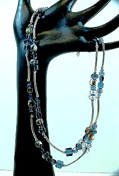
| LOOK:
THE BLUE WATERFALL NECKLACE
Warren Feld, 2001. |
Materials and Description:
Mix of glass, crystal, and sterling silver beads.
Each segment of beads has a different number of bead, and different sizes/color/finish of beads within it.
The colors are not part of a color scheme, and would be seen to clash if compared one to one outside of their use in the bracelet. Example: sapphire blues and montana blues; golds and silvers; matte and glossy.
The segments nearer the clasp are shorter than those further from the clasp.
The sterling silver tubes are all curved.
There is no focal point per se.
The clasp is an adjustable hook and eye choker clasp. |
||||||||||||||||||||||||||||||||||||||||||||||||||||||||||||||||||||||||||||||||||||||
| KEY DESIGN ELEMENTS:
(see key at bottom of table for list)
|
KEY ATTRIBUTES OF DESIGN ELEMENTS:
1a. No conformance to color scheme, though leans toward the monochromatic 2a. Simultaneity effects 3a. Feels balanced though there the distribution of sizes, numbers and segment lengths varies within each strand and between each strand 4a. Brings your eye down to a central place, but no specific focal point 4b. Curved lines distort the linearity 5a. Expresses feeling of moving water, but no moving parts 6a. Curved tubes key element 6b. Bead of different shapes 7a. Adjustable choker clasp allows wearer to adjust necklace to body, to achieve that optimum sense of balance and movement 8a. Consists of each length segments separating unequal length segments. 8b. Important that segments on both strands do not match up with each other, but feel staggered 8c. Important that no segment shows dominance or becomes a clear focal point. |
||||||||||||||||||||||||||||||||||||||||||||||||||||||||||||||||||||||||||||||||||||||
| SCORE:
SCORE CARD ON PRINCIPLES:
EXPLAIN:
|
|||||||||||||||||||||||||||||||||||||||||||||||||||||||||||||||||||||||||||||||||||||||
FOOTNOTES
[1] Feld, Warren. “Jewelry Design Composition: Playing with Building Blocks Called Design Elements,” 3/17/2018
[2] Feld, Warren. “Jewelry Design: A Managed Process,” Klimt02, 2/2/18. https://klimt02.net/forum/articles/jewelry-design-managed-process-warren-feld
[3]Shared Understandings. In another graduate education class, the major text reviewed the differences between understanding and knowledge. The question was how to teach understanding. Worth the read to gain many insights about how to structure teaching to get sufficient understanding to enrich learning.
Understanding by Design by Grant Wiggins and Jay McTighe, 2nd Edition, Association for Supervision and Curriculum Development, 2005.
[4] Thinking Routines. I teach jewelry design. I find it useful to engage students with various ways of thinking out loud. They need to hear me think out loud about what choices I am making and what things I am considering when making those choices. They need to hear themselves think out loud so that they can develop strategies for getting more organized and strategic in dealing with information and making decisions. My inspiration here was based on the work done by Visible Thinking by Project Zero at Harvard Graduate School of Education .
|
Posted in Art or Craft?, design management, jewelry design, jewelry making, Learn To Bead | Tagged: art, design, design management, jewelry construction, jewelry design, principles of composition | 2 Comments »
Posted by learntobead on June 30, 2013
WHEN IS ENOUGH ENOUGH?
Beading and jewelry making can be so much fun, and you have so many choices of so many beautiful pieces to play with, that sometimes, from a design sense, it’s easy to go overboard.
Too many strands. Too many different kinds of beads. Too many colors. Too much embellishment. Too much fringe. Too much repetition of themes and design elements.
There is a tendency too often to over-do.
How do you answer this question for yourself – when is enough enough?
Do you tend to over-do (or under-do) your pieces?
How do you edit? Do you make a piece, and get the judgment of others? Is this based on some kind of intuition?
How do you work with students or friends who have difficulty answering this question?
Let me know what you think.
Warren
Could this be better or worse? or more satisfying or less satisfying?
With more strands?
If longer?
More colors?
More involved patterning?
From an article I’ve posted online…
I had discussed in an article – 10 Principles of Jewelry Design Composition (http://www.landofodds.com/store/goodjewelrydesign.htm) – what is in effect a type of grammar and vocabulary for good jewelry design. The last principle was called Parsimony. And this one is really difficult to achieve. The jewelry artist who is good at Parsimony has a great deal of control over the design process.
Parsimony means that there should be no nonessential elements.
The designer should achieve the maximal effect with the least effort or excess.
Many jewelry designers, when they like a particular bead, or a particular design, often over-do their pieces. The thinking here is that, if they have a beautiful part, adding many of these parts will make the whole even more beautiful. Often, it results in the finished product that is boring or uninteresting. The finished product loses a type of tension, power and energy.
The artist has made a good point with their choices, but then beats a dead horse to death by trying to make the point over and over again, too many times.
Good Parsimony shows that the designer has a good sense of the relationship of the parts to the whole.
There should be no nonessential elements.
The designer should achieve the maximal effect with the least effort or excess.
There is a tendency of beaders and jewelry makers to over-do:
– over-embellish the surface
– add too much fringe
– repeat themes and design elements too often
– use too many colors
More often than not, people over-do, rather than under-do.
Posted in jewelry design | Tagged: embellishmentf, fringe, jewelry design, parsimony, principles of composition, when is enough enough | 1 Comment »


