Warren Feld Jewelry

Taking Jewelry Making Beyond Craft

HOW DO YOU PLAY WITH SHAPES?

Posted by learntobead on May 14, 2013

SHAPES — HOW DO YOU PLAY WITH SHAPES?

bw3nb01-amethystsage-show-2-strips-opening-up

How has “shape” entered into your design thinking, your design work, and your design frameworks?

Over the past few months, I’ve been intrigued with all the new shapes of seed beads coming out on the market. I’ve been trying, really struggling, with ideas for using them in compositions — pieces that have a lot of dimensionality to them, great interest, some levels of complexity. And I’ve been trying to mix the shapes within the same composition, things like long magatamas, superduos, mini fringe drops, peanuts, tila beads. … And of course, it’s always fun to think about ways to bead-weave beads into larger shapes.


gwynian-wine-detail2-medium

SHAPE

The shape of the bead and the orientation of its hole or holes is critical to the success of a piece. These are the “building blocks”. Connecting the blocks affects what the piece looks like, how light and shadow impact the aesthetic, how it moves, how it drapes and feels, and how it holds up in its entirety as a composition.

Around 2010, the various bead companies in Japan and The Czech Republic began introducing many new shapes of seed beads. I began experimenting with how to push these new shapes to their limits.

Then there are the shapes created by assembling beads into ever greater shapes.

Shape differs from the use of “line” or the use of “point”. Shapes serve to provide positioning, direction and orientation to the pieces, often better than lines and points.

Shapes are often the basis of many strategies for adding more dimensionality to your pieces. And you can embellish these shapes with other beads, or overlap shapes, to achieve even greater dimensional effects. You can combine different kinds of shapes.

The Designer must ask these kinds of questions, when using shapes:
How do we position each bead?
How do we link them?
How do we stack them or layer them?
When visual impact does each have, given which side or “face” is seen?
How do we use shape to create appealing textures and patterns?
How do we create “forms” and “themes” with them.

Playing with shapes can be both an encumbrance, as well as an opportunity for the designer.

How has the playing with shapes affected your work?

Posted in jewelry making | Tagged: , , , | Leave a Comment »

So You Want To Do Craft Shows…

Posted by learntobead on May 8, 2013

SO YOU WANT TO DO CRAFT SHOWS…
New CraftArtEdu.com Video Tutorial By Warren Feld
http://www.craftartedu.com/warren-feld-so-you-want-to-do-craft-shows

cf-naples-fair2
In this class, presented in 6 parts with 16 lessons, artist and businessman, Warren Feld, will fill you in on the ins and outs, the dos and the don’ts of selling at craft shows and fairs. Which are best for you, which may be a waste of your time. How to compute the revenue you must earn to justify participating in an event. This is a must see class for anyone thinking of entering the art and craft show world and will maximize your chances of success in these venues. 6 Broadcasts.
Price:
$30
Level: All Levels
Duration: 113:58

Posted in bead weaving, beads, beadwork, business of craft, jewelry making, Resources | Tagged: , , , , , | Leave a Comment »

FASHION AND JEWELRY DESIGN

Posted by learntobead on May 6, 2013

TO WHAT DEGREE DOES/SHOULD “FASHION” INFLUENCE OUR JEWELRY DESIGN DECISIONS?

reposted from my Jewelry Design Discussion Group on FaceBook
https://www.facebook.com/groups/jewelrydesign/

pearl10-full-moneyshot-hi-res-medium

In our store, I am asked repeatedly about what the current fashion colors are? Did I see what so-and-so was wearing on TV or at an awards show? But usually, at least in Nashville, TN, a sense of fashion plays a small part in the day-to-day decisions most people make about the jewelry they want to wear.

What are your feelings and views? What are your experiences? What role should “Fashion” play? How important is Fashion to jewelry design? Should we take our design “cues” from New York and Los Angeles? To what extent do you think Fashion influences the average woman’s choices she makes, when purchasing or wearing a piece of jewelry?

Warren Feld

ctamayadetail1

From an article I wrote… APPLIED FASHION Women don’t just wear pieces of jewelry – they inhabit them.

Buying a piece of jewelry for yourself – a necklace, a bracelet, earrings, a brooch, something else – isn’t a task easily given to someone else. It’s often not a spur of the moment thing either. You just don’t rush off to the local boutique or the local Wal-Mart, grab whatever you see, and go home. I’m not talking about that impulse buy during your leisurely visit to the mall. I’m referring to purchasing those pieces of jewelry you know will have to do a lot of the hard work to accessorize your wardrobe and help you get the compliments and notice of your family, friends and   co-workers you comport with and compete with each and every day.

No, buying a piece of jewelry for yourself is a multi-purposed moment, one which must be thought through carefully and one which must be savored. Lest you buy the wrong piece. That doesn’t really go with what you intend to wear. Or is over-priced. Or poorly made. Or conveys the wrong impression about status. Or is out of fashion. Or something one of your friends already has.

The jewelry you buy has to conform to quite a long list of essential criteria before you could ever think of buying it. It is something you will wear more than once. As such, it is your companion. Your necklace is not merely lying around your neck. Or your bracelet around your wrist. Or your earrings dangling from your ears. Jewelry can cause you to lose face with others. It can irritate or scratch your skin, or get caught up in your hair. It might weigh you down or stretch or tear your ear lobes. Jewelry can break without warning in the most unexpected and embarrassing of places. It can get caught on things, sometimes hurting you in the process.

Jewelry conveys to the world something about who you really are, or think you are. As such, jewelry is very personal. Your private, innermost, most soul searching choices made very public for all to see. As you caress it, as you touch the smooth or faceted or crevice’d beads and metal parts or the clasp or the material the beads are strung on, when you twist and move the piece within your hand, you are confirming to yourself the extent to which your jewelry is doing its job.

When you buy new jewelry, the dilemmas multiply. How will the new compare to the old? Will it be able to handle all these responsibilities – looking good, representing you, fitting in with your wardrobe, meeting the expectations of others? Like divorcing, then remarrying, changing your jewelry can take some time for readjustment. And you do not want to be seen as noncommittal to your jewelry. This would sort of be like going to a hotel, but not unpacking your suitcase while staying in the room.

Conveying some sort of social or psychological distance from your jewelry can be very unsettling for others. So you need to inhabit it. You need to inhabit your jewelry, wear it with conviction, pride and satisfaction. Be one with it. Inhabiting jewelry often comes with a price. There becomes so much pressure to buy the “right” pieces, given all the roles we demand our jewelry to play, that we too often stick with the same brands, the same colors, the same styles, the same silhouettes.

We get stuck in this rut and are afraid to step out of it. Or we wear too many pieces of jewelry. The long earrings, plus the cuff bracelets on both arms, plus the head band, plus the hair ornament, plus the 7-strand necklace, plus the 5 rings. We are ever uncertain which piece or pieces will succeed at what, so hopefully, at least some combination or subset of what we wear will work out.

In a similar way, we wear over-embellished pieces – lots of charms, lots of dangles, lots of fringe, lots of strands. Something will surely be the right color, the right fit and proportion, the right fashion, the right power statement, the right reflection of me.

And our need to inhabit our jewelry comes with one more price. We are too willing to overpay for poorly made pieces in our desperation to have that right look. The $100.00 of beads strung on elastic string. The poorly dyed stones which fade in the light. The poorly crimped and overly stiff pieces with little ease for accommodating movement and frequent wear. It is OK to inhabit our jewelry. In fact, it is necessary, given all we want jewelry to do for us. But we need to be smart about it. We need to learn to recognize better designs and better designers.

This need not be expensive at all.

Just smarter.

Posted in bead weaving, beads, beadwork, jewelry design, jewelry making | Tagged: , , | 3 Comments »

COLOR BLENDING: A MANAGEMENT APPROACH

Posted by learntobead on April 30, 2013

COLOR BLENDING:
A MANAGEMENT PROCESS

bw2fr1-8-fall-palette-bracelet2 - Copy - Copy

Color blending with beads is always challenging. It is not like paints, where you can merge and blend colors with ease. Beads are physical objects with set colors. You can’t mush them together, The transition from bead to bead in any piece, requires the eye/brain, when interacting and interpreting colors, to literally jump a cliff between the inevitable gaps of light between each bead. You want the viewer to have a satisfying, pleasurable journey as their eye/brain moves along that line of color-transitioning beads.

It is this transition from color to color that must be managed.

bw2fr1-spring-begin-garden-border - Copy (2)

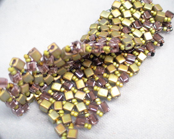
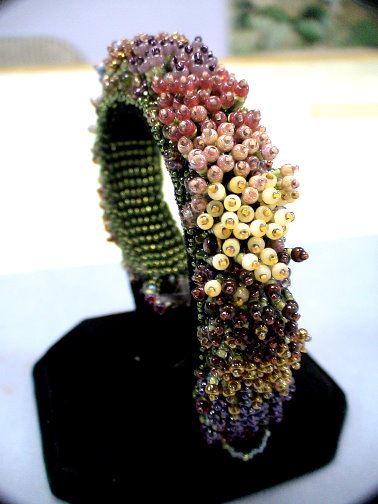
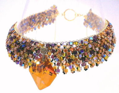
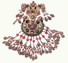
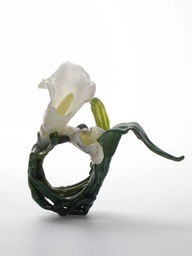
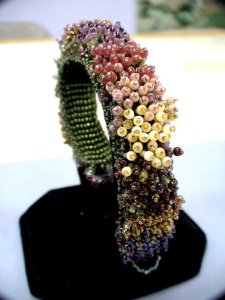
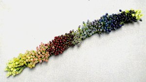
The Monet’s Garden Bracelet by Kathleen Lynam
One Example of a Color Blending Strategy

The Monet’s Garden Bracelet is a fun project that students love. It is for students who have some familiarity with bead weaving. Kathleen had been experimenting with various strategies for blending colors along the length of a bracelet. At about the same time, Beadwork issued a call for project proposals to be used in a book about what to do with your Bead Stash — all those small quantities of lots of different colors you have left over. This was the perfect type of project for color blending.

bw2fr1-spring-fringe-done-1

This bracelet teaches a mathematical approach for organizing several colors within a color blending scheme. Also presented is a simple math formula for personalizing your bracelet — that is, varying the width and length to suit your needs. The techniques here are Square Stitch and Fringing.

In her pieces, Kathleen loves to draw on nature’s inspiration. She gathers flowers and plants and bring them into the bead shop to match their colors as closely as she can. For her Monet’s Garden Bracelet, she developed instructions for both a Spring Palette, as well as a Fall Palette. However, the instructions would be as useful for a monochromatic palette, such as whites to grays to black, or a Southwest palette, such as turquoise to corals to reds. Use your imagination — and use up your bead stash, in the process!

Color Blending

Your goal is to move from one color to the next, in a satisfying way. You have many different kinds of choices to make, when managing a transition like this.

After you have chosen which colors you want to use, you need to decide what the color will look like as a “base” color, and what the color might look like as a “blend” color. With paints, this task is much, much easier, than with beads. It is not easy to blend beads, not least of which is because it is difficult to find the right colors needed to merge a color from base to blend and back to the base of the next color.
In this project, our strategy is to change the proportions of the base color as we move from one row to the next, until the proportions of the base to the blend in the first row are in reverse to the proportions to the blend to the base in the last transitional row. [And then, the blend becomes the new base, etc. along the bracelet.]

Besides varying the proportions, other options of blending that you have as a jewelry artist:

– Varying the brightness and dullness as you move from base to blend, such as finding colors with either more black, more gray, or more white in them

– Graduating the length of your fringes from row to row to create a sense of layering

– Varying the lightness and darkness as you move from base to blend, such as going from red to maroon or from red to pink

When choosing a set of colors, these do not have to match perfectly, but they do need to be coordinated. It is difficult if you vary the finishes of the beads too much. For example, transparent and transparent AB would not work well together in our scheme. Nor would transparent AB and luster finishes. Yet transparent AB, silver-lined and metallic colors do work well together, but only when you allow one of the finishes to be predominant.

Kathleen:”This Monet’s Garden Bracelet project is about color blending, so I went all out in selecting 14 colors. I could have easily used fewer colors or more colors.
Using the color blending strategy presented for this project, with 14 colors, each color would require 4 rows. So, in a bracelet, the base of which consists of 58 rows, the maximum number of colors we could use would be 14 (that is, 58 divided by 4, with 2 extra rows). I decided that when I got to the end with my 14th color, I would blend it with the 1st color, and color an extra row at the beginning and at the end (thus, my two extra rows), both done in the 1st color. [An alternative for treating the end of the bracelet would be to transition back from color 14 to color 13, and finish off the rows.]

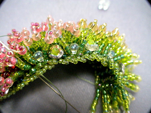
I use a formula discussed below in allocating the proportion of each color, row by row. I played with combinations of different finishes. I was not satisfied with plain transparent beads — not enough brightness or dimensionality. Using all one finish, such as an AB finish or luster finish, was interesting, but too monotonous. It didn’t look like “nature”. I settled on using primarily transparent luster-finish colors, with some transparent AB, transparent silver-lined and a couple of metallic and metallic iris finish colors. This mixing of finishes seemed better. These captured and reflected light in different ways, and drew the eye into the bead differently, thus adding considerable interest. Lastly, I used more matte finishes in my Fall palette, than in my Spring.

My transitions from color to color are relatively quick. Each transition from one color to the next takes up 2 rows. With 14 colors, thus 4 rows allocated for each, you would have 2 full color rows and 2 transitional color rows. However, I could have easily come up with a formula-strategy to make the transitions much slower. And I could have come up with a formula-strategy to transition 3 colors at a time, instead of 2.

For this project, I graduated my colors in a way that seeming pleasing to me. The main transition is from reds to purples to golds and topaz’s.

My flower stalks are two sizes. For the first and last stalks, four 11/0 seed beads long and then topped with an 8/0 and a 15/0 seed bead as the flower tips, about 3/8”. For the 2nd through 7th stalks, six 11/0 seed beads long and then topped with an 8/0 and a 15/0 seed bead as the flower tips, about 1/2″. Because I have used Japanese seed beads, the 2nd thru 7th stalks/tips are the same lengths. I tried a sample going longer (8 11/0 seed beads plus the 8/0 and 15/0 tip), but this wasn’t appealing to me. Also, I would not have gone much longer, because the stalks could more likely bend in half, instead of standing more firmly upright. It was important to use 3 color gradations in my flower stalk, rather than a single color. A sense of “movement” is one of the key beauties of this bracelet. As the bracelet is worn, and the fringe move, I want the viewer to have a sense of watching flowers blowing in the wind. To maximize this effect, I vary the colors from darkest near the base to lightest near the flower tip.

For the Fall Palette, I also vary the finishes from luster to color lined, to silver lined, to AB, so that they eye’s interaction with any glass bead will also vary. I want things to feel like that changing of nature during Fall.

I coordinated the colors of the 8/0 and 15/0 seed beads forming the flower and its tip. In many cases, I found colors that were very similar. In a couple of cases, to add a bit of variety and surprise, and I used colors with a little more contrast, yet in the same general color family. “

The pattern underlying Kathleen’s color blending formula:
Determine the color patterns for the non-transitional and the transitional rows of flower stalk tips (the fringe in her bracelet). This pattern is based on playing with the proportions of the two colors, as we transition between them.

In our instructions today, we use the following patterns:
Where,
S=Same or current color
N=Next new color

Non-Transitional Row:
S | S | S | S | S | S | S
First of two Transitional Rows:
S | N | S | N | S | N | S
Second of two Transitional Rows:
N | N | N | S | N | N | N

Color Blending:

It is difficult to blend colors, when using beads. Some people like to make a bead mix of all the beads and colors they want to blend. This “Random” approach to blending works sometimes, but in a random way. Similarly, “Alternating” colors or “Graduating Colors from light to dark, or bright to dull” along your piece, also do not work well.

Usually, to get a great color-blending design, you need to plan, pre-test, plan again, pre-test again, until you work out a more involved, complex patterning.

One way to choreograph things, is to play with color proportions. Go line by line, and begin with the ideal proportionate relationship between two colors. Gradually manipulate this down the line by anticipating the next ideal proportionate relationship between the next two colors that need to follow.

Posted in bead weaving | Tagged: , , , , | Leave a Comment »

A LESSON IN USING COLOR SIMULTANEITY EFFECTS:

Posted by learntobead on April 22, 2013

A LESSON IN USING COLOR SIMULTANEITY EFFECTS:
The Contemporized Etruscan Collar
By Warren Feld
http://www.warrenfeldjewelry.com


reposted from my Jewelry Design Discussion Group on FaceBook
https://www.facebook.com/groups/jewelrydesign/

bw3nb01-amethystsage-full4-hi-res-small-medium

Several years ago, I had been asked to do a week-long jewelry design workshop in Cortona, Italy. The topic I selected was on Contemporizing Traditional Etruscan Jewelry. One of the projects I developed for the workshop was this Contemporized Etruscan Collar. The challenge, here for me, was to create a sophisticated, wearable, and attractive piece that exemplified concepts about contemporizing traditional jewelry.

Contemporizing Traditional Jewelry has to do with how you take particular traditional forms and techniques, and both add your personal style to the pieces, as well as make them more relevant to today’s sense of fashion and style. The challenge for the designer is how to keep traditional ideas essential and alive for today’s audience.

Things clicked. I found a traditional Etruscan Collar that I immediately connected with.

The Contemporized Etruscan Collar

The contemporized piece basically consists of two staggered and overlapping bead-woven strips. The bead-woven technique used is the Ndebele Stitch (sometimes called Herringbone).

There are many design theory elements incorporated into this piece, including dimensionality, curvature, malleability, and movement. One of the more interesting theories I applied here has to do with color simultaneity effects.

Color Simultaneity Effects
bw3nb01-amethystsage-small-medium-full3-hi-res
Picking colors is about making strategic choices. Picking colors is very revealing about the jewelry artist’s understanding of how the bead asserts its needs for color. One set of color-theories employed to make these kinds of choices has to do with Simultaneity Effects. Colors in the presence of other colors get perceived differently, depending on the color combination.

For example, a White Square on a Black background looks bigger than a Black Square on a white background. White reaches out and overflows the boundary; black contracts.
colorsimulataneity1
Another example: Gray always picks up some of the color characteristics of other colors around it. Gray next to orange will appear to have an orange tone to it. Gray next to green will appear to have a green tone to it. A “Gray” bead is one, the color of which, has a strong gray or black tone to it. Besides the obvious “gray”, these other colors function as a “gray”: montana blue, alexandrite, colorado topaz, prairie green. Many color-lined and silver-lined beads can function as a “gray”, particularly when the glass color is other than clear. Many metallic or otherwise reflective surface beads can function as a “gray”.

A final example of simultaneity effects has to do with how people sense whether colors are warm or cool. In one composition, depending on the color mix, a particular color might be felt as “warm”. In a second composition, with a different color mix, that same color might be felt as “cool”. You can picture a yellow square surrounded by white feels lighter, brighter and a different temperature than its counterpart surrounded by black. A red square surrounded by black feels darker, duller, and a different temperature than its counterpart surrounded by white.

Existence of these simultaneity effects is a great piece of information for the designer. There will be gaps of color and light between beads. Many bead colors are imperfect, particularly in combination. Playing with simultaneity effects gives the designer tools to overcome some of the color limitations associated with the bead and the gaps of light between beads. These allow you to “blend” and build “bridges” and create “transitions.”

Look back at the images of the Ndebele-stitched piece. When you work with beads, there are always gaps between them. In the Ndebele-stitch, there are many and very pronounced gaps of light between beads. This can be very threatening to a viewer. People are pre-wired to avoid things which might harm them, such as snakes and spiders. This is our fear- or anxiety-response.

We can summarize most color theories as a set of principles the brain uses – both in perception and cognition – to find a state of color or colors which are harmonious. That is, people like to see and feel comfortable and safe with colors which harmonize and go together. When we start to lose that harmonious state of color, this makes the brain edgy. When the brain starts to get edgy, we start to interpret pieces as boring, monotonous, scary, dangerous, will cause death. We innately reject, as part of our pre-wired fear response, that which does not follow good principles of color.

Any viewer’s brain will immediately try to interpret what it sees and make sense of it. This includes jewelry. The viewer’s brain needs to know immediately whether to approach or flee. Each time the eye/brain comes to the end of the bead and is confronted with a gap of light separating it from the next bead, it’s similar to a person approaching a cliff, and getting asked to jump off of that cliff.
No one wants to jump off a cliff. And no one’s eye/brain wants to jump over a gap of light between two beads.

We have to fool ourselves, that is, our brain, in some way. Color theories offer us many possible ideas on how to do this. I find using simultaneity effects works especially well in jewelry compositions using beads. Certain colors, when juxtaposed, create their own meanings, and fool the brain into thinking it sees something in these gaps, or is somehow more motivated to fill in the gaps, and proceed from one bead to the next.

In this Etruscan Collar project, many of my color choices were based on an understanding of simultaneity effects.

Posted in beadwork, jewelry design | Leave a Comment »

WHAT SHOULD I CREATE

Posted by learntobead on April 15, 2013

WHAT SHOULD I CREATE?

reposted from my Jewelry Design Discussion Group on FaceBook
https://www.facebook.com/groups/jewelrydesign/
cgswarovskifull
Kierkegaard – and I apologize for getting a little show-off-y with my referents – once described “Creativity” as “a passionate sense of the potential.” And I love this definition. Passion is very important. Some kind of intuitive sense made operational by bringing all your capabilities and wonderings and technical know-how to the fore – creativity is the sum of a whole set of thinking and mechanical and imaginative activities.

You sit down, and you ask, what should I create? For most people, especially those getting started, they look for patterns and instructions in bead magazines or how-to books or websites online. They let someone else make all the creative choices for them. The singular creative choice here is picking what you want to make. And, when you’re starting, this is OK.

When you feel more comfortable with the materials and the techniques, you can begin to make additional choices. You can choose your own colors. You can make simple adaptations, such as changing out the bead, or changing the dimensions, or changing out a row.

Eventually, however, you will want to confront the Creativity issue head on. You want to decide that pursuing your innermost “jewelry designer”, no matter what pathway this takes you along, is the next thing, and right thing, to do. That means, at first, you want your jewelry and your beadwork to reflect your artistic hand. You want to develop a personal style. You want to come up with your own projects.

But applying yourself creatively is also work. It can be fun at times, but scary at other times. There is an element of risk. You might not like what you end up doing. Your friends might not like it. Nor your family. You might not finish it. Or you might do it wrong. It always will seem easier to go with someone else’s project, already proven to be liked and tested – because it’s been published, and passed around, and done over and over again by many different people. Sometimes it seems insurmountable, after finishing one project, to decide what to do next.

But it’s important to keep pushing on. Challenging yourself. Developing yourself. Turning yourself into a bead artist or jewelry artist. And pursuing opportunities to exercise your talents even more, as you enter the world of design.

So, what kinds of creative advice can you offer others about enhancing their creativity?

Here is some of my advice:

Success Stories. While you are fiddling with beads and wire and clasps and everything else, try to be as aware as you can of why your successes are successful. What are all the things you did to succeed? On what points does everyone agree the project succeeds?

Un-Block. Don’t set up any road blocks. Many people, rather than venture onto an unknown highway of creativity, put up walls to delay their path. If they just had the right beads. Or the right colors. Or sufficient time. Or had learned one more technique. Or had taken one more class. Or could find a better clasp. These are excuses. Excuses to avoid getting creative.

Adapt. Anticipate contingencies. It amazes me how many people come into the shop with a picture out of a magazine. We probably can find over half the components, but for the remaining components pictured which we don’t have in stock, we suggest substitutes. But, NO, the customer has to have it exactly like the picture, or not at all. Not every store has every bead and component. Many beads and components are not made all the time. Many colors vary from batch to batch. Many established companies have components especially made up for them – and not available to the general public. The supplies of many beads and components are very limited – not unlimited.

Play. Be a kid again. Let your imagination run wild. Try things. Try anything. If the world says your color combination is ugly, don’t listen to them. Do it anyway. Ignore all restrictions. Forget about social and art conventions.

Be Curious. Play “What If…” games. What if a different color? What if a different technique? What if a different width or length? What if a different style of clasp. Re-arrange things. Tweak. Take out a bead board, and lay out beads and findings on the board, and re-order everything — Ask yourself: More or less satisfying?

Embrace the New. Don’t do the same project over and over again, simply because you have proven to yourself that you can make it. While you might want to repeat a project, with some variations, to learn more things, too much doing of the same-ole, same-ole, can be very stifling.

Evaluate. Learn from failures. You have invested time, money and effort into making these pieces. And not everything works out, or works out well. Figure out why, and turn these failed pieces into lessons and insights.

And if you suddenly find your productivity interrupted by Bead-Block and Artist-Block and Jeweler’s-Block, put your project down. Take a break. Robert Alan Black gives great advice. He shouts at the blocked: Break A Crayon. He shouts again: Draw Outside The Lines. And I would add: Stick your hands into a bowl full of mud. These are all great advice.

Do something out of the ordinary. Something unexpected. Or socially taboo. Or something not just done. This will shock your system to think in different ways. To see things in a new light. To recognize contradictions.

And unblock you.

Posted in Stitch 'n Bitch | 4 Comments »

TURKMEN JEWELRY

Posted by learntobead on February 13, 2013

Turkmen Jewelry from the Marshall and
Marilyn R. Wolf Collection

Exhibit at the NY Metropolitan Museum of Art
Closing 2/24/13

turkmen1

This exhibit displays the metal and stone-set jewelry of the nomadic Turkmen people of Central Asia.

turkmen2

Turkmen women’s jewelry consisted of headgear in the form of crowns, caps, headbands, and braid ornaments; pendants attached to headdresses and suspended on either side of the head; earrings; pectoral and dorsal ornaments; amulet holders; appliqués for clothing; armbands; and rings.

turkmen3

The exhibition is organized according to the principal techniques employed by Turkmen silversmiths. One grouping shows fire gilding, a technique in which gold filings—possibly obtained from coins—were combined with mercury in a paste that was brushed onto prepared silver; heat drove off the mercury, and the remaining gold was burnished to a brilliant sheen.

turkmen4


Other items feature stamped beading that was produced by stamping metal from behind to obtain the appearance of individual beads or granulation on the front.

turkmen5


A third section focuses on the inlay of carnelian and turquoise using bezels.

The fourth major technique— openwork decoration—involved the use of a chisel or fine fret saw to cut through silver sheets.

turkmen6

The surface decoration is typically represented by a repetition of objects or motifs — such as lozenges, squares, ovals and diamonds.    There are style variations from tribal group to tribal group within this vast area the Turkmen people occupy.

I always like to get inspired by ethnic designs, ornamentation and construction techniques.


Posted in jewelry making | Tagged: | Leave a Comment »

Suzanne Belperron — Influential Jeweler, 1930’s thru 1970’s

Posted by learntobead on February 10, 2013

Suzanne Belperron — Influential Jeweler, 1930’s thru 1970’s

belperron1

Suzanne Belperron was a successful jeweler, widely influential.   She was one of the few female jewelry designers of her time.   Her daring creations remain today of extraordinary modernity and aesthetics.  She began her career in 1919 at age 19.  She died in 1983. Her life and career spanned the modern movement in the arts, feminism and the emergence of fashion as a big business.   Her style reflected the movement in the jewelry design field away from very ornamental pieces, to those which emphasize bold forms.

belperron2

Her creations appeared in the most influential fashion magazines of the time, including Vogue and Harper’s Bazaar.  Her clients included royalty, celebrities and aristocrats.

belperron3

She never signed her pieces.     She claimed, “My style is my signature.”

belperron4

She introduced unprecedented combinations of stones and minerals in her designs.


belperron5


Posted in jewelry design | Tagged: , | Leave a Comment »

Gisbert Stach – Making Art or Jewelry?

Posted by learntobead on February 10, 2013

GISBERT STACH – MAKING ART OR JEWELRY?


I read this blog post about Gisbert Stach recently.    Intriguing.    Could some art, displayed like jewelry, not be considered jewelry?

stach1

The “art” is definitely here, expressed through symbolic paradoxes and juxtapositions.    The juxtaposition of jewelry and wearer evokes a response of the viewer, and makes the viewer think about what is acceptable/unacceptable, satisfying, unsatisfying, jewelry/not jewelry.    The use of materials evokes the contemporary, but at the same time, reminds one of ethnic ornamentation and the historical.

stach2

There is an unsettling sense of the need and desire for ornamentation, and the ability of the body to support it.

stach3


Posted in Art or Craft? | Tagged: , | Leave a Comment »

Call For Submissions: SHOWCASE 1000 BEADS, Lark Pub.

Posted by learntobead on February 5, 2013

Call For Submissions:
Showcase 1000 Beads
Lark Publications
2/14/13 deadline

Lark Jewelry & Beading (http://www.facebook.com/LarkJewelryBeading) seeks
excellent photographs of original, contemporary beads in all materials to
publish in a new juried, international collection in our 500 Series of
books: Showcase 1000 Beads. This book is scheduled to be published in
January 2014. The book will be juried by glass beadmaker Kristina Logan.

We welcome and encourage submission of photographs of your handmade beads in
all materials, including glass, metal, polymer clay, metal clay, ceramics,
paper, fiber, plastic, wood, stone, etc., and in all design styles. All work
must be made no earlier than 2010, and the more recent the work the better;
we would prefer to see your 2012 work over your 2011 work, and your 2011
work over your 2010 work.

We strongly prefer images of beads that have not been published previously,
and please do NOT submit images of pieces that have been published in any
Lark book. We can accept only high-quality digital images. Artists will
receive full acknowledgment within the book and a complimentary copy.
Artists retain copyright of their work. There is no entry fee.

All submissions must be submitted electronically through Juried Art
Services. Note that there is no fee for using Juried Art Services. The entry
page can be found at the following link: http://bit.ly/VTfT6E or, the full
URL:
http://www.juriedartservices.com/index.php?content=event_info&event_id=614.

Entries must be submitted by February 14, 2013.

All visuals submitted must represent work that is original in design. A
maximum of four entries per artist is allowed, so please submit your best
work. An entry may consist of no more than two visuals: an overall shot and
one detail (or alternate view); the detail shots are not required. The
primary images you submit should each be different designs. For example,
please do not submit four variations of very similar beads; instead, submit
one bead from each of four series.

Important: Lark will only publish photos of entries containing images and
text that are free of copyright or for which the artist (or approved
institution) holds copyright.

I've already received two questions repeatedly about this call for entries,
so I'll answer them here: My model for the work in the book is Showcase 1000
Glass Beads. That means most of the photos are of a bead or beads, but some
photographs of beads incorporated in jewelry or other artwork, in which the
beads are highlighted, will be considered. Ultimately those choices will
rest in the juror's final decision-making. Also, beaded beads are acceptable
as submissions.

Thank you for your participation, either in submitting entries yourself or
sharing the call for entries with your craft community.

Please join us on Facebook, as well:
http://www.facebook.com/LarkJewelryBeading.

Thank you!
Ray Hemachandra
Lark Jewelry & Beading

67 Broadway
Asheville, North Carolina 28801
(828) 253-0467 ext. 762
ray@larkbooks.com
http://www.larkcrafts.com/jewelry-beading

Posted in beads | Tagged: | Leave a Comment »

ALL DOLLED UP: Beaded Art Doll Competition

Posted by learntobead on January 30, 2013

ALL DOLLED UP:
BEADED ART DOLL COMPETITION
deadline: 8/31/2013

Create a BEADED ART DOLL by manipulating beads and forms into an imaginative
tactile and visual 3-dimensional representation. And then write a Short Story
about your Beaded Art Doll, what it represents, and how it was created.

ALL DOLLED UP: BEADED ART DOLL COMPETITION is offering a first prize of a $1000.00
shopping spree on the Land of Odds web-site (www.landofodds.com), and a Runner-Up
prize of a $400.00 shopping spree on the web-site. This is more than a beauty
pageant. It is a design competition. The Competition will take into account
the Artist’s intentions and how well these are incorporated into the design.
Enter to Win!

Beaded Art Dolls submitted as entries for this competition may be realistic,
surrealistic, whimsical or imaginary. They may be humanistic, animalistic, caricatures,
cartoons, impressions or abstractions. A Beaded Art Doll is a physical representation
in three dimensions, using human figural and expressive characteristics, through
the creative use and manipulation of beads. Beaded Art Dolls should be between
8” and 36” in size. They must be at least 80% composed of beads.

The Artist is given wide leeway in techniques for how the doll is to be beaded,
and may use one particular technique or several. Techniques, for example, may
include bead weaving stitches, bead embellishment, bead appliqué, bead
knitting, bead crochet, bead embroidery, lampworking.

Review the Official Rules on the website.

Sponsored by Land of Odds, Be Dazzled Beads, LearnToBead.net, and The Center
for Beadwork & Jewelry Arts

Posted in bead weaving, beadwork, Contests | Tagged: , , | Leave a Comment »

Jewelry As Art: Hanna Liljenberg

Posted by learntobead on January 30, 2013

JEWELRY AS ART: HANNA LILJENBERG
http://www.hannaliljenberg.se/

liljenberg1

The works of Hanna Liljenberg are great examples of Jewelry As Art.

liljenberg2

As “art”, jewelry is seen as a subset of sculpture or painting, and follows the prescribed rules of each.

liljenberg3

The jewelry’s success is judged as if sitting on an easel or on a mannequin.   The body’s shape is mere pedestal or frame, supportive, but subordinate.

liljenberg4

Wearability, drape, movement, context, and other functional concerns are secondary to the aesthetic.

liljenberg5

Hanna’s pieces are indeed beautiful.   How well she reaches that line connecting jewelry to art, rather than distinguishing between the two — jewelry OR art — I’ll leave up to you.


Posted in jewelry design | Tagged: , , , | Leave a Comment »

JEWELRY DESIGN DISCUSSION GROUP

Posted by learntobead on January 30, 2013


THE JEWELRY DESIGN DISCUSSION GROUP

Please join our new group on facebook at:

https://www.facebook.com/groups/jewelrydesign/


We’ve taken our BEAD STUDY group at The Center for Beadwork & Jewelry Arts, and opened it up online at Facebook.


Current Discussions:
– Art vs. Craft
– Technique vs. Skill
– How to organize your ideal work space
– Getting a management handle on client “Wants”
– Color Blending
– Bead Spills
– How did you get your start in beading/jewelry making?


Posted in beadwork, jewelry design, Workshops, Classes, Exhibits | Leave a Comment »

The Artistry of Barbara Natoli Witt

Posted by learntobead on January 30, 2013

THE ARTISTRY OF BARBARA NATOLI WITT
http://necklaceart.com/NecklaceArt.com.html
witt1a

I wanted to share with you some of the beautiful, fascinating and romantic works of Barbara Natoli Witt.

witt1

Her pieces blend tapestry techniques with captivating webs of colored threads, beads, stones, artifacts and found objects.

witt2

I frequently advocate among my students that they learn to incorporate several types of techniques and materials within their pieces, and Witt is a perfect example of the result.

witt3

Her use of historical motifs, signs, symbols and materials imbued with meaning within necklace pieces with a contemporary flair add synergy and power to her pieces.    She marries “meaning” to “aesthetic” particularly well.

witt4

The historical referents  make you think of themes of classical beauty, the classical role of women and the classical role of jewelry, and how these relate to women and jewelry today.

witt5

A good background biography of the artist can be found here.

witt6


Posted in bead weaving, beadwork, jewelry design | Leave a Comment »

Learn To Pearl Knot

Posted by learntobead on January 21, 2013

Pearl Knotting with Warren Feld
By: Warren Feld
http://www.craftartedu.com/warren-feld-pearl-knotting-with-warren-feld
pearl10-full-moneyshot-hi-res-medium

New video tutorail on CraftArtEdu.com.

Everything you need to know for successfully designing with pearls, including knotting – traditional vs non traditional methods, attaching clasps, finishing, care of your pearls, repair and types of pearls, the nature of the pearl. Jewelry designer Warren Feld will lead you through this comprehensive CraftArtEdu class that is all about pearls. 6 Broadcasts.
Price:
$40
Level: All Levels
Duration: 106:17

Posted in beads, jewelry making, Workshops, Classes, Exhibits | Leave a Comment »