|
||||||||||||||||||||||||||||||||||||||||||||||||||||||||||||||||||||||||||||||||||||||||||||||||||||||||||||||||||||||||||||||||||||||||||||||||||||||||||||||||||||||||||||||||||||||||||||||||||||||||||||||||||||||||||||||||||||||||||||||||||||||||||||


Powered by WebRing.
|
Posted by learntobead on May 31, 2019
|
||||||||||||||||||||||||||||||||||||||||||||||||||||||||||||||||||||||||||||||||||||||||||||||||||||||||||||||||||||||||||||||||||||||||||||||||||||||||||||||||||||||||||||||||||||||||||||||||||||||||||||||||||||||||||||||||||||||||||||||||||||||||||||
Posted in architecture, Art or Craft?, art theory, bead weaving, beadwork, design management, design theory, jewelry design, jewelry making | Tagged: art theory, blooms taxonomy, craft, design, design management, design theory, disciplinary literacy, jewelry, jewelry design, jewelry making, literacy, professional development, teaching, teaching design, teaching literacy | Leave a Comment »
Posted by learntobead on February 16, 2019
THE JEWELRY DESIGNER’S APPROACH TO COLOR
|
||||||||||||||||||||||||||

Different color schemes are associated with different geometric shapes that you can overlay within the wheel, and rotate, thus helping you select colors that work well together. |
With color schemes, you always need to think about things like:
Let’s look at the three most popular, often-used Color Schemes – Analogous, Complementary, and Split Complementary.
Analogous
The analogous color scheme is where you pick any 3 hues which are adjacent to one another on the color wheel. For example, you might pick yellow-green, yellow, and yellow-orange. This scheme is a little trickier than it seems. It works best when no color predominates. Where the intensity of each color is similar. And the design is symmetrical. I also think this scheme works best when you have blocks of each color, rather than alternating each color. That is, BETTER: color 1, 1, 1, 1, 1, 2, 2, 2, 2, 3, 3, 3, 3 rather than WORSE: color 1, 2, 3, 2, 1, 2, 3, 2, 1, 2, 3, 2, 1.
Complementary (also known as “true complementary” or “dyadic”)
The complementary color scheme is where you pick any 2 colors which are the direct opposite on the color wheel. For example, you might pick yellow and violet. To use this color scheme effectively, you would balance the contrast of the colors by value (lightness/darkness) and/or intensity (brightness/dullness). In this color scheme, one color has to predominate.
Split Complementary
This is the most popular color scheme. Here you choose three colors: a hue and the hues on either side of its complement. For example, you might choose yellow and blue-violet and red-violet (thus, the two colors on either side of Violet – the complement). In this scheme, one color needs to predominate. This scheme works well with both symmetrical and asymmetrical designs. You can use an isosceles triangle (has two sides with equal length) within the Color Wheel to pick colors.
One thing I like to do with this scheme is arrange all my beads, then replace one color with one of the others, and vice versa. Let’s say you had 20 blue-green (aqua), 10 orange, and 5 red beads, which you had laid out in a satisfactory arrangement. You could change it to 20 orange, 10 blue-green, and 5 red beads, and it would look just as good.
A lot of people have difficulty using the color orange in jewelry designs, but find it easy to use blue-green. Here’s a nifty way to trick them into using orange, and liking it. Do the composition with blue-green dominant, then switch out all the blue-green for orange, and any orange you used for blue-green.
There are many other color schemes. Some examples:
Analogous Complementary.(3 analogous colors, and one complement of one of these 3). Example: blue-violet, violet, red-violet with yellow-green.
Triadic: (3 tertiary hues equidistant on the color wheel.) Example: red-violet, yellow-orange, and blue-green. You can use an equilateral triangle within the color wheel to help you pick choices.
Tetradic: (Using 4 colors, a double complementary scheme). Example: Yellow-green, orange, red-violet, and blue. You can use a square or rectangle within the color wheel to help you pick choices.
Hexadic: (Using 5 colors). Can use a pentagon within the color wheel to select your colors.
Monochromatic: (A single hue, though with different intensities, tints and shades)
Achromatic: (black and white and gray (without color))
Neutrals: (mixes of hues to get browns (or grays))
Clash: (combines a color hue with a color on either side of its complement).
Example: blue w/red-orange or orange-yellow
There are many books, as well as free on-line color scheme designer apps to check out and play with.
(4) Color Proportions and the Sensation of Color Contrasts
Just because the colors picked conformed to a Color Wheel, doesn’t mean that they will be successful within your jewelry composition. It turns out that making color choices based on Light Values alone are less than perfect. Colors do not occur in a vacuum. They appear next to other colors. They appear within a situation or context. They reflect and refract light and shadow differently, depending on setting, lighting, and context.
That means, perceiving and recognizing one or more colors is important information to have, but not enough information for the brain to determine if the object is satisfying or not, or safe or not. People do not yet have enough information to make an absolute choice whether to wear or buy a piece of jewelry, at this point.
This bring us to the sensation of Color Contrasts. Colors appear together in different proportions. This also affects the brain’s processes of trying to harmonize them – that is, achieve a light value of zero.
Another series of color research focused on the effects of color proportions. These scientifically derived proportions show the joint effect of 2 or more colors, if the brain is to score their sum as a value of 0.0. (Again, I’ve made up this scoring, but you get the point about reaching equilibrium). The brain would like to know, not only what color it is, but what proportion relative to other colors, we have before us.
As designers, to achieve a sense of harmony and balance, we are going to mimic what the brain does when seeing more than one color – we are going to vary the proportions so that, in combination, the sense of that perceptual and cognitive zero-sum game is still maintained.
And again, I’ll make the point that not all compositions have to be perfectly harmonious.
Itten has a picture of the ideal and relative proportions of colors in harmony and balance.

Yellow to purple, 1:4 (This is read as “1 in 4”, and means that given 4 parts, 1 should be yellow and the remaining 3 should be purple. )
Orange to blue, 1:3
Red to green, 1:2
Yellow to orange: 1:1.3
Choreographing Color Blending and Transitioning:
Playing With Proportions

ColorBlock Bracelet, Warren Feld, 2017 (playing with progressive proportions)
Every so often, you might want to create a rainbow, or some sequencing of colors, say from light to dark, where all the colors seem to emerge from the last, and bleed into the next. This is much more difficult with beads than with paints for all the usual reasons discussed above.
A “Random” selection or placement of colors doesn’t usually work as well as selecting and placing based on some more mathematical formula. “Alternating” or “graduating” colors doesn’t always work as well, either. You must create a more complex, involved patterning. You must choreograph the layout of colors, so that, from a short distance, they look like they are blending, and gradually changing across the length of your piece.

Monet’s Garden Bracelet, Kathleen Lynam, 2013 (using math formula)
One of the easier mathematical formulas to come up with as a way to choreograph things, is to play with color proportions. Go bead by bead or row by row, and begin with the ideal proportionate relationship between two colors. Gradually manipulate this down the piece by anticipating the next ideal proportionate relationship between the next two colors that need to follow.
In fact, any kind of statistical or mathematical formula underlying an arrangement will work better than something random or intuitive, when managing color blending and transitions.
(5) Simultaneity Effects and the Sensation of Simultaneous Color Contrasts
It turns out there is even more to how the brain recognizes and tries to harmonize colors. Knowing (1) the color (light value) and (2) the relative proportions (contrasts) of color within the piece of jewelry is necessary, but still not enough for the brain to decide whether the piece of jewelry will be satisfying, finished and successful, or somewhat ugly, not buy-able or unwearable.
Some colors, when sitting on or near a particular color, are experienced differently, than when sitting on or near a different color. The line of research we are focusing on here deals with what are called Simultaneity Effects. Colors can be affected by other colors around them (simultaneous color contrasts). Colors in the presence of other colors get perceived differently, depending on the color combination.
Simultaneity Effects are a boon to the jewelry designer. They are great tools for such things as…
For example, a White Square on a Black background looks bigger than a Black Square on a white background. White reaches out and overflows the boundary; black contracts.
 |
 |
Gray always picks up some of the color characteristics of other colors around it.

Existence of these simultaneity effects is a great piece of information for the designer. There will be gaps of color and light between beads. Many bead colors are imperfect, particularly in combination. Playing with what I call “grays” [thus, simultaneity effects] gives the designer tools to overcome some of the color limitations associated with the bead.
Simultaneity effects trick the brain into filling in those gaps of light between beads. Simultaneity effects trick the brain into believing colors are more connected and blended and mutually-supportive than they would, if separately evaluated. Simultaneity effects trick the brain into seeing satisfying arrangements, rhythms, and dimensionality, where, without them, things would be unsatisfying instead.
A final example of simultaneity effects has to do with how people sense whether colors are warm or cool. In one composition, depending on the color mix, a particular color might be felt as “warm”. In a second composition, with a different color mix, that same color might be felt as “cool”.
Here the yellow square surrounded by white feels lighter, brighter and a different temperature than its counterpart. The red square surrounded by the black feels darker, duller, and a different temperature than its counterpart.

Again, simultaneity effects give tools to the jewelry designer for intensifying and clarifying the design, without disturbing the eye/brain pre-wired fear and anxiety responses. These allow you to “blend” and build “bridges” and create “transitions.” You have a lot of tricks to use here which enable you to push the envelop with your designs. And still have your piece be judged as beautiful and appealing.
Simultaneity Effects are some of the easiest things the jewelry artist can control and manipulate, to fool the brain just a little bit. They let you bring in unexpected colors, and fool the brain into seeing color coordination and color blending. They let you convince the brain that the color proportions are correct when, in reality, they are not. They let you convince the brain to jump the cliff, which the gap between beads presents.
For the brain, gaps between beads – that is, areas with undefined colors, creates work for the brain, and is fraught with danger. The brain has to actually construct a color and meaning to fill in this gap. Without any clues or rules or assistance, it is more risky for the brain to jump the cliff, so to speak, and fill in the gaps with color, than it is for the brain to follow an easier pathway and simply define the jewelry as ugly or boring and reject it and move on. Similarly, simultaneity effects convince the brain to look around corners, go into crevices, explore and move around the whole piece from end to end.
It is at this point in the design process where the jewelry artist must be most fluent, creative and strategic in using color. It is primarily and most often through establishing, and then managing, the sensation of simultaneous color contrasts where the artist begins to build that connection between audience and self, wearer and resonance, the wearing-of and the context, coherency and contagion.
With Simultaneity Effects, colors begin to take on meanings and emotions. These can be as simple as sensations of warm and color, close and far, approaching and fleeing, soft and harsh. Or they can be much more complex, even thematic and symbolic.
The Use of “GRAYS” (simultaneity effects) to tie things together – Blending and Bridging
With beads, the eye often needs to merge or coordinate colors, as it scans any piece. And then there are the gaps of light between beads. The eye needs help in spanning those gaps. The Artist needs to build color “bridges” and “transitions”, so that the eye doesn’t fall off a cliff or have to make a leap of death from one bead, across the gap, all the way to the next.
One easy technique to use is to play with simultaneity effects. One such effect is where gray takes on the characteristics of the color(s) around it.
In beads, there are many colors that function as “grays” – gray, black diamond, alexandrite, Montana blue, prairie green, fuchsia, Colorado topaz – colors that have a lot of black or gray tones to them. Most color lined beads result in a gray effect (where the class encasing distorts the inside color). Metallic finishes can result in a gray effect.
 |
 |
 |
| Aqua/peach lined | Antique rose | Teal iris |
In one piece I made, for example, I used 11/0 peach lined aqua beads as a “gray” to tie in larger teal and antique rose beads together. While aqua is different than teal and the peach is different than the antique rose, in combination, the aqua/peach-lined beads acted like a gray. When close to the teal iris beads, the aqua took on the teal color; when close to the antique rose beads, the peach took on the antique rose color. Gray colors pull from one bead, and transition to the next in a very subtle way, that tricks the brain, but does not disturb it.
Expressive Attributes of Color and Color Contrasts:
Important Color Terms and Vocabulary
Each color on the wheel is called a HUE. Hues are pure colors – any color except black or white. And if you look again, there is no black or white on the Color Wheel.
BLACK is the absence of color. We consider black to be opaque. Usually, when people see black, they tend to see shadows. With black, designs tend to feel older, more antique’y, richer, more traditional and solid, and seem to have a patina around them.
WHITE is all the colors merged together. When all colors in “light” merge, you get White. When all the colors in paints or pigments are merged, you get a neutral gray-black or beige. With White, designs tend to feel sharper, brighter, more contemporary.
INTENSITY and VALUE. Better jewelry designers are those who master how to play with INTENSITIES and play with VALUES. This means they know and are comfortable with manipulating bright and dull (intensity), and light and dark (value). They know the subtle differences among red, pink and maroon, and how viewers react to these. They know how to punctuate – BAM! – with Yellow, and EASE – with purple, and CALM – with blue.
The contrasts between Bright and Dull or Light and Dark are not quite the same. Bright and Dull (intensity) has to do with how much white, gray or black underlay the Hue or pure color. Low intensity is duller; high intensity is brighter. Think of a Stop Sign. It could have just as easily been Red, Pink or Maroon. Red is the most intense – the brightest of the 3 – and hence the sign is Red. You can see red from the farthest distance away. Red is “Bright (intensity)”, but not necessarily “Lighter (values)” than Pink or Maroon.
The contrasts between Light and Dark are called VALUES. A lower value is darker, though not necessarily duller (intensity). Pink has a higher value than maroon, because it is lighter. Yellow is the lightest color; violet is the darkest. Yellow has a higher value than violet.
Unfortunately, in many texts and guides written by Bead Artists and Jewelry Designers, they combine the concepts of intensity and value into a single concept they refer to as “Values”. Bead Artists and Colorists often write that the “secret” to using colors is to vary “values”. When they refer to “values”, they are actually combining these two color theory concepts – “values” and “intensities”. Both are really different, so this combined meaning is a disservice to the bead artist and jewelry designer trying to learn to control color choices and color expression.
| INTENSITY AND VALUES EXERCISE | |||
| Intensity Exercise:
Use your Blue Pencil, as well as your White, Gray and Black Pencils, to color in the 2nd column. Start by coloring in all the squares with a medium shade of blue. Using your white, gray and black pencils, now vary the darkness of the blue to approximate the darkness of the grays in the 1st column. |
Values Exercise:
Using your Blue Pencil only, color in each cell in the table below, making the top cell the lightest (highest value), subsequent cells darker than the previous ones, and the last bottom cell, the darkest (lowest value). [Press lightly on the pencil when coloring in the first cell, and then harder and harder as you go down the column.] |
||
 |
 |
 |
 |
So, as you work with people to create jewelry for them, you make choices about, and then manipulate:
– colors
– balance and harmony (distribution, placement, and proportions)
– intensities
– values
– simultaneity effects
Let’s say you wanted to design a necklace with blue tones. If you were designing this necklace for someone to wear at work, it would probably be made up of several blue colors which vary in values, but Not in intensities. To give it some interest, it might be a mix of light blue, blue, dark blue and very dark blue. Thus, the piece is pretty, but does not force any power or sexuality issues on the situation.
If you were making this same necklace for someone to go out on the town one evening, you might use several blue colors which vary in intensity. You might mix periwinkles and Montana blues and cobalt blues and blue quartzes. You want to make a power or sensual statement here, and the typical necklace someone would wear to work just won’t do.
Let’s continue with some more important color building blocks or concepts.
TINT, SHADE and TONE are similar to values and intensities. They are another way of saying similar things about manipulating color Hues. TINTS are colors with white added to them. Pink is a tint of Red. SHADES are colors with black or gray added to them. Maroon is a shade of Red. And TONES define the relative darkness of a color. Violet is a dark tone and yellow is a light tone. Red and green have the same tonal value. “Tones” are what copy machines pick up, and the depth of the black on a photocopy relates to the tonal value of the colors on the original paper you are copying. Red and green photocopy the same black color. They have the same tonal value.

TEMPERATURE. Colors also have Temperature. Some colors are WARM. The addition of black tends to warm colors up. Warm colors are usually based in Red. Red-Orange is considered the warmest color. Warm colors tend to project forward.
COOL colors are usually based in Blue. Green-blue is the coldest color. Addition of white often cools colors. Cool colors tend to recede.
Given the other colors which surround them, however, usually warm colors may appear cold, and vice versa.
Juxtaposing colors creates MOVEMENT and RHYTHM. By creating patterns, you guide the brain/eye in its circuitous route around the piece, as it tries to make sense of it. Juxtaposing Warm with Cool colors increases the speed or sense of movement.
 |
Some colors tend to PROJECT FORWARD and others tend to RECEDE. Yellow is an advancing color. Black recedes. You can play with this effect to trick the viewer into seeing a more MULTI-DIMENSIONAL piece of jewelry before her. By mixing different colors and different finishes, you can create a marvelous sense of dimensionality.

To Reiterate Some of The Key Ideas and Understandings
The color research begins to open up ideas about how the brain processes color, and which of these processes might be seen as universal, and which more subjective.
The brain first perceives, then tries to understand the color as a color. It senses Light Values.
The brain perceives, then tries to understand the color relative to other colors around it. It senses Color Contrasts.
At the same time, the brain perceives and tries to understand the color within some context or situation, to gauge more meaning or emotional content. It interprets Simultaneous Color Contrasts within the boundaries of a context, situation, personal or group culture.
The END RESULT is simple:
Should we consider the jewelry to be finished and successful?
Should we like the jewelry or not like it?
Should it get and hold our attention, or not?
Should we approach it, or avoid it?
Should we get excited about it, or not?
Should we comment about it to others?
Should we buy it?
Should we wear it?
All this perceptual and cognitive and interpretive activity happens very quickly, but somewhat messy. Some of it follows universal precepts. Some of it is very subjective. Our brain is trying everything it can to make sense of the situation. It tries to zero-sum the light values. It has to take in information about a color’s energy signature. It has to take in information about how much of one color there is in relation to other colors. It has to take in information about emotional and other meaningful content the juxtaposition of any group of colors within any context or situation represents.
With any piece of jewelry, the artist and designer is at the core of this all. It is the designer, in anticipation of how others perceive, recognize and interpret colors in their lives, who establishes how color is used, and manages its expression within the piece. The jewelry designer is the manager. The designer is the controller. The designer is the influencer. The designer establishes and conveys intent and meaning.
DECODING COLOR AS A DESIGN ELEMENT

A composition in orange and blue.
Art and design theory informs us how to objectively use color. That means, there are universally accepted shared understandings and expectations about what makes a piece of jewelry more satisfying (or dissatisfying) in terms of choices about color.
So, when we refer to our lessons above about color use, and examine the orange and blue necklace above, we can recognize some problematic choices about color.
The first is about color proportions. The most satisfying proportionate relationship between orange and blue is 1:3. That means, for every 3 parts, one should be orange and two should be blue. In our illustrated composition, the relationship is more 1:2 or half orange and half blue. To make this piece more attractive and satisfying, we would need to reduce the amount of orange and increase the amount of blue.
The second is about color schemes. Here we have a 2-color, complimentary color scheme. To make this piece more attractive and satisfying as a complimentary color scheme, we have learned that one of the two colors should predominate. Either we have to add more orange, or have to add more blue.
So, we have decoded our Color Design Element and we see that the proportions are less than optimal, and the color scheme chosen is less than optimal. To make the necklace more appealing, and in conformance with universally agreed upon understandings about good color use, we will need to increase the amount of blue and decrease the amount of orange, so that we get a 1:3 (orange to blue) proportionate outcome, and we allow one color to predominate.
Let’s look at another example:

Composition in green, white and red.
First, white is not considered a color. We can ignore it.
Second, proportionately, there should be equal amounts of green to that of red. The relationship is 1:2, meaning for every 2 parts, 1 should be green and 1 should be red. Proportionately, in this piece, we are close to this proportionate relationship.
Third, we have, in effect, since we ignore white, a 2-color complimentary color scheme. We have learned that in this scheme, one color should predominate.
That means, in this composition, the current use of color will not and cannot work. It results in an unacceptable and unsatisfying use of color. Proportionately, both colors need to be equal. Color Scheme wise, one color needs to clearly predominate. We can’t conform to both universally-accepted shared understandings about the use of green and red in a 2-color scheme.
DESIGNING JEWELRY WITH COLOR
Always remember that your choice of color(s) should be secondary to the choices you make about concept, theme, arrangement and organization. Color should be used to enhance your design thinking. Color should not, however, be the design.
When we study color from a design standpoint, we think of color as part of the jewelry’s structure. That means, color is not merely a decorative effect or object. It is more like an integral building component which has been organized or arranged within a larger composition. As a component, it is a “Design Element”. Color is the most important Design Element. It can both stand alone, as well as easily be combined with other Design Elements. There are some universal aspects when color is objectively understood as an element of design. As part of an arrangement, we begin to treat color in terms of Principles of Composition, Construction and Manipulation. Color takes on some subjectivity. Its effects become much more dependent on the artist’s intent and the situation in which the jewelry is worn.
Color is used to express meaning and enhance meaningful expressions. We use color to express elements of the materials used, like glass or gemstone. We use color to express or emphasize elements of the forms we are creating. We use color to enhance a sense of movement or dimension. We use color to express moods and emotions. We use color to influence others in sharing the artist’s inspirations and aspirations.
As designers, we…
– Anticipate how the parts we use to make a piece of jewelry assert their needs for color
– Anticipate shared universal understandings among self, viewer, wearer, exhibitor and seller about color and its use
– Think through how colors relate to our inspirations and how they might impact our aspirations
– Pick colors
– Place and arrange colors
– Distribute the proportions of colors
– Play with and experiment with color values and color intensities
– Leverage the synergistic effects and what happens when two (or more) colors are placed next to one another
– Create focus, rhythm, balance, dimension and movement with color
– Create satisfying blending and transitioning strategies using color
– Anticipate how color and the play of color within our piece might be affected by contextual or situational variables
– Reflect on how our choices about color affect how the piece of jewelry is judged as finished and successful by our various client audiences
– Use color to promote the coherency of our pieces, and the speed and extent to which attention by others continues to spread
Fluent designers can decode color and its use intuitively and quickly, and apply color in more expressive ways to convey inspiration, show the artist’s strategy and intent, and trigger an especially resonant, energetic response by wearers and viewers alike.
Don’t get into a Color Rut
And a last piece of advice.
Don’t get into a color rut. Experiment with different colors. Force yourself to use colors you usually do not use or avoid. If it’s too psychologically painful, make a game of it.
————————————————————————————

WARREN FELD, Jewelry Designer
warren@warrenfeldjewelry.com
615-292-0610
For Warren Feld, Jewelry Designer, (www.warrenfeldjewelry.com), beading and jewelry making have been wonderful adventures. These adventures have taken Warren from the basics of bead stringing and bead weaving, to wire working, wire weaving and silversmithing, and onward to more complex jewelry designs which build on the strengths of a full range of technical skills and experiences.
Warren leads a group of instructors at Be Dazzled Beads (www.bedazzledbeads.com). He teaches many of the bead-weaving, bead-stringing, wire weaving, jewelry design and business-oriented courses. He works with people just getting started with beading and jewelry making, as well as those with more experience. Many of his classes and projects have been turned into kits, available for purchase from www.warrenfeldjewelry.com or www.landofodds.com. He conducts workshops at many sites around the US, and the world.
Join Warren for an enrichment-travel adventure on Your World Of Jewelry Making Cruises.
His pieces have appeared in beading and jewelry magazines and books. One piece is in the Swarovski museum in Innsbruck, Austria.
He is probably best known for creating the international The Ugly Necklace Contest, where good jewelry designers attempt to overcome our pre-wired brains’ fear response for resisting anything Ugly.
He is currently writing a book – Fluency In Design: Do You Speak Jewelry?
_________________________________________________________
FOOTNOTES
[1] Pantone website https://www.pantone.com
[2] Itten, Johannes. The Elements of Color: A Treatise on the Color System of Johannes Itten, NY: John Wiley & Sons, 2001
[3] In reality, the selection of primary colors is arbitrary. The primary colors depend on the light source, the color of the background, and the biology of the color-sensing components of the eye. We choose red-yellow-blue when referencing painting or coloring on white background, like paper. We choose red-green-blue when referencing color placed on a black background, such as a TV or computer screen. We choose cyan-maroon-yellow-black when using overlapping inks to create color on a white background, and better reproduce true colors. We understand that the eye sees red-greenish yellow-blue-violet most clearly.
Color References Worth Checking Out
Rockport Publishers, Color Harmony Workbook, Gloucester, MA: Rockport Publishers,
1999.
Deeb, Margie. The Beader’s Guide to Jewelry Design, NY: Lark Jewelry & Beading,
2014.
Posted in Art or Craft?, art theory, bead weaving, beads, beadwork, color, design management, design theory, jewelry collecting, jewelry design, jewelry making, Stitch 'n Bitch | Tagged: art theory, bead weaving, beading, color theory, jewelry design, jewelry making | Leave a Comment »
Posted by learntobead on February 11, 2019
|
|||||||||||||||||||||||||||||||||||||||||||||||||||||||||||||||||
Posted in Art or Craft?, art theory, bead weaving, beads, beadwork, design theory, jewelry design, jewelry making, Stitch 'n Bitch | Tagged: art theory, contemporary jewelry, contemporizing traditional jewelry, design theory, inspiration, jewelry design, jewelry making, traditional jewelry | Leave a Comment »
Posted by learntobead on January 31, 2019
|
||||||||||||||||||||||||||||||||||||||||||||||||||||||||||||||||||||||
Posted in Art or Craft?, art theory, bead weaving, beadwork, design theory, jewelry design, jewelry making | Tagged: art jewelry, art theory, contemporary jewelry, design theory, jewelry design, traditional jewelry | Leave a Comment »
Posted by learntobead on December 30, 2018
|
Posted in Art or Craft?, art theory, bead weaving, beadwork, design management, design theory, jewelry collecting, jewelry design, jewelry making, Stitch 'n Bitch | Tagged: art, jewelry, jewelry collecting, jewelry collector, jewelry design | Leave a Comment »
Posted by learntobead on November 30, 2018
View the full video tutorial online (1 hour and 45 minutes). Found on top of home page of Land of Odds-Be Dazzled Beads.

In this class, I discuss critical choices jewelry designers need to make when doing craft shows.
That means, understanding everything involved, and asking the right questions.
Learn How To…
…Find, Evaluate and Select Craft Shows Right For You
…Set Realistic Goals
…Compute a Simple Break-Even Analysis
…Best to Develop Your Applications and Apply
…Understand How Much Inventory To Bring
…Best Promote and Operate Your Craft Show Business
Doing craft shows is a wonderful experience.
You can make a lot of money.
You meet new people.
You have new adventures.
And you learn a lot about business and arts and crafts designing.

Jewelry design is a life lived with wearable art.
My name is Warren Feld.
And I am here to share some of my life experiences and insights with you about beading and jewelry making.
In this class, I discuss critical choices jewelry designers need to make when doing craft shows.
It is very important for anyone thinking about selling at craft shows, festivals, markets or similar settings to be smart about it.
That means, understanding everything involved, and asking the right questions.
 “
“
Many years ago, I started my business with my partner Jayden, by doing flea markets and craft shows. Eventually, our business evolved into one store, then a second store, and an online business. But you never forget your roots.
You can learn a lot of good business tricks and find out about a lot of good resources if,… And that’s a big, “IF”! you know what you are doing. All too often, jewelry designers who want to do craft shows, have not done their homework. They have not researched and evaluated which shows to do, and which not to do. They have not figured out how best to set up their booths and displays. They are clueless about what inventory to make, and to bring, and how to price it. They are unprepared to promote, to market and to sell.

I developed this online tutorial to help prepare you for doing this kind of craft show homework.
I discuss:
– What information you need to gather
– How to set personal and business goals
– How to find, evaluate and select craftshows
– How best to promote and operate your business at these craftshows

In fact, I go over 16 lessons I learned for successfully doing craftshows.
There are two groups of lessons.
First, I discuss lessons about finding and selecting craft shows, and determining how well your business will fit in.
In the second group of lessons, I discuss how to promote and operate your business at these craft shows.
Last, I offer some final advice.
At the end of the tutorial, I have a list of resources for you to explore in more detail.

You will find the full 1 hour and 45 minute tutorial
at the top of the Land of Odds-Be Dazzled Beads website.
We are so Excited to offer an Awesome, fun Enrichment-Travel opportunity!
Find out more about our YOUR WORLD OF JEWELRY MAKING CRUISE!
Join us, Miami – Cozumel, Mexico – Key West, Florida, an unforgettable, 5-nights, February 29th thru March 5th, 2020
Jewelry Making Classes, Skills Development, Design Seminars, Fun Get-Togethers and Mixers
Unwind, Make New Friends, Learn New Skills
Sponsored by Land of Odds-Be Dazzled Beads, Be Well Travel, and Celebrity Cruise Lines
Posted in Art or Craft?, bead weaving, beads, beadwork, business of craft, craft shows, cruises, enrichment travel, jewelry collecting, jewelry design, jewelry making, Learn To Bead, Resources, Stitch 'n Bitch, Travel Opportunities, Workshops, Classes, Exhibits | Tagged: be well travel, beading, business of craft, buying gemstones and pearls, caribbean jewelry, celebrity cruise line, classes, cruises, enrichment travel, jewelry design, jewelry making, land of odds, latin american jewelry, mexican jewelry, micro macrame, wire weaving, workshops, wrap bracelets | Leave a Comment »
Posted by learntobead on May 31, 2018
<!–
|
||||||||||||||||||||||||||||||||||||||||||||||||||||||||||||||||||||||||||||||
Posted in Art or Craft?, art theory, beads, beadwork, design management, design theory, jewelry design, jewelry making | Tagged: art theory, beading, color theory, jewelry design | 2 Comments »
Posted by learntobead on May 18, 2018
| THE GOAL-ORIENTED DESIGNER:
The Path To Resonance by Warren Feld, Designer
“Vestment”, Warren Feld, 2004, Miyuki cubes, seed beads and delicas, Austrian crystals, with 14KT, gold filled, sterling silver, and antiqued copper chain, clasps and other findings, lampwork bead by Lori Greenberg Abstract: Jewelry Designers want to be successful. But things can get a little muddled when thinking about how to get there. Our teachers, our friends, our colleagues often disagree on this point, and tell us to look for conflicting measures of success. We can often lose sight of what we want to end up with. The Goal-Oriented Jewelry Designer has but one guiding star: To achieve Resonance. Everything else is secondary. We achieve Resonance by gaining a comfort in communicating about design. This comfort, or disciplinary fluency, translates into all our composing, constructing and manipulating choices. This is empowering. Our pieces resonate. We achieve success. THE GOAL-ORIENTED DESIGNER: The Path To Resonance Jewelry Designers want to be successful. But things can get a little muddled when thinking about how to get there. Where should they start? What should they learn first? What materials should they accumulate? What techniques should they start with? Should they focus on the process of designing jewelry? Or moreso on making jewelry? Or still yet, on achieving certain target measures, such as numbers of pieces made, or numbers of sales, or numbers of venues in which their jewelry is sold? Are there qualitative things which are important to accumulate, such as self-satisfaction or customer-satisfaction? Or style? Or recognition? Acceptance? Understanding? Our teachers, our friends, our colleagues often disagree on how to get there, and tell us to look for“Vestment”, Warren Feld, 2004, Miyuki cubes, seed beads and delicas, Austrian crystals, with 14KT, gold filled, sterling silver, and antiqued copper chain, clasps and other findings, lampwork bead by Lori Greenberg Abstract: Jewelry Designers want to be successful. But things can get a little muddled when thinking about how to get there. Our teachers, our friends, our colleagues often disagree on this point, and tell us to look for conflicting measures of success. We can often lose sight of what we want to end up with. The Goal-Oriented Jewelry Designer has but one guiding star: To achieve Resonance. Everything else is secondary. We achieve Resonance by gaining a comfort in communicating about design. This comfort, or disciplinary fluency, translates into all our composing, constructing and manipulating choices. This is empowering. Our pieces resonate. We achieve success. THE GOAL-ORIENTED DESIGNER: The Path To Resonance Jewelry Designers want to be successful. But things can get a little muddled when thinking about how to get there. Where should they start? What should they learn first? What materials should they accumulate? What techniques should they start with? Should they focus on the process of designing jewelry? Or moreso on making jewelry? Or still yet, on achieving certain target measures, such as numbers of pieces made, or numbers of sales, or numbers of venues in which their jewelry is sold? Are there qualitative things which are important to accumulate, such as self-satisfaction or customer-satisfaction? Or style? Or recognition? Acceptance? Understanding? Our teachers, our friends, our colleagues often disagree on how to get there, and tell us to look for, what turn out to be in effect, conflicting measures of success. We can often lose sight of what we want to end up with. We get a lot of contradictory advice. How should we organize our creative work and our time? How should we select materials and techniques? How do we know when our piece is finished? How should we anticipate our client’s desires? How should we showcase our jewelry? How should we be judged and evaluated? We need to perform, we want to perform authentically, but how – how should we perform as a jewelry designer? The search for answers can be very frustrating, confusing, even demoralizing. But it shouldn’t be. Every jewelry designer should have but one guiding star – Resonance. If our jewelry does not have some degree of resonance, we keep working on it. If the process of creative exploration and design does not lead us in the direction of resonance, we change it. If the results we achieve – numbers of pieces made and numbers of pieces sold – is not synced tightly with resonance, we cannot call ourselves designers. The Goal-Oriented Jewelry Designer specifies those goals about performance which will lead to one primary outcome: To achieve Resonance. Everything else is secondary. Design elements are selected and applied with that idea of Resonance in mind. Principles of Composition, Construction and Manipulation are applied with that idea of Resonance in mind, with extra special attention paid to the Principle of Parsimony – knowing when enough is enough. People may approach the performance tasks in varied ways. For some this means getting very detailed on pathways, activities, and objectives. For others, they let the process of design emerge and see where it takes them. Whatever approach they take in their creative process, for all designers, a focus on one outcome – Resonance – frees them up to think through design without encumbrance. This singular focus becomes a framework within which to question everything and try to make sense of everything. Make sense of what the materials and techniques can allow them to do, and what they cannot. Make sense of what understandings other people – clients, sellers, buyers, students, colleagues, teachers – will bring to the situation, when exploring and evaluating their work. Make sense of why some things inspire you, and other things do not. Make sense of why you are a jewelry designer designing jewelry. Make sense of the fluency of your artistic expression, what works, how it works, why it works. We achieve Resonance by gaining a comfort and ease in communicating about design. This comfort and ease, or disciplinary fluency, has to do with how we translate our inspirations and aspirations into all our compositional, constructive and manipulative choices. It is empowering. Our pieces resonate. We achieve success. Resonance, communication, success, fluency – these are all words that stand in place for an intimacy between the designer and the materials, the designer and the techniques, the designer and inspiration. They reflect the designer’s aspirations. They reflect the shared understandings of everyone the designer’s jewelry is expected to touch. They reflect the designer’s managerial prowess in bringing all these things together. Resonance and disciplinary fluency result from a well-managed jewelry design process [3]. This process of creativity involves artist, audience and context. It is very interactional. Transactional. Integrative. Contingent. For the artist, this process functions on several, coordinated levels, including…
CONTEMPLATION: An Intimacy with Materials and Techniques Contemplation is a mystical theology. Beads have a mystique to them. You stare at a bead, and, ask what it is. You put some thread on a needle, then the bead on the needle, and ask what to do. You stitch a few beads together, and wonder what will become of this. You create a necklace, and, ask how it will be worn. And you stare at each bead again, and, think where do all these feelings welling up within you come from – curiosity, beauty, peace and calm, reflection, satisfaction, magic, appeal, a sensuousness and sexuality. Your brain and eye enter into this fantastic dance, a fugue of focusing, refocusing, gauging and re-gauging light, color, shadow, a shadow’s shadow, harmony, and discord. You don’t just bead and make jewelry. There’s a lot involved here. You have to buy (or fabricate) beads and findings and stringing materials, organize them, buy some extra parts, think about them, create with them, live with some failed creations, and go from there. If there wasn’t something special about how our materials translate light into color, shade and shadow, then jewelry making would simply be work. But it’s not. You have to put one piece next to another…and then another. And when you put two beads next to each other, or one on top of the other, you’re doing God’s work. There’s nothing as spectacular as painting and sculpting with light. This bead before you — why is it so enticing? Why do you beg it to let you be addicted? An object with a hole. How ridiculous its power. Some curving, some faceting, some coloration, some crevicing or texturing, some shadow, some bending of light. That’s all it is. Yet you’re drawn to it in a slap-silly sort of way. When you arrange many beads, the excitement explodes geometrically within your being. Two beads together are so much more than one. Four beads so much more than two. A hundred beads so much more than twenty-five times four. The pleasure is uncontainable. You feel so powerful. Creative. You can make more of what you have than with what you started. You need to select a method or strategy for arranging your beads. There are so many choices. Your organization should be appealing. It must enhance the power the bead has for you, then transcend as a power the bead has for others. It must be architecturally correct because this architecture determines the wear, drape and flow where the jewelry meets the person at the boundary between bead and body. And this assembling — another gift. String through the hole, pull, tug, align, and string through the hole, pull, tug, align, and string through the hole, pull, tug, align, and string through the hole, pull, tug, align. So meditative. Calming. How could beads be so stress-relieving, other-worldly-visiting, and creative-exciting at the same time? Contemplation. To contemplate the bead is to enter the deep reaches of your mind where emotion is one with geometry, and geometry is one with art, and art is one with physics, and beads are one with self. Designing jewelry is an authentic performance task. This involves a profound intimacy with the materials (and techniques) the artist relies on. This intimacy means understanding how to select them, how to leverage their strengths and minimize their weaknesses, and how to manage their ability to enhance or impede resonance. INSPIRATION: Becoming One with What Inspires You Inspirations are sacred revelations you want to share through art and design. The word inspiration comes from the Latin roots meaning “to breathe into.” But before you can breathe your inspiration into your jewelry, you need to become one with it. There are these wonderfully exciting, sensually terrific, incredibly fulfilling things that you find as you try to imagine the jewelry you will create. They come from many sources: ideas, nature, images, people, behaviors. They might be realistic or abstract. They may be the particular color or pattern or texture or the way the light hits it and casts a shadow. They may be a need for order over chaos. They may be points of view. They may flow from some inner imagination. For some reason, these inspirations take on a divine, sacred revelation for you – so meaningful that you want to incorporate them somehow into what you do. A fire in your soul. You want to translate these inspirations into colors, shapes, lines, patterns and textures. You want to impose an organization on them. You want to recapture their energy and power they have had over you. You feel compelled to bring these feelings into ideas. There are many challenges to inspiration. That which we call “inspiring” can often be somewhat fuzzy. It might be a feeling. It might be a piece of an idea, or a small spot on an image. You might feel inspired, but, cannot put the What or the Why into words or images. On the surface, it may seem important to you, but unimportant to others. You the artist may not feel in control of the inspiration in that it seems like it is something that is evoked, not necessarily directed, by you. When inspired, artists perceive new possibilities that transcend that which is ordinary around them. Too often, the artist feels passive in this process. This transcendence does not feel like a willfully generated idea. However, it needs to be. The successful artist – one who eventually can achieve a level of resonance – is one who is not only inspired by, but also inspired to. This all requires a great deal of metacognitive self-awareness. The artist must be able to perceive the intrinsic value of the inspiring object, and how to extend this value in design, where the piece of jewelry becomes its expression. Inspiration is motivating. Inspiration is not the source of creativity; creativity does not come from it. Inspiration, instead, should be viewed as a motivational response to creativity. It motivates the artist, through jewelry and its design, to connect this inspiration with others. It serves as a mediator between the self and the anticipated shared understandings of others. The jewelry encapsulates the artist’s ability to make this connection. When the connection is well-made, resonance follows. But finding inspirations is not only personal, but more importantly, it is an effort to influence others. It is an act of translating the emotions which resonate in you into some object of art which, in turn, will inspire and resonate with others. How does the inspiration occur to you, and how do you anticipate how this inspiration might occur to others? Too often we lose sight of the importance of inspiration to the authentic performance task of creating jewelry. We operate with the belief that anyone can be inspired by anything. There’s nothing more to it. Moreover, inspiration gets downplayed when put next to the discussion of the effort of making jewelry itself. But it should not. Inspiration is not less important than perspiration. It plays an equal role in the creative process. The artist’s clarity about why something is inspiring, and why this inspiration motivates the artist to respond, will be critical for achieving success, that is resonance. ASPIRATION: Translating Creativity into A Technical Product Design Aspiration motivates the artist to actualize inspiration. Aspiration is where the artist translates inspiration into a completed product design. The artist begins to control and regulate what happens next. This involves selecting Design Elements[1] and clustering them to formulate meaningful expressions. The artist then applies Principles of Composition, Construction and Manipulation[2] for organizing and arranging things into a more complete whole with more elaborated expressions. The greater value the artist places on resonance, the stronger the aspiration will be to achieve it. Aspiration is future-oriented. It requires a stick-to-it-ness. The artist must be sufficiently motivated to invest the time, energy and money into designing and making the jewelry that will not necessarily be finished, displayed or sold right away. It may require some additional learning and skills-development time. The artist may need to find a level of creativity within, and discover the kinds of skills, techniques and insights necessary for bringing this creativity to the aspired task at hand. Aspiration requires the calculus: Is it worth it? It adds a level of risk to the project. It forces the artist to pay attention to the world around her or him. This world presents dynamic clues – what I discuss below as shared understandings – about opportunities, constraints, risks, contingencies, consequences, strategies and goals, and likely successes. For some artists, motivation primarily is seen as instinctual. Think of seat-of-the-pants. Emergent, not controlled. A search for harmony, balance, rhythm, unity as something that feels right and looks right and seems right with the universe. Expressive, yes. Imaginative, yes. But not necessarily resonant. Achieving resonance, however, is, for the most part, more than instinctual. It has some deliberate quality to it. It is communicative. It requires a purposeful act on the part of the artist. It is a different type of motivation — intentional. The artist might want to convey a specific emotion. Or advocate for some change. Or illustrate a point of view. The artist may want to entertain or teach. Heal. Attract mates. Propagandize. Where a jewelry’s design is not reflective of an artist’s intent, there can be no resonance. ANTICIPATION: Shared Understandings[4] Shared understandings dictate opportunities, contingencies and constraints. The question of whether the audience correctly infers the presence of the artist’s inspiration, and the sense of how the artist’s hand comes into play within the design, remains. The answer revolves around a dynamic interaction between artist and audience, as they anticipate understandings they share, and ones they do not. Shared understandings should be enduring, transferable, big ideas at the heart of what we think of as good jewelry design. These shared understandings are things which spark meaningful connections between designer and materials, designer and techniques, and designer and client. We need, however, to recognize that the idea of understanding is very multidimensional and complicated. Understanding is not one achievement, but more the result of several loosely organized choices. Understanding is revealed through performance and evidence. Jewelry designers must perform effectively with knowledge, insight, wisdom and skill to convince us – the world at large and the client in particular — that they really understand what design is all about. This involves a big interpersonal component where the artist introduces their jewelry to a wider audience and subjects it to psychological, social, cultural, and economic assessment. Understanding is more than knowledge. The designer may be able to articulate what needs to be done to achieve something labeled good jewelry design, but, may not know how to apply it. Understanding is more than interpretation. The designer may be able to explain how a piece was constructed and conformed to ideas about good jewelry design, but this does not necessarily account for the significance of the results. Understanding is more than applying principles of construction. It is more than simply organizing a set of design elements into an arrangement. The designer must match knowledge and interpretation about good jewelry design to the context. Application is a context-dependent skill. Understanding is more than perspective. The designer works within a myriad of expectations and points of view about good jewelry design. The designer must dispassionately anticipate these various perspectives about design, and, bring some constructed point of view and knowledge of implications to bear within the design and design process. We do not design in a vacuum. The designer must have the ability to empathize with individuals and grasp their individual and group cultures. If selling their jewelry, the designer must have the ability to empathize with small and larger markets, as well. Empathy is not sympathy. Empathy is where we can feel what others feel, and see what others see. Last, understanding is self-knowledge, as well. The designer should have the self-knowledge, wisdom and insights to know how their own patterns of thought may inform, as well as prejudice, their understandings of good jewelry design. How the jewelry designer begins the process of creating a piece of jewelry is very revealing about the potential for success, and ultimately achieving a level of resonance. The designer should always begin the process by articulating the essential shared understandings against which their work will be evaluated and judged. For now, let’s refer to this as Backwards Design[5]. The designer starts with questions about assessment, and then allows this understanding to influence all other choices going forward. Some essential shared understandings for good jewelry design, I would posit, might include the following:
SPECIFICATION: Goal-Orientation It’s not just what you do…it’s how you get there. Jewelry designers are too quick to focus on the outcome, and too lax to focus on the process. It’s always things like getting it done. Getting it to the client on deadline. Ending up with something concrete to show someone. Too much concentration on outcome can lead to taking shortcuts. Shortsightedness. Inflexibility. A misunderstanding, perhaps illusion about, whether the piece is finished and successful. Artists more appropriately should focus on goals. Artists who are focused on goals tend to embrace process. It’s about all the smart choices regarding composition, construction and manipulation you made at each increment along the way. By specifying goals, the artist is encouraged to find connections, and be connected to and aware of shared understandings and their impact on perceived success. When problems arise, a goal-oriented focus allows the artist to be flexible and problem solve. The artist is present from contemplation to inspiration and through to aspiration, anticipation, specification and application. The goal-orientation prevents the artist from becoming lost or paralyzed with inaction. The jewelry artist pursues several goals at once. The jewelry should be both appealing and functional. It should evoke emotion, elicit response, and resonate. The piece should show both unity and variety. The piece should create opinions, validate status, and reconfirm a cultural and social identify. The piece should be reflective and communicative. It should be pleasurable to the maker, the wearer and the viewer alike. When specifying goals, it is important to remember that not all goals are alike. The goals I am discussing here are the essential elements related to effective performance. That effective performance results in a finished and successful piece of jewelry reflective of the artist’s hand and which resonates among a varied set of audiences. The artist needs to set goals which clarify what results need to be accomplished by the time any piece of jewelry is finished and showcased. Goals provide perspective. They are there to prevent the artist from achieving anything less than resonance. These goals relate to generating deep understandings and competence at performance. They are not results-specific per se; they are overarching. They serve as sign-posts to point to and highlight what jewelry designers need to engage with when thinking through and implementing design. The jewelry designer specifies goals as standards of professional performance, such as…
Within each generalized performance goal, the designer can further identify particular tasks, knowledges and skills required in order to accomplish them. Often, with too many choices about what to do, what to include, and how to proceed, priorities and timeframes will need to be set, as well. Resonance is more easily achieved when the designer approaches design as a process, an understanding of the myriad sets and levels of choices as made within a coherent system of creative thinking and activity, and with clear performance goals to guide the way. APPLICATION: Unity, Emotions, Resonance Think like an assessor[6]…find evidence related to desired results. What is the evidence we need to know for determining when a piece is finished and successful? What clear and appropriate criteria specify what we should look at? There are different opinions in craft, art and design about what are the most revealing and important aspects of the work, and which every authentic jewelry design performance must meet. The traditional criteria used in the art world are that the designer should achieve unity, variety and evoke emotions. These, I feel, may work well when applied to paintings or sculpture, but they are insufficient measures of success when applied to jewelry. Jewelry involves the creation of objects where both artistic appeal as well as practical considerations of use are essential. The artistry of jewelry cannot be distinguished from that jewelry as it is worn, and the context within which it is worn. So, when referencing any jewelry’s design, I prefer to use criteria of parsimony and resonance, instead. We know when a piece is finished and successful when the choices of the artist are deemed parsimonious, and the various audiences perceive the piece to resonate. Parsimony vs. Unity/Variety In art, the traditional measure of completion and success is a feeling or sense of “Unity.” Unity signifies how everything feels all right. All the Design Elements used, and how they were coordinated and placed, are very coherent, clear, balanced, harmonious and satisfying. I think the idea of unity begins to get at the place we want to end up. But this concept is not concrete enough for me. What bothers me the most is that you can have unity, but the piece still be seen as boring when there is no variety. Criteria provided from the art perspective recognizes this. But somehow tempering unity with variety starts to add some ambiguity to our measurements of finish and success. This ambiguity is unacceptable as a principled outcome of jewelry construction. Another concern I have, is that you can have unity with variety, but, from the art perspective, these assessments rely too much on universal, objective perceptions of design elements and their attributes (for example, the use of color schemes). Resonance is not about picking the correct color scheme. It is more about how that color scheme is used, manipulated, leveraged or violated within the piece. We must not leave the artist, the wearer, and the situation out of the equation. We must not minimize the artist’s hand – the artist’s intent, thinking, strategizing, arranging, pushing the boundaries, even violating the universal, objective rules. Jewelry creation usually demands a series of judgment calls and tradeoffs. Tradeoffs between aesthetics and functionality. Tradeoffs between artist goals and audience understandings and expectations. Tradeoffs between a full palette of colors-shapes-textures and a very limited one. Any measure of completeness and success needs to result from the forced choice decisions of the artist. It needs to account for the significance of the results, not just the organization of them. It needs to explain the Why, not just the What. For me, the more appropriate concept here is Parsimony. Parsimony is when you know enough is enough. When the finished and successful piece is parsimonious, the relationship of all the Design Elements and their expressed attributes will be so strong, that to add or remove any one thing would diminish, not just the design, but rather the significance of the design. Parsimony is sometimes referred to in art and design as Economy, but the idea of economy is reserved for the visual effects. The designer needs to be able to decide when enough is enough. For jewelry designers, we want that economy or parsimony to apply to functional and situational effects, as well.
Resonance vs. Evoking Emotions Finished and successful jewelry should not only evoke emotions, but, should resonate. Resonance is something more than emotion. It is some kind of additional energy we see, feel and otherwise experience. Emotion is very reactive. Resonance is intuitive, involving, identifying. Resonance is an empathetic response where artist and audience realize a shared (or contradictory) understanding without losing sight of whose views and feelings belong to whom. Resonance results from how the artist controls light, shadow, and their characteristics of warmth and cold, receding and approaching, bright and dull, light and dark. Resonance results from how the artist leverages the strengths of materials and techniques and minimizes their weaknesses. Resonance results from social, cultural and situational cues. Resonance results from how the artist takes us to the edge of universal, objective understandings, and pushes us every so slightly, but not too, too far, beyond that edge.
FLUENCY[7] AND EMPOWERMENT: Managing Choices In Expression Empowerment is about successfully making choices. These are choices about expressing one’s intent through art and design. These choices could be as simple as whether to follow through on some inspiration. They might involve selection of elements of design, or principled arrangements of beads, forms and components. The designer will make choices about how to draw someone’s attention to the piece, or, present the piece to a larger audience. The designer will make choices between aesthetics and functionality. She or he may decide to submit the piece to a magazine or contest. She or he may want to sell the piece and market it. The designer will make choices about how a piece might be worn, or who might wear it, or when it might be worn, in what context. The fluent designer will be adept at making these choices. The better designer is able to bring a high level of coherence and consistency to the process of managing all this – intent, shared understandings, knowledge and skills, evaluative review, and reflection and adjustment. This is called “fluency in design”. Fluency is the ability of the designer to select and connect Design Elements smoothly, in visually and functionally and situationally appropriate ways with understanding. The idea of understanding is broadly defined, to include the artist’s personal goals for expression, as well as the expectations of all the audiences – the wearer, the viewer, the buyer, the seller, the student, the master. The better designer achieves a level of disciplinary literacy where fluency becomes automatic, accurate, and rapidly applied. The better, more fluent jewelry designer is able to anticipate how others will come to understand these mechanisms and the implications for applying them in one way or another. For example, the better and more fluent designer would be able to select and combine design elements to appropriately differentiate jewelry that would best be worn at work, and jewelry that would best be worn, say, when someone was going to a night club for dancing and socializing. Lastly, fluency means that the designer has also been taught to look for, anticipate and incorporate context clues. Design does not occur in a vacuum. It has implications which become realized in a context. That context might be historical, cultural or situational.
RUBRIC[8] AS THINKING ROUTINE Designers need a simple map to all these ideas about literacy and fluency – something they can easily review and determine where their strengths and weaknesses are as they gain proficiency and fluency in design. One type of map is a rubric. A rubric is a table of criteria used to rate and rank understanding and performance. A rubric answers the question by what criteria performance should be judged. The rubric provides insightful clues for the kinds of evidence we need to make such assessments. The rubric helps us distinguish degrees of performance, from the sophisticated to the naïve. The rubric encapsulates what an authentic jewelry design performance would look like. Such a rubric is presented below for the artist to use as a thinking routine.[9] Here I have used one rubric to represent both (1) understanding and (2) performance, but, I could have easily created two separate rubrics toward this end. In this rubric table below, the rows represent contemplation, inspiration, aspiration, anticipation, application, and fluency and empowerment. The columns represent the degrees of understanding and performance along a continuum, from proficient on one end to not there yet on the other. By way of example, I use the rubric to assess my performance with a piece I created called Vestment (Feld, 2004).
The Rubric…
RUBRIC: How Proficient Am I In Achieving Resonance? The piece…
_________________________________________________________ WARREN FELD, Jewelry Designer 615-292-0610
For Warren Feld, Jewelry Designer, (www.warrenfeldjewelry.com), beading and jewelry making have been wonderful adventures. These adventures have taken Warren from the basics of bead stringing and bead weaving, to wire working and silver smithing, and onward to more complex jewelry designs which build on the strengths of a full range of technical skills and experiences. Warren leads a group of instructors at Be Dazzled Beads (www.bedazzledbeads.com). He teaches many of the bead-weaving, bead-stringing, jewelry design and business-oriented courses. He works with people just getting started with beading and jewelry making, as well as those with more experience. His pieces have appeared in beading and jewelry magazines and books. One piece is in the Swarovski museum in Innsbruck, Austria. He is probably best known for creating the international The Ugly Necklace Contest, where good jewelry designers attempt to overcome our pre-wired brains’ fear response for resisting anything Ugly. _________________________________________________________ FOOTNOTES [2] Feld, Warren. “Jewelry Design Principles: Composing, Constructing, Manipulating,” 4/25/2018 [3] Feld, Warren. “Jewelry Design: A Managed Process,” Klimt02, 2/2/18. https://klimt02.net/forum/articles/jewelry-design-managed-process-warren-feld [4]Shared Understandings. In another graduate education class, the major text reviewed the differences between understanding and knowledge. The question was how to teach understanding. Worth the read to gain many insights about how to structure teaching to get sufficient understanding to enrich learning. [8]Rubrics. |
||||||||||||||||||||||||||||||||||||||||||||||||||||||||||||||
Posted in Art or Craft?, art theory, beads, beadwork, design management, design theory, jewelry design, jewelry making, Learn To Bead, Stitch 'n Bitch | Tagged: art theory, beading, design process management, design theory, jewelry, jewelry design, resonance | 1 Comment »
Posted by learntobead on April 24, 2018
JEWELRY DESIGN PRINCIPLES:
|
|||||||||||||||||||||||||||||||||||||||||||||||||||||||||||||||||||||||||||||||||||||||||||||||||||||||||||||||||||||||||||||||||||||||||||||||||||||||||||||||||||||||||||||||||||||||||||||||||||||||||||||||||||||||||||||||
 |
 |
 |
 |
 |
 |
Abstract:
It is not happenstance that some pieces of jewelry draw your attention, and others do not. It is the result of an artist fluent in design. That fluency begins with selecting Design Elements, but it comes to full fruition with the application of Principles of Composition, Construction and Manipulation. This is where the artist flourishes, shows a recognition of shared understandings about good design, and makes that cluster of jewelry design choices resulting in a piece that is seen as both finished and successful. These Principles represent different organizing schemes the artist might resort to. Jewelry artists translate these Principles a little differently than painters or sculptors, in that jewelry presents different demands and expectations on the artist. The better artist/designer achieves a level of disciplinary literacy – selecting Design Elements and applying Principles — where fluency becomes automatic, accurate, and rapidly applied.
COMPOSING, CONSTRUCTING, MANIPULATING
Some pieces of jewelry draw your attention. Others do not.
This is not a matter of happenstance. It is the result of an artist fluent in design. That fluency begins with the selection of Design Elements – the smallest meaningful units of design. But it comes to full fulfillment with the application and manipulation of Principles of Composition, Construction and Manipulation. These “organizing schemes” reflect what the individual artist wants to express, and how the individual artist anticipates how others will understand and respond to this expression.
Design Elements, which I have discussed in an earlier article [1], are like building blocks and function a bit like the vowel and consonant letters of the alphabet. They have form. They have meaning. They can be assembled into different arrangements which extend their meaning and usefulness in expression. Examples: color, shape, texture, point/line/plane, movement, dimensionality, and the like. Each Design Element has a set of expressive attributes. Color can be expressed as a color scheme, or as proportions, or as simultaneity effects. Shape can be geometric or dimensional or recognizable or symbolic. And so forth.
Design Elements function like a vocabulary. They represent universally accepted expressive content. Visualize the analogy between design elements and vocabulary. Picture a “t”, perhaps combined with an “h”, and then with an “e”. Or, picture the difficulty in trying to combine a “th” with a “z”. Or, still yet, picture how the “c” in “cat” is pronounced differently than the “c” in “sense”, yet still recognized as a “c”. In similar ways, the artist might decide to use the design elements of “color” and “line,” and combine them to yield another design element of “movement.” Literacy begins with the ability to decode, and this ability centers on the selection and use of Design Elements.
Principles of Composition, Construction and Manipulation function more like a grammar. Given the Design Elements selected by the artist, Principles represent organizing strategies to which the artist resorts when attempting to achieve a piece that will be seen as both “finished” and “successful”, both by the artist, as well as that artist’s audience. The artist might arrange several design elements and their expressive attributes to yield a higher level organizing principle. For example, the artist might combine color(intensity)+line(direction)+
shape( geometry)+placement(symmetry)+balance+material” to yield a sense of “rhythm.”
To continue our analogy with vocabulary, grammar and literacy, picture our “t”, “h” and “e” put together to form a full word like ”thesaurus”, then expanded into an idea, like “teachers like to use a thesaurus”, and further expressed, in anticipation of a response, to something like “but students hate when the teacher asks them to use a thesaurus.”
Literacy goes beyond decoding; it includes a fluency in how the Design Elements are organized to evoke an emotional response. This involves an intuitive understanding of Principles of Composition, Construction and Manipulation, and how to apply them. While Design Elements are selected primarily based on shared, more universal understandings of what they express, often, Principles are applied in ways more reflective of artist’s hand, and its subjective expression.
The successful jewelry designer has developed a fluency in the Disciplinary Literacy of jewelry design. Fluency is the ability of the designer to select and connect Design Elements smoothly, in visually and functionally and situationally appropriate ways with understanding. The idea of understanding is broadly defined, to include the artist’s personal goals for expression, as well as the expectations of all the audiences – the wearer, the viewer, the buyer, the seller, the student, the master. The better designer achieves a level of disciplinary literacy where fluency becomes automatic, accurate, and rapidly applied.
This Disciplinary Literacy in jewelry design has a structure all its own. There are four main components to it:
1) Vocabulary: Design Elements As The Basis Of Composition
2) Grammar: Principles of Composition, Construction and Manipulation
3) Strategy: Project Management[2]
4) Context/Culture: Shared Understandings[3]
This article focuses on the second component – Principles.
What Are Principles of Composition, Construction and Manipulation?
Jewelry Design is the strategic application of basic principles of organization and expression to achieve a piece which evokes emotion, resonates, and is appealing as it is worn. Traditionally the art and design worlds referred to these as “Principles of Composition.” Often artists and designers get tripped up on the word Principles, and jewelry designers get a bit confused or frustrated with the word Composition.
The use of the word “Principles” in art and design can be somewhat confusing. These Principles do not represent a set of universal, dependable and repeatable standards to strive for, which we might assume, at first.
A different meaning about “Principles” applies here. A Principle is an organizing scheme as a way to combine design elements into a more pleasing whole composition. The design elements include things which are visual effects; but, for jewelry designers, they also include things which functional, as well as things which are more social, psychological, cultural and situational. Principles inform artists in their expressive, authentic performances. Every artist is expected to apply these Principles, but only in ways the artist chooses. There might be better or worse ways to apply them, but no right or wrong ways.
Another aspect of confusion is the use of the word “Composition”. I’ve expanded the phrase, though somewhat awkwardly, to “Principles of Composition, Construction and Manipulation.” The traditional art and design idea of “composition” covers two very different types of jewelry design literacy skills under a single label, namely decoding (Design Elements) and fluency (Principles). The better jewelry designer needs to learn and apply both aspects of disciplinary literacy, but each involves different ways of thinking. As a teacher, both require different sets of strategies for training and educating jewelry designers.
Jewelry designers, by the nature of jewelry, have to deal equally with functional aspects of design, not just artistic composition. Traditional Principles of Composition need to be re-oriented for the jewelry artist to be more sensitive to the more architectural aspects of design. Design choices are also best understood at the boundary between the art of design and the body it adorns.
Limited to the idea of composition, jewelry might be judged successful as “art”, as if it was displayed on a mannequin or easel. But jewelry, in reality, can only be judged as a constructive, manipulated result situated at the boundary between art and body; that is, jewelry can only be judged as “art as it is worn.”
In this article, I focus on Principles of Composition, Construction and Manipulation. The Principles, as organizing schemes, are intertwined, and, the use of one will often depend on another. Movement might be achieved by the placement of lines, which might also establish a rhythm. Such placement of lines might be symmetrically balanced, with line thinness and thickness statistically distributed evenly through the piece.
These organizing and arranging schemes might include:
Some of these design Principles are applied in similar ways to all art forms, such as painting and sculpture, no matter what the medium.
For other Principles, jewelry creates its own challenges, because all jewelry places some different demands and expectations on the artist than painting or sculpture does. Jewelry…
Good jewelry should exude an energy. It should resonate. This energy results from how the artist applies these Principles to compose with, construct and manipulate light and shadow, and their characteristics of warmth and cold, receding and approaching, bright and dull, light and dark. The artist’s piece is judged on whether the resulting piece feels coherent, organized, controlled, and strategically designed, again, as the jewelry is worn. Successful application of these Principles results in a piece which feels finished and successful.
The Principles include,
TABLE OF PRINCIPLES
| Principles of Composition, Construction, and Manipulation
(Organizing Schemes) |
What the Principle is About | How Principle Might Get Expressed as Organizing Schema |
|
This is how the piece leads the viewer through sequences of steps. It is a measure of the degree the piece engages the viewer’s eye.
There is a continuance, a flow or a feeling of movement from one place of the piece to another. |
Repetition
Pattern Random Regular Alternating Flowing Progressive Vertical, Horizontal, Diagonal, Overlapping, Piercing Placement |
|
Pointers are places of emphasis, dominance or focus. Certain elements assume more importance than others within the same composition. | Isolating
Directional Contrast Anomaly Leading Convergence Size, Weight, Color Gradient Framing Focusing and Depth Absence Implied |
|
The degree the piece is not disorienting; obvious what is “up” and what is “down”.
Orienting and Directional |
Straight or Curved
2-D or 3D Violating, Crossing or Intersecting, Interpenetrating Parallel or Aligned Perpendicular Angular or Diagonal Vector Fixed, Directional, Infinite, or Disappearing Continuous, Broken or Perforated Radial At Edges or Within; Framed or Bound Thin or Thick Textured or Smooth Opaque or Transparent Moving, Rotating, Spinning, Darting, Flashing Silhouette |
|
The degree the artist has made the ordinary…”noteworthy” | Add variety
Give person an experience Vibrance, Intensity Unexpected use or positioning Surprise Sense of strength or fragility Symbolic meaning Perspective Inspirational Pattern Clash Juxtaposition Simultaneity effects |
|
How satisfying the numbers and sizes and measures of objects within the piece are | Equality, Equity, Equal Weight, Mass, Volume, Visual Effect (or the opposite of equality)
Randomness Color proportions Scale Measurements Numbers of |
|
How satisfying the placement of objects (and their attributes) is | Equilibrium in Weight, Mass, Volume, Visual Effect
Symmetry or Asymmetry Pattern or No Pattern Regular or Irregular Equalizing visual forces Scale Permanent, Illusory, Contingent Placement, Alignment, Proximity, Repetition Radial Identical or Similar |
|
Jewelry often can be structured in terms of segments, components or forms. How the pieces get interconnected or amassed is of concern. | Unique, Singular, Parallel/Symmetrical, Repeated, Multiple
Evolving Variety Segmentation 2-D or 3-D Realistic or Abstract Geometric or Organic Complete or Incomplete Layering, Overlapping Fringing, Surface Embellishment Continuity Coordinating Clashing, Off-putting |
|
Any piece of jewelry must be acceptable within a certain historical, social, cultural or situational context. | Visual Expectation
Materials Expectation Techniques/Technology Expectation Referents, Inscriptions, Images Symbolism Themes Rule-bound or not Revival style or Contemporized Traditional style Appropriateness/Relevance to situation or context Coordination with situation or context |
|
The degree the piece is designed so that it accommodates physical stresses when the piece is worn | Jointedness and Support (links, rivets, hinges, loops, unglued knots, and the like)
Drape, Flow, Movement (built-in features allowing adjustment to body shape or body movement) Length, Fit Adjustability Choices of stringing material or assembly strategy Clasp Assembly (how piece attached to clasp) Strap, Bail, Pendant, Fringe, Embellishment Stiffness, Looseness, Bending, Conforming Inclusion of technology Structural Integrity Application of architectural principles of construction Physical mechanics Weight-bearing |
|
There should be no nonessential elements; the addition or subtraction of one element or its attribute will make the piece less satisfying | Length, Volume, Mass, Weight, Visual Effects
Goodness of fit Sufficient balance between unity and variety to evoke an emotional response and resonance An economy in the use of resources A result which feels finished and successful, reflecting the artist’s hand, as well as an anticipation of shared understandings among all audiences – viewer, wearer, buyer, seller, student, master |
THE PRINCIPLES IN MORE DETAIL
1. Rhythm
Movement is the path our eyes follow when we look at a work of art, and it is generally very important to keep a viewer’s eyes engaged in the work. Without movement, artwork becomes stagnant. A few good strategies to evoke a sense of movement (among many others) are using diagonal lines, placing shapes so that the extend beyond the boundaries of the picture plane, and using changing values.
Rhythm is one Principle used to shape the viewer’s experience with the piece. Rhythm is how the piece leads the viewer through sequences of steps. It is a measure of the degree the piece engages the viewer’s eye.
There is a continuance, a flow or a feeling of movement from one place of the piece to another.
Repetition and pattern are key here. The artist might achieve a rhythm by varying or repeating colors, textures, sizes, forms. The rhythm might be slow, fast, predictable, random, staccato, measured, safe, edgy, and so forth. The intervals between repetitions and patterns can create a sense of rhythm in the viewer and a sense of movement. Repetitions and patterns can be random, regular, alternating, flowing, progressive – there are many directions the artist can go in establishing a rhythm.
When a piece has multiple and coordinated rhythms, we call this Symphonic Rhythm. For example, in a piece, there might be a clear rhythm set by the use of colors throughout the piece, as well as the positioning of definable forms, such as a series of beaded leaves or other shapes.
The Rhythm should assist the viewer in cognitively making a complete circle around the piece. You don’t want the viewer to lose interest, get bored, or fall flat, before the eye and brain can make that complete circle.
Example:
Black-o-Black-o-Black-o-White-o-Black-o-Black-o-Black-o-White-o
Or,
Black-o-White-o-Black-o-White-o-Black-o-White-o-Black-o-White-o
The better designer can empower the design, if using Rhythm in the right way.
~~~~~~~~~~~~~~~~~~~~~~~~~~~~~~~~~~~~~~~~~~~~~~~~
2. Pointers
Pointers are places of emphasis, dominance or focus. Certain elements assume more importance than others within the same composition.
Pointers guide the viewer to a specific place, or focal point. Cognitively, you want to create the place for the eye/brain to come to rest.
Examples:
The better designer is able to capture the viewer’s attention to more important parts of the piece.
~~~~~~~~~~~~~~~~~~~~~~~~~~~~~~~~~~~~~~~~~~~~~~~~
3. Linear and Planar Relationships

This is the degree the piece is not disorienting to the viewer, or particularly confusing in terms of what is up and what is down.
People always need to orient themselves to their surroundings, so that they know what is up and what is down. They usually do this by recognizing the horizontal planes of the floor and the ceiling of a room (ground and sky outside), and the vertical planes of the walls of a room (buildings, trees and the like outside).
Jewelry must assist, or at least not get in the way, of this natural orienting process. It accomplishes this in how its “lines” are arranged and organized. If a piece is very 3-dimensional, then how its “planes” are arranged and organized becomes important, as well.
Design elements we might use to achieve a satisfactory planar relationship within our piece:
– a strategic use of lines and planes
— shapes
— boundaries
– -silhouettes
— contours
– symmetry
– or, more difficult to achieve, a satisfying asymmetry
– a planar pattern in how each section of the piece relates to the other sections
– how sections of the piece interlock
– how we “draw and interrelate” parallel lines/planes, perpendicular lines/planes and curved lines/planes within the piece
Example:
How can a person truly pull off wearing only one earring? After all, visually, it pulls the person off to one side, thus violating the basic orienting planar relationships. What about the composition of the earring, allows this to work; what about the composition doesn’t?
Example:
Wearing a necklace, where the clasp is worn on the side, instead of the back. Again, what about the composition of the necklace, allows this to work; what about the composition doesn’t?
~~~~~~~~~~~~~~~~~~~~~~~~~~~~~~~~~~~~~~~~~~~~~~~~
4. Interest

“Interest” means the degree to which the artist makes the ordinary…noteworthy.
Here the artist demonstrates how to balance off and control “variety” with “unity” and “harmony”. Without unity and harmony, the piece becomes chaotic. Without variety, the piece becomes boring, monotonous and uninteresting.
Arranging and organizing Design Elements might involve:
– selection of materials and mix of materials
– selection of color combinations
– varying the sizes of things
– pushing the envelop on interrelating planar relationships among the sections of the jewelry
– playing with the rhythm
– clever use of a focal point
~~~~~~~~~~~~~~~~~~~~~~~~~~~~~~~~~~~~~~~~~~~~~~~~
5. Statistical Distribution
The artist is always concerned with the number or size or scale or measurement of things. This principle focuses on these statistics. With this principle, we are not concerned with the placement or balance of things – just the numbers and measurements.
We ask: How pleasing and satisfying are the selection of the numbers, sizes, proportions, volumes/weights, and color/textures of objects the artist wants to use in the piece. The artist might, at this point, anticipate creating a pattern, or not.
Examples:
BIG-o-BIG-o-small-o-BIG-o-BIG-o-small-o-
PURPLE-o-PURPLE-o-PURPLE-o-YELLOW-o-PURPLE-o-YELLOW-o-
~~~~~~~~~~~~~~~~~~~~~~~~~~~~~~~~~~~~~~~~~~~~~~~~
6. Balance

Balance has to do with placement. How pleasing or satisfying is the placement of objects (and their attributes) within a piece?
Usually, the designer is trying to achieve a feeling of equality in weight, attention or attraction of the various visual design elements. The design attributes would include such things as the positioning or relative positioning of the materials used, the colors, textures and patterns, the sizes and scales.
The artist might play with placement in terms of proximity, alignment or repetition.
There are different types of balance.
(1) symmetry: the use of identical compositional units on either side of a vertical axis
(2) approximate symmetry: the use of similarly balanced compositional units on either side of a vertical axis
(3) radial symmetry: an even, radiating out from a central point to all four quadrants (directions) of the shape’s plane (surface)
(4) asymmetry: even though the compositional units are not identical on either side of a vertical axis, there is a “felt” equilibrium of the total piece. Often, with jewelry, this equilibrium depends on what clothes or other jewelry the person is wearing, or something about that person’s body/body shape.
~~~~~~~~~~~~~~~~~~~~~~~~~~~~~~~~~~~~~~~~~~~~~~~~
7. Forms, Their Proportions, Distributions and Dimensionality
Jewelry often can be structured in terms of segments, components or forms. How are pieces interconnected or amassed? Is this achieved through optical effects or reality?
The designer is concerned with managing these structures in terms of proportions, distributions and/or dimensionality. The artist makes choices about how each part relates to the whole in terms of scale or relevance.
The artist might play with things like:
Layering
Surface embellishment
Fringing
Curvature
Overlapping planes
Balance
The better designer creates pieces where the whole is greater than the sum of the parts.
Example:
Flat loomed bracelet and a button clasp, that sits so high on the bracelet, that it detracts from the 2-dimensional reason-for-being of the piece.
~~~~~~~~~~~~~~~~~~~~~~~~~~~~~~~~~~~~~~~~~~~~~~~~
8. Temporal Extension: Time and Place
Any piece of jewelry must be acceptable within a certain historical, social, cultural or situational context.
For example, is a piece appropriate for a wedding also appropriate for office wear? Is a great University of Tennessee Orange Necklace as successful when worn to a Vanderbilt football game?
Temporal Extension may narrowly refer to one specific wearer in particular, or more broadly to group, situational, social or societal expectations.
Other examples:
~~~~~~~~~~~~~~~~~~~~~~~~~~~~~~~~~~~~~~~~~~~~
9. Physical Extension: Functionality

Any piece of jewelry must be functional when worn.
Functionality has to do with such things as movement, drape, comfort, flow and durability. The piece of jewelry needs to feel comfortable when worn, always look good on the wearer no matter what the wearer is doing, and be durable. This involves a lot of building in understandings of physical mechanics and architectural principles of construction.
When there is (or should be) movement in a piece, there should be clear evidence that the designer anticipated where the parts came from, and where they are going to. Jewelry is worn by people who move, so the design should be a natural physical extension to such movements, and the stress they put on the piece.
For example, in a necklace, the clasp should remain on the neck, even as the beadwork moves with the person, without the necklace turning around on the neck, or breaking.
Example: The dangle earring which has the dangle stuck in a 90 degree angle.
Example: The crimped bracelet which breaks at the crimp.
Example: The bracelet too tight when the design is turned into a circle placed around the wrist
~~~~~~~~~~~~~~~~~~~~~~~~~~~~~~~~~~~~~~~~~~~~~~~~
10. Parsimony
(something similar to, but a little bit beyond harmony and unity)
At the point where the piece is judged to be finished and successful, there should be no nonessential elements. When the piece is finished and successful, it should evoke emotions and resonate.
The designer should achieve the maximal effect with the least effort or excess.
There is a tendency of beaders and jewelry makers to over-do:
– over-embellish the surface
– add too much fringe
– repeat themes and design elements too often
– use too many colors
Parsimony vs. Unity
In art, the traditional measure of completion and success was a feeling or sense of “Unity.” Unity signified how everything felt all right. All the Design Elements used, and how they were coordinated and placed, were very coherent, clear, harmonious and satisfying.
I think the idea of unity begins to get at the place we want to end up. But this concept is not concrete enough for me. You can have unity, but the piece still seen as boring when there is no variety. This condition is unacceptable as a principled outcome of jewelry construction. Finished and successful jewelry should evoke emotions and resonate. You can have unity, but the assessments rely too much on universal, objective perceptions of design elements and their attributes. The artist, the wearer, and the situation are too easily left out of the equation.
Jewelry creation usually demands a series of judgment calls and tradeoffs between aesthetics and functionality, artist goals and audience understandings and expectations, a full palette of colors, shapes and textures and a very limited one. A measure of completeness and success needs to result from the forced choice decisions of the artist. It needs to account for the significance of the results, not just the organization of them. It needs to explain the Why, not just the What.
For me, the more appropriate concept here is “Parsimony.” Parsimony is sometimes referred to in art and design as “Economy”, but the idea of economy is reserved for the visual effects. For jewelry designers, we want that economy or parsimony to apply to functional and situational effects, as well. When the finished and successful piece is parsimonious, the relationship of all the Design Elements and their expressed attributes will be so strong, that to add or remove any one thing would diminish, not just the design, but rather the significance of the design.
Parsimony…
– forces explanation; its forced-choice nature is most revealing about the artist’s understandings and intentions
– relies on evidence moreso than assumptions to get at criticality
– focuses examination of the few elements that make a difference
~~~~~~~~~~~~~~~~~~~~~~~~~~~~~~~~~~~~~~~~~~~~~~~~
THINKING ROUTINE[4]: LOOK – SCORE – EXPLAIN
| LOOK:
CLASSICISM NECKLACE Warren Feld, 2001. |
Materials and Description:
Three strands, druk rondelles Czech glass, in matte amethyst, matte olivine, and matte topaz. Center, overlapping agate stones.
At the center, each of the three strands pass through a 3-hole separator bar, and through one of three thin sterling silver tubes. The centerpiece stones slide over the top and bottom tubes. The middle tube is sandwiched between the stones. These stones can spin around on the tubes, allowing them to adjust to body shape and movement, but the middle tube restricts the movement to maintain the general visual appearance as in the image. S-clasp in back. |
||||||||||||||||||||||||||||||||||||||||||||||||||||||||||||||||||||||||||||||||||||||
| KEY DESIGN ELEMENTS:
(see key at bottom of table for list)
|
KEY ATTRIBUTES OF DESIGN ELEMENTS:
1a. Some Tonal quality and finish 1b. Split Complementary color scheme 1c. Gradation dark to light 2a. Symmetry 3a. Same size druk rondelles 4a. Strong lines core design feature 4b. Overlapping centerpiece stones establishes 2 planes; can move but restricted from violating planes 5a. Mixing glass, metal and gemstone 6a. Center stones allowed to spin on tubes 7a. Layering of center stones 8a. Unexpected connection of strap to centerpiece |
||||||||||||||||||||||||||||||||||||||||||||||||||||||||||||||||||||||||||||||||||||||
| SCORE:
SCORE CARD ON PRINCIPLES:
EXPLAIN:
|
|||||||||||||||||||||||||||||||||||||||||||||||||||||||||||||||||||||||||||||||||||||||
| LOOK:
THE BLUE WATERFALL NECKLACE
Warren Feld, 2001. |
Materials and Description:
Mix of glass, crystal, and sterling silver beads.
Each segment of beads has a different number of bead, and different sizes/color/finish of beads within it.
The colors are not part of a color scheme, and would be seen to clash if compared one to one outside of their use in the bracelet. Example: sapphire blues and montana blues; golds and silvers; matte and glossy.
The segments nearer the clasp are shorter than those further from the clasp.
The sterling silver tubes are all curved.
There is no focal point per se.
The clasp is an adjustable hook and eye choker clasp. |
||||||||||||||||||||||||||||||||||||||||||||||||||||||||||||||||||||||||||||||||||||||
| KEY DESIGN ELEMENTS:
(see key at bottom of table for list)
|
KEY ATTRIBUTES OF DESIGN ELEMENTS:
1a. No conformance to color scheme, though leans toward the monochromatic 2a. Simultaneity effects 3a. Feels balanced though there the distribution of sizes, numbers and segment lengths varies within each strand and between each strand 4a. Brings your eye down to a central place, but no specific focal point 4b. Curved lines distort the linearity 5a. Expresses feeling of moving water, but no moving parts 6a. Curved tubes key element 6b. Bead of different shapes 7a. Adjustable choker clasp allows wearer to adjust necklace to body, to achieve that optimum sense of balance and movement 8a. Consists of each length segments separating unequal length segments. 8b. Important that segments on both strands do not match up with each other, but feel staggered 8c. Important that no segment shows dominance or becomes a clear focal point. |
||||||||||||||||||||||||||||||||||||||||||||||||||||||||||||||||||||||||||||||||||||||
| SCORE:
SCORE CARD ON PRINCIPLES:
EXPLAIN:
|
|||||||||||||||||||||||||||||||||||||||||||||||||||||||||||||||||||||||||||||||||||||||
FOOTNOTES
[1] Feld, Warren. “Jewelry Design Composition: Playing with Building Blocks Called Design Elements,” 3/17/2018
[2] Feld, Warren. “Jewelry Design: A Managed Process,” Klimt02, 2/2/18. https://klimt02.net/forum/articles/jewelry-design-managed-process-warren-feld
[3]Shared Understandings. In another graduate education class, the major text reviewed the differences between understanding and knowledge. The question was how to teach understanding. Worth the read to gain many insights about how to structure teaching to get sufficient understanding to enrich learning.
Understanding by Design by Grant Wiggins and Jay McTighe, 2nd Edition, Association for Supervision and Curriculum Development, 2005.
[4] Thinking Routines. I teach jewelry design. I find it useful to engage students with various ways of thinking out loud. They need to hear me think out loud about what choices I am making and what things I am considering when making those choices. They need to hear themselves think out loud so that they can develop strategies for getting more organized and strategic in dealing with information and making decisions. My inspiration here was based on the work done by Visible Thinking by Project Zero at Harvard Graduate School of Education .
|
Posted in Art or Craft?, design management, jewelry design, jewelry making, Learn To Bead | Tagged: art, design, design management, jewelry construction, jewelry design, principles of composition | 2 Comments »
Posted by learntobead on March 17, 2018
JEWELRY DESIGN COMPOSITION:
PLAYING WITH BUILDING BLOCKS
CALLED DESIGN ELEMENTS
by Warren Feld, Designer

Abstract:
Jewelry making is a constructive process of expression. The language of expression begins with the idea of Design Elements. Design Elements are the smallest, meaningful units of design. Design Elements
function in a similar way as vowels and consonants in a language. They have form. They have meaning. They have expression. Some can stand alone, and others are dependent and must be clustered together. Better jewelry designers are aware of and can decode these expressive aspects of design elements and how they are included within any piece. This is one part of learning a disciplinary
literacy in design. This literacy begins with a process of decoding and builds to an intuitive fluency in design. This article focuses on this process of decoding.
Jewelry making is a constructive process of expression.
The language of expression begins with the idea of Design Elements. Design Elements are like building blocks and function a bit like the vowel and consonant letters of the alphabet. They have form. They have meaning. They can be assembled into different arrangements which extend their meaning and usefulness in expression.
There is an underlying logic to this process – a vocabulary and grammar, so to speak. Recognizing how this vocabulary and grammar is structured and applied enables the jewelry designer to learn how to be fluent in design. Such recognition is critical in developing a coherent, consistent disciplinary literacy in jewelry design. Such disciplinary literacy is at the heart
of a professional identity for jewelry design artisans. This literacy structure in design has four main components to it:
1) Vocabulary: Design Elements As The Basis Of Composition
2) Grammar: Principles of Construction
3) Strategy: Project Management[1]
4) Context/Culture: Shared Understandings[2]
This article focuses on the first component – Design Elements.
It makes sense for the designer to begin with something like building blocks, which I call Design Elements. Design Elements, like building blocks, are tangible things. They can be visualized. They can be touched and moved around. They can be combined in different arrangements. They can be used to create many types of expressions. Design Elements include things like color, shape, movement, dimensionality, materials, use of space, and the like. Design Elements are the smallest, meaningful units of design.
Not every Design Element is alike. Color is different than Shape
is different than Texture. Movement is different than Balance is
different than Dimensionality. Learning about and understanding the
differentiation among Design Elements becomes very important if the jewelry designer is to have sufficient power and insight over consistency, variation, coherence and unity in their designs. This power and insight is called decoding. Every jewelry designer needs to learn how to decode, if they are to be successful in design.
Some Design Elements are syllabic meaning they are independent
and can stand alone. Others are non-syllabic, meaning they are dependent and cannot stand alone.
|
INDEPENDENT DESIGN ELEMENTS |
DEPENDENT DESIGN ELEMENTS |
|
Function like vowels in alphabet Many expressive variations Syllabic Can stand alone and be expressive Expressions sensitive to placement or context |
Function like consonants in alphabet Limited expressive variations if used alone and not in combination Non-syllabic Do not often stand alone and more usually require an assist from Expressions consistent, somewhat insensitive to placement or |
Design Elements have graphic representations. Graphic representations allow these elements to be recognized symbolically as a sort of short-hand.
Each Design Element also encompasses a range of acceptable meanings, which I call expressive variations. These expressive variations, while different among themselves, are still reflective of that Design Element. They have universal qualities in that people tend to share understandings about what these expressive variations mean and how they are to be used.
Color Schemes, for example, are objective, agreed-upon combinations of colors seen as coherent and unifying. Thus, any color scheme is an expressive variation on the element of Color.
The universal, expressive variations associated with each Design Element are, in effect, attributes of that Design Element. These attributes have an
objective quality to them in that there is general agreement among designer,
viewer, wearer, buyer and seller as to what they express and how they might be used. There is an expectation that whatever role a person plays relative to the piece of jewelry, the Design Elements and their attributes will be decoded in a similar way.
At this stage in the jewelry design process, the focus is on a simple vocabulary. The vocabulary is made up of Design Elements
and their expressive attributes. The vocabulary encapsulates a generally shared understanding of its meaning and how it is to be used. It is
at the point of grammar, thus manipulation and construction, that individual artists get to show their artistic hand in selecting and placing these elements into a finished piece of jewelry.
These Design Elements and their attributes can be arranged in different configurations I call clusters. Clusters may consist of independent Design
Elements alone, dependent Design Elements alone, or a mix of both. For example, we may use an arrangement of glossy and matte Color beads to
project Dimensionality. We may use different Colors of beads, rhythmically arranged, to project Movement.
Combinations of Design Elements into clusters can have different effects, from synergy, antagonism, blending, bounding, freeing and inflection.
Selecting Design Elements and clustering them does not occur in a vacuum.
The designer selects and arranges Design Elements in anticipation of how
these choices will be understood by others in a universal or objective sense.
This is a process which I call “Backwards Designing”.[3] The building blocks and their attributes are first selected in anticipation of these shared understandings. For instance, the designer might choose colors by anticipating how others will recognize the legitimacy and appeal of
certain clusters of colors – color schemes.
If the viewer, wearer, buyer or seller of a piece of jewelry cannot understand and relate to its Design Elements and how they are clustered within the piece, they will not understand it. They will not appreciate it. They will not see it as a legitimate piece of artistic expression. It will not
feel authentic. To others, if the piece lacks evidence of shared understandings, this will result in that jewelry (and by implication, the jewelry artisan) getting labeled, for example, as unsatisfying or boring or ugly or monotonous.
DESIGN ELEMENTS COMPRISE A VOCABULARY
OF BASIC ARTISTIC EXPRESSION
Working with Design Elements is not much different than working with an alphabet.
An alphabet is made up of different letters. Each letter has different
attributes – how it is written, how it sounds, how it is used. Configurations of letters result in more sounds and more meanings and more ways to be used.
A person working with an alphabet has to be able to decode the letters, sounds and meanings, as letters are used individually as well as in combination. As the speaker becomes better at decoding, she or he begins to build in understanding of implications for how any letter is used, again, individually or in combination.
This is exactly what the jewelry designer does with Design Elements. The
designer has to decode, that is, make sense of a series of elements and their attributes in light of our shared understandings about which Design Elements are appropriate, and how they should be legitimately expressed.
Let’s examine a set of jewelry Design Elements in more detail and elaboration.
|
DESIGN ELEMENT Independent |
GRAPHIC REPRESENTATION |
EXPRESSIVE VARIATIONS |
EXPRESSIVE VARIATIONS |
EXPRESSIVE VARIATIONS |
|
Color |
|
Schemes Hue and Saturation |
Simultaneity Effects |
Values and Intensity Temperature Receding or Projecting |
|
Shape |
|
Recognizable Focused Distinct Blended Abstract Filled or Empty |
Delimited, fixed, geometric Infinite, extending Distorted or overlapped |
Masculine or feminine Organic or mechanical Background, foreground, middle ground |
|
Texture and |
|
Regular, Predictable, Statistical Repeated or singular |
Random, Non-Statistical Feel or look |
Layered or Non-layered Smooth or Rough |
|
Point, Line, |
|
2-Dimensional 3-Dimensional Conform or violate |
Connected or Unconnected Span and distance Actual or implied Thickness |
Silhouette Focused or unfocused Bounded or unbounded geometric or curved
|
|
Material |
|
Natural or Man-Made Soft or solid Heavy or light |
Single or mixed media |
Light refraction, reflection, absorption |
|
Technique and |
|
Bead Weaving, Bead Stringing, Wire Working, |
With or without application of heat and/or |
Fabricated or Machine Made Pattern or freeform |
|
DESIGN ELEMENT
Dependent
|
GRAPHIC
|
EXPRESSIVE VARIATIONS
|
EXPRESSIVE VARIATIONS
|
EXPRESSIVE VARIATIONS
|
|
Dimensionality
|
|
2-dimensional
|
3-dimensional (relief, low relief, high relief)
Interior and Exterior Contours
|
Frontal or in-the-round
Open or closed forms
Static or dynamic forms
|
|
Movement
|
|
Passive
Direction
Linear or wave
|
Physical
Stable or erratic
|
Mechanical
|
|
Color Blending
|
|
Simultaneity effects
|
Value and intensity
Saturation and vibrance
|
Distinct or blurred
Dominant or recessive
|
|
Theme, Symbols
|
|
Surface or interpreted meaning(s) or
Power, position, protection, identification
|
Clear or abstract referents
Object as whole, or parts of object
|
Repetition or not
Individual, group, cultural, societal,
|
|
Beauty and
|
|
Sensually pleasing: visual, touch, auditory,
|
Objective or emotional
|
Coherence, harmony and unity
Fashion, style, timeliness, timelessness
|
|
Structure and
|
|
Stiff or flexible
Flow and drape
Linkage, connectivity
|
Wearability
Display
Organization
|
Articulation
Autonomy vs. Temporariness
Interactive with wearer, or not
|
|
Craftsmanship
|
|
Inspiration
Skill and dexterity
With tools, or not
|
Design acumen
|
Personality and preferences
|
|
Form, Segmentation,
|
|
Shape with Volume
Whole or divided
Organized or chaotic
|
Perspective
2-dimensional or 3-dimensional
Alignment
|
Shading
Positioning or spacing
Simple or Complex
|
|
Balance and
|
|
Symmetrical (By size, color, or shape)
Visual weight
Visual size
|
Asymmetrical (By size, color, or shape)
Radial
Visual placement
|
Random
Stable or unstable
Directed or undirected
|
|
Referents to specific
|
|
Vintage Revival
Direct or implied
|
Contemporary
Literal or figurative
|
Symbolic
|
|
Context,
|
|
Economic, social, psychological, cultural,
|
Complicit artist, or not
|
Derived meaning, or objective meaning
|
|
Negative and
|
|
Figure or ground
Form or no form
Shading
Perspective
|
Depth
Use of space around an object
|
Interpenetration of space
Illusion or reality
Placement
|
|
Light and
|
|
Suggestive
Gradient
Perspective
|
Shading
Illumination
Solid or Cast
|
Dimensionality
Moon
|
The Japanese Fragrance Garden Bracelet


“Japanese Fragrance Garden Bracelet”, by Warren Feld, March 2018, photography by Warren Feld
For example, this is the kind of building blocks thinking I did when designing my Japanese Fragrance Garden Bracelet.
This bracelet has a foundation base. The finishes of these beads in the
base are either a luster finish or a dichroic finish. Off the base, I created flower stalks that were 4-6 seed beads tall, and topped with a slightly
larger and more brightly colored seed bead. The colors of the beads in the stalks vary from dark (near the base) to light (near the flower tip). Between
each bed of flowers is a “moon bridge” – the kind you might expect when
meandering through a Japanese garden.
See how I clustered independent and dependent Design Elements to achieve a particular expression.
What I Wanted To Achieve
Design Elements I Thought About
Movement
with flower stalks where they would retain their verticality
(thus not flop over) after the piece was worn.
Technique: Fringing technique
Technology: Use of One-G beading thread which, unlike
all other beading threads, has a springy quality to it. When the fringe is pulled out during
wearing, the thread helps spring it back into place
Color: To mimic how moving
colors will be perceived, I varied color in flower stalks from dark at the
bottom to medium to light at the top, just under the flower, and then used
bright colors for the flowers topping off each stalk
Point, Line: Easy for viewer to perceive and follow
movement of points and lines, which are key elements in the piece
Dimensionality
where the piece would not be seen as flat
Point, Line: Visually, the flower stalks lead the eye from the foundation
base, up the stalks, and to the bright flower colors on top of the
stalks.
Color: I use a reflective foundation base of two types of bead
finishes, (a) luster, and (b) dichroic.
Both have a mirroring effect, making it difficult for the eye to see
the “bottom”, and at the same time reflecting the colors sitting above them.
Color Blending
where as the eye moves up and down any flower stalk, or moves
across the piece from end to end, everything feels coherent and unified
Color: I make a wide use of simultaneity effects, where the placement
of one color affects the perception of the color next to it. This fools the brain into blending colors, which in reality, you cannot do easily with
beads (as opposed to paints).
Shape/Points/Line/Pattern: There is a consistent repetition of shapes, points and lines, and pattern, leading the viewer to be able to predict what should happen next along the bracelet, and again, fooling the brain into doing some color blending perceptual tricks of its own.
How Do You Teach Designers A Vocabulary of Design?
Most designers most likely start theirjewelry making careers taking craft-oriented classes and following instructions in how-to books or online in how-to videos. They learn to repeat a set of steps and end up with something like what is pictured. The whole jewelry making approach assumes that jewelry making is a natural process. Surround the budding artist with patterns, books and videos, and they will somehow become great jewelry designers.
Yet, although the artisans follow a set of steps over and over again, they never learn how to make choices or evaluate implications or get any experience making judgement calls and tradeoffs when designing something that must look good and wear well at the same time. Jewelry making is not a natural skill that is learned automatically. Jewelry designers need to be taught to design.
Towards this end, I think it is much more useful to build an educational curriculum and program around the idea of disciplinary literacy. We need to teach designers to explicitly and systematically think design. Designers need to be able to recognize the elements that make up a piece, how they were used, and how this leads to more or less success in evoking an expression or an emotional response.
Disciplinary Literacy, means, in part, that the designer is aware of the “codes” which were selected for a piece of jewelry. The designer is able to segment the piece and identify its Design Elements. The designer is also able to put Design Elements together and blend them to achieve a desired expression. The better designer is very aware of all the codes, or Design Elements. The better designer is very aware of how the codes, or Design Elements, were selected, combined, blended and expressed. And the designer is very aware of how and why clusters of Design Elements may sometimes get bounded; that is, may be unfortunately stuck within some
indeterminant meaning or expression.
Towards this end, this means first teaching designers how to decode. It means figuring out what universally accepted Design Elements should be used in a piece. It also means recognizing how these elements can vary, and how such variation can change the artistic or design expression
of the piece. Designers need to learn how Design Elements get clustered and constructed to convey certain expressions, and which cannot.
At this stage, we are training the designer to have some comfort recognizing and applying objective, shared understandings about what certain Design Elements mean, and the variations in how they might get expressed within a piece.
As the designer’s education progresses, we would gradually reduce the student’s involvement with decoding, and increase the involvement with tasks involving fluency. This involves more in-depth learning about
manipulation and construction. Here the designer is taught how to define a personal style and approach, and implement it. The designer is guided from creating the merely appealing, to the more resounding resonant. The designer is also taught to look for, anticipate and incorporate context clues. All this gets into the areas of grammar and process management, which I discuss in other articles.[1,2]
_________________________________________________________

WARREN FELD, Jewelry Designer
warren@warrenfeldjewelry.com
615-292-0610
For Warren Feld, Jewelry Designer, (www.warrenfeldjewelry.com), beading and jewelry making have been wonderful adventures. These adventures have taken Warren from the basics of bead stringing and bead weaving, to wire working and silver smithing, and onward to more complex jewelry designs which build on the strengths of a full range of technical skills and experiences.
Warren leads a group of instructors at Be Dazzled Beads (www.bedazzledbeads.com). He teaches many of the bead-weaving, bead-stringing, jewelry design and business-oriented courses. He works with people just getting started with beading and jewelry making, as well as those with more experience.
His pieces have appeared in beading and jewelry magazines and books. One piece is in the Swarovski museum in Innsbruck, Austria.
He is probably best known for creating the international The Ugly Necklace Contest, where good jewelry designers attempt to overcome our pre-wired brains’ fear response for resisting anything Ugly.
Footnotes
[1] Read my article Jewelry Design: A Managed Process, Klimt02.net Forum, https://klimt02.net/forum/articles/jewelry-design-managed-process-warren-feld
[2] I discuss a little about shared understandings in a yet unpublished article I wrote about Contemporary Design. From that article…
“Shared understandings should be enduring, transferable, big ideas at the heart of what we think of as contemporary jewelry. These shared understandings are things which spark meaningful connections between designer and materials, designer and techniques, and designer and client. We need, however, to recognize that the idea of understanding is very multidimensional and complicated.
Understanding is not one achievement, but more the result of several loosely organized choices. Understanding is revealed through performance and evidence. Jewelry designers must perform effectively with knowledge, insight, wisdom and skill to convince us – the world at large and the client in particular — that they really understand what design, and with our case here, contemporary design, is all about. This involves a big interpersonal component where the artist introduces their jewelry to a wider audience and subjects it to psychological, social, cultural, and economic assessment.
Understanding is more than knowledge. The designer may be able to
articulate what needs to be done to achieve something labeled contemporary, but
may not know how to apply it.
Understanding is more than interpretation. The designer may be able to explain how a piece was constructed and conformed to ideas about contemporary, but this does not necessarily account for the significance of the results.
Understanding is more than applying principles of construction. It is more
than simply organizing a set of Design Elements into an arrangement. The designer must match knowledge and interpretation about contemporary to
the context. Application is a context-dependent skill.
Understanding is more than perspective. The designer works within
a myriad of expectations and points of view about contemporary jewelry. The designer must dispassionately anticipate these various perspectives about contemporary design, and, bring some constructed point of view and knowledge of implications to bear within the design and design process.
We do not design in a vacuum. The designer must have the ability to
empathize with individuals and grasp their individual and group cultures. If selling their jewelry, the designer must have the ability to empathize with small and larger markets, as well. Empathy is not sympathy. Empathy is where we can feel what others feel, and see what others see.
Last, understanding is self-knowledge, as well. The designer should have the
self-knowledge, wisdom and insights to know how their own patterns of thought
may inform, as well as prejudice, their understandings of contemporary
design.
How the jewelry designer begins the process of creating a contemporary piece of jewelry is very revealing about the potential for success. The designer
should always begin the process by articulating the essential shared understandings against which their work will be evaluated and judged. For now, let’s refer to this as Backwards Design[4]. The designer starts with questions about assessment, and then allows this understanding to influence all other choices going forward.”
[3] Backwards Design. I had taken two graduate education courses in Literacy and one in Planning that were very influential in
my approach to disciplinary literacy. One of the big take-aways from
Understanding by Design by Grant Wiggins and Jay McTighe,
2nd Edition, Association for Supervision and Curriculum Development,
2005, was the idea they introduced of “backwards design”. Their point is that you can better teach understanding if you anticipate the evidence others will use in their assessments of what you are trying to do.
When coupled with ideas about teaching literacy and fluency (see
Literacy:Helping Students Construct Meaning by J. David Cooper, M. Robinson, J.A. Slansky and N. Kiger, 9th Edition, Cengage Learning, 2015), you can begin to introduce ideas about managing the design process in a coherent and alignable way.
Posted in Art or Craft?, bead weaving, beads, beadwork, design management, jewelry collecting, jewelry design, jewelry making, Learn To Bead, Stitch 'n Bitch | Tagged: jewelry design | Leave a Comment »
Posted by learntobead on February 15, 2018
CONTEMPORARY JEWELRY IS NOT A “LOOK” —
IT’S A WAY OF “THINKING”
by Warren Feld, Jewelry Artisan
warren@warrenfeldjewelry.com
718 Thompson Lane, Ste 123, Nashville, TN 37204
615-292-0610

“Canyon Sunrise”, Warren Feld, designer, 2004, Austrian crystal, glass seed beads, 14KT gold chain and constructed clasp, fireline cable thread, photographer Warren Feld
Abstract:
Contemporary Jewelry represents a specific approach for thinking through design. Making jewelry is, in essence, an authentic performance task. The jewelry artisan applies knowledge, skill and awareness within the anticipation of the influence and constraints of a set of shared understandings. Shared understandings relate to composition, construction and performance. These understandings are enduring, transferable, big ideas at the heart of what we think of as “contemporary jewelry”. They are things which spark meaningful connections between designer and materials, designer and techniques, and designer and client. Managing these connections is what we call “fluency in design”.
Jewelry Design is a professional discipline. Every legitimately defined profession has at its core a discipline-specific way of thinking. This includes core concepts, core rules, and core beliefs. And it includes professional routines and strategies for applying, manipulating and managing these. The good designer is fluent in how to think through design, and the good contemporary designer is fluent in how to think through design which earns the label “contemporary”.
But, the jewelry designer can only wonder at this with crossed eyes and bewilderment. As a profession, jewelry design balances a series of contradictions, most notably to what extent the practice is craft, art or design. This works against professional legitimacy.
Jewelry Design, as a discipline, is not always clear and consistent about its own literacy – that is, what it means to be fluent in design. Its core concepts, rules and beliefs are not well-defined, and often break down by medium, by operational location – (visualize museum, gallery, studio, store, factory, workshop, class, home), and by the degree of involvement and commitment to the profession of the jewelry designer him- or herself. The diversity of materials, approaches, styles and the like make it difficult to delineate any unifying principles or professional image.
As designers, we see, feel and experience the evolving dynamics of an occupation in search of a profession. But our profession is still in search of a coherent identify. Perhaps we see this most often in debates over how we come to recognize what jewelry we think should be labeled “contemporary” and what jewelry should not.
On the one hand, the idea of contemporary can be very elucidating. On the other, however, we are not sure what contemporary involves, how the label should be applied, and what the label represents. Yet, our sense-making search for its meaning is at the forefront of the professionalization of jewelry design. Our persistent questioning about “What is contemporary jewelry?” opens up thinking and possibilities for every jewelry designer, working across many styles and with many materials, both experienced and novice alike.
The term “contemporary” is defined as something occurring in our time, and that can be very confusing for the jewelry designer. We get caught in a major Identity Crisis for lack of a clear, agreed-upon definition of contemporary. How we resolve this Identity Crisis around a common understanding of “contemporary jewelry” can go a long way, I believe, towards developing a coherent disciplinary literacy and professional identity for all jewelry designers. Resolution can be very unifying.
Many conceptual questions about contemporary jewelry arise. We need to be very cognizant of how we think through our responses.
Does the label apply to every piece of jewelry made today? We see all kinds of styles, shapes, silhouettes, materials, techniques, fashions all around us. There appears to be no common denominator except that they all have been created in our time.
Should the label be applied to all this variation?
Could it?
Why would we want it to?
Does the label apply to a certain timeframe, with the expectation that it will be supplanted by another label sometime in the future?
What is contemporary jewelry?
“Contemporary” Is A Specific Approach For Thinking Through Design
I suggest that contemporary jewelry is not a specific thing. But rather it is a way of thinking through the design process. It is a type of thinking routine[1] which underlays the universal core of contemporary jewelry design.
Contemporary jewelry is not every piece of jewelry made in our time. It is, instead, jewelry designed and crafted with certain shared understandings in mind – understandings about composition, construction and performance.
Contemporary jewelry is not associated with any particular color or pattern or texture. It is, instead, a strategy for selecting colors, patterns and textures.
Contemporary jewelry is not something that only a few people would make or wear, whether boring or outlandish. It is, instead, something most people recognize as wearable with some level of appeal.
Contemporary jewelry is not restricted to the use of unusual or unexpected materials or techniques. It is, instead, something which leverages the strengths or minimizes the weaknesses of any and all materials and/or techniques used in a project.
Contemporary jewelry is not a specific silhouette, or line, or shape, or form, or theme, but, instead, something which shows the artist’s control over how these can be manipulated, used, played off of, and, even, violated.
Contemporary jewelry is an integral part of our culture. We wear jewelry to tell ourselves and to tell others we are OK. It is reflective of the sum of all our choices about how we think through our place among others, our relative value among others, our behaviors among others, our preferred ways to interact, challenge, conform, question, organize and arrange.
The contemporary jewelry designer is especially positioned to serve at the nexus of all this culture. The designer’s ability to think through and define what contemporary means becomes instrumental for everyone wearing their jewelry to successfully negotiate the day-to-day cultural demands of the community they live in. Designers have a unique ability to dignify and make people feel valued, respected, honored and seen.
Think of all that power!
Each person stands at that precipice of acceptance or not, relevance or not. The jewelry designer has the power to push someone in one direction, or another.
If only we had the established profession and a disciplinary literacy to help us be smart about this.
FLUENCY[2] IN DESIGN: Managing The Contemporary Design Process
Jewelry design is, in effect, an authentic performance task.
The jewelry designer demonstrates their knowledge, awareness and abilities to:
1. Work within our shared understandings about contemporary jewelry.
2. Apply key knowledge and skills to achieve the desired result – a contemporary piece of jewelry.
3. Anticipate how their work will be reviewed, judged and evaluated by criteria reflective of these same shared understandings.
4. Step back, reflect, and validate all their thinking to reject any misunderstandings, and make adjustments accordingly.
The better designer is able to bring a high level of coherence and consistency to the process of managing all this – shared understandings, knowledge and skills, evaluative review, and reflection and adjustment.
This is called “fluency in design”.
Shared Understandings[3]
Shared understandings should be enduring, transferable, big ideas at the heart of what we think of as contemporary jewelry. These shared understandings are things which spark meaningful connections between designer and materials, designer and techniques, and designer and client. We need, however, to recognize that the idea of understanding is very multidimensional and complicated.
Understanding is not one achievement, but more the result of several loosely organized choices. Understanding is revealed through performance and evidence. Jewelry designers must perform effectively with knowledge, insight, wisdom and skill to convince us – the world at large and the client in particular — that they really understand what design, and with our case here, contemporary design, is all about. This involves a big interpersonal component where the artist introduces their jewelry to a wider audience and subjects it to psychological, social, cultural, and economic assessment.
Understanding is more than knowledge. The designer may be able to articulate what needs to be done to achieve something labeled contemporary, but may not know how to apply it.
Understanding is more than interpretation. The designer may be able to explain how a piece was constructed and conformed to ideas about contemporary, but this does not necessarily account for the significance of the results.
Understanding is more than applying principles of construction. It is more than simply organizing a set of design elements into an arrangement. The designer must match knowledge and interpretation about contemporary to the context. Application is a context-dependent skill.
Understanding is more than perspective. The designer works within a myriad of expectations and points of view about contemporary jewelry. The designer must dispassionately anticipate these various perspectives about contemporary design, and, bring some constructed point of view and knowledge of implications to bear within the design and design process.
We do not design in a vacuum. The designer must have the ability to empathize with individuals and grasp their individual and group cultures. If selling their jewelry, the designer must have the ability to empathize with small and larger markets, as well. Empathy is not sympathy. Empathy is where we can feel what others feel, and see what others see.
Last, understanding is self-knowledge, as well. The designer should have the self-knowledge, wisdom and insights to know how their own patterns of thought may inform, as well as prejudice, their understandings of contemporary design.
How the jewelry designer begins the process of creating a contemporary piece of jewelry is very revealing about the potential for success. The designer should always begin the process by articulating the essential shared understandings against which their work will be evaluated and judged. For now, let’s refer to this as Backwards Design[4]. The designer starts with questions about assessment, and then allows this understanding to influence all other choices going forward.
When designing contemporary jewelry, the designer will push for shared understandings about what it means to be worthy of the label “contemporary.” I propose the following five shared understandings as a place to start, and hopefully, to generate more discussion and debate.
These are,
1. Fixed Frameworks and Rules should not pre-determine what designers do.
Rules do exist, such as color schemes or rules for achieving balance or rhythm. But rules may be challenged or serve as guidelines for the designer. In fact, the designer may develop and implement rules of their own.
Designers do not learn understanding if they are only able to answer a question if framed in one particular way. How the designer invents and applies rules for managing design as a process become of primary importance because they reveal design fluency and thinking. And this allows for a variety of approaches as well as an escape from any dominant definitions. Nothing is sacred.
2. Jewelry should extend, rework, and play with, or even push, the boundaries of materials, techniques and technologies.
Contemporary designers are meant to ask questions, evaluate different options and experiment widely. They do this in order to leverage the strengths and minimize the weaknesses of materials, techniques and technologies used. Their jewelry should reflect this.
3. Jewelry should evoke emotions.
The audience is an integral part of the success of contemporary jewelry. The viewer/wearer recognizes things in the piece and is allowed to, (in fact, expected to), react and interpret. The designer’s goal is to achieve a level of resonance.
4. Jewelry should connect people with culture.
Contemporary jewelry is not made for art’s sake alone. Contemporary jewelry is made to connect to the world around us. It is meant to assist a person in recognizing how they want to live their lives, and how they want to introduce their view of themselves into the broader community or communities they live in.
5. Successful jewelry designs should only be judged as the jewelry is worn.
Jewelry is not designed in isolation from the human body. Its design should anticipate requirements for movement, drape and flow. Its design should anticipate the implications of the context in which the jewelry is worn. The implications for all jewelry design choices are most apparent at the boundary between jewelry and person.
Given that the designer “backward-designs [4],” he or she begins the process by anticipating those understandings about how their work will be assessed. The designer then is equipped to make three types of informed choices:
A. Choices about composition
B. Choices about construction
C. Choices about performance
The designer determines (a) what design elements to include in the piece, and then (b) rules for manipulating them. The contemporary designer (c) measures these against our shared understandings about contemporary design. These measures are a continuum – degrees of contemporary, not either/or’s or absolutes. In any given piece of jewelry, some design elements may be very contemporary, and others might not.
GOOD COMPOSITION:
Selecting and Articulating Upon Design Elements and Their Attributes
Jewelry making is a constructive process. It makes sense for the designer to begin with something like building blocks, which I call design elements. Design elements include things like color, movement, dimensionality, materials, use of space, and the like.
Each design element, in turn, encompasses a range of acceptable meanings, yet still reflective of that design element, and which are called attributes.
These design elements can be arranged in different configurations.
The combination of any two or more design elements can have synergistic effects.
Working with design elements is not much different than working with an alphabet. An alphabet is made up of different letters. Each letter has different attributes – how it is written, how it sounds, how it is used. Configurations of letters result in more sounds and more meanings and more ways to be used.
A person working with an alphabet has to be able to decode the letters, sounds and meanings, as letters are used individually as well as in combination. As the speaker becomes better at decoding, she or he begins to build in understanding of implications for how any letter is used, again, individually or in combination.
This is exactly what the jewelry designer does with design elements. The designer has to decode, that is, make sense of a series of elements and their attributes in light of our shared understandings about jewelry design. The contemporary designer decodes in light of our further shared understandings about contemporary jewelry design.
The designer might, for example, want to select from this list of design elements I have generated below. I have arranged these design elements into what is called a thinking routine[1]. The designer uses the routine to determine how each element might be incorporated into the piece, and how the desired attributes of each element relate to contemporary design. They might also use the routine to look for issues of true and false. They might use the routine to rate each element as to importance and uncertainty.
| DESIGN ELEMENT | LESS CONTEMPORARY | MORE CONTEMPORARY |
| Dimensionality | Flat; Width/Length focus | Not Flat; Noticeable Width/Length/Height focus |
| Movement, Moving Elements | Little or no movement, either from the movement of actual components, or from how colors or patterns are used | Great sense of movement, either from the movement of components, or from how colors or patterns are used |
| Color, Color Blending | Follows color rules, resistant to violate them | Pushes color rules to the edge, or violates them |
| Light and Shadow | Little sense artist attempted to control light and shadow in a strategic sense | Great sense artist attempted to control light and shadow, strategically |
| Negative and Positive Spaces | Little sense artist attempted to control negative and positive spaces in a strategic sense | Great sense artist attempted to control negative and positive spaces strategically |
| Point, Line, Plane, Shape, Form | Conforms to expectations; comfortable working within basic parameters | Violates expectations; challenges basic parameters |
| Theme, Symbols | If used, themes and symbols are simplistic and readily identified | If used, themes and symbols have a complex relationship to form and structure, and stimulate debate and discussion to fully make sense of them |
| Beauty and Appeal | Primary goal of piece | Synergistic relationship between beauty and function to achieve designer’s ends |
| Structure and Support | Little concern with movement, drape and flow; unwilling to sacrifice appeal for function | Considerable concern with movement, drape and flow, and a willingness to make tradeoffs between appeal and function |
| Materials | Materials are selected for how they look | Materials are selected for how they function; designer leverages strengths and minimizes weaknesses |
| Craftsmanship | Disconnect from Artist as if Artist was anonymous | Shows Artist’s Hand |
| Context, Situation, Culture | Pieces created for the sake of making something, or for the sake of beauty and appeal only | Pieces created in anticipation of shared understandings about contemporary jewelry |
| Balance, Distribution | Conforms to expectations; comfortable working within basic parameters | Violates expectations; challenges basic parameters |
| Technique(s) | Selected without questioning implications of how technique affects boundary between jewelry and person | Selected after questioning implications of how technique affects boundary between jewelry and person |
| Texture, Pattern | Conforms to expectations; comfortable working within basic parameters | Violates expectations; challenges basic parameters |
| Reference and Reinforce an Idea, Style | May or may not reference and/or reinforce symbolic meanings; if so, usually does so in a linear fashion, such as mimicking or repeating them | May or may not reference and/or reinforce symbolic meanings; if so, learns from them, and then, based on this learning, takes the references to another level |
Example of some choices I made using the routine when creating my piece Canyon Sunrise:
Canyon Sunrise, Warren Feld, 2004
 |
 |
| Dimensionality | Two layers of beadwork. The top layer overlapping the bottom layer, where the first row of the bottom layer is attached to the 2nd row of the top layer, forcing a curvature along the top. The pendant sits on top of bottom layer and in line with top layer. |
| Moving Elements | The two layers are only connected at their tops. As the wearer moves, each layer can move somewhat independently of the other. |
| Color, Color Blending | The piece uses a 5-color scheme, but increases the natural proportions of one color relative to the others. There are many gaps of light between all the beads which calls for a color blending strategy(ies). The piece relies heavily on simultaneity effects, as well as the overlapping effects of transparent and translucent beads. |
| Technique(s) | The bead woven strips are allowed to fan out from the top, thus better accommodating the wearer’s body. |
GOOD CONSTRUCTION:
Applying Knowledge, Skills, Competencies for Manipulating Design Elements
Design elements need to be selected, organized and implemented in some kind of satisfying design. Towards this end, the artist, consciously or not, anticipates our shared understandings in order to make these kinds of choices.
These are the most visible choices the artist makes. We can see the finished piece of jewelry. We interact with it. We question it. We get a sense of whether we want to emotionally respond to it. We either feel its resonance, or we don’t.
Most artists manage intuitively, learning to make good choices as they receive feedback and assessment, and adjust their decisions accordingly. The better jewelry designers, however, show “metacognitive awareness” of all the things they have thought of, anticipated, structured, and accomplished during the design process as these relate to larger shared understandings about contemporary jewelry.
Let’s return, for a minute, to the analogy with building blocks and the alphabet. The design elements are building blocks. I compared them to the letters of the alphabet. Building blocks have attributes, and letters have attributes. Attributes further define them and give them purpose.
The novice designer learns to decode these building blocks and their attributes. With more experience, the blocks, just like letters, get combined and constructed into words and phrases and larger, meaningful ideas and expressions.
In essence, the finished piece of jewelry is an exemplar of the jewelry artisan’s vocabulary and grammar of design. The fluency in how the artist uses this vocabulary and grammar in designing their piece should be, I would think, especially correlated with the success and resonance of the piece.
Often, artists implement their design element choices with attention and recognition to Principles of Construction. Principles of Construction are the rules or grammar for using design elements in a piece. Given the artist’s goals for beauty and function, the artist is free to apply the rules in any way she or he sees fit. However, we expect to find this grammar underlaying all pieces of jewelry, whether the piece is contemporary or otherwise.
When we want to apply the label “contemporary,” however, we search for the choices and logic the artist has used for constructing design elements into a contemporary whole, and in anticipation of our shared understandings.
I suggest these 10 Principles of Construction. All Principles need to be applied, yet each is different from and somewhat independent of the others. For example, the colors may be well chosen, but proportions or placement not right.
| Principle of Construction | What the Principle is About |
| Rhythm | How the piece engages the viewer and directs their eye |
| Pointers | How the piece directs the viewer to a certain place or focal point |
| Planar Relationships | The degree the piece is not disorienting; obvious what is “up” and what is “down” |
| Interest | The degree the artist has made the ordinary…”noteworthy” |
| Statistical Distribution | How satisfying the numbers and sizes of objects within the piece are |
| Balance | How satisfying the placement of objects (and their attributes) is |
| Dimensionality | The degree to which the piece is flat or 3-dimensional, how satisfying this dimensionality is to the piece |
| Temporal Extension | How well the parts are integrated into the whole in anticipation of how, where and when the jewelry is to be worn; the whole should be more than the sum of its parts |
| Physical Extension/Finishing | The degree the piece is designed so that it accommodates physical stresses when the piece is worn |
| Parsimony | There should be no nonessential elements; the addition or subtraction of one element or its attribute will make the piece less satisfying |
GOOD PERFORMANCE:
Seeking Continual Feedback and Evaluation About Choices and Results
The jewelry designer brings perspective. The designer shows they can rise above the passions, inclinations and dominant opinions of the moment to do what their feelings, thoughts and reflections reveal to be best. And, at the same time, the designer shows that they can strive for a rapport, a sharing of values, an empathetic response, a type of respect deemed contemporary.
If we return to our alphabet metaphor, it is necessary, but not sufficient, for the artist to assemble a palette of building blocks, thus, design elements. It is necessary, but not sufficient, for the artist to apply a vocabulary and grammar for arranging these building blocks, thus for constructing a piece of jewelry.
Most importantly, however, it is both necessary and sufficient for the artist to anticipate how the piece of jewelry will be assessed prior to making any choice about design element or construction. The more coherent and aligned each aspect of this process is, the better managed. To the extent the artist can strategically manage this whole “backwards” design process, the more fluent in design that artist is. The more fluent in design, the more the finished piece reveals the artist’s hand and resonates.
So, there is a very dynamic performance component to design. The contemporary jewelry designer needs to think about what criteria their client and the general culture and market will use as acceptable evidence of “contemporary” and “good contemporary design”, when the piece is introduced. The artist needs to think about things like connection, emotion, resonance, integrity, market.
The designer needs answers to several questions at this point.
What is the designer’s process and routine for thinking about shared understandings and evidence of authentic performance?
How well have they anticipated these criteria of evaluation?
Has the designer created a continual feedback loop so that acceptable evidence is introduced throughout the full process of design?
To what extent will the eventual evaluation of the contemporary jewelry designer and their work be fair, valid, reliable, and a sufficient measure of their results?
_________________________________________________________
WARREN FELD, Jewelry Designer
warren@warrenfeldjewelry.com
615-292-0610
For Warren Feld, Jewelry Designer, (www.warrenfeldjewelry.com), beading and jewelry making have been wonderful adventures. These adventures have taken Warren from the basics of bead stringing and bead weaving, to wire working and silver smithing, and onward to more complex jewelry designs which build on the strengths of a full range of technical skills and experiences.
Warren leads a group of instructors at Be Dazzled Beads (www.bedazzledbeads.com). He teaches many of the bead-weaving, bead-stringing, jewelry design and business-oriented courses. He works with people just getting started with beading and jewelry making, as well as those with more experience.
His pieces have appeared in beading and jewelry magazines and books. One piece is in the Swarovski museum in Innsbruck, Austria.
He is probably best known for creating the international The Ugly Necklace Contest, where good jewelry designers attempt to overcome our pre-wired brains’ fear response for resisting anything Ugly.
_________________________________________________________
FOOTNOTES
1 Thinking Routines. I teach jewelry design. I find it useful to engage students with various ways of thinking out loud. They need to hear me think out loud about what choices I am making and what things I am considering when making those choices. They need to hear themselves think out loud so that they can develop strategies for getting more organized and strategic in dealing with information and making decisions. My inspiration here was based on the work done by Visible Thinking by Project Zero at Harvard Graduate School of Education .
2 Fluency. I took two graduate education courses in Literacy. The primary text we used was Literacy: Helping Students Construct Meaning by J. David Cooper, M. Robinson, J.A. Slansky and N. Kiger, 9th Edition, Cengage Learning, 2015. Even though the text was not about jewelry designing per se, it provides an excellent framework for understanding what fluency is all about, and how fluency with language develops over a period of years. I have relied on many of the ideas in the text to develop my own ideas about a disciplinary literacy for jewelry design.
3 Shared Understandings. In another graduate education class, the major text reviewed the differences between understanding and knowledge. The question was how to teach understanding. Worth the read to gain many insights about how to structure teaching to get sufficient understanding to enrich learning. Understanding by Design by Grant Wiggins and Jay McTighe, 2nd Edition, Association for Supervision and Curriculum Development, 2005.
4 Backwards Design. One of the big take-aways from Understanding by Design (see footnote 2) was the idea they introduced of “backwards design”. Their point is that you can better teach understanding if you anticipate the evidence others will use in their assessments of what you are trying to do. When coupled with ideas about teaching literacy and fluency (see footnote 1), you can begin to introduce ideas about managing the design process in a coherent and alignable way.
Posted in design management, jewelry design, jewelry making, Learn To Bead, Stitch 'n Bitch | Tagged: art, beading, craft, design, jewelry, jewelry design, jewelry making | 3 Comments »
Posted by learntobead on January 4, 2018
“Jewelry is art, but only art as it is worn.”
That’s a powerful idea, — “as it is worn” — but, when making jewelry, we somewhat ignore it. We bury it somewhere in the back of our brains, so it doesn’t get in the way of what we are trying to do. We relegate it to a phrase on the last page of a book we have promised ourselves to read sometime, so it doesn’t put any road blocks in front of our process of creation.
We like to follow steps, and are thrilled when a lot of the thinking has been done for us. We like to make beautiful things. But, we do not want to have to make a lot of choices. We don’t want anything to disrupt our creative process.
We do not want to worry about and think about and agonize over jewelry “as it is to be worn.” Let’s not deal with those movement, architectural, engineering, context, interpersonal and behavioral stuff. We just want to make things.
To most artisans, making jewelry should never be work. It should always be fun.
Making jewelry should be putting a lot of things on a table in front of you, and going for it.
Making jewelry just is. It is not something we have to worry about managing.
It is easy to make, copy or mimic jewelry someone else has designed, either through kits or through imitation.
Making jewelry is doing. Not thinking.
Creating. Not managing.
We prefer to make jewelry distinct from any context in which it might be worn or sold. We don’t want someone looking over our shoulder, while we create. We don’t want to adjust any design choice we make because the client won’t like it, or, perhaps, it is out of fashion or color-shaded with colors not everyone likes. Perhaps our design choices at-the-moment do not fit with the necessities associated with how we need to market our wares to sell them. Our pieces might somehow be off-brand.
All too often, we avoid having to think about the difficult choices and tradeoffs we need to make, when searching for balance. That is balance among aesthetics, functionality, context, materials and technique. And balance between our needs as designers and the wearer’s needs, as well. So, too, we shy aware from making any extra effort to please “others” or “them”. Even though this hardly makes sense if we want these “others” or “them” to wear our jewelry or buy our jewelry creations.
Everything comes down to a series of difficult choices. We are resistant to making many of them. So we ignore them. We pretend they are choices better left to other people, though never fully sure who those other people are. We yearn to be artists, but resign ourselves to be craftspersons. We dabble with art, but avoid design.
We hate to make trade-offs between art and function; that is, allow something to be a little less beautiful so that it won’t break or not drape and move well when worn. We hate to make things in colors or silhouettes we don’t like. We hate to make the same design over and over again, even though it might be popular or sell well.
But make these kinds of choices we must! Your jewelry is a reflection of the sum of these choices. It is a reflection of you. You as an artist. You as a crafter. You as architect and engineer. You as social scientist. You as a business person. You as a designer.
So, the more we can anticipate what kinds of choices we need to make, and the more experience we have to successfully manage and maneuver within these choices, the more enjoyable and successful our jewelry designs become … and the more satisfying for the people for whom we make them.
JEWELRY DESIGN IS A MANAGEMENT PROCESS
Designers who are able to re-interpret the steps she or he go through and see them in “process” terms, that is, with organization and purpose, have the advantage.
There are many different kinds of choices to be made, but they are interdependent and connected. Recognizing interdependency and connectedness makes it easier to learn about, visualize and execute these choices as part of an organized, deliberate and managed jewelry design process.
I am going to get on my soap box here. We tend to teach students to very mechanically follow a series of steps. We need, instead, to teach them “Process”. Strategy. Insight. Connectedness. Contingency. Dependency. Construction. Context. Problem-Solving. Consequences.
Good jewelry design must answer questions and teach practitioners about managing the processes of anticipating the audience, selecting materials, implementing techniques, and constructing the piece from one end to the other. Again, this is not a mechanical process. Often, it is not a linear step-by-step pathway. There is a lot of iteration – that is, the next choice made will limit some things and make more relevant other things which are to happen next.
A “process” is something to be managed, from beginning to end, as the designer’s knowledge, techniques and skills are put to the test. That test could be very small-scale and simple, such as creating a piece of jewelry to give to someone as a gift. Or creating a visual for a customer. Or when you need to know the costs. Or, that test could be very large-scale and more complex, such as convincing a sales agent to represent your jewelry in their showroom.
Better Jewelry Designers smartly manage their design processes at the boundary between jewelry and person. It is at this boundary where all the interdependencies of all the various types of choices we designers make are clearest and have the most consequence.
WELL-DESIGNED JEWELRY MUST BE MANAGED
AT THE BOUNDARY BETWEEN JEWELRY AND PERSON
What exactly does it mean to “manage design at the boundary between jewelry and person?” What kinds of things happen at that boundary?
A person breathes. She moves. She sits at a desk, perhaps fidgeting with her jewelry. She might make sudden turns. She gracefully transitions from one space to another. She has shape, actually many shapes.
Her jewelry serves many purposes. It signifies her as someone or something. It expresses her feelings. Or status. Or future intentions. Or past history. It ties her to people and places, events and times. It suggests power, or lack thereof. It hides faults, and amplifies strengths. It implies whether she fits with the situation.
Jewelry attracts. It attracts seekers of the wearer’s attention. It wards off denigrators. It orients people to the world around them. It tells them a story with enough symbol, clue and information to allow people to decide whether to flee or approach, run away or walk toward, hide or shine.
Jewelry has a feel and sparkle to it. It reminds us that we are real. It empowers a sensuality and a sexuality. It elevates our esteem. Sometimes uncomfortable or scratchy. Sometimes not. Sometimes reflective of our moods. Othertimes not.
Jewelry is a shared experience. It helps similar people find one another. It signals what level of respect will be demanded. It entices. It repels. It offers themes both desirable and otherwise.
Jewelry has shape, form and mechanics. All the components must self-adjust to forces of movement, yet at the same time, not lose shape or form or maneuverability. If a piece is designed to visually display in a particular way, forces cannot be allowed to disrupt its presentation. Jewelry should take the shape of the body and move with the body. It should not make a mockery of the body, or resist the body as it wants to express itself.
Jewelry defines a silhouette. It draws a line on the body, often demarcating what to look at and what to look away from. What to touch, and what to avoid. What is important, and what is less so.
Managing here at the boundary between jewelry and person means understanding what wearing jewelry involves and is all about. There is an especially high level of clarity at this boundary because it is here where the implications of any choice matters.
The choice of stringing material anticipates durability, movement, drape. The choices of color and shape and silhouette anticipate aesthetics, tensions between light and shadow, context, the viewer’s needs or personality or preferences at the moment. The choice of technique anticipates how best to coordinate choices about materials with purpose and objective. The choice of price determines marketability, and where it’s out there, and whether it’s out there.
You choose Fireline cable thread and this choice means your piece will be stiffer, might hold a shape better, might resist the abrasion of beads, but also might mean less comfort or adaptability.
You choose cable wire and this choice means that your piece might not lay right or comfortably. A necklace will be more likely to turn around on the neck. It might make the wearer look clownish. At the same time, it might make the stringing process go more quickly. Efficiency translates into less money charged, and perhaps more sales.
You choose to mix opaque glass with gemstone beads, mixing media which do not necessarily interact with the eye and brain in the same way. This may make interacting with the piece seem more like work or annoying.
The ends of your wirework will not keep from bending or unraveling, so you solder them. Visually this disrupts the dance you achieve with wire bending and cheapens it.
You choose gray-toned beads to intersperse among your brightly colored ones. The grays pick up the colors around them, adding vibrancy and resonance to your piece. The gaps of light between each bead more easily fade away as the brain is tricked into filling them in with color.
You mix metalized plastic beads in with your Austrian crystal beads. In a fortnight, the finish has chipped off all the plastic beads.
You construct a loom bracelet, flat, lacking depth or a sense of movement. Your piece may be seen as pretty, but out of step with contemporary ideas of fashion, style, and design.
If we pretend our management choices here do not matter, we fool ourselves into thinking we are greater artists and designers than we really are.
JEWELRY DESIGN MANAGEMENT:
BUILDING A STRUCTURE AND ORGANIZATION FOR THINKING THROUGH DESIGN
Design management is multi-faceted. We intuitively know that proper preparation prevents piss poor performance. So let’s properly prepare. This means…
DESIGN THINKING
Designing jewelry demands that we both do and think. Create and manage. Experience and reflect.
The better Jewelry Designer sees any Project as a system of things, activities and outcomes. These are interconnected and mutually dependent. Things are sometimes linear, but most often iterative – a lot of back and forth and readjustments.
The better Jewelry Designer is very reflective. She or he thinks about every detail, plays mental exercises of what-if analyses, monitors and evaluates all throughout the Project’s management. She or he thinks through the implications of each choice made. The Designer does not blindly follow a set of instructions without questioning them.
At the end of the day, your jewelry is the result of the decisions you made.
Something to think about.
HOW DO WE TEACH JEWELRY DESIGN THINKING
AS A MANAGEMENT PROCESS
We should teach students to design jewelry, not craft it. Rather than have students merely follow a set of steps, we need to do what is called “Guided Thinking”.
For example, we might encourage students to construct and feel and touch similar pieces made with different materials, beads and techniques, and have them tell us what differences they perceive. We should guide them in thinking through the implications for these differences. When teaching a stitch, I typically have students make samples using two different beads – say a cylinder bead and a seed bead, and try two different stringing materials, say Fireline and Nymo threads.
We also should guide them in thinking through all the management and control issues they were experiencing. Very often beginning students have difficulty finding a comfortable way to hold their pieces while working them. I let them work a little on a project, stop them, and then ask them to explain what was difficult and what was not. I suggest some alternative solutions – but do not impose a one-best-way – and have them try these solutions. Then we discuss them, fine-tuning our thinking.
I link our developing discussions to some goals. We want good thread management for a bead woven piece. We want the beads to lay correctly within the piece. We want the piece to feel fluid. We return to Guided Thinking. I summarize all the choices we have made in order to begin the project: type of bead, size of bead, shape of bead, type of thread, strategy for holding the piece while working it, strategy for bringing the new bead to the work in progress. I ask the students what ideas are emerging in their minds about how to bring all they have done so far together.
At this point, I usually would interject a Mini-Lesson, where I demonstrate, given the discussions, the smarter way to begin the Project. In the Mini-Lesson, I “Think Aloud” so that my students can see and hear how I am approaching our Project.
And then I continue with Guided Thinking as we work through various sections of the Project towards completion. Whatever we do – select materials, select and apply techniques, set goals, anticipate how we want the Project to end up – is shown as resulting from a managed process of thinking through our design.
In “Guided Thinking”, I would prompt my students to try to explain what is/is not going on, what is/is not working as desired, where the student hopes to end up, what seems to be enhancing/impeding getting there.
With guidance, demonstration and repetition, it is my hope that such thinking becomes a series of Thinking Routines my students resort to when starting a new project. As students develop and internalize more Thinking Routines, they develop greater Fluency with design.
And that should be our primary goal as teachers: developing our students’ Fluency with design.
Posted in Art or Craft?, bead weaving, beads, beadwork, business of craft, design management, jewelry design, jewelry making, Learn To Bead | Tagged: beading, design management, jewelry design, jewelry design theory | 2 Comments »
Posted by learntobead on December 14, 2017
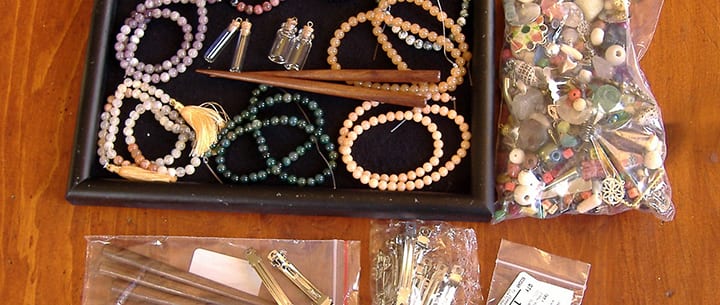
Interested in trying your hand at jewelry design? Before you begin, consider the following 5 questions, as outlined by Nashville jewelry designer and teacher Warren Feld (www.warrenfeldjewelry.com)
Susan felt very unsure of herself. And unsure of her jewelry. Would people like it? Was the color mix appropriate? Was the construction secure? Was the price smart and fair? She allowed all this uncertainty to affect her design work – she had difficulty finishing pieces she was working on, starting new projects, and getting her work out there.
Like many of my jewelry and beadwork students, Susan needed to be empowered as a designer.
Empowerment is about making choices. These choices could be as simple as whether to finish a piece or not. Or whether to begin a second piece. The designer will make choices about how to draw someone’s attention to the piece, or present the piece to a larger audience. She or he may decide to submit the piece to a magazine or contest. She or he may want to sell the piece and market it. The designer will make choices about how a piece might be worn, or who might wear it, or when it might be worn, in what context.
And for all these choices, the jewelry designer might need to overcome a sense of fear, boredom, or resistance. The designer might need to overcome anxiety, a sense of giving up, having jeweler’s block, feeling unchallenged, and even laziness.
The empowered jewelry designer should have answers to 5 critical questions:
Question 1: Should BEADWORK and JEWELRY MAKING be considered ART or CRAFT?
The jewelry designer confronts a world that is unsure whether jewelry is “craft” or “art.” This can get very confusing and unsettling. Each approach has its own separate ideas about how the designer should work, and how he or she should be judged.
When defined as “craft,” jewelry is seen as something that anyone can do – no special powers are needed to be a jewelry designer. As “craft,” there is somewhat of a pejorative meaning — it’s looked down upon, thought of as something less than art. But as “craft,” we recognize the interplay of the artist’s hand with the piece and the storytelling underlying it. We honor the technical prowess. People love to bring art into their personal worlds, and the craftsperson offers them functional objects that have artistic sensibilities.
When defined as “art,” jewelry is seen as something which transcends itself and its design. It evokes an emotional response from the viewer. It has more of a sense of clarity of purpose and choice, a sense of presence. As “jewelry art,” things done to improve functionality – durability, movement, drape and flow – should play no role at all, or as a compromise, merely be supplemental.
How you define your work as ART or CRAFT will determine what skills you learn, how you apply them, and how you introduce your pieces to a wider audience.
QUESTION 2: How do you decide what you want to create?
What kinds of things do you do to translate your passions and inspirations into jewelry? What is your creative process?
Applying yourself creatively can be fun at times, but scary at other times. It is work. There is an element of risk. You might not like what you end up doing. Your friends might not like it. Nor your family. You might not finish it. Or you might do it wrong. It may seem easier to go with someone else’s project.
Set no boundaries and set no rules. Be free. Go with the flow. Don’t conform to expectations.
Play. Pretend you’re a kid again. Have fun. Get the giggles.
Experiment. Take the time to do a lot of What Ifs and Variations On A Theme and Trial and Error.
Keep good records. Make good notes and sketches of what seems to work, and what seems to not work.
Evaluate. Learn from your successes and mistakes. Figure out the Why did something work, and the Why Nots.
QUESTION 3: What kinds of MATERIALS work well together, and which ones do not?
The choice of materials, including beads, clasps, and stringing materials, set the tone and chances of success for your piece. There are light/shadow issues, textural issues, and color issues. All of these choices:
… affect the look
… affect the drape
… affect the feel
… relate to the context
I always suggest using the highest quality materials your budget will allow.
Question 4: Beyond applying basic techniques, how does the Jewelry Designer evoke an emotional response to their jewelry?
An artistic and well-designed piece of jewelry should evoke an emotional response. This takes both the successful application of techniques as well as skills.
Unfortunately, beaders and jewelry makers focus too often on techniques and not often enough on skills. It is important to draw distinctions here.
Techniques are necessary but not sufficient to get you there. You need skills. The classic analogy comparing techniques and skills references cutting bread with a knife. Technique: How to hold the knife relative to the bread in order to cut it. Skill: The force applied so that the bread gets cut successfully.
Skills are the kinds of things the jewelry designer applies which enhance his or her capacity to control for bad workmanship. These include:
– Judgment
– Presentation
– Care and dexterity
– Taking risks
QUESTION #5: When is enough enough?
How does the jewelry artist know when the piece is done? Overdone? Or underdone? How do you edit?
In the bead and jewelry arenas, you see piece after piece that is either over-embellished or under-done. Things may get too repetitive with the elements and materials. Or the pieces don’t feel that they are quite there yet.
For every piece of jewelry there will be that point of parsimony, where adding or subtracting one more element will make the experiencing of the whole greater than the sum of its parts.
The empowered jewelry designer will have answers to these questions, though not every designer will have the same answers, nor is there one best answer. Yet it is unacceptable to avoid answering any of these 5 questions, for fear you might not like the answer.
The empowered jewelry designer will have learned the skills for making good choices. These choices include making judgments about combining materials, both physical and aesthetic, into wearable art forms and adornment. This is jewelry making and design.
 For Warren F., Jewelry Designer and teacher in Nashville, TN, beading and jewelry making endeavors have been wonderful adventures. These adventures, over the past 25 years, have taken Warren from the basics of bead stringing and bead weaving, to wire working and silver smithing, and onward to more complex jewelry designs which build on the strengths of a full range of technical skills and experiences. Learn more about Warren here!
Posted in Art or Craft?, jewelry design | Tagged: art, bead weaving, craft, jewelry design | Leave a Comment »
Posted by learntobead on April 28, 2014
QUESTION: Have you ever designed something truly ugly? Look at some of the previous submitted entries to the Ugly Necklace Contest? In your view, and from a design sense, are there any particularly outstanding examples of “Ugly”?
Past Contests — View the Galleries of Entries
2003: http://www.landofodds.com/store/ugliest2003a.htm
2004: http://www.landofodds.com/store/ugliest2004a.htm
2005: http://www.landofodds.com/store/ugliest2005a.htm
2006: http://www.landofodds.com/store/ugliest2006a.htm
2007: http://www.landofodds.com/store/ugliest2007a.htm
2008: http://www.landofodds.com/store/ugliest2008a.htm
2010: http://www.landofodds.com/store/ugliest2010a.htm
2012: http://www.landofodds.com/store/ugly9contest.htm
About The UGLY NECKLACE CONTEST — A Jewelry Design Competition With A Twist
Submission Deadline: August 31, 2014
Enter To Win! http://www.landofodds.com/store/uglynecklace.htm
The UGLY NECKLACE CONTEST is a jewelry design contest with a twist. The contest presents a challenge not often tackled — at least intentionally. The contest draws the jewelry designer into an alternative universe where beautiful artists create ugly necklaces. It’s not easy to do.
“Ugly” is more involved than simple surface treatment. It is not just laying out a bunch of ugly parts into a circle. It turns out that “Ugly” is something more than that. “Ugly” is the result of the interplay among Designer, Wearer, and Viewer. “Ugly” is very much a result of how a necklace is designed and constructed. “Ugly” is something the viewer actively tries to avoid and move away from. “Ugly” has deep-rooted psychological, cognitive, perceptual, sociological and anthropological functions and purposes.
As research into color and design has shown, your eye and brain compensate for imbalances in color or in the positioning of pieces and objects – they try to correct and harmonize them. They try to neutralize anything out of place or not quite right. You are pre-wired to subconsciously avoid anything that is disorienting, disturbing or distracting. Your mind and eye won’t let you go here. This is considered part of the fear response, where your brain actively attempts to avoid things like snakes and spiders…. and ugly necklaces.
This means that jewelry designers, if they are to create beautiful, wearable art, have to be more deeply involved with their pieces beyond “surface”. Or their pieces will be less successful, thus less beautiful, thus more disturbing or distracting or disorienting, thus more Ugly.
Luckily, for the jewelry designer, we are pre-wired to avoid these negative things. This makes it easier to end up with pieces that look good. Beauty, in some sense, then, is very intuitive. On the other hand, it makes it more difficult to end up with pieces that look bad. You see, Ugly goes against our nature. It’s hard to do.
To achieve a truly hideous result means making the hard design choices, putting ourselves in situations and forcing us to make the kinds of choices we’re unfamiliar with, and taking us inside ourselves to places that we are somewhat scared about, and where we do not want to go.
– Can I push myself to use more yellow than the purple warrants, and mix in some orange?
– Can I make the piece off-sided or disorienting, or not have a clear beginning, middle or end?
– Can I disrupt my pattern in a way that, rather than “jazz,” results in “discord?”
– Can I work with colors and materials and patterns and textures and placements and proportions I don’t like?
– Can I design something I do not personally like, and perhaps am unwilling, to wear around my neck?
– Can I create a piece of jewelry that represents some awful feeling, emotion or experience I’m uncomfortable with?
– Can I make something I know that others won’t like, and may ridicule me for it?
Because answering questions like these is not something people like to do, jewelry designers who attempt to achieve “Ugly,” have to have a lot of control and discipline to override, perhaps overcome, intuitive, internally integrated principles of artistic beauty. The best jewelry designers, therefore, will be those artists who can prove that they can design a truly Ugly Necklace. In our contest, we invite all those jewelry designers out there to give it a try.
The Ugly Necklace Contest is one of the many programs at Be Dazzled Beads and The Center for Beadwork & Jewelry Arts in Nashville, Tennessee, that encourage beadwork and jewelry makers to challenge themselves and to test their design skills, and learn some fundamentals about jewelry design in the process.
What Is Ugly?
Different participants in The Ugly Necklace Contest have interpreted “Ugly” in different ways.
Some focused on the ugliness of each individual component. Some used materials that they felt conveyed a sense of ugly, such as llama droppings, or felted matted dog hair, or rusty nails, or cigarette butts, or a banana peel. Some focused on mood and consciousness, and how certain configurations of pieces and colors evoked these moods or states of consciousness.
Others focused on combining colors which don’t combine well. Still others focused on how the wearer’s own body would contribute to a sense of ugliness, when wearing the piece, such as the addition of a “Breast Pocket” which would lay just below the woman’s breast, or peacock feathers that covered the wearer’s mouth, or the irritating sounds of rusty cow bells, or the icky feeling of a rotting banana peel on the skin. Still others saw Ugly as a sense of psychological consciousness, such as being homeless, or an uncomfortable transition from adolescence to adulthood. For some Ugly meant politically ugly, like Saddam Hussein of Iraq, or the trans-fats associated with fast foods.
It is not enough just to string a bunch of ugly beads on a wire. Ugly pieces do not necessarily result in an ugly necklace. As one entrant learned, when she strung her ugly beads together, the final project was beautiful, and sold for $225.00, before she could enter it into the contest! Actually, if you look at many of the entries, you see that ugly pieces, once arranged and organized, don’t seem as ugly. Organization and arrangement contribute their own qualities and sense of beauty that transcends the ugly parts.
Adding to the fun, the contestant also has to create a piece of jewelry which is functional and wearable. This is what sets beadwork and jewelry design apart from other design arts. A piece of jewelry as art, (even Ugly art), has to maintain its essence and purpose, even as the wearer moves, bends down, or rubs against things. Jewelry is Art as it is worn. Jewelry is not a subset of painting or a type of sculpture.
Jewelry is something more. Jewelry is art and architecture in motion, often frenetic motion. The pieces that make it up, and the techniques and designs which coherently interrelate these pieces, must also anticipate this dynamic totality. Otherwise, the piece of jewelry becomes a failure not only as a piece of jewelry, but of art, as well.
The Ugly Necklace Contest is an arena for budding and established beadwork and jewelry designers to strut their stuff – to show how adept they are at creating ugly-necklace-pieces-of-art. It’s a jewelry design competition with a twist.
The finalists of The Ugly Necklace Contest are those beadwork and jewelry designers who can best elaborate upon rules of design, whether intuitively or strategically. These rules of design are, in effect, an underlying grammar and vocabulary – the theoretical and professional basis of beadwork and jewelry making as art, not just craft.
~~~~~~~~~~~~~~~~~
Be sure to check out this new book by Margie Deeb, in which she includes a discussion about The Ugly Necklace Contest:
The Beader’s Guide to Jewelry Design: A Beautiful Exploration of Unity, Balance, Color & More Paperback
by Margie Deeb (Author)
Once beaders have mastered the basics and enjoyed bringing others’ patterns to life, they’re ready and eager to take the next step: creating their own original pieces. Here, finally, is their must-have guidebook to the fundamental principles of visual design. Focusing on jewelry, it helps beaders explore concepts such as unity, scale, proportion, balance, rhythm, volume, shape, pattern, texture, movement, drape, and color in their work. Exercises, reader challenges, and lavish photos enhance understanding and assure design success.
This book is available for Pre-Order at Amazon.com.
Posted in Contests, jewelry design | Tagged: bead weaving, beading, Contests, design theory, jewelry design, multimedia art, polymer clay, precious metal clay, ugly necklace, wire working | Leave a Comment »
Posted by learntobead on February 7, 2014
Center for Beadwork & Jewelry Arts: Workshops
|
|
||||||||||||||||||||||||||||||||||
//
//
Posted in beadwork | Tagged: beading workshops, beadwork classes, jewelry design, warren feld | Leave a Comment »


