Warren Feld Jewelry

Taking Jewelry Making Beyond Craft

Posts Tagged ‘bead weaving’

JEWELRY MAKING TIPS: Wax,Wax,Wax

Posted by learntobead on April 19, 2020

Wax. Wax. Wax.

A really good artist will wax their beading thread (Nymo, C-Lon, One-G) or cable thread (Fireline). Even if the thread says it’s been pre-waxed, you want to re-wax this thread.

We wax our thread to make it strong, less likely to fray, to straighten and stretch it a bit before using, to waterproof and protect the thread from weird body chemistries as well as cosmetics, perfumes and perfume oils and hair sprays, and pollutants in the air, to glide through the beads better, and to fill in the jagged edges of the hole of a bead to make it less likely to cut the thread.

There are different types of threads and conditioners.

The primary choices are among pure beeswax, synthetic beeswax (also called microcrystalline wax), and a thread conditioner, like Thread Heaven. I suggest you always use beeswax, either pure or synthetic. I do not recommend a thread conditioner.

Thread conditioners reduce the chances your thread will get tangled or knotted up while you are weaving or stringing with it. It reduces the static electricity that builds up each time you pull the thread or cable thread through a bead. But it doesn’t have any of the positive impacts that wax does. It’s an either or choice. So I choose wax.

The synthetic wax is a little more expensive than the pure wax, but I prefer it. The synthetic does everything the pure one does, only better.

Waxing the thread takes very little time, and it can add years to the life of your bead art. Regular bees wax will protect your thread for 150 years. Synthetic bees way many more times this.

When waxing, we pull our thread through the wax two times. Then we take our two fingers, pinching the thread, and slowing moving down the full length of our thread. Our body temperature melts the wax into the thread. Our fingers also knock off any excess wax on the thread. Always pull by the thread, not by your needle, when waxing.

To feel the effects of waxing, try this:

Take an arm’s length (about 6 feet) of Nymo D or C-Lon D Thread it onto a Size #10 English beading needle.

Double it up, so that you now have your length of thread in half, with two equal lengths extending from either side of your needle’s eye hole.

At the needle end, wrap the thread around your forefinger a couple times. When we pull the thread through the wax, we want to pull by the thread, and NOT by the needle.

Wax the thread twice, then take your two fingers and go down the thread, allowing your body temperature to melt the wax into the thread.

Now un-double your thread.

Move your needle up to one end, leaving about an 8–10” tail.

Take your two fingers, pinching the thread, and feel down the length of the thread to find the area that was wrapped around your finger, and did not get waxed. Your fingers will slip.

Now wax two more times from that area on down.

Pinch your thread at one end, moving your fingers down the length to melt the wax into the thread.

Other Articles of Interest by Warren Feld:

Best Way To Thread Your Needle

Bead Stringing With Needle and Thread

Beading Threads vs. Bead Cord

Turning Silver and Copper Metals Black: Some Oxidizing Techniques

Color Blending; A Management Approach

Cleaning Sterling Silver Jewelry: What Works!

What Glue Should I Use When Making Jewelry?

When Choosing Colors Has You Down, Check Out The Magic Of Simultaneity Effects

The Color Effects of Threads

Wax, Wax, Wax

When You Attend A Bead Show…

When Your Cord Doesn’t Come With A Needle…What You Can Do

Duct Tape Your Pliers

What To Know About Gluing Rhinestones

Know Your Anatomy Of A Necklace

How Does The Jewelry Designer Make Asymmetry Work?

I hope you found this article useful. Be sure to click the CLAP HANDS icon at the bottom of this article.

Also, check out my website (www.warrenfeldjewelry.com).

Subscribe to my Learn To Bead blog (https://blog.landofodds.com).

Visit Land of Odds online (https://www.landofodds.com)for all your jewelry making supplies.

Enroll in my jewelry design and business of craft video tutorials online.

Add your name to my email list.

Posted in Stitch 'n Bitch | Tagged: , , , , | Leave a Comment »

JEWELRY MAKING TIPS: Beading Threads vs. Bead Cord

Posted by learntobead on April 19, 2020

Beading Threads
Bead Cord

Beading Threads vs. Bead Cords

People often confuse BEAD CORDS and THREADS.

Beading Threads are very thin ribbons, and are meant to be fully covered with beads, thus hidden within your pieces. They are typically waxed with beeswax to keep them from fraying. Threads, once waxed, are actually stronger and more durable than bead cords, but they are unsightly.

Threads are used in both bead weaving and bead stringing projects.

Beading Cords are threads that are braided together, to make them visually attractive. But you don’t wax bead cords — this would make them ugly. So Bead Cords will have problems of fraying and stretching that waxed Threads will not. When Bead Cord is waxed, the exposed waxed cord also picks up dirt and body oils, making it dirty and unsightly, and furthering weakening the cord.

Bead Cords are used for projects where you want the cord to show, like putting knots between beads, or tin cup necklaces where you have a cluster of beads, then a length of cord showing, and then another cluster of beads, then the cord, and so forth.

If you do not want your cord to show, then you would use a waxed Bead Thread or Cable Wire, which are much more durable than Bead Cords.

Other Articles of Interest by Warren Feld:

Best Way To Thread Your Needle

Bead Stringing With Needle and Thread

Beading Threads vs. Bead Cord

Turning Silver and Copper Metals Black: Some Oxidizing Techniques

Color Blending; A Management Approach

Cleaning Sterling Silver Jewelry: What Works!

What Glue Should I Use When Making Jewelry?

When Choosing Colors Has You Down, Check Out The Magic Of Simultaneity Effects

The Color Effects of Threads

Wax, Wax, Wax

When You Attend A Bead Show…

When Your Cord Doesn’t Come With A Needle…What You Can Do

Duct Tape Your Pliers

What To Know About Gluing Rhinestones

Know Your Anatomy Of A Necklace

How Does The Jewelry Designer Make Asymmetry Work?

I hope you found this article useful. Be sure to click the CLAP HANDS icon at the bottom of this article.

Also, check out my website (www.warrenfeldjewelry.com).

Subscribe to my Learn To Bead blog (https://blog.landofodds.com).

Visit Land of Odds online (https://www.landofodds.com)for all your jewelry making supplies.

Enroll in my jewelry design and business of craft video tutorials online.

Add your name to my email list.

Posted in Stitch 'n Bitch | Tagged: , , , , | Leave a Comment »

Watch Out! Or You’ll Catch The Bead-Bug!

Posted by learntobead on April 18, 2020

Getting Started Beading and Making Jewelry
 
Channeling your excitement”

CATCHING THE “BEAD-BUG”

As someone once told me, “I bought some beads, dumped them all out on the table, and I was hooked!”

She began making simple bracelets and necklaces, and was hooked some more.

And then she learned wire working, and made wire bezels and bails, wire clasps and ear-wires, and wire-constructed bracelets, and yes, she was hooked some more.

She sold several pieces, and now, even her husband started getting hooked.

And she learned bead weaving and some silversmithing, some polymer clay and metal clay, some kumihimo and micro-macrame, and now, not just herself and her husband, but her three children and her mother and her next-door neighbor were hooked.

She spent hours and hours organizing her beads. And organizing some more, as her beads and her ongoing projects took up more and more room in her house.

She was overwhelmed by choices. And was very hooked. And, although she kept buying up bead after bead, and learning technique after technique, and organizing workspace after workspace, she allowed very little time for “design.”

Yet, we need to give her a chance to get started. To catch her breath. To learn how to learn. To learn how to organize and work. To learn how to manage all the emotions and anxieties which come with so many choices, and so many colors, and so many parts, and so many different ways to go about making jewelry and beadwork. Before she is ready to wander that path. And bump into her Inner Designer.

What Can You Do With Beads?

A BEAD is anything that has a hole in it. And you can do a lot of things with things that have holes.

You can put these things on string.

You can sew these things onto fabric.

You can weave these things together with threads.

You can knot or braid or knit or crochet these things together.

You can combine and wrap and en-cage these things with metal wires and metal sheets.

You can work these things into projects with clay, polymer clay and metal clay.

You can embellish whatever you can think of — dolls, tapestries, clothes, shoes, scrapbooks, pillows, containers, and vases.

You can use these things in scientific experiments.

You can fuse these things together.

You can incorporate these things into projects involving stained glass, mosaics, or multi-media art.

You can decorate your house and your household things with these things.

You can texture surfaces with these things, using glues, cements or resins.
 
 You can buy these pre-made, or make your own.

You can do a lot of things with beads.

Most people begin by Stringing beads, and graduate to things like Weaving beads, Embellishing with beads on Fiber, Knotting and Braiding with beads, and Wire Working with beads. A few people learn to hand-make Lampwork glass beads, or learn to sculpt with Polymer Clay or Precious Metal Clay, or learn to solder using Silver-Smithing techniques.

And you can feel self-satisfied and secure in the knowledge that, should everything else in the world around you go to pot, we will all be back to bartering with beads.

And you will have them.

So, beads are good.

Getting Started

Everyone has a Getting-Started story. Some people were always crafty, and beading was a natural extension to what they were doing. Others were driven by the allure of beads and jewelry. They saw fabulous earrings and necklaces and bracelets in magazines, department stores and boutiques at prices out of reach, and they said to themselves: I can do this — and for less. And still others were drawn by the beads themselves — beautiful objects to be adorned. And played with. And fondled.

Vanessa told me how she got started. She had bought a strand of beads. She possessed them. They possessed her. She kept them with her at all times. In her pocket. In her purse. Between her hands. Inside a zip-lock bag. Then outside the zip-lock bag. And back into the zip-lock bag. After weeks of taking them out, putting them away, and then taking them out again, she sat herself down at her kitchen table. She lay the strand of beads on the table, ever-so-gently. She reached for the sharpened scissors. And cut the strand.

The beads rolled all over the table. Vaness’s eyes got wide. She told me she couldn’t stop looking at them and touching them and playing with them. The look on her face was sinful, almost pornographic.

Vanessa returned to the local bead store. And bought some more beads.

Terry had been crafty her whole life, ever since she was a little girl. She didn’t remember when she first started making jewelry. But she did remember when she was lucky enough to get paid for it. She made more jewelry. She sold more jewelry. And made more. And sold more.

Hessie loved to watch the jewelry home shopping network. She imagined herself modeling the jewelry on TV, and telling her audience how wonderful the beads and the colors and the stones and the designers all were. She began watching the craft shows on cable, and studying the instructors and every little thing they said and did. She started bead stringing jewelry and learning some wirework.

If you had walked into Renee’s bedroom, you would have seen boxes and boxes of jewelry — all in need of repair. She kept meaning to fix each piece, but the cost and inconvenience were too high. Finally, she convinced herself, “I can do this myself.”

Darita was a fiber artist. She had become frustrated, a bit, because she wanted more life in her projects. By a happy accident — a shattered car window and shards of glass sticking into several fiber projects on the front seat of her car — she discovered she could add beads. These beads added light and interplays on light. Darita was very happy with the results.

I always find myself asking our customers and students how they got started. Here’s how some of them finished the sentence, 
When I started beading…

“… I needed jewelry for my prom.”

“… My neighbor made me do it.”

“… A friend wanted a pair of earrings.”

“… I visited my first bead shop.”

“… I needed someone to repair a necklace, and couldn’t find anyone to do it.”

“… I needed to make some extra money.”

“… I was thinking about what to do after I retired.”

“… I ordered a kit on-line.”

“… I dreamed about beads and designed in my sleep.”

“… My dad brought me a beaded Indian doll, and I had to learn how to make something so similar.”

“… I was recuperating in the hospital from some surgery, and the volunteer brought me some beadwork to keep me busy.”

“… I begged a friend of mine to make me a bracelet like hers, but she never did. So I made one for myself.”

“… I decorated a scrapbook with some beads, and suddenly found myself switching craft careers.”

“… I needed an escape, something relaxing, something meditative.”

“… I was a baby in diapers learning to walk by following my mother holding some big beads dangling from a string.”

When I started beading in the late 1980’s, there were no major bead magazines — like Bead & Button or Beadwork. There were very few stringing material options, and in fact, many people used dental floss or sewing thread or fishing line. There were few choices of clasps and other findings — especially for stringing on thicker cords like leather or waxed cotton. I had to go to hardware stores and sewing notion stores and antique stores and flea markets to find things, and make them work. I cannibalized a lot of old jewelry for their parts.

I was in Nashville, Tennessee, at the time. There wasn’t much of a beading culture here. It was difficult to find advice and direction. This was pre-Internet. I mostly strung beads, and got hooked early on. Probably because I sold so much of what I made. Selling your stuff gets you addicted very fast.

Life Has A Way of Linking You Up To Beads

I grew up in a semi-rural part of New Jersey, where every year they published the Farms Report. The Report indicated how many farms were left in each county in New Jersey. There were 300 farms left in Somerset County when I left for college in Massachusetts. The year was 1971. My parents owned a small independent pharmacy. Their business could be traced back to before the Civil War, though it moved up and down the street several times on what was called The Old York Road. I worked in the store from when I was very young, and always loved the retail setting. Healthcare, my professional occupation, not so much.

As most upwardly mobile young adolescents do in the New Jersey/New York corridor, I pursued a professional track. I studied anthropology and psychology at Brandeis. I pursed a masters degree in City and Regional Planning at Rutgers. Got a job as a city health planner in New Brunswick, NJ. And eventually went on to get my doctorate in Public Health at the University of North Carolina.

I held a series of progressively more responsible jobs in healthcare. Initially, I was an assistant professor at Ole Miss in Oxford, Mississippi. I taught graduate students health law, medical anthropology, epidemiology, and health planning. Loved Ole Miss. Loved Oxford. Loved Mississippi. At the time, however, I wasn’t so keen on teaching, and was never a big fan of working in the healthcare field.

I went on to become a health policy planner for the State of Tennessee. That’s how I got to Nashville. And then director of the Tennessee Primary Care Association. But, at that point, I could push myself to stay in healthcare no more. In spite of the great pay. In spite of the prestige. In spite of the power base I had created for myself. In spite of wanting to help people get access to care. I finally reached a point where I no longer cared as much about the money. And I cared much more about bringing back some more authenticity in my life. Some other “Fool” could step in and take over all these professional responsibilities. I had paid my dues to society.

So, I took the plunge.

With my partner Jayden, we opened a bead shop. We sold all the parts, as well as finished pieces we made. We repaired jewelry. Jayden did some teaching and instruction. We were in the right place with the right products at the right time. Business sky-rocketed. I had assumed that I would have had to continue doing some healthcare consulting, mostly with HCA, and some teaching at the graduate program with Meharry Medical College and Tennessee State University.

But I never had to. And, over the next 30+ years, never had to again.

I caught the bead-bug.

And it never left me.

Other Articles of Interest by Warren Feld:

Best Way To Thread Your Needle

Bead Stringing With Needle and Thread

Beading Threads vs. Bead Cord

Turning Silver and Copper Metals Black: Some Oxidizing Techniques

Color Blending; A Management Approach

Cleaning Sterling Silver Jewelry: What Works!

What Glue Should I Use When Making Jewelry?

When Choosing Colors Has You Down, Check Out The Magic Of Simultaneity Effects

The Color Effects of Threads

Wax, Wax, Wax

When You Attend A Bead Show…

When Your Cord Doesn’t Come With A Needle…What You Can Do

Duct Tape Your Pliers

What To Know About Gluing Rhinestones

Know Your Anatomy Of A Necklace

How Does The Jewelry Designer Make Asymmetry Work?

How To Design An Ugly Necklace: The Ultimate Designer Challenge

I hope you found this article useful. Be sure to click the CLAP HANDS icon at the bottom of this article.

Also, check out my website (www.warrenfeldjewelry.com).

Subscribe to my Learn To Bead blog (https://blog.landofodds.com).

Visit Land of Odds online (https://www.landofodds.com)for all your jewelry making supplies.

Enroll in my jewelry design and business of craft video tutorials online.

Add your name to my email list.

Posted in Stitch 'n Bitch | Tagged: , , , , | Leave a Comment »

The Greatest Lover Of Beads Ever

Posted by learntobead on April 18, 2020

Connie Welch

The Greatest Bead Lover Ever!

Connie Welch was the greatest bead lover you could ever meet. She was one of our first store customers. She was instrumental in our success — on many levels. In 2009, she passed away.

It seems like only yesterday morning, Connie Welch and I were chatting about our very successful and exciting Laura McCabe workshops over the weekend before Connie’s death. We had all been together with our closest friends and bead-mates, and had met several more we immediately included with our group.

Connie had been very excited about the workshops. She loved the projects. They were fun, challenging and appealing. She learned many new things. She couldn’t wait to ask Laura to come back to Nashville again. Connie and I remarked how the workshop reflected the results of so many years she, I and others had spent creating and developing and fostering and participating in The Center for Beadwork & Jewelry Arts — the name we gave our educational program at Be Dazzled Beads.

Connie was instrumental in bringing a professional bent to beadwork in Nashville. She played very key roles in helping Jayden and I grow our business and raise all our dogs, especially Rosie.

So you can imagine how shocked and saddened Jayden and I were to learn that Connie had passed away. We miss her deeply.

Connie was part of our original advisory groups which researched beading education around the world, distilled this information into sets of critical ideas, and then wove these ideas into our educational program at CBJA and Be Dazzled Beads. The first things Connie worked on were identifying critical bead-weaving skills, like managing thread tension. She worked with the group to developmentally order these skills, and then link them to specific courses. But her proudest moment and claim to fame was her development of our Advanced Bead Studies program. Connie took the leadership role in organizing these Bead Studies over 9 years.

Connie had shopped in our stores since our beginnings. She took it upon herself to make sure that we were always in the know about major things happening in the bead world. She was our “deputized” market researcher. She followed bead trends, bead magazines, bead websites and bead artists. She brought her knowledge of color and graphics to the fore. She made us aware of the local bead scene in Nashville, the major players, the stores, the groups and opportunities.

And Connie made sure that all our store dogs — Rosie, Dottie, Stormy, Lily and Daisy — were treated like royalty. Connie loved all our dogs, but had a special place in her heart for Rosie. And Rosie had a special series of sounds to announce each time that Connie was arriving at our store’s front door.

Connie loved to bead. She loved beads, beaders and anything beading related.

Connie’s enthusiasm affected all around her — almost as if she imbued them with all the visual and textural and sensual and emotional powers of the beads she so lovingly contemplated herself. Connie made everyone want to bead. And she made everyone want to share in the addiction.

I received this note about Connie after her death:

“I knew Connie from the AOL boards from years ago. I live in the Phoenix area and when she’d come in Sept, or then Aug, for the fiber convention, my job was to, on Fridays, drive to Walgreens, buy coke for her, hit the hotel, and she would yell at Jim (her husband) and I all afternoon as we tore up the hotel room, reinvented the furniture, and set up the displays to her satisfaction.

“She took us to dinner at a place called Sam’s every time, for working for her. Saturdays I would return and spend all day with her, beading, showing our stuff to each other, and she often shared stories of the Land of Odds, and the folks she met and the classes she took there.

“She told me some great stuff over the few years we did this. I’d return on Sundays and we’d visit again, but then Jim and I had to tear down and repack all of the show supplies to Connie’s barked orders.

“One time she sent me to another vendor to identify some stone beads. As it turned out, the woman was new to beading so I ended up giving her all sorts of information, and leads on other local stores besides where she had obtained said beads. The other vendor and her daughter spent much of that show buying the beads and buttons I had just learned to make along with things I had hauled in from Tucson, and ended up trading some beads for some silk ribbons I had. I’d had no idea what they were worth. I just showed them to her, and her eyes got big as saucers.

“While sitting in Connie’s showroom, we used to laugh hard and bead, and this drew in the “bead curious” who would have otherwise walked past her salesroom.

“Sometimes it would result in a sale, sometimes potential customers for either one of us as one time she let me display some beads in there — I just recalled that. But always Connie ramped up that person’s enthusiasm for beads, or learning to incorporate beads into their fiber work. When there was no one around, she loved to tell stories of beads and beading and however Cleo (her cat) got involved.

“Connie was generous with information and she was also really curious about how I figured things out. I was a self-taught beader and to date have still only ever taken 2 classes, maybe 3. Admiring her beautiful work inspired me to go further with my freeform work. She taught me now to make the little “boats” to start a freeform peyote pouch, and I have had some good success with that project.”

— — Caryn

Connie, we sure do miss you!

Other Articles of Interest by Warren Feld:

Do You Know Where Your Beading Needles Are?

Consignment Selling: A Last Resort

Odds or Evens? What’s Your Preference?

My Clasp, My Clasp, My Kingdom For A Clasp

Why Am I So Addicted To Beads?

The Bead Spill: My Horrifying Initiation

The Artists At The Party

How To Bead A Rogue Elephant

You Can Never Have Enough Containers For Your Stuff

Beading While Traveling On A Plane

Contemplative Ode To A Bead

How To Bead In A Car

My Aunt Gert: Illustrating Some Lessons In Business Smarts

A Jewelry Designer’s Day Dream

A Dog’s Life by Lily

I Make All The Mistakes In The Book

How Sparkle Enters People’s Lives

Upstairs, Downstairs At The Bead Store

Beads and Race

Were The Ways of Women or of Men Better At Fostering How To Make Jewelry

Women and Their Husbands When Shopping For Beads

Women Making Choices In The Pursuit Of Fashion

Existing As A Jewelry Designer: What Befuddlement!

The Bridesmaid Bracelets

How To Design An Ugly Necklace: The Ultimate Designer Challenge

I hope you found this article useful. Be sure to click the CLAP HANDS icon at the bottom of this article.

Also, check out my website (www.warrenfeldjewelry.com).

Subscribe to my Learn To Bead blog (https://blog.landofodds.com).

Visit Land of Odds online (https://www.landofodds.com)for all your jewelry making supplies.

Enroll in my jewelry design and business of craft video tutorials online.

Add your name to my email list.

Posted in Stitch 'n Bitch | Tagged: , , , | Leave a Comment »

Bead Weaving An Arch -The Japanese Fragrance Garden Bracelet Project

Posted by learntobead on April 17, 2020

JAPANESE FRAGRANCE GARDEN BRACELET

PLANNING YOUR PROJECT
 Thinking about the types of choices made for this project

The Japanese Garden Bracelet is a fun project that students love. It is for students who have some familiarity with bead weaving. I had been experimenting with various strategies for bead weaving an “arch” shape (parabolic arch) which can keep its physical shape while the bracelet is worn. Not an easy task. It has required hours and hours of trial and error. The final choices here were influenced by the architecture of Antonio Gaudi, building a column in segments, and then forcing it into a tight arch configuration.

This project is also a good example of how you can use a natural setting for inspiration. This setting influences color choice, color positioning, as well as shape and its placement. This is the image that inspired this piece.

In this fragrance garden landscape, we see the red moon bridge over a glistening pond of water. Commonly used Japanese garden plants that unfurl flowers include peony, chrysanthemum and, near water features, Japanese water iris. Flowering shrubs include azalea, camellia and hydrangea, all of which provide strong winter interest.

We feel that each plant, walkway, stone and other related elements have been deliberately placed, some shaped and others allowed to grow at will. Japanese gardens are designed to express their cultural values and philosophies. The gardens express the fragility of existence as well as time’s unstoppable advance. I believe the Japanese Fragrance Garden Bracelet captures all this.

It is important, I believe, for a contemporary piece of jewelry to have a sense of dimensionality, movement, and a strong use of color. In contemporary pieces, we also want some sense of the violation of straight lines and flat planes.

MANAGING SUPPORT SYSTEMS AND OTHER ARCHITECTURAL ISSUES

Whenever you create a piece of jewelry, it is important to try to anticipate how your choice of techniques and materials might positively or negatively affect how the piece moves and feels when worn, as well as your piece’s overall durability.

Towards this end, it is important to redefine your techniques and materials in architectural terms. The important term or concept we think about when we begin our piece is called a “Support System”. A support system is anything that gives your piece “jointedness”, that is, allows the piece to move easily when worn, and allows the piece to adapt to the negative forces any movement places on your piece, making your piece feel more comfortable to wear and more durable.

The bridges are basically parabolic arches.

Parabolic Arch
Parabolic Arches by Antonio Gaudi

Antonio Gaudi is a famous architecture from Barcelona, Spain. Much of his fantastical work is organized around and supported by parabolic arches.

The arch is made up of a series of stacked stones, each fitted together, then shaped. They way these segments are pieced together supports the shape, and this shape supports the weight of the structures resting on them. I tried to mimic his architectural/construction ideas with bead weaving.

After a lot of trial and error, my “arch” (which is called a “bridge” in this project) is constructed using 2-stack ladder stitch. It is made up of 4 ladder stitched components. Within each component, all the beads need to be very tightly stitched together. Between any two components, the stitched connection needs to be looser. When the bridge is attached to the foundation of the bracelet, a 15/0 seed bead is wedged between each of the 4 ladder stitched components to force that arching shape, and keep that arching shape, no matter the stresses or strains put on the bracelet when worn.

The Ladder Stitch and the Bridge Construction

The bridge is constructed using a 2-drop ladder stitch. “2-drop” means that we pick up 2 beads at a time, and treat them as “one”.

Each 2 beads or drops is referred to as a “stack”.

The ladder stitch is used to connect stacks.

The bridge consists of 4 connected stacks.

The 4 connected stacks are, in turn, connected together into what is called a “Column Segment”.

Each bridge consists of 4 connected Column Segments.

All the beads in any one column segment should be tight enough to “move as one”.

The connection between any two column segments is looser, so they can move somewhat independently, and thus be able to bend into an arch.

STEP:Making the Bridge

Column Segment Component 1 of 4

Start with 3–4’ of thread. Wax your thread.

Pick up 4 COLOR Q (11/0 delicas).

Slide these beads down to one end, leaving 6” tail.

STEP: Create 2 Stacks

Return through the first bead added, and continue through the other three beads to make a circle.

DOUBLE CHECK that you still have your 6” tail.

With your fingers, push beads together so that you have 2 stacks of 2 beads side by side.

Take the tail and the working thread and tie an overhand knot. This will make getting started to create your column segment easier to manage.

Take your needle through 1 stack so it is exiting the opposite side from the tail.

STEP: Add 3rd Stack, Column Segment One

Pick up 2 more COLOR Q.

Make a “circle” by returning through the opposite side, exiting where you started.

STEP: Secure 3rd Stack

Continue your “circle” through the 2-bead-stack you just added.

STEP: Add 4th Stack, Column Segment One

Add 1 more 2-bead-Stack.

Pick up 2 beads.

“Circle” back through the previous Stack.

Return through the new stack.

STEP: Connect 4th Stack to the 1st Stack To Finish Column Segment Component

Attach the last Stack to the first to create a column segment.

Fold the stacks so that two stacks are sitting in front of the other two stacks.

“Circle” through first 2-bead stack, back through the last 2-bead stack.

NOTE: If you are not on the opposite side of the tail, keep circling until you are.

Tighten this up.

You are now positioned to add the 2nd column segment to our bridge component.

Create Column Segment 2 of 4

STEP: Create 2nd Column segment

Pick up 4Q.

Return back down the previous stack.
 [Pick up 4 beads]
 [Down 2 beads]

Pull tight.

You should have 2 new stacks sitting on top of 2 existing stacks.

STEP: Return

Return back up the original stack, and the new 2-bead stack.
 [Up 4 beads]

STEP: Circle around two new Stacks

Circle around the 2 new stacks, exiting where you started.
 [Down 2 beads, 
 then up 2 beads]

Pull tight.
 You can push the new paired stacks towards the first column segment beneath it.

STEP: Add 3rd Stack to 2nd Column Segment

Pick up 2Q.

Return back down through (un-topped) Stack in previous column segment, (in this case, 1st column segment).
 [Pick up 2 beads]
 [Down 2 beads]

STEP: Return

Return up through remaining “untopped” Stack in previous column segment (in this case 1st column segment).
 [Up 2 beads]

STEP: Add 4th Stack to Column Segment 2

Add 4th Stack to 2nd column segment.

Pick up 2Q.

Return through previous stack in new column segment (in this case segment 2)

[Pick up 2 beads]
 [Down 2 beads]

NOTE: Do NOT travel all the way down through column segment one.

STEP: Secure Stacks

Your thread is exiting the bottom of a 2-bead stack.

a. Return back one more stack to the previous stack. Come up this stack.

b. Come forward one stack. Go down this stack.

c. Go forward and up the next stack.

d. Continue forward, going down the next stack.

e. Return back one stack. Go up this stack.

[BACK ONE, FORWARD THREE, BACK ONE:

Return back one stack.
 Up 2.
 Go forward one stack.
 Down 2.
 Go forward one stack.
 Up 2.
 Go forward one more stack.
 Down 2.
 Return back.
 Up 2
 ]

  • *REALITY CHECK:
     If you created the thread path correctly, all 4 stacks in new segment (in this case segment 2) should be connected.
     You cannot push any stack aside like you would opening a curtain drape.

STEP 29: Add 3rd and 4th column segments

Completed bridge with 4 column segments

Repeat the pattern in STEPS 22–28.

NOTE: Remember: You are securing the new column segment to the previous column segment only.

NOTE: So, when adding 3rd column segment, you begin by picking up 4Q, returning back down 2-bead stack in column segment 2.

DO NOT go all the way back through column segment 1.

Other Articles of Interest by Warren Feld:

Pearl Knotting Warren’s Way

Mini Lesson: Making Stretchy Bracelets

Mini Lesson: Making Adjustable Slip Knots With Thicker Cords

Mini Lesson: How To Crimp

Mini Lesson: Attaching End Caps, Cones, Crimp Ends

Mini Lesson: Brick Stitch

Mini Lesson: Flat Even Count Peyote

Mini Lesson: Ndebele Stitch

Mini Lesson: Petersburg Chain

Mini Lesson: Right Angle Weave

I hope you found this article useful. Be sure to click the CLAP HANDS icon at the bottom of this article.

Also, check out my website (www.warrenfeldjewelry.com).

Subscribe to my Learn To Bead blog (https://blog.landofodds.com).

Visit Land of Odds online (https://www.landofodds.com)for all your jewelry making supplies.

Enroll in my jewelry design and business of craft video tutorials online.

Add your name to my email list.

This Japanese Garden Bracelet is available as a kit from Land of Odds online.

Posted in Stitch 'n Bitch | Tagged: , , , , | Leave a Comment »

Use of Armature in Jewelry Design — Legitimate, or Not?

Posted by learntobead on April 17, 2020

Autumns End Bracelet

While I occasionally use armatures in my beadwork projects, I have a psychological aversion to them as somehow contaminating my beadwork, making it less pure, taking the sacred and making it profane. I think what I viscerally react to is how often, the way people use the armatures, makes the piece look more crafty or less finished.

Nevertheless, when you need your beadwork to hold a shape, what other things can you resort to?

What kinds of experiences do you have with armatures? What kinds of materials have you used, and which to you like to use best?

How do you marry the beadwork with the armature? Camouflage?

About Armature

Armature is used to create and preserve shape within a piece. It is a type of “skeleton” or internal structure.

Your goals, as a bead artist and jewelry designer, are to select an appropriate material and size of the armature, so that it does not compete or detract from your finished piece. You do not want your piece to look or feel “crafty.” You want it to look and feel artistic and well-designed. You do not want your piece to feel weak, or somehow insufficient, given the wearer’s and the viewer’s expectations.

You do not want the essence of the armature’s materials in any way to work against the essence of the material(s) your beads are made of. Usually, but not always, this means hiding the armature inside the piece.

In making your selection of armature, you need to understand the design-relationships between those sections of the piece requiring armature, and why they require it.

One reason is to create or preserve a Shape. In Autumn’s End (pictured), Kathleen Lynam wanted to turn the somewhat soft, floppy and flimsy Ndebele tube into a solid, 3-dimensional tube which maintained a consistence 3-D s cylindrical shape.

A second reason to use an armature is to Pose. In Autumn’s End, she wanted the Ndebele tube to make a circle around a person’s wrist, and, once there, stay in form and place. Thus, our armature needs some degree of flexibility, but at the same time, it must be able to hold the pose, as well.

A third reason has to do with Action. She was concerned with Action, when a part of her piece had to be animated in some way. This is somewhat important with Autumn’s End, in that our wearer will have to pull open and push closed on the wristlet, to get it on and off, and to position it comfortably on the wrist..

There are many types of materials bead artists and jewelry designers use to make armatures. Sometimes this involves stuffing with cotton or fiber fill. It might involve using tin foil. Othertimes, we might use a toothpick, dowel, straw, tubing, wire, or metal rod. We can also create the armature using glue or floor wax to create a solid or stiffened structure. We can also create our armature from sculpted clay, like polymer clay or metal clay or plastic wood.

Given the shape and pose requirements of Autumn’s End, her choices came down to plastic aquarium tubing, a thick-gauge wire, or plumber’s solder. The tubing would not have met her “pose” and “action” requirements anywhere near as well as the solder does. Nor would a thick gauge wire.

In this piece, she used the idea of “Armature” in a secondary way. She painted the flowers and leaves with acrylic floor wax. This stiffened the threads — what would be considered the canvas of the piece — so that these threads, too, turned into a type of armature preserving “shape” and “pose”.

Other Articles of Interest by Warren Feld:

Best Way To Thread Your Needle

Bead Stringing With Needle and Thread

Beading Threads vs. Bead Cord

Turning Silver and Copper Metals Black: Some Oxidizing Techniques

Color Blending; A Management Approach

Cleaning Sterling Silver Jewelry: What Works!

What Glue Should I Use When Making Jewelry?

When Choosing Colors Has You Down, Check Out The Magic Of Simultaneity Effects

The Color Effects of Threads

Wax, Wax, Wax

When You Attend A Bead Show…

When Your Cord Doesn’t Come With A Needle…What You Can Do

Duct Tape Your Pliers

What To Know About Gluing Rhinestones

Know Your Anatomy Of A Necklace

How Does The Jewelry Designer Make Asymmetry Work?

How To Design An Ugly Necklace: The Ultimate Designer Challenge

I hope you found this article useful. Be sure to click the CLAP HANDS icon at the bottom of this article.

Also, check out my website (www.warrenfeldjewelry.com).

Subscribe to my Learn To Bead blog (https://blog.landofodds.com).

Visit Land of Odds online (https://www.landofodds.com)for all your jewelry making supplies.

The Autumns End Bracelet project is available as instructions for download on the Land of Odds website.

Enroll in my jewelry design and business of craft video tutorials online.

Add your name to my email list.

Posted in Stitch 'n Bitch | Tagged: , , , , | Leave a Comment »

THE JEWELRY DESIGNER’S APPROACH TO COLOR

Posted by learntobead on February 16, 2019

THE JEWELRY DESIGNER’S APPROACH TO COLOR

by Warren Feld, Jewelry Designer


Abstract
Color is the single most important Design Element, whether used alone, or in combination with other Design Elements.    Yet jewelry creates a series of dilemmas for the colorist not always anticipated by what jewelry designers are taught in a typical art class.    This article reviews the basic concepts in color theory and suggests how to adapt each of these to the special requirements of beads and jewelry.   Special attention is paid to differentiating those aspects of color use we can consider as objective and universal from those which are more subjective.    The fluent designer is one who can maneuver between universal understandings and subjective beliefs when selecting and implementing colors, color combinations and color blends.  This involves managing the sensation of color light value (balance), the sensation of color contrasts (proportion), and the sensation of simultaneous color contrasts (context) among designer, wearer and viewer.

RETHINKING THE TEACHING OF “COLOR” IN JEWELRY DESIGN
You cannot paint with beads and other jewelry components.
I am going to repeat this:   You cannot paint with beads and other jewelry components.
When you take color class after color class rooted in art, they are teaching you how to paint.    You can’t do this with jewelry and beads.

As frustrating as this can be, you cannot ignore the fact that Color is the single most important Design Element.   Colors, their selection, use and arrangement, are believed to have universal powers to get people to see things as harmonious and appealing.   Color attracts attention.   A great use of color within and object, not only makes that object more coherent, it can be contagious, as well.    Using colors that do not work well together, or using too many colors or not enough colors, or using colors which look good on paper but distort in reality can put people off.

Designers can learn the artistic basics of Color concepts and theories.   They can reference this visual language of color to influence how they go about making choices, including those about picking and using colors.    However, jewelry artists who are fluent in design will be very aware of the limitations this artistic, painterly language imposes on them.    They will have to learn how to decode, adjust and leverage their thinking to anticipate how the bead and other related and integrated materials assert their needs for color, and how to strategically compose, construct and manipulate them.

Jewelry, unlike painting or sculpture, has certain characteristics and requirements which rely on the management and control of color, its sensation and its variability with a slightly different emphasis than learned in a traditional art class.  Jewelry is a 3-dimensional object, composed of a range of materials.  Jewelry situates, moves and adjusts in relation to the human body and what that body is doing at the moment.   To get the attention their jewelry deserves, jewelry artists must become fluent with color selection and application from their own disciplinary perspective.    We must understand color in jewelry as the jewelry is worn, and worn in a particular context or situation.

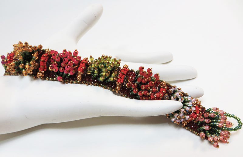
Beads  [here I use ‘beads’ as a stand-in for all the component parts and stringing materials used in a piece of jewelry]  are curved or faceted or otherwise shaped, and the shape and texture and material and dimensionality affect the color, its variation and its placement and movement on the beads surface.  They affect how light reflects and refracts, so depending on the angle at which you are standing, and how you are looking at the bead, you get some unexpected, unanticipated, sometimes unwanted colors in your piece of jewelry.

Additionally, you need to anticipate how the bead, when worn, can alter its color, depending on the source of light, the type and pace of movement of the wearer, and how the eye interacts with the bead at any point of time or positioning.   There are many gaps of light between each pair of beads, and you can’t paint these in.  The colors don’t blend, don’t merge, don’t spill over, don’t integrate.    You can’t create the millions of subtle color variations that you can with paint.

I’m not suggesting that beaders and jewelry makers be afraid of colors.    Rather, they should embrace them.  They should learn insights into understanding colors.  They should be inspired by colors.   They should express their artistic and creative selves through color.    They should use color palettes to their fullest.    They should recognize how their various audiences see and claim and interact with color.

It is most important that jewelry designers understand color, its use and application from their own disciplinary standpoint.   In some sense, however, the approaches of most bead artists and jewelry designers too often remain somewhat painterly – too routed in the Art Model.    The Art Model ignores things about functionality and context.    It diminishes how the individuality of the designer, and the subjective responses of the wearer and viewer affect each other.  In many respects, these are synergetic, mutually dependent and reciprocal.  The Art model understands the success of jewelry as if sitting on an easel, not as it is worn.

As a result, color theories get oversimplified for the jewelry artist.   “Value” is barely differentiated from “Intensity”.   Color selection focuses too much on harmony, and too little on resonance and edginess.  Color training too often steers jewelry designers towards a step-by-step, paint-by-number sort of approach to color selection and application.   The co-dependent relationship between Color and other Design Elements is downplayed and glossed over.    This is a major disservice.

So, I’ve tried to re-think how we could and should think about and teach “color” to jewelry artists.     Not easy.   Art and Design Theory suggests that, in order to teach designers to make good choices, we need to break down color concepts and theories into teachable and digestible groups of skills.    And then show how the next set of skills builds upon the first.

We need to show jewelry artists what kinds of color choices they will be making as they create pieces of jewelry, and then put them in situations where they are forced to make these kinds of choices.     We need to think of colors as “building blocks”, and the process of using colors, as one of creative construction.   Creative construction requires focusing on how color (and multiple colors) is (are) sensed, and sensed by various audiences which include the artist him- or herself, and the wearer and the viewer, and the exhibitor, collector, and the seller, if need be.

So, that’s where I’ll begin with color:   Delineating the types of choices that the jewelry artist needs to make, starting with choices about picking colors.

Picking Colors
As a design element, color is used to attract attention.   It aids in grouping some objects and setting boundaries between others.   It can emphasize and focus.   It conveys meaning and value.   Usually color enhances the aesthetics and appeal.    Color can be used as an organizing tool and create segments, components, rhythms, movement, dimension and hierarchical arrangements within your jewelry composition.   Color can affect the figure/ground relationship of the composition.

There are many different kinds of choices involved, when using Color:

Choices about colors based on our understanding of…
– Personal strategies for picking colors or finding inspirations for colors
– Color theories and concepts
– How the bead (and related jewelry materials) asserts its (their) needs for color
– How color affects the viewers of color
– The process for designing jewelry with color
– The situation or context within which the jewelry is to be worn

Part of picking colors is very personal and subjective.   And part of this is very strategic and must be managed.    That is, part of picking colors is about anticipating more universal understandings about how various audiences will sense and pick colors.     How do you actually go about picking your colors, and then deciding on your final colors for your piece?   What kinds of things influence you in choosing colors?   What inspires you?   Where do you look for inspiration?    Do you have favorite colors and color combinations?    Or colors and color combinations that you detest?    How do you anticipate how others will view and evaluate the colors you pick?

Choosing Colors is an involved exercise.     Most people avoid this kind of exercise, and settle for a set of colors that match.    But, in design terms, Colors are used by the designer to clarify and intensify the effects she or he wants to achieve.

What does it mean to “clarify and intensify” the effects you might want to achieve?   For example, the artist may use color to clarify and/or intensify any of these kinds of things…
– delineation of segments, forms, themes, areas
– expressions of naturalism or abstraction
– enhancing the sense of structure or physicality (forward/recede; emphasize mass or lines or surfaces or points)
– playing with light (surprise, distort, challenge, contradict, provoke)
– altering the natural relationship between the jewelry and the situation it is worn in (context, clothing, setting)

Color is the primary Design Element designers choose to express their intent, establish unity, create rhythm, set movement and dimensionality in place, enhance shape, make points, lines and planes come alive, and the like.    Alas, too few people apply this kind of thinking and make this kind of effort when choosing colors.

For myself, I know that as I start to play with my design arrangements, I also begin to identify potential color issues.    Designs are imperfect.   Beads are imperfect.  Colors are imperfect.   With each issue, I try to figure out solutions – other things I can do with colors to make everything work.   My choices begin with scientifically proven color theories – shared universals that virtually everyone has about picking colors.

In literacy terminology, this is called decoding. Then I begin to personalize my choices so that my results show more of my individuality as an artist.   Some of these latter choices do not necessarily reflect shared universal understandings about color, its sensation and its use.   In literacy terminology, my ability to move back and forth between the objective and subjective is called fluency.

Bead Choices
The bead – its very being – creates as series of dilemmas for the colorist.    And each dilemma is only overcome through strategically making and managing choices about color and design.
Such dilemmas include things like… 

  • Beads are not the same as using paints
  • Can’t blend beads
  • Boundary issues
  • Issues associated with shapes, faceting, edges, crevices
  • Jewelry reflects and refracts light, and this may change as the wearer moves, or lighting changes, or perspective and angle of vision changes, or materials or material mixes change
  • Limits in the range of colors (and color tones) you can pick from
  • Issues associated with the fact that jewelry as worn, takes many shapes/positions, as the person moves, and the color appearance may change or vary
  • Beads are parts in whole compositions, and juxtaposition of 2 or more beads may change or vary the colors’ appearance
  • Jumping from bead to bead within the composition, means the viewer’s mind has to fill in where there are gaps of color to give the illusion there is a continuance of color throughout the composition

Yet most people do not recognize or anticipate these kinds of dilemmas.

Emotions, Moods and Choices
The emotional and psychological effects of color are undeniable.  These effects are usually felt through processes of color comparisons and contrasts.   The better designer anticipates the goals of the wearer, and what emotions and moods the wearer wants to evoke in all that see the jewelry as worn.    This might be appeal, beauty, trust, power, wealth, intelligence, and the list goes on.


Designing With Color – Many Choices
The jewelry designer must be strategic with color, which comes down to..

  1. Selection
  2. Placement
  3. Distribution
  4. Transition
  5. Proportion

Designers must be intentional, not only with the selection of colors, but in the placement of color within the piece, as well.     The designer achieves balance and harmony, partly through the placement of colors.    The designer determines how colors are distributed within the piece, and how colors transition from one color to the next.   And the designer determines what proportions of each color are used, where in the piece, and how.   These kinds of choices affect movement and rhythm, dimensionality, and resonance.

Subjective or Objective Choices?
SOME TOOLS FROM ART THEORY

Many people are often skeptical that you can choose colors with any basis of rationality.     Choosing colors is intuitive, subjective, personal.    You can’t teach people to be better users of colors, because you’re either born with a sense of color, or you are not.

People seem to have cultural or social expectations about the meanings of some colors.   When Vanderbilt students see black and gold, they associate it with school colors.   When others see black and gold, they associate it with something else.    The same goes for University of Tennessee Orange, and so forth school to school.

If we are to be able to teach jewelry makers and beaders to be more scientific in their choices of colors, and be able to anticipate how their various audiences respond to colors, then we would need to have some objective rules, rules that refer universally to just about everyone.  Rules that inform people what colors are best.   What colors go together, which ones do not.   Rules that show how to manipulate color and its expression in perfect and predictable ways.

But everything seems so subjective.

When people see colors on the vertical, they may respond very differently than when they see these same colors on the horizontal.

Look at flags of countries around the world.   Many flag colors are red, white and blue.

If you look at France’s flag, you have red/white/blue on the vertical.

Russia’s flag has red/white/blue on the horizontal.

You frequently find that people might like a color arrangement in a vertical organization, but feel very uncomfortable, or have much disdain for those same colors, when found in the horizontal.

COLOR TOOLS AND THEIR THEORETICAL BASIS
Sensation Management

Color research over the past 100 years or so suggests that there are many universals in how people perceive, understand and respond to colors.   These universals provide the basis for several “sensation-management-tools” jewelry designers might use to help them manipulate various design elements and their arrangements within a jewelry composition.    Some of the most useful color tools are those which designers use to control how to make one color relate to another.     These have to do with creating and managing…

A. Sensations of Color Balance (Light Values)
B. Sensations of Color Proportions (Color Contrast)
C. Sensations of Simultaneous Color (Simultaneous Color Contrasts)

As jewelry designers, we need to know…

  • What these color TOOLS are, and with which we can play
  • What the special demands beads (and all other materials) place on our use of these TOOLS
  • How we can push the limits of these TOOLS to achieve harmony, variety and emotional responses
  • How Far We Can Push the limits of these TOOLS to achieve parsimony and resonance

Toward this end, we need to know a little bit about the research and theories these tools are based upon.We need to understand some things about perception and cognition.That is, we need to understand, as people interact with our jewelry, how the brain comes to see color, recognize color, and interpret color in context.

Theory / Research Underlying These Color-Sensation Management Tools
My favorite book on the research into the theoretical bases of these kinds of color management tools is by Johannes Itten [2] called The Elements of Color.    The most important theories about color universals for jewelry designers, as detailed in his book, include,

  1. After Images
  2. Use of the Color Wheel
  3. Color Schemes
  4. Color Proportions
  5. Simultaneity Effects

As a design element in and of itself, Color (and its attributes) are universally understood as if they were objective facts which comprise a visual grammar.  It is important to understand how to employ universal understandings about color.

Universality, in and of itself, however, is necessary but not sufficient for understanding why some color use draws your attention, and others do not.  Here aspects of subjective interpretations and reactions, given the context, have great influence.The fluent, successful jewelry designer should understand both those universal and subjective aspects of color.

The initial discussion below, however, primarily concerns itself about color as a design element – that is, as something universal and objective.

(1) After Images
The first research had to do with After Images.    If you stare at a particular color long enough, and close your eyes, you’ll begin to see the color on the opposite side of the color wheel.   So, if you stare at red, close your eyes, and you’ll see green.

I know you want to do this, so stare away:


So our first color-sensation tools are based on LIGHT VALUE.    Each color has its own energy signature.  This seems to be universally perceived, and perceived in the same way.

Some colors have a positive energy signature; other colors have a negative energy signature.   The brain wants to balance these out and harmonize them into some kind of zero-sum outcome.    Everyone seems to see after images and see the same after images.    It seems that the eye/brain wants somehow to neutralize the energy in color to achieve some balance or 0.0 point.      The brain always seeks a balanced energy in light and color.   The human eye is only “satisfied” when the complementary color is established.

[This is the basis underlying the various color schemes below. ]

If red had an energy of +10  (I’m making up this scale), and the eye/brain then convinced your psyche to see green, then I would suppose that green would have an energy of -10.   Hence, we reach a 0.0 point (+10 – 10 = 0).

Again, the brain wants balance, harmony, beauty, non-threatening situations.   The brain does not want edginess, tension, anxiety, fear, or ugliness.   So, when you perceive red, your brain, in knee-jerk fashion, and in the absence of other information which might lead to a different interpretation of the situation, tries to compensate for the imbalance by also seeing green.

And we can continue to speculate that your eye/brain does Not want you the designer to overly clarify and intensify, should this result in a more resonant, perhaps edgy, composition.   This takes you too far away from 0.0 energy, and starts to become threatening.   It might excite you.   It might revolt you.   In either case you would react, feel, sense the power of color, but maybe not in a more balanced way the eye/brain would prefer.

But all jewelry designers need to know, and this is important, that their guiding star is “Resonance”, and this can take you a little beyond the harmony the brain seeks.     Creating a little “edginess” in your jewelry can’t hurt, and might better help in achieving finish and success.   But creating too much “edginess” might strike too forcefully at the heart of our pre-wired anxiety response, and our brain will not let us go there.   Your eye/brain does Not want you to push yourself and your jewelry too far to the edge with color.  This countervailing force might create tensions with your artistic and design intentions.

The eye/brain wants balance, harmony, monotony.     Red and green can seem so much fun at Christmas time.    But if you put your red and green necklace on a copy machine, and took a photocopy of it, it would all look like one color of black.    Red and green will always copy as the same color and shade of black.

And that is how we perceive them.    And cognate them.   We see red and green as the same.   As the same color black.    And if we assign red a +10 score, and green a -10 score, the eye/brain is happy to end up with a 0.0 score.  This combination can be boring and monotonous.   Combinations of red and green can feel unified and appear varied, yet somehow fail as choices in our jewelry designs.

And it is important to recognized that if, your composition only uses red, that in reality, when something doesn’t balance off the color red, in this case, the brain will create its own after image – some sensation of green —  to force that balance.   The brain wants to feel safe and in harmony and balance.    Everyone’s brain seems to operate similarly so that this aspect of perceiving color is universally employed.

How far the jewelry designer should fight this universal tendency is up for debate.    However, when initially picking colors to combine in a piece, we might try to achieve this 0.0 balance score (thus, a point of harmony and balance), and then, by clarifying and intensifying, deviate from it a little bit, but always with an eye on that 0.0 – what anyone’s eye/brain is driving it to do.    We want the eye/brain to feel satisfied and “safe”, but as a designer, we also want to give the jewelry a punch, a wow, an edge.    There are many color tricks and techniques that the designer can apply here.


(2) The Color Wheel: A Spectrum of Light Values
Science and Art Theory have provided us with tools to help us pick and combine colors.    One tool is the Color Wheel.    With almost every book about color, there is a Color Wheel.   Some are more detailed than others.   Some are easier to turn and manipulate.    They all have different colors at the North, South, East and West points, but it is the same series of colors, ordered in the same way, color to color.

It is important to understand how to use the Color Wheel.  This curtain of color provides the insights for selecting and arranging colors that might go together well.   The color wheel helps us delineate what color choices we can make, and which combinations of colors might work the best together, to achieve a perceived harmony and balance.

The Color Wheel is a tool and a guide.   It’s not an absolute.   Beads don’t always conform to the colors on the wheel; nor do they reflect light and color in ways consistent with how these colors appear on the wheel.

Look at this color wheel:

Get some color pencils, and color in all the colors around the wheel.

On the Color Wheel, there are 12 colors arranged into three families of color.

The Primary Color [3] family includes three colors:   yellow, blue and red.     These colors present the world as Absolutes.  They are definitive, certain, and steady.   They convey intelligence, security, and clarity.

The Secondary Color family includes those colors you can make by mixing any two primary colors.   These three colors are:  green, orange and violet.    These colors present the world as Contingencies.  They are situational, dependent on something, and questioning.   They convey questioning, inquiry, risks assessed against benefits.

The Tertiary Color family includes six colors.    Each of these colors is a mix of one of the primary colors and one of the secondary colors.  These include:  red-violet, yellow-orange, blue-green, blue-violet, yellow-green, red-orange.   These colors show Transitions.   These colors are useful for transitioning from one primary or secondary color to the next.    They bridge, integrate, tie things together, stretch things out.   They give a sense of before and after, lower then higher, inside and outside, betwixt and between.    They convey ambiguity or a teetering on the fulcrum of a scale.

As you begin to pick colors, you will also want to manipulate them – make them lighter or darker, brighter or duller, more forward projecting or more receding, and the like.   Expressions of color are referred to as attributes.  Expressive attributes are the ways you use color as building blocks in design.   So, here are some important building block/color terms/attributes and vocabulary.


(3) Color Schemes – Rules for Balancing Light Values
Color schemes are different, universally recognized and proven ways to use and combine colors, in order to achieve a pleasing or satisfying result.

Good color combinations based on color schemes have balanced, harmonious tonal values – their light energy levels balance out at the zero-zero (0.0) point.    Better designers like to tweak these combinations a bit, in order to evoke an emotional and resonant response to their work.

Color Schemes, then, as represented in a Color Wheel, are based on harmonizing (e.g., zero-sum) combinations of colors.   Color schemes – like the split complementary scheme of violet, yellow-green and yellow-orange – are different combinations of colors the Light Values of which add up to zero, and achieve harmony.

You can place geometric shapes inside the Color Wheel, and rotate them, and where the points hit the wheel, you have a good color combination.    For example, if you place an equilateral triangle (all sides are equal length) within the circle, as in the diagram below, the points touch Yellow, Red and Blue.   If you rotate it two colors to the right, it touches Orange, Violet and Green.

Different color schemes are associated with different geometric shapes that you can overlay within the wheel, and rotate, thus helping you select colors that work well together.


With color schemes, you always need to think about things like:

  1. Whether one color should predominate, or all colors should be more or less equal
  2. Whether there should always be a “splash of color”, as interior designers like to say — a “drama” color to achieve exciting, focal, look at me first effects
  3. If symmetry works with or against your color choices
  4. If you need to adjust intensity (brightness) or value (lightness) in each color, to get a better sense of satisfaction
  5. If you need to adjust the proportions or distributional patterns or arrangements of each color used; that is, experiment with same colors, different placement or different sizes or different quantities or different shapes or mixes of shapes

Let’s look at the three most popular, often-used Color Schemes – Analogous, Complementary, and Split Complementary.

Analogous
The analogous color scheme is where you pick any 3 hues which are adjacent to one another on the color wheel.   For example, you might pick yellow-green, yellow, and yellow-orange.   This scheme is a little trickier than it seems.    It works best when no color predominates.    Where the intensity of each color is similar.   And the design is symmetrical.   I also think this scheme works best when you have blocks of each color, rather than alternating each color.   That is, BETTER:  color 1, 1, 1, 1, 1, 2, 2, 2, 2, 3, 3, 3, 3 rather than WORSE: color 1, 2, 3, 2, 1, 2, 3, 2, 1, 2, 3, 2, 1.

Complementary  (also known as “true complementary” or “dyadic”)
The complementary color scheme is where you pick any 2 colors which are the direct opposite on the color wheel.   For example, you might pick yellow and violet.   To use this color scheme effectively, you would balance the contrast of the colors by value (lightness/darkness) and/or intensity (brightness/dullness).   In this color scheme, one color has to predominate.

Split Complementary
This is the most popular color scheme.  Here you choose three colors:  a hue and the hues on either side of its complement.   For example, you might choose yellow and blue-violet and red-violet  (thus, the two colors on either side of Violet – the complement).   In this scheme, one color needs to predominate.   This scheme works well with both symmetrical and asymmetrical designs.  You can use an isosceles triangle (has two sides with equal length) within the Color Wheel to pick colors.

One thing I like to do with this scheme is arrange all my beads, then replace one color with one of the others, and vice versa.    Let’s say you had 20 blue-green (aqua), 10 orange, and 5 red beads, which you had laid out in a satisfactory arrangement.    You could change it to 20 orange, 10 blue-green, and 5 red beads, and it would look just as good.

A lot of people have difficulty using the color orange in jewelry designs, but find it easy to use blue-green.   Here’s a nifty way to trick them into using orange, and liking it.   Do the composition with blue-green dominant, then switch out all the blue-green for orange, and any orange you used for blue-green.

There are many other color schemes.   Some examples:

Analogous Complementary
.(3 analogous colors, and one complement of one of these 3).             Example:  blue-violet, violet, red-violet with yellow-green.

Triadic
:  (3 tertiary hues equidistant on the color wheel.)             Example:  red-violet, yellow-orange, and blue-green.  You can use an equilateral triangle within the color wheel to help you pick choices.

Tetradic:
   (Using 4 colors, a double complementary scheme).   Example:   Yellow-green, orange, red-violet, and blue.   You can use a square or rectangle within the color wheel to help you pick choices.

Hexadic:   (Using 5 colors).   Can use a pentagon within the color wheel to select your colors.

Monochromatic:   (A single hue, though with different intensities, tints and shades)

Achromatic:  (black and white and gray  (without color))

Neutrals:   (mixes of hues to get browns (or grays))

Clash:  (combines a color hue with a color on either side of its complement).

Example:   blue w/red-orange or orange-yellow

There are many books, as well as free on-line color scheme designer apps to check out and play with.

(4) Color Proportions and the Sensation of Color Contrasts
Just because the colors picked conformed to a Color Wheel, doesn’t mean that they will be successful within your jewelry composition.   It turns out that making color choices based on Light Values alone are less than perfect.   Colors do not occur in a vacuum.    They appear next to other colors.   They appear within a situation or context.   They reflect and refract light and shadow differently, depending on setting, lighting, and context.

That means, perceiving and recognizing one or more colors is important information to have, but not enough information for the brain to determine if the object is satisfying or not, or safe or not.    People do not yet have enough information to make an absolute choice whether to wear or buy a piece of jewelry, at this point.

This bring us to the sensation of Color Contrasts.   Colors appear together in different proportions.   This also affects the brain’s processes of trying to harmonize them – that is, achieve a light value of zero.

Another series of color research focused on the effects of color proportions.   These scientifically derived proportions show the joint effect of 2 or more colors, if the brain is to score their sum as a value of 0.0.   (Again, I’ve made up this scoring, but you get the point about reaching equilibrium).     The brain would like to know, not only what color it is, but what proportion relative to other colors, we have before us.

As designers, to achieve a sense of harmony and balance, we are going to mimic what the brain does when seeing more than one color – we are going to vary the proportions so that, in combination, the sense of that perceptual and cognitive zero-sum game is still maintained.

And again, I’ll make the point that not all compositions have to be perfectly harmonious.

Itten has a picture of the ideal and relative proportions of colors in harmony and balance.

Yellow to purple, 1:4   (This is read as “1 in 4”, and means that given 4 parts, 1 should be yellow and the remaining 3 should be purple.  )

Orange to blue, 1:3
Red to green, 1:2
Yellow to orange: 1:1.3

Choreographing Color Blending and Transitioning:
Playing With Proportions

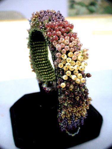
ColorBlock Bracelet, Warren Feld, 2017   (playing with progressive proportions)

Every so often, you might want to create a rainbow, or some sequencing of colors, say from light to dark, where all the colors seem to emerge from the last, and bleed into the next.    This is much more difficult with beads than with paints for all the usual reasons discussed above.

A “Random” selection or placement of colors doesn’t usually work as well as selecting and placing based on some more mathematical formula.  “Alternating” or “graduating” colors doesn’t always work as well, either.    You must create a more complex, involved patterning.   You must choreograph the layout of colors, so that, from a short distance, they look like they are blending, and gradually changing across the length of your piece.

Monet’s Garden Bracelet, Kathleen Lynam, 2013  (using math formula)

One of the easier mathematical formulas to come up with as a way to choreograph things, is to play with color proportions.   Go bead by bead or row by row, and begin with the ideal proportionate relationship between two colors.    Gradually manipulate this down the piece by anticipating the next ideal proportionate relationship between the next two colors that need to follow.

In fact, any kind of statistical or mathematical formula underlying an arrangement will work better than something random or intuitive, when managing color blending and transitions.

(5) Simultaneity Effects and the Sensation of Simultaneous Color Contrasts
It turns out there is even more to how the brain recognizes and tries to harmonize colors.  Knowing (1) the color (light value) and (2) the relative proportions (contrasts) of color within the piece of jewelry is necessary, but still not enough for the brain to decide whether the piece of jewelry will be satisfying, finished and successful, or somewhat ugly, not buy-able or unwearable.

Some colors, when sitting on or near a particular color, are experienced differently, than when sitting on or near a different color.    The line of research we are focusing on here deals with what are called Simultaneity Effects.   Colors can be affected by other colors around them (simultaneous color contrasts).    Colors in the presence of other colors get perceived differently, depending on the color combination.

Simultaneity Effects are a boon to the jewelry designer.   They are great tools for such things as… 

  • Filling in the gaps of light between beads
  • Assisting in the blending of colors or the sense of movement of colors along a line or plane
  • Assisting in establishing dimensionality in a piece that otherwise would appear flat
  • Harmonizing 2 or more colors which, on as a set, don’t quite match up on the color wheel
  • Establishing frames, boundaries or silhouettes
  • Re-directing the eye to another place, or creating sense of movement

For example, a White Square on a Black background looks bigger than a Black Square on a white background.  White reaches out and overflows the boundary; black contracts.


Gray always picks up some of the color characteristics of other colors around it.


Existence of these simultaneity effects is a great piece of information for the designer.  There will be gaps of color and light between beads.   Many bead colors are imperfect, particularly in combination.    Playing with what I call “grays” [thus, simultaneity effects] gives the designer tools to overcome some of the color limitations associated with the bead.

Simultaneity effects trick the brain into filling in those gaps of light between beads.  Simultaneity effects trick the brain into believing colors are more connected and blended and mutually-supportive than they would, if separately evaluated.    Simultaneity effects trick the brain into seeing satisfying arrangements, rhythms, and dimensionality, where, without them, things would be unsatisfying instead.

A final example of simultaneity effects has to do with how people sense whether colors are warm or cool.   In one composition, depending on the color mix, a particular color might be felt as “warm”.   In a second composition, with a different color mix, that same color might be felt as “cool”.

Here the yellow square surrounded by white feels lighter, brighter and a different temperature than its counterpart.    The red square surrounded by the black feels darker, duller, and a different temperature than its counterpart.

Again, simultaneity effects give tools to the jewelry designer for intensifying and clarifying the design, without disturbing the eye/brain pre-wired fear and anxiety responses.    These allow you to “blend” and build “bridges” and create “transitions.”   You have a lot of tricks to use here which enable you to push the envelop with your designs.   And still have your piece be judged as beautiful and appealing.

Simultaneity Effects are some of the easiest things the jewelry artist can control and manipulate, to fool the brain just a little bit.    They let you bring in unexpected colors, and fool the brain into seeing color coordination and color blending.   They let you convince the brain that the color proportions are correct when, in reality, they are not.  They let you convince the brain to jump the cliff, which the gap between beads presents.

For the brain, gaps between beads – that is, areas with undefined colors, creates work for the brain, and is fraught with danger.  The brain has to actually construct a color and meaning to fill in this gap.  Without any clues or rules or assistance, it is more risky for the brain to jump the cliff, so to speak, and fill in the gaps with color, than it is for the brain to follow an easier pathway and simply define the jewelry as ugly or boring and reject it and move on.   Similarly, simultaneity effects convince the brain to look around corners, go into crevices, explore and move around the whole piece from end to end.

It is at this point in the design process where the jewelry artist must be most fluent, creative and strategic in using color.     It is primarily and most often through establishing, and then managing, the sensation of simultaneous color contrasts where the artist begins to build that connection between audience and self, wearer and resonance, the wearing-of and the context, coherency and contagion.

With Simultaneity Effects, colors begin to take on meanings and emotions.    These can be as simple as sensations of warm and color, close and far, approaching and fleeing, soft and harsh.   Or they can be much more complex, even thematic and symbolic.


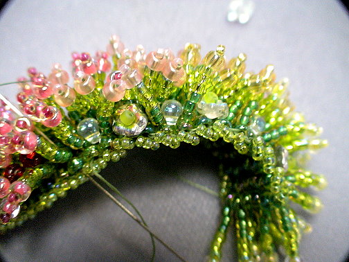
The Use of “GRAYS” (simultaneity effects) to tie things together – Blending and Bridging

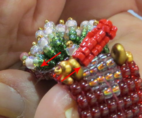
With beads, the eye often needs to merge or coordinate colors, as it scans any piece.  And then there are the gaps of light between beads.  The eye needs help in spanning those gaps.   The Artist needs to build color “bridges” and “transitions”, so that the eye doesn’t fall off a cliff or have to make a leap of death from one bead, across the gap, all the way to the next.

One easy technique to use is to play with simultaneity effects.  One such effect is where gray takes on the characteristics of the color(s) around it.

In beads, there are many colors that function as “grays” – gray, black diamond, alexandrite, Montana blue, prairie green, fuchsia, Colorado topaz – colors that have a lot of black or gray tones to them.    Most color lined beads result in a gray effect (where the class encasing distorts the inside color).  Metallic finishes can result in a gray effect.

Aqua/peach lined Antique rose Teal iris

In one piece I made, for example, I used 11/0 peach lined aqua beads as a “gray” to tie in larger teal and antique rose beads together.    While aqua is different than teal and the peach is different than the antique rose, in combination, the aqua/peach-lined beads acted like a gray.  When close to the teal iris beads, the aqua took on the teal color; when close to the antique rose beads, the peach took on the antique rose color.   Gray colors pull from one bead, and transition to the next in a very subtle way, that tricks the brain, but does not disturb it.


Expressive Attributes of Color and Color Contrasts:
Important Color Terms and Vocabulary

Each color on the wheel is called a HUE.     Hues are pure colors – any color except black or white.    And if you look again, there is no black or white on the Color Wheel.

BLACK
is the absence of color.   We consider black to be opaque.   Usually, when people see black, they tend to see shadows.   With black, designs tend to feel older, more antique’y, richer, more traditional and solid, and seem to have a patina around them.

WHITE is all the colors merged together.    When all colors in “light” merge, you get White.  When all the colors in paints or pigments are merged, you get a neutral gray-black or beige.   With White, designs tend to feel sharper, brighter, more contemporary.

INTENSITY and VALUE.  Better jewelry designers are those who master how to play with INTENSITIES and play with VALUES.   This means they know and are comfortable with manipulating bright and dull (intensity), and light and dark (value).    They know the subtle differences among red, pink and maroon, and how viewers react to these.    They know how to punctuate – BAM! – with Yellow, and EASE – with purple, and CALM – with blue.

The contrasts between Bright and Dull or Light and Dark are not quite the same.    Bright and Dull (intensity) has to do with how much white, gray or black underlay the Hue or pure color.    Low intensity is duller; high intensity is brighter.    Think of a Stop Sign.   It could have just as easily been Red, Pink or Maroon.    Red is the most intense – the brightest of the 3 – and hence the sign is Red.   You can see red from the farthest distance away.    Red is “Bright (intensity)”, but not necessarily “Lighter (values)” than Pink or Maroon.

The contrasts between Light and Dark are called VALUES.  A lower value is darker, though not necessarily duller (intensity).   Pink has a higher value than maroon, because it is lighter.   Yellow is the lightest color; violet is the darkest.    Yellow has a higher value than violet.

Unfortunately, in many texts and guides written by Bead Artists and Jewelry Designers, they combine the concepts of intensity and value into a single concept they refer to as “Values”.   Bead Artists and Colorists often write that the “secret” to using colors is to vary “values”.     When they refer to “values”, they are actually combining these two color theory concepts – “values” and “intensities”.    Both are really different, so this combined meaning is a disservice to the bead artist and jewelry designer trying to learn to control color choices and color expression.

INTENSITY AND VALUES EXERCISE
Intensity Exercise:

Use your Blue Pencil, as well as your White, Gray and Black Pencils, to color in the 2nd column.   Start by coloring in all the squares with a medium shade of blue.

Using your white, gray and black pencils, now vary the darkness of the blue to approximate the darkness of the grays in the 1st column. 

Values Exercise:

Using your Blue Pencil only, color in each cell in the table below, making the top cell the lightest (highest value), subsequent cells darker than the previous ones, and the last bottom cell, the darkest (lowest value).   [Press lightly on the pencil when coloring in the first cell, and then harder and harder as you go down the column.]

So, as you work with people to create jewelry for them, you make choices about, and then manipulate:

– colors
– balance and harmony (distribution, placement, and proportions)
– intensities
– values
– simultaneity effects

Let’s say you wanted to design a necklace with blue tones.   If you were designing this necklace for someone to wear at work, it would probably be made up of several blue colors which vary in values, but Not in intensities.   To give it some interest, it might be a mix of light blue, blue, dark blue and very dark blue.    Thus, the piece is pretty, but does not force any power or sexuality issues on the situation.

If you were making this same necklace for someone to go out on the town one evening, you might use several blue colors which vary in intensity.    You might mix periwinkles and Montana blues and cobalt blues and blue quartzes.     You want to make a power or sensual statement here, and the typical necklace someone would wear to work just won’t do.

Let’s continue with some more important color building blocks or concepts.

TINT, SHADE and TONE are similar to values and intensities.    They are another way of saying similar things about manipulating color Hues.    TINTS are colors with white added to them.  Pink is a tint of Red.    SHADES are colors with black or gray added to them.   Maroon is a shade of Red.    And TONES define the relative darkness of a color.    Violet is a dark tone and yellow is a light tone.    Red and green have the same tonal value.   “Tones” are what copy machines pick up, and the depth of the black on a photocopy relates to the tonal value of the colors on the original paper you are copying.   Red and green photocopy the same black color.   They have the same tonal value.

TEMPERATURE.  Colors also have Temperature.   Some colors are WARM.   The addition of black tends to warm colors up.   Warm colors are usually based in Red.   Red-Orange is considered the warmest color.   Warm colors tend to project forward.

COOL
colors are usually based in Blue.   Green-blue is the coldest color.   Addition of white often cools colors.   Cool colors tend to recede.

Given the other colors which surround them, however, usually warm colors may appear cold, and vice versa.

Juxtaposing colors creates MOVEMENT and RHYTHM.   By creating patterns, you guide the brain/eye in its circuitous route around the piece, as it tries to make sense of it.   Juxtaposing Warm with Cool colors increases the speed or sense of movement.


Some colors tend to PROJECT FORWARD and others tend to RECEDE.   Yellow is an advancing color.  Black recedes.     You can play with this effect to trick the viewer into seeing a more MULTI-DIMENSIONAL piece of jewelry before her.   By mixing different colors and different finishes, you can create a marvelous sense of dimensionality.


  • Faceted, Glossy beads will tend to look closer and capture the foreground
  • Smooth, Glossy beads will tend to capture the middle ground
  • Matte, Dull, Frosted, or Muted beads will tend to fall into the background


To Reiterate Some of The Key Ideas and Understandings
The color research begins to open up ideas about how the brain processes color, and which of these processes might be seen as universal, and which more subjective.

The brain first perceives, then tries to understand the color as a color.    It senses Light Values.

The brain perceives, then tries to understand the color relative to other colors around it.    It senses Color Contrasts.

At the same time, the brain perceives and tries to understand the color within some context or situation, to gauge more meaning or emotional content.   It interprets Simultaneous Color Contrasts within the boundaries of a context, situation, personal or group culture.

The END RESULT is simple:
Should we consider the jewelry to be finished and successful?
Should we like the jewelry or not like it?
Should it get and hold our attention, or not?
Should we approach it, or avoid it?
Should we get excited about it, or not?
Should we comment about it to others?
Should we buy it?
Should we wear it?

All this perceptual and cognitive and interpretive activity happens very quickly, but somewhat messy.  Some of it follows universal precepts.   Some of it is very subjective.   Our brain is trying everything it can to make sense of the situation.   It tries to zero-sum the light values.   It has to take in information about a color’s energy signature.  It has to take in information about how much of one color there is in relation to other colors.   It has to take in information about emotional and other meaningful content the juxtaposition of any group of colors within any context or situation represents.

With any piece of jewelry, the artist and designer is at the core of this all.    It is the designer, in anticipation of how others perceive, recognize and interpret colors in their lives, who establishes how color is used, and manages its expression within the piece.    The jewelry designer is the manager.    The designer is the controller.   The designer is the influencer.   The designer establishes and conveys intent and meaning.

DECODING COLOR AS A DESIGN ELEMENT


A composition in orange and blue.

Art and design theory informs us how to objectively use color.    That means, there are universally accepted shared understandings and expectations about what makes a piece of jewelry more satisfying (or dissatisfying) in terms of choices about color.

So, when we refer to our lessons above about color use, and examine the orange and blue necklace above, we can recognize some problematic choices about color.

The first is about color proportions.      The most satisfying proportionate relationship between orange and blue is 1:3.    That means, for every 3 parts, one should be orange and two should be blue.    In our illustrated composition, the relationship is more 1:2 or half orange and half blue.   To make this piece more attractive and satisfying, we would need to reduce the amount of orange and increase the amount of blue.

The second is about color schemes.    Here we have a 2-color, complimentary color scheme.   To make this piece more attractive and satisfying as a complimentary color scheme, we have learned that one of the two colors should predominate.   Either we have to add more orange, or have to add more blue.

So, we have decoded our Color Design Element and we see that the proportions are less than optimal, and the color scheme chosen is less than optimal.    To make the necklace more appealing, and in conformance with universally agreed upon understandings about good color use, we will need to increase the amount of blue and decrease the amount of orange, so that we get a 1:3 (orange to blue) proportionate outcome, and we allow one color to predominate.

Let’s look at another example:


Composition in green, white and red.

First, white is not considered a color.   We can ignore it.

Second, proportionately, there should be equal amounts of green to that of red.   The relationship is 1:2, meaning for every 2 parts, 1 should be green and 1 should be red.    Proportionately, in this piece, we are close to this proportionate relationship.

Third, we have, in effect, since we ignore white, a 2-color complimentary color scheme.    We have learned that in this scheme, one color should predominate.

That means, in this composition, the current use of color will not and cannot work.  It results in an unacceptable and unsatisfying use of color.    Proportionately, both colors need to be equal.   Color Scheme wise, one color needs to clearly predominate.    We can’t conform to both universally-accepted shared understandings about the use of green and red in a 2-color scheme.


DESIGNING JEWELRY WITH COLOR
Always remember that your choice of color(s) should be secondary to the choices you make about concept, theme, arrangement and organization.    Color should be used to enhance your design thinking.    Color should not, however, be the design.

When we study color from a design standpoint, we think of color as part of the jewelry’s structure.  That means, color is not merely a decorative effect or object.    It is more like an integral building component which has been organized or arranged within a larger composition.   As a component, it is a “Design Element”.    Color is the most important Design Element.      It can both stand alone, as well as easily be combined with other Design Elements.  There are some universal aspects when color is objectively understood as an element of design.   As part of an arrangement, we begin to treat color in terms of Principles of Composition, Construction and Manipulation.   Color takes on some subjectivity.    Its effects become much more dependent on the artist’s intent and the situation in which the jewelry is worn.

Color is used to express meaning and enhance meaningful expressions.   We use color to express elements of the materials used, like glass or gemstone.   We use color to express or emphasize elements of the forms we are creating.   We use color to enhance a sense of movement or dimension.   We use color to express moods and emotions.   We use color to influence others in sharing the artist’s inspirations and aspirations.

As designers, we…
– Anticipate how the parts we use to make a piece of jewelry assert their needs for color
– Anticipate shared universal understandings among self, viewer, wearer, exhibitor and seller about color and its use
– Think through how colors relate to our inspirations and how they might impact our aspirations
– Pick colors
– Place and arrange colors
– Distribute the proportions of colors
– Play with and experiment with color values and color intensities
– Leverage the synergistic effects and what happens when two (or more) colors are placed next to one another
– Create focus, rhythm, balance, dimension and movement with color
– Create satisfying blending and transitioning strategies using color
– Anticipate how color and the play of color within our piece might be affected by contextual or situational variables
– Reflect on how our choices about color affect how the piece of jewelry is judged as finished and successful by our various client audiences
– Use color to promote the coherency of our pieces, and the speed and extent to which attention by others continues to spread

Fluent designers can decode color and its use intuitively and quickly, and apply color in more expressive ways to convey inspiration, show the artist’s strategy and intent, and trigger an especially resonant, energetic response by wearers and viewers alike.

Don’t get into a Color Rut
And a last piece of advice.

Don’t get into a color rut.    Experiment with different colors.   Force yourself to use colors you usually do not use or avoid.     If it’s too psychologically painful, make a game of it.

————————————————————————————


WARREN FELD, Jewelry Designer
warren@warrenfeldjewelry.com
615-292-0610

For Warren Feld, Jewelry Designer, (www.warrenfeldjewelry.com), beading and jewelry making have been wonderful adventures. These adventures have taken Warren from the basics of bead stringing and bead weaving, to wire working, wire weaving and silversmithing, and onward to more complex jewelry designs which build on the strengths of a full range of technical skills and experiences.

Warren leads a group of instructors at Be Dazzled Beads (www.bedazzledbeads.com).  He teaches many of the bead-weaving, bead-stringing, wire weaving, jewelry design and business-oriented courses. He works with people just getting started with beading and jewelry making, as well as those with more experience.    Many of his classes and projects have been turned into kits, available for purchase from www.warrenfeldjewelry.com  or www.landofodds.com.     He conducts workshops at many sites around the US, and the world.

Join Warren for an enrichment-travel adventure on Your World Of Jewelry Making Cruises.

His pieces have appeared in beading and jewelry magazines and books. One piece is in the Swarovski museum in Innsbruck, Austria.

He is probably best known for creating the international The Ugly Necklace Contest, where good jewelry designers attempt to overcome our pre-wired brains’ fear response for resisting anything Ugly.

He is currently writing a book – Fluency In Design:   Do You Speak Jewelry?

_________________________________________________________

FOOTNOTES
[1] Pantone website   https://www.pantone.com
[2]  Itten, Johannes.  The Elements of Color: A Treatise on the Color System of Johannes Itten, NY: John Wiley & Sons, 2001

[3] In reality, the selection of primary colors is arbitrary.    The primary colors depend on the light source, the color of the background, and the biology of the color-sensing components of the eye.    We choose red-yellow-blue when referencing painting or coloring on white background, like paper.   We choose red-green-blue when referencing color placed on a black background, such as a TV or computer screen.   We choose cyan-maroon-yellow-black when using overlapping inks to create color on a white background, and better reproduce true colors.    We understand that the eye sees red-greenish yellow-blue-violet most clearly.


Color References Worth Checking Out
Rockport Publishers, Color Harmony Workbook, Gloucester, MA: Rockport Publishers,
1999.
Deeb, Margie.  The Beader’s Guide to Jewelry Design, NY: Lark Jewelry & Beading,
2014.


Posted in Art or Craft?, art theory, bead weaving, beads, beadwork, color, design management, design theory, jewelry collecting, jewelry design, jewelry making, Stitch 'n Bitch | Tagged: , , , , , | Leave a Comment »

5 Questions Every Jewelry Designer Should Have An Answer For

Posted by learntobead on December 14, 2017

Interested in trying your hand at jewelry design? Before you begin, consider the following 5 questions, as outlined by Nashville jewelry designer and teacher Warren Feld  (www.warrenfeldjewelry.com) 

Susan felt very unsure of herself. And unsure of her jewelry. Would people like it? Was the color mix appropriate? Was the construction secure? Was the price smart and fair? She allowed all this uncertainty to affect her design work – she had difficulty finishing pieces she was working on, starting new projects, and getting her work out there.

Like many of my jewelry and beadwork students, Susan needed to be empowered as a designer.

Empowerment is about making choices. These choices could be as simple as whether to finish a piece or not. Or whether to begin a second piece. The designer will make choices about how to draw someone’s attention to the piece, or present the piece to a larger audience. She or he may decide to submit the piece to a magazine or contest. She or he may want to sell the piece and market it. The designer will make choices about how a piece might be worn, or who might wear it, or when it might be worn, in what context.

And for all these choices, the jewelry designer might need to overcome a sense of fear, boredom, or resistance. The designer might need to overcome anxiety, a sense of giving up, having jeweler’s block, feeling unchallenged, and even laziness.

The empowered jewelry designer should have answers to 5 critical questions:

Question 1:  Should BEADWORK and JEWELRY MAKING be considered ART or CRAFT?
The jewelry designer confronts a world that is unsure whether jewelry is “craft” or “art.” This can get very confusing and unsettling. Each approach has its own separate ideas about how the designer should work, and how he or she should be judged.

When defined as “craft,” jewelry is seen as something that anyone can do – no special powers are needed to be a jewelry designer. As “craft,” there is somewhat of a pejorative meaning — it’s looked down upon, thought of as something less than art. But as “craft,” we recognize the interplay of the artist’s hand with the piece and the storytelling underlying it. We honor the technical prowess. People love to bring art into their personal worlds, and the craftsperson offers them functional objects that have artistic sensibilities.

When defined as “art,” jewelry is seen as something which transcends itself and its design. It evokes an emotional response from the viewer.   It has more of a sense of clarity of purpose and choice, a sense of presence. As “jewelry art,”  things done to improve functionality – durability, movement, drape and flow – should play no role at all, or as a compromise, merely be supplemental.

How you define your work as ART or CRAFT will determine what skills you learn, how you apply them, and how you introduce your pieces to a wider audience.

QUESTION 2:  How do you decide what you want to create?
What kinds of things do you do to translate your passions and inspirations into jewelry? What is your creative process?

Applying yourself creatively can be fun at times, but scary at other times. It is work. There is an element of risk. You might not like what you end up doing. Your friends might not like it. Nor your family. You might not finish it.  Or you might do it wrong. It may seem easier to go with someone else’s project.

Set no boundaries and set no rules. Be free. Go with the flow. Don’t conform to expectations.
Play. Pretend you’re a kid again. Have fun. Get the giggles.
Experiment. Take the time to do a lot of What Ifs and Variations On A Theme and Trial and Error.
Keep good records. Make good notes and sketches of what seems to work, and what seems to not work.
Evaluate. Learn from your successes and mistakes. Figure out the Why did something work, and the Why Nots.

QUESTION 3:  What kinds of MATERIALS work well together, and which ones do not?   
The choice of materials, including beads, clasps, and stringing materials, set the tone and chances of success for your piece.   There are light/shadow issues, textural issues, and color issues.  All of these choices:
… affect the look
… affect the drape
… affect the feel
… relate to the context

I always suggest using the highest quality materials your budget will allow.

Question 4: Beyond applying basic techniques, how does the Jewelry Designer evoke an emotional response to their jewelry?
An artistic and well-designed piece of jewelry should evoke an emotional response. This takes both the successful application of techniques as well as skills.

Unfortunately, beaders and jewelry makers focus too often on techniques and not often enough on skills. It is important to draw distinctions here.

Techniques are necessary but not sufficient to get you there. You need skills. The classic analogy comparing techniques and skills references cutting bread with a knife. Technique:  How to hold the knife relative to the bread in order to cut it. Skill:  The force applied so that the bread gets cut successfully.

Skills are the kinds of things the jewelry designer applies which enhance his or her capacity to control for bad workmanship. These include:
– Judgment
– Presentation
– Care and dexterity
– Taking risks

QUESTION #5: When is enough enough?
How does the jewelry artist know when the piece is done? Overdone? Or underdone? How do you edit?

In the bead and jewelry arenas, you see piece after piece that is either over-embellished or under-done. Things may get too repetitive with the elements and materials. Or the pieces don’t feel that they are quite there yet.

For every piece of jewelry there will be that point of parsimony, where adding or subtracting one more element will make the experiencing of the whole greater than the sum of its parts.

The empowered jewelry designer will have answers to these questions, though not every designer will have the same answers, nor is there one best answer. Yet it is unacceptable to avoid answering any of these 5 questions, for fear you might not like the answer.

The empowered jewelry designer will have learned the skills for making good choices. These choices include making judgments about combining materials, both physical and aesthetic, into wearable art forms and adornment. This is jewelry making and design.


Warren FFor Warren F., Jewelry Designer and teacher in Nashville, TN, beading and jewelry making endeavors have been wonderful adventures. These adventures, over the past 25 years, have taken Warren from the basics of bead stringing and bead weaving, to wire working and silver smithing, and onward to more complex jewelry designs which build on the strengths of a full range of technical skills and experiences. Learn more about Warren here!

Posted in Art or Craft?, jewelry design | Tagged: , , , | Leave a Comment »

It’s not too late to VOTE! for the UGLIEST NECKLACE of 2014

Posted by learntobead on December 4, 2014

OnLine Voting Ends 12/15/2015!
10th International 2014 The Ugly Necklace Contest
A Jewelry Design Competition With A Twist

Your expert opinion counts!

It ain’t easy doing Ugly!

Five Jewelry Artists from around the world have been selected as Semi-Finalists of The 10th International 2014 The Ugly Necklace Contest –  A Jewelry Design Competition With A Twist, by a panel of judges from Be Dazzled Beads, The Center for Beadwork & Jewelry Arts and Land of Odds.

Vote Online for your favorites, and help determine who will win the Grand Prize – a $992.93 shopping spree on the Land of Odds web-site (http://www.landofodds.com).  Runner Up Prize:  $399.07 shopping spree.   Voting Ends December 15, 2014

Help the world determine which necklace is the absolutely ugliest necklace in 2014!

More details and images on-line at:
http://www.landofodds.com/store/ugly10contest.htm


2014 Semi-Finalists Announced:

Patricia Parker, Quakertown, Pennsylvania

Joan Veress, Norwood New York

Cecilia Wells, Brentwood, Tennessee

Lynn Davy, Wimborne, Dorset, United Kingdom

Pamela Orians, Zanesville, Ohio


Synopsis:

It’s not easy to do Ugly!

So the many jewelry designers from across America and around the Globe who entered our 10th International 2014 The Ugly Necklace Contest — A Jewelry Design Competition With A Twist, found this contest especially challenging.   After all, your brain is pre-wired to avoid and reject things which are ugly.   Think of snakes and spiders.   And even if you start your necklace with a bunch of ugly pieces, once you organize them into a circle, the very nature of an ordered round form makes it difficult to achieve Ugly.   Yes, “Ugly” is easier said than done.

Who will win?   We need your help to influence our panel of judges.

Our respected judges evaluated these creatively-designed pieces in terms of hideousness, use of materials and clasp, the number of jewelry design principles violated, and the designer’s artistic control.   Extra points were awarded for artists’ use of smaller beads, because it’s much more difficult to do Ugly with these.

Now it’s time for America and the World to help finalize the decision about which of these 8 semi-finalists’ Ugly Necklaces to vote for.   The winner will truly be an exceptional jewelry designer.   The losers….well….this isn’t a contest where you really can “lose”.

Come see these and the other semi-finalists’ pieces at www.landofodds.com, and vote your choice for the Ugliest Necklace,  2014.

And if you are in the Nashville, Tennessee area, please stop by The Open Windows Gallery (fine art jewelry) at Be Dazzled Beads, where the 8 semi-finalists’ Ugly Necklaces are on display through March 15, 2014.


LAND OF ODDS-BE DAZZLED BEADS
Attention: Warren Feld
www.landofodds.com
718 Thompson Lane, Ste 123, Nashville, TN 37204
Phone: 615-292-0610; Fax: 615-460-7001
Email: warren@landofodds.com

Posted in Contests, jewelry design | Tagged: , , , | Leave a Comment »

The Ugly Necklace Contest – Submission Deadline Approaching

Posted by learntobead on April 28, 2014


THE UGLY NECKLACE CONTEST
– A JEWELRY DESIGN COMPETITION WITH A TWIST
Submission Deadline Approaching:  August 31, 2014

uglynecklace1


QUESTION:  Have you ever designed something truly ugly? Look at some of the previous submitted entries to the Ugly Necklace Contest? In your view, and from a design sense, are there any particularly outstanding  examples of “Ugly”?

Past Contests — View  the Galleries of Entries

2003:  http://www.landofodds.com/store/ugliest2003a.htm
2004:  http://www.landofodds.com/store/ugliest2004a.htm
2005:  http://www.landofodds.com/store/ugliest2005a.htm
2006:  http://www.landofodds.com/store/ugliest2006a.htm
2007:  http://www.landofodds.com/store/ugliest2007a.htm
2008: http://www.landofodds.com/store/ugliest2008a.htm
2010: http://www.landofodds.com/store/ugliest2010a.htm
2012: http://www.landofodds.com/store/ugly9contest.htm


About The UGLY NECKLACE CONTEST — A Jewelry Design Competition With A Twist
Submission Deadline: August 31, 2014
Enter To Win! http://www.landofodds.com/store/uglynecklace.htm

The UGLY NECKLACE CONTEST is a jewelry design contest with a twist. The contest presents a challenge not often tackled — at least intentionally. The contest draws the jewelry designer into an alternative universe where beautiful artists create ugly necklaces. It’s not easy to do.

“Ugly” is more involved than simple surface treatment. It is not just laying out a bunch of ugly parts into a circle. It turns out that “Ugly” is something more than that. “Ugly” is the result of the interplay among Designer, Wearer, and Viewer. “Ugly” is very much a result of how a necklace is designed and constructed. “Ugly” is something the viewer actively tries to avoid and move away from. “Ugly” has deep-rooted psychological, cognitive, perceptual, sociological and anthropological functions and purposes.

As research into color and design has shown, your eye and brain compensate for imbalances in color or in the positioning of pieces and objects – they try to correct and harmonize them. They try to neutralize anything out of place or not quite right. You are pre-wired to subconsciously avoid anything that is disorienting, disturbing or distracting. Your mind and eye won’t let you go here. This is considered part of the fear response, where your brain actively attempts to avoid things like snakes and spiders…. and ugly necklaces.

This means that jewelry designers, if they are to create beautiful, wearable art, have to be more deeply involved with their pieces beyond “surface”. Or their pieces will be less successful, thus less beautiful, thus more disturbing or distracting or disorienting, thus more Ugly.

Luckily, for the jewelry designer, we are pre-wired to avoid these negative things. This makes it easier to end up with pieces that look good. Beauty, in some sense, then, is very intuitive. On the other hand, it makes it more difficult to end up with pieces that look bad. You see, Ugly goes against our nature. It’s hard to do.

To achieve a truly hideous result means making the hard design choices, putting ourselves in situations and forcing us to make the kinds of choices we’re unfamiliar with, and taking us inside ourselves to places that we are somewhat scared about, and where we do not want to go.

– Can I push myself to use more yellow than the purple warrants, and mix in some orange?

– Can I make the piece off-sided or disorienting, or not have a clear beginning, middle or end?

– Can I disrupt my pattern in a way that, rather than “jazz,” results in “discord?”

– Can I work with colors and materials and patterns and textures and placements and proportions I don’t like?

– Can I design something I do not personally like, and perhaps am unwilling, to wear around my neck?

– Can I create a piece of jewelry that represents some awful feeling, emotion or experience I’m uncomfortable with?

– Can I make something I know that others won’t like, and may ridicule me for it?


Because answering questions like these is not something people like to do, jewelry designers who attempt to achieve “Ugly,” have to have a lot of control and discipline to override, perhaps overcome, intuitive, internally integrated principles of artistic beauty. The best jewelry designers, therefore, will be those artists who can prove that they can design a truly Ugly Necklace. In our contest, we invite all those jewelry designers out there to give it a try.

The Ugly Necklace Contest is one of the many programs at Be Dazzled Beads and The Center for Beadwork & Jewelry Arts in Nashville, Tennessee, that encourage beadwork and jewelry makers to challenge themselves and to test their design skills, and learn some fundamentals about jewelry design in the process.


What Is Ugly?

Different participants in The Ugly Necklace Contest have interpreted “Ugly” in different ways.

Some focused on the ugliness of each individual component. Some used materials that they felt conveyed a sense of ugly, such as llama droppings, or felted matted dog hair, or rusty nails, or cigarette butts, or a banana peel. Some focused on mood and consciousness, and how certain configurations of pieces and colors evoked these moods or states of consciousness.

Others focused on combining colors which don’t combine well. Still others focused on how the wearer’s own body would contribute to a sense of ugliness, when wearing the piece, such as the addition of a “Breast Pocket” which would lay just below the woman’s breast, or peacock feathers that covered the wearer’s mouth, or the irritating sounds of rusty cow bells, or the icky feeling of a rotting banana peel on the skin. Still others saw Ugly as a sense of psychological consciousness, such as being homeless, or an uncomfortable transition from adolescence to adulthood. For some Ugly meant politically ugly, like Saddam Hussein of Iraq, or the trans-fats associated with fast foods.

It is not enough just to string a bunch of ugly beads on a wire. Ugly pieces do not necessarily result in an ugly necklace. As one entrant learned, when she strung her ugly beads together, the final project was beautiful, and sold for $225.00, before she could enter it into the contest! Actually, if you look at many of the entries, you see that ugly pieces, once arranged and organized, don’t seem as ugly. Organization and arrangement contribute their own qualities and sense of beauty that transcends the ugly parts.

Adding to the fun, the contestant also has to create a piece of jewelry which is functional and wearable. This is what sets beadwork and jewelry design apart from other design arts. A piece of jewelry as art, (even Ugly art), has to maintain its essence and purpose, even as the wearer moves, bends down, or rubs against things. Jewelry is Art as it is worn. Jewelry is not a subset of painting or a type of sculpture.

Jewelry is something more. Jewelry is art and architecture in motion, often frenetic motion. The pieces that make it up, and the techniques and designs which coherently interrelate these pieces, must also anticipate this dynamic totality. Otherwise, the piece of jewelry becomes a failure not only as a piece of jewelry, but of art, as well.


The Ugly Necklace Contest is an arena for budding and established beadwork and jewelry designers to strut their stuff – to show how adept they are at creating ugly-necklace-pieces-of-art. It’s a jewelry design competition with a twist.

The finalists of The Ugly Necklace Contest are those beadwork and jewelry designers who can best elaborate upon rules of design, whether intuitively or strategically. These rules of design are, in effect, an underlying grammar and vocabulary – the theoretical and professional basis of beadwork and jewelry making as art, not just craft.

~~~~~~~~~~~~~~~~~

Be sure to check out this new book by Margie Deeb, in which she includes a discussion about The Ugly Necklace Contest:

The Beader’s Guide to Jewelry Design: A Beautiful Exploration of Unity, Balance, Color & More Paperback
by Margie Deeb  (Author)

Once beaders have mastered the basics and enjoyed bringing others’ patterns to life, they’re ready and eager to take the next step: creating their own original pieces. Here, finally, is their must-have guidebook to the fundamental principles of visual design. Focusing on jewelry, it helps beaders explore concepts such as unity, scale, proportion, balance, rhythm, volume, shape, pattern, texture, movement, drape, and color in their work. Exercises, reader challenges, and lavish photos enhance understanding and assure design success.

This book is available for Pre-Order at Amazon.com.

deeb-jewelrydesign


http://www.amazon.com/The-Beaders-Guide-Jewelry-Design/dp/1454704063/ref=sr_1_1?ie=UTF8&qid=1391443968&sr=8-1&keywords=the+beaders+guide+to+jewelry+design

Posted in Contests, jewelry design | Tagged: , , , , , , , , , | Leave a Comment »

COLOR BLENDING: A MANAGEMENT APPROACH

Posted by learntobead on April 30, 2013

COLOR BLENDING:
A MANAGEMENT PROCESS

bw2fr1-8-fall-palette-bracelet2 - Copy - Copy

Color blending with beads is always challenging. It is not like paints, where you can merge and blend colors with ease. Beads are physical objects with set colors. You can’t mush them together, The transition from bead to bead in any piece, requires the eye/brain, when interacting and interpreting colors, to literally jump a cliff between the inevitable gaps of light between each bead. You want the viewer to have a satisfying, pleasurable journey as their eye/brain moves along that line of color-transitioning beads.

It is this transition from color to color that must be managed.

bw2fr1-spring-begin-garden-border - Copy (2)

The Monet’s Garden Bracelet by Kathleen Lynam
One Example of a Color Blending Strategy

The Monet’s Garden Bracelet is a fun project that students love. It is for students who have some familiarity with bead weaving. Kathleen had been experimenting with various strategies for blending colors along the length of a bracelet. At about the same time, Beadwork issued a call for project proposals to be used in a book about what to do with your Bead Stash — all those small quantities of lots of different colors you have left over. This was the perfect type of project for color blending.

bw2fr1-spring-fringe-done-1

This bracelet teaches a mathematical approach for organizing several colors within a color blending scheme. Also presented is a simple math formula for personalizing your bracelet — that is, varying the width and length to suit your needs. The techniques here are Square Stitch and Fringing.

In her pieces, Kathleen loves to draw on nature’s inspiration. She gathers flowers and plants and bring them into the bead shop to match their colors as closely as she can. For her Monet’s Garden Bracelet, she developed instructions for both a Spring Palette, as well as a Fall Palette. However, the instructions would be as useful for a monochromatic palette, such as whites to grays to black, or a Southwest palette, such as turquoise to corals to reds. Use your imagination — and use up your bead stash, in the process!

Color Blending

Your goal is to move from one color to the next, in a satisfying way. You have many different kinds of choices to make, when managing a transition like this.

After you have chosen which colors you want to use, you need to decide what the color will look like as a “base” color, and what the color might look like as a “blend” color. With paints, this task is much, much easier, than with beads. It is not easy to blend beads, not least of which is because it is difficult to find the right colors needed to merge a color from base to blend and back to the base of the next color.
In this project, our strategy is to change the proportions of the base color as we move from one row to the next, until the proportions of the base to the blend in the first row are in reverse to the proportions to the blend to the base in the last transitional row. [And then, the blend becomes the new base, etc. along the bracelet.]

Besides varying the proportions, other options of blending that you have as a jewelry artist:

– Varying the brightness and dullness as you move from base to blend, such as finding colors with either more black, more gray, or more white in them

– Graduating the length of your fringes from row to row to create a sense of layering

– Varying the lightness and darkness as you move from base to blend, such as going from red to maroon or from red to pink

When choosing a set of colors, these do not have to match perfectly, but they do need to be coordinated. It is difficult if you vary the finishes of the beads too much. For example, transparent and transparent AB would not work well together in our scheme. Nor would transparent AB and luster finishes. Yet transparent AB, silver-lined and metallic colors do work well together, but only when you allow one of the finishes to be predominant.

Kathleen:”This Monet’s Garden Bracelet project is about color blending, so I went all out in selecting 14 colors. I could have easily used fewer colors or more colors.
Using the color blending strategy presented for this project, with 14 colors, each color would require 4 rows. So, in a bracelet, the base of which consists of 58 rows, the maximum number of colors we could use would be 14 (that is, 58 divided by 4, with 2 extra rows). I decided that when I got to the end with my 14th color, I would blend it with the 1st color, and color an extra row at the beginning and at the end (thus, my two extra rows), both done in the 1st color. [An alternative for treating the end of the bracelet would be to transition back from color 14 to color 13, and finish off the rows.]

I use a formula discussed below in allocating the proportion of each color, row by row. I played with combinations of different finishes. I was not satisfied with plain transparent beads — not enough brightness or dimensionality. Using all one finish, such as an AB finish or luster finish, was interesting, but too monotonous. It didn’t look like “nature”. I settled on using primarily transparent luster-finish colors, with some transparent AB, transparent silver-lined and a couple of metallic and metallic iris finish colors. This mixing of finishes seemed better. These captured and reflected light in different ways, and drew the eye into the bead differently, thus adding considerable interest. Lastly, I used more matte finishes in my Fall palette, than in my Spring.

My transitions from color to color are relatively quick. Each transition from one color to the next takes up 2 rows. With 14 colors, thus 4 rows allocated for each, you would have 2 full color rows and 2 transitional color rows. However, I could have easily come up with a formula-strategy to make the transitions much slower. And I could have come up with a formula-strategy to transition 3 colors at a time, instead of 2.

For this project, I graduated my colors in a way that seeming pleasing to me. The main transition is from reds to purples to golds and topaz’s.

My flower stalks are two sizes. For the first and last stalks, four 11/0 seed beads long and then topped with an 8/0 and a 15/0 seed bead as the flower tips, about 3/8”. For the 2nd through 7th stalks, six 11/0 seed beads long and then topped with an 8/0 and a 15/0 seed bead as the flower tips, about 1/2″. Because I have used Japanese seed beads, the 2nd thru 7th stalks/tips are the same lengths. I tried a sample going longer (8 11/0 seed beads plus the 8/0 and 15/0 tip), but this wasn’t appealing to me. Also, I would not have gone much longer, because the stalks could more likely bend in half, instead of standing more firmly upright. It was important to use 3 color gradations in my flower stalk, rather than a single color. A sense of “movement” is one of the key beauties of this bracelet. As the bracelet is worn, and the fringe move, I want the viewer to have a sense of watching flowers blowing in the wind. To maximize this effect, I vary the colors from darkest near the base to lightest near the flower tip.

For the Fall Palette, I also vary the finishes from luster to color lined, to silver lined, to AB, so that they eye’s interaction with any glass bead will also vary. I want things to feel like that changing of nature during Fall.

I coordinated the colors of the 8/0 and 15/0 seed beads forming the flower and its tip. In many cases, I found colors that were very similar. In a couple of cases, to add a bit of variety and surprise, and I used colors with a little more contrast, yet in the same general color family. “

The pattern underlying Kathleen’s color blending formula:
Determine the color patterns for the non-transitional and the transitional rows of flower stalk tips (the fringe in her bracelet). This pattern is based on playing with the proportions of the two colors, as we transition between them.

In our instructions today, we use the following patterns:
Where,
S=Same or current color
N=Next new color

Non-Transitional Row:
S | S | S | S | S | S | S
First of two Transitional Rows:
S | N | S | N | S | N | S
Second of two Transitional Rows:
N | N | N | S | N | N | N

Color Blending:

It is difficult to blend colors, when using beads. Some people like to make a bead mix of all the beads and colors they want to blend. This “Random” approach to blending works sometimes, but in a random way. Similarly, “Alternating” colors or “Graduating Colors from light to dark, or bright to dull” along your piece, also do not work well.

Usually, to get a great color-blending design, you need to plan, pre-test, plan again, pre-test again, until you work out a more involved, complex patterning.

One way to choreograph things, is to play with color proportions. Go line by line, and begin with the ideal proportionate relationship between two colors. Gradually manipulate this down the line by anticipating the next ideal proportionate relationship between the next two colors that need to follow.

Posted in bead weaving | Tagged: , , , , | Leave a Comment »

Piece accepted for inclusion 500 BEADED JEWELRY book

Posted by learntobead on February 8, 2012

Just found out that one of my pieces — Little Tapestries/Ghindia — was juried into the book SHOWCASE 500 BEADED JEWELRY, Lark Publications. The book comes out August 2012, but is already listed on Amazon.com at http://amzn.to/z6tZH2 .

From Amazon.com:

This book gathers photographs of 500 of the most breathtaking beaded jewelry designs created in recent years. The techniques the beaders employ are as varied as the aesthetic sensibilities they bring to their gorgeous creations and include beadweaving in every stitch imaginable, embroidery, quilling, loom weaving, and kumihimo braiding, as well as basic stringing, simple wirework, and fine metalwork. Sometimes, a bead maker’s focal piece simply is set in a straightforward, unpretentious, and beautiful design.


Virtually all of the world’s most famous beaders who make jewelry have pieces included — including Carol Wilcox Wells, Diane Fitzgerald, Marcia DeCoster, Jamie Cloud Eakin, Huib Petersen, Paulette Baron, Sabine Lippert, Sherry Serafini, Margie Deeb, Maggie Meister, Melanie Potter, Ann Tevepaugh Mitchell, Laura McCabe, Suzanne Golden, Jean Campbell, Rachel Nelson-Smith, Eva Dobos, and many more — but we also present work from many artists who have never been published before. All together, this extensive, international, and fabulous survey of 500 pieces includes work from nearly 300 artists from 30 countries and reveals the striking vision and ambition of today’s beading community.

Posted in beads, beadwork, jewelry design | Tagged: , , , | 1 Comment »

BEADED TAPESTRY COMPETITION SEMI-FINALISTS SELECTED

Posted by learntobead on October 21, 2011

BEADED TAPESTRY COMPETITION SEMI-FINALISTS SELECTED

Images of our semifinalists entries posted on facebook
The Illustrative Beader: Beaded Tapestry Competition, 2011
Theme: Mystery Genre Book Covers
http://www.facebook.com/pages/The-Illustrative-Beader-Beaded-Tapestry-Competition/176006269128968?sk=wall

KAY FIELDEN

Auckland, New Zealand

“The Lovely Bones”
by Alice Sebold

JUNE JACKSON and JAMIE BRUNS

Bryan, Texas

“Lizzie Borden”
by Elizabeth Engstrom

DOT LEWALLEN

Westerville, Ohio

“Black Notice”
by Patricia Cornwell


PATTY ROCKHILL

O’Brien, Florida

“When Night Falls”
by Jenna Ryan

Voting online for the winner will begin around 11/7/2011 on the land of odds website —

http://www.landofodds.com/

http://www.landofodds.com/store/tapestry.htm

Posted in bead weaving, Contests | Tagged: , , , , , | Leave a Comment »

Join Warren in On-Line Discussion Seminar

Posted by learntobead on October 9, 2011

JOIN WARREN IN ON-LINE DISCUSSION SEMINAR

Warren will be leading this discussion on Bead Chat/Facebook next Tuesday, 10/11, 10:00am central time (11:00am eastern time). Please join us.

EMPOWERING THE JEWELRY ARTIST:
5 Questions Every Jewelry Designer Should Have An Answer For!

Time
Tuesday, October 11 · 10:00am-11:00am Central Timel (11:00am -12:00pm Eastern Time)
Location
Bead Chat Room
http://www.facebook.com/groups/261514230535263/
Created By
Auntie’s Beads
For Bead Chat (hosted by Auntie’s Beads)

Warren Feld discusses these questions in the context of art vs. craft, passion and inspiration, materials and components, techniques vs. skills, and when is enough enough. There is not one best answer. These are the kinds of things each jewelry designer must define for themselves, in a way satisfying to them, but anticipating their audience’s needs, as well. Join us for live chat with Warren!

About Auntie’s Beads Bead Chat on Facebook
Ask to join if you are interested in group chat discussions about beading and jewelry making topics. Chat is ongoing and informal, but we also post event notices and host these online events via chat…

Posted in jewelry design | Tagged: , , , , , , , , , , | Leave a Comment »

Huib Petersen Workshops – 5/20-22/2011

Posted by learntobead on April 20, 2011

Be Dazzled Beads,
and The Center for Beadwork & Jewelry Arts
in Nashvile, Tennessee

welcomes

Huib Petersen
May 20th-22nd, 2011

Art Nouveau Sweet Pea Necklace
Friday, 5/20

Playing with Butterflies and Bugs
Saturday/Sunday, 5/21-22

FOR MORE INFORMATION:
Click Here 

Huib Petersen is known for his creative translation of nature’s themes, wonders and little inhabitants through beadwork. His necklaces tell little stories about how nature’s elements come together and play.

What a wonderful opportunity to expore our craft with the artist in person — share special insights, get that master-level perception, understand her craft and artistic strategy!

Posted in beadwork, Workshops, Classes, Exhibits | Tagged: , , | 1 Comment »